How to: Create and Customize the TileNavPane Control at Design Time
- 3 minutes to read
This topic explains how to use Visual Studio’s designer to create and customize a Tile Navigation Pane. The figure below shows a control created at design time.
Note
Run the ApplicationUI demo and click Open Solution for the complete example. In Solution Explorer, find ModuleTileNavePane file and open it in the designer.
Create a Tile Navigation Pane
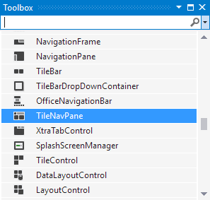
Drop the TileNavPane control from the Toolbox window onto the application’s form.
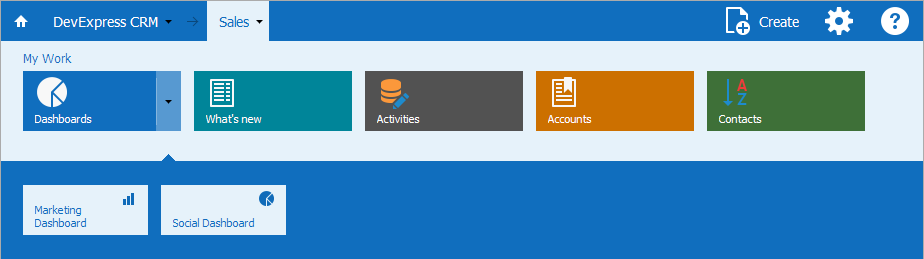
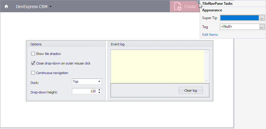
The TileNavPane control’s smart tag  menu provides access to designer tasks. The figure below shows the Tile Nav Pane from the demo application.
The TileNavPane already contains the main button if you create the control in the designer. In this example, the main button caption is DevExpress CRM. We also added custom buttons to the nav bar.
Note
If you create the control in code, you should add the main button to the TileNavPane.Buttons collection.
Populate the Main Menu with Tiles
The main button provides access to root navigation elements. Use the TileNavPane.MainButtonBehavior property to specify whether the control uses a three- or two-level hierarchy of navigation elements.
Three-level hierarchy
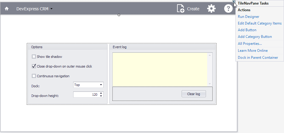
If you use a three-level navigation hierarchy, click Run Designer smart tag menu task to invoke TileNavPane Designer. In this designer, you can add categories, category items, and sub-items to the menu.
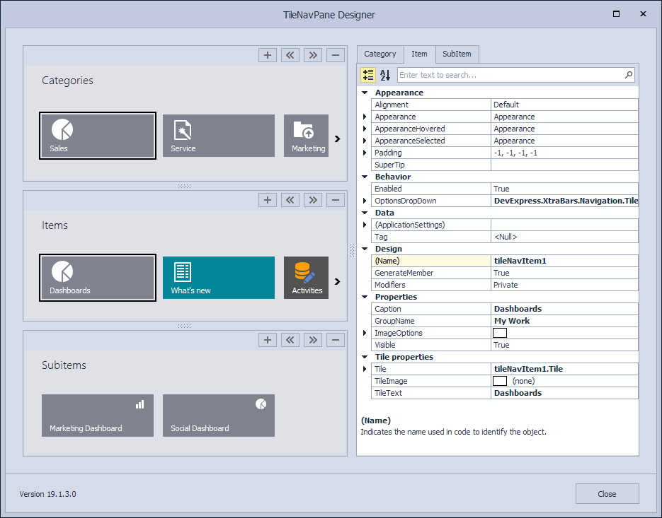
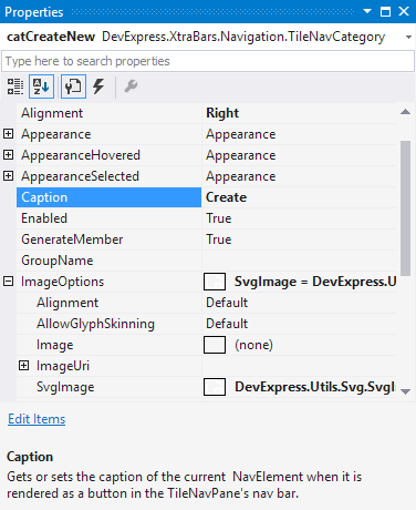
You can use the TileNavElement.TileText and TileNavElement.TileImage properties to specify the text block and image of the main element of the tile.
Note
The TileNavElement.TileText and TileNavElement.TileImage properties specify the navigation element’s text and image displayed in the drop-down bars, while the NavElement.Caption and NavElement.ImageOptions properties specify the caption and glyph displayed in the nav bar.
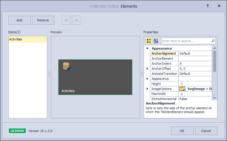
The TileNavElement.Tile property provides access to the tile that renders the navigation element in the drop-down bars. To display multiple text blocks and images in a tile, use the TileItem.Elements collection. See Tile Item Structure for more information.
Two-level hierarchy
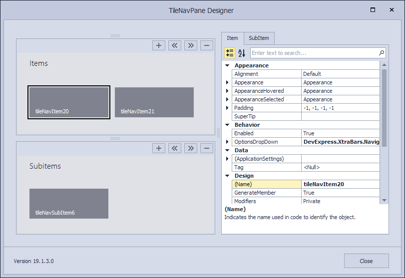
If you want to use a two-level navigation element hierarchy, click Edit Default Category Items smart tag menu task. In this case, TileNavPane Designer omits the category level.
Create and Customize Buttons in the Nav Bar
Add Button and Add Category Button smart tag tasks add corresponding buttons directly to the nav bar. The category button’s smart tag menu allows you to add items to this category and assign a tooltip.
Use the NavElement.Alignment property to align buttons relative to the nav bar. To arrange buttons at design time, you can also use drag-and-drop operations.
The NavElement.Caption and NavElement.ImageOptions properties allow you to specify the caption and glyph. To specify the glyph’s alignment relative to the button, use the NavElement.ImageOptions.Alignment property.