Resource Headers
- 3 minutes to read
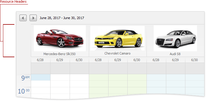
The ResourceHeader class represents a resource header that displays a caption and an image. Headers are only visible when appointments are grouped by a resource or date. Use the SchedulerControl.GroupType property to group appointments.
The HorizontalResourceHeader and VerticalResourceHeader classes represent a resource header displayed horizontally and vertically. The header orientation depends on the applied view.
The Resource.ImageBytes property (mapped to the SchedulerControl.DataStorage.Resources.Mappings.Image data field) specifies the image displayed in the header. The Resource.Caption property (mapped to the SchedulerControl.DataStorage.Resources.Mappings.Caption data field) specifies the header caption.
Layout Options
The SchedulerControl.OptionsView.ResourceHeaders property provides access to the following options related to the resource headers.
Option | Description |
|---|---|
Gets or sets the height of the resource header. | |
Gets or sets the image alignment within a resource header. | |
Gets or sets the size of an image which is shown within a resource header. | |
Gets or sets the size mode of an image which is displayed within a resource header. | |
Gets or sets the value indicating whether to rotate the caption’s text. Disable this option to display captions in vertical headers horizontally. |
Appearance Settings
A ResourceHeader object’s Appearance property provides access to appearance settings applied to resource headers. The table below contains available settings.
Setting | Description |
|---|---|
Gets the appearance settings used to paint headers. | |
Gets the appearance settings used to paint the horizontal line under the header. | |
Gets the appearance settings used to paint a selection within the View. | |
Gets the appearance settings used to paint the alternate (Today) header. | |
Gets the appearance settings used to paint the horizontal line under the alternate (Today) header. | |
Gets the appearance settings used to paint an additional header shown in the Agenda View and far aligned. | |
Gets the appearance settings used to paint additional alternate (“Today”) header shown in the Agenda View and far aligned. |
Note
If a skin is applied, background colors for day headers are not in effect.
Customization Events
The SchedulerControl.LayoutViewInfoCustomizing event fires before a time cell, day header, day-of-week header, or resource header is displayed and allows you to customize them.
The SchedulerControl.CustomDrawResourceHeader event fires before a resource header is displayed and allows you to draw it manually.
Resource Category Headers
If resources are organized into categories, category headers are displayed instead of resource headers. A category header displays captions of the resources that belong to the category. Use the ResourceCategory.Caption property to provide a custom caption for the category.
You can also set the SchedulerControl.OptionsView.ResourceCategories.ResourceDisplayStyle property to Tabs to display resource headers as tabs that users can select. To display appointments associated with the selected resource (tab) only, set the AppointmentDisplayMode property to SelectedResource.