TokenEdit with Custom Drop-Down Control
- 6 minutes to read
The Token Edit Control displays its currently available tokens within a drop-down based on a simple pop-up menu. There can be scenarios when a simple pop-up is insufficient. In this case, you can manually create your own drop-down control and assign it to the TokenEdit.
This example will demonstrate you how to add a GalleryControl as a TokenEdit’s drop-down.
- Create a new Windows Forms solution and drop a TokenEdit onto the form.
Right-click your solution in the Visual Studio’s Solution Explorer and add a new user control as shown below.
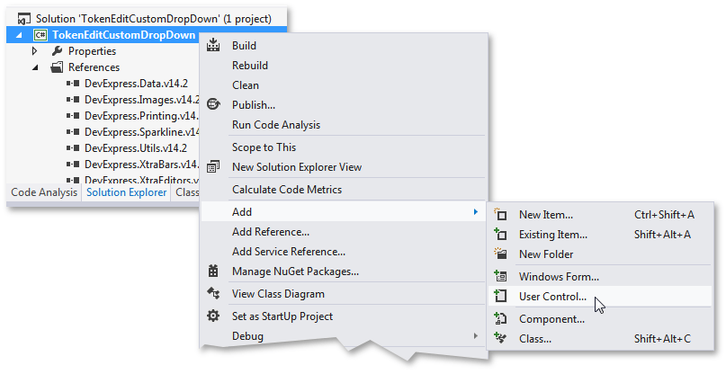
This control will serve as a drop-down for the TokenEdit control.
- Drop a GalleryControl onto this user control.
Derive your user control from the CustomTokenEditDropDownControlBase class in code.
This class provides all necessary functionality that a control may require as a TokenEdit’s drop-down. To acheive this goal, you will overload this class’ methods with the following steps.
The first method you will require is the SetDataSource method. It takes an object as a parameter and allows you to bind your custom drop-down control to data (if the control used supports data binding). This method is called automatically each time a drop-down is about to be displayed. In this example, a very simple scenario is described - a list containing tokens is created and populated with 10 tokens, and for each token in this list a new gallery item is created.
List<TokenEditToken> tokenList = new List<TokenEditToken>(); public override void SetDataSource(object dataSource) { if (customGallery1.Gallery.Groups[0].Items.Count != 10) createData(); } public IEnumerable<TokenEditToken> createData() { for (int i = 0; i < 10; i++) { tokenList.Add(new TokenEditToken("Token " + i.ToString(), "Token " + i.ToString())); customGallery1.Gallery.Groups[0].Items.Add(new GalleryItem(imageCollection1.Images[i], tokenList[i].Description, tokenList[i].Description)); } return tokenList; }For the next step, override the GetItemCount method. You need to return the number of tokens within the drop-down control. Otherwise, the editor will not display its drop-down. In this example, this count depends on the number of tokens added to the list in the previous step.
To tweak the details of your custom drop-down, override the CalcFormHeight and CalcFormWidth methods that return the drop-down height and width respectively.
Assign a new instance of your custom drop-down control to the RepositoryItemTokenEdit.CustomDropDownControl property.
If you now launch the application and try to enter something in the editor, your custom drop-down with 10 items will be displayed. But, clicking gallery items will do nothing and no new token will be added to the editor’s edit box. To provide this functionality, you need to manually access the gallery’s OwnerControl object (which will be your TokenEdit control) and call its ClosePopup method with the PopupCloseMode.Normal parameter that tells the editor that its drop-down was intentionally closed. Then, you will need to override the GetResultValue method - it will be called automatically after a drop-down is closed and needs to return a token (if any) that was selected in this drop-down.
GalleryItem clickedItem;

public CustomDropDown() {
    InitializeComponent();
    customGallery1.Gallery.ItemClick += Gallery_ItemClick;
}

void Gallery_ItemClick(object sender, DevExpress.XtraBars.Ribbon.GalleryItemClickEventArgs e) {
    clickedItem = e.Item;
    this.OwnerEdit.ClosePopup(PopupCloseMode.Normal);
}

public override object GetResultValue() {
    int index = customGallery1.Gallery.Groups[0].Items.IndexOf(clickedItem);
    return tokenList[index];
}
Depending on the control you have chosen as the TokenEdit drop-down, the previous step could be your last. For instance, if you use a GridControl, you need only to follow the steps above (except for setting the BaseView.Editable property to false to avoid entering the edit mode each time a grid cell is clicked). But with some editors, like GalleryControl in this example, you need to deal with the fact that each editor works with user focus in its own way. The GalleryControl keeps the user focus when the drop-down is closed. This causes the drop-down to be closed differently than you would expect, like when you call the ClosePopup method with the Normal parameter. Instead, the GalleryControl will be closed in the Immediate mode, which corresponds to an unexpected close due to losing focus.
Important
The editor within your custom drop-down control must be able to lose focus when the drop-down closes.
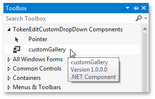
To fix this issue, create a new custom class that will derive from the GalleryControl. The only thing you need is to override its AllowFocus property so it will always return false.
[ToolboxItem(true)] public class customGallery : GalleryControl { public customGallery() { } protected override bool AllowFocus { get { return false; } } }This step can vary, depending on the control chosen. For instance, if you use the TreeList control, you will need to modify its ControlStyle, as shown in the code below.
[ToolboxItem(true)] public class customTreeList : TreeList { public customGallery() { SetStyle(ControlStyles.UserMouse, false); } }Rebuild the solution and remove your GalleryControl from the UserControl. Then, since you used the ToolboxItem(true) attribute, you will be able to find your custom GalleryControl descendant in the Visual Studio toolbox and drop it onto the User Control.
Remember to search the previous gallery name and replace it with the new gallery name throughout the solution.
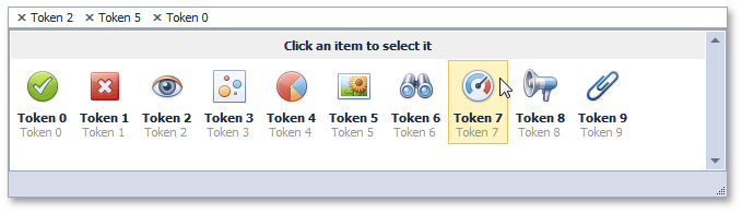
Launch the application to see the result.
Code Central Examples
To explore and download solutions that demonstrate different controls used as the TokenEdit drop-down controls, click a corresponding link below.