Resources for Appointments
- 7 minutes to read
A resource is an abstraction and its actual interpretation depends on a particular application. In a project schedule, a resource is an employee, and a vehicle in a car sharing service, etc. This document explains how to assign resources to appointments.
Overview
The SchedulerControl.DataStorage property returns a SchedulerDataStorage object, which is a storage for appointments and resources. The SchedulerDataStorage.Resources property returns a ResourceStorage object that is a storage for resources. Use its Items property to access the collection of resources. A resource is an object that implements the Resource interface:
- Id — gets or sets an object that uniquely identifies the resource.
- Caption — gets or sets the caption displayed in the resource header.
Assign Resources to Appointments
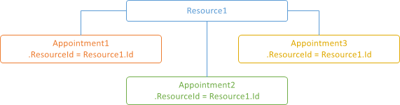
To assign a resource to an appointment, assign the resource’s Id property value to the appointment’s ResourceId property.
Note that the resource storage should contain the resource. Otherwise, the appointment is not loaded into the appointment storage. This means that appointments with associated resources are not displayed in a scheduler with empty resource storage.
If an appointment has no associated resource, it belongs to all resources. Enable the SchedulerControl.OptionsView.ShowOnlyResourceAppointments option to display appointments only with associated resources.
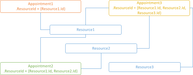
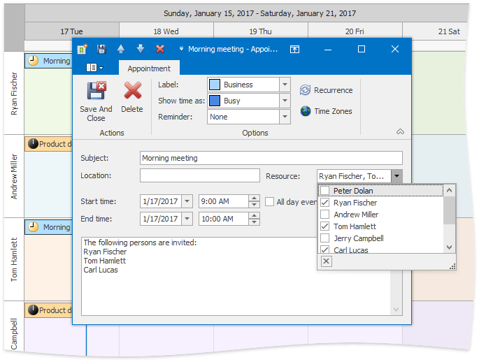
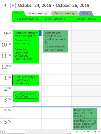
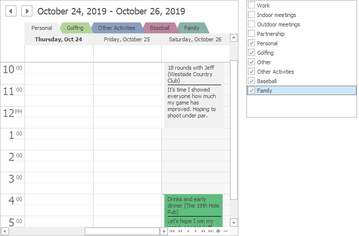
An appointment can be associated with multiple resources. For example, a single task can be assigned to multiple employees. To associate an appointment with multiple resources, use the appointment’s ResourceIds collection.
Enable the appointment storage’s ResourceSharing option to share appointments between resources.
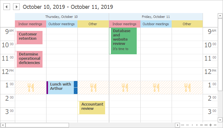
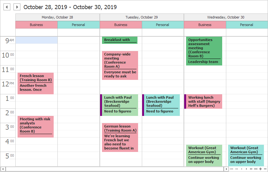
In the image below, you can see how users can assign multiple resources to an appointment.
Note
When multiple resources are associated with an appointment, resource identifiers are serialized in the XML format. Starting from version 15.2, the control uses Base64 encoding for XML serialization. Set the static (Shared in VB) SchedulerCompatibility.Base64XmlObjectSerialization property to false to revert to the previous serialization format. For more information, see the Data Sources topic.
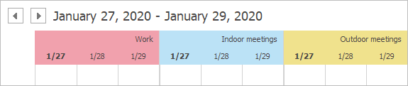
Appointment Groups
Each appointment has a date and can have an associated resource. Dates are displayed at the top of the view.
Resources are only displayed if appointments are grouped. To group the appointments, set the SchedulerControl.GroupType property to one of the following values:

The Timeline View displays resources vertically on the left and dates horizontally at the top, regardless of the group type.
The Agenda View does not support groups.
Options
The options below are only in effect when appointments are grouped.
Resource Navigator
The Resource Navigator is displayed when appointments are grouped. The navigator allows users to do the following:
- Scroll through resources. To navigate through resources in code, use Resource Navigation Services.
- Specify the number of resources displayed on-screen. To change the number in code, use the View‘s ResourcesPerPage property. The VisibleResources property provides access to the collection of visible resources.
To hide the navigator, set the SchedulerControl.ResourceNavigator.Visibility property to Never.
Resource Visibility
If a resource’s Visible property is set to false, then resource appointments are hidden.
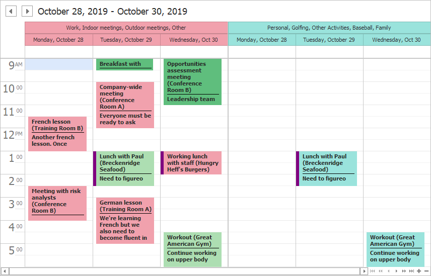
Resource Categories
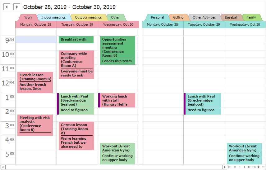
You can arrange resources in separate categories. For example, you can create a business and personal category.

The ResourceCategory class represents a category where you can place resources. Use the ResourceCategory.Resources collection to add resources to the category. When categories are created and populated with resources, add them to the SchedulerControl.ResourceCategories collection.
In the code below, resources are arranged into categories according to the ParentId field.
using DevExpress.XtraScheduler;

Scheduler.GroupType = SchedulerGroupType.Resource;

var categories = this.schedulerDataStorage1.Resources.Items
    .GroupBy(x => x.ParentId ?? x.Id)
    .Select(x => new ResourceCategory(x));
foreach (ResourceCategory category in categories)
    Scheduler.ResourceCategories.Add(category);
Note
Run the XtraScheduler demo and click Open Solution for the complete example.
Options
The SchedulerControl.OptionsView.ResourceCategories property provides access to options that are only applied when resources are organized into categories.
Resource Display Style
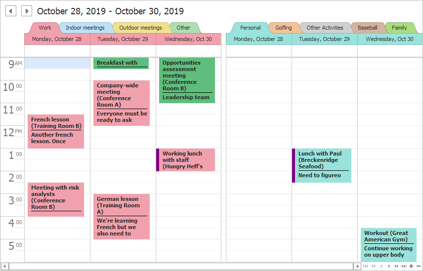
The ResourceDisplayStyle property specifies how to display resources in categories:
Tabs — each resource in a category is displayed as a separate tab and users can select a resource (tab) in a category. The ResourceCategory.SelectedResource property specifies the selected resource.
Headers — all resources in a category are displayed as a single category header and users cannot select a resource in a category (you can select a resource in code).
If resources are displayed as category headers, you can use the ResourceCategory.Caption property to provide a custom caption for the category.
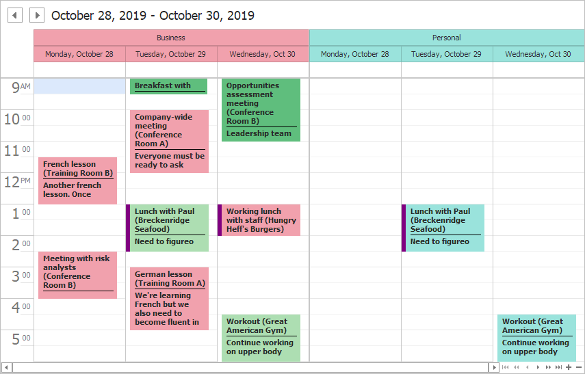
If appointments are grouped by dates, resources are always displayed as category headers.
Appointment Display Mode
The AppointmentDisplayMode property specifies how to display appointments in a category depending on the selected resource:
AllResources — a category displays appointments for all resources, regardless of the selected resource.
SelectedResource — a category displays appointments for the selected resource only.
Buttons to Show and Hide a Resource in a Category
Users can click the Close button in a resource header to hide the resource. The Add button invokes a pop-up menu that contains all resources available in the control. Resources that are visible in the current category are checked. Unchecked resources are hidden or belong to other categories. Users can check a resource to show a hidden resource or move a resource from another category to the current category.
To hide these buttons, disable the ShowCloseButton and ShowAddButton options.
Note
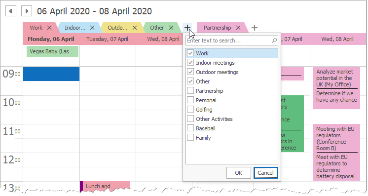
The control shows only resources that meet the current filter criteria. To filter the resources, use the FilterResource event.
Resource Appearance
Background Colors
Resources obtain background colors from a field mapped to the Color property. If the “Color” mapping is not set, colors are retrieved from the SchedulerControl.ResourceColorSchemas property.
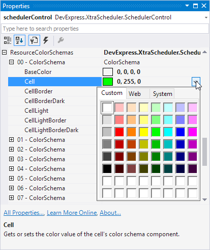
If no custom color scheme is applied, colors are retrieved from the active skin. To modify these default color schemas, run the WinForms Skin Editor and edit values of “ResourceColor01”, “ResourceColor02”, …, “ResourceColor12” properties.
You can also call the resource’s extension SetColor(Resource, Color) method to explicitly set a resource color. The code below illustrates how to apply the orange color for the Work resource and its appointments.
schedulerControl1.DataStorage.Resources.Items.FirstOrDefault(x => x.Caption == "Work")
    .SetColor(Color.Orange);
Resource Image
Use a resource’s extension SetImage(Resource, Image) method to assign an image to the resource. The image is displayed in the resource header. You can also use the ImageBytes property to specify the image.
Resource Headers
The SchedulerControl.OptionsView.ResourceHeaders property provides access to options that specify resource headers.
Orientation
In the Timeline View, resources are displayed vertically. Disable the SchedulerControl.OptionsView.ResourceHeaders.RotateCaption property to display captions horizontally.
Appearance and Alignment
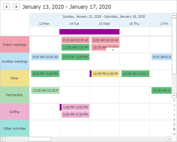
The Scheduler.Appearance.ResourceHeaderCaption property provides access to appearance settings applied to resource headers. For example, you can use the HAlignment property to align resource captions. Captions are aligned at the far edge in the following picture.
Scheduler.Appearance.ResourceHeaderCaption.TextOptions.HAlignment = DevExpress.Utils.HorzAlignment.Far;
Filter Resources
To filter resources in code, handle the SchedulerDataStorage.FilterResource event.
The example below shows how to filter resources in a scheduler. The filter shows the first three resources only.
using DevExpress.XtraScheduler;

private void schedulerDataStorage1_FilterResource(object sender, PersistentObjectCancelEventArgs e) {
    SchedulerDataStorage storage = (SchedulerDataStorage) sender;
    Resource res = (Resource) e.Object;
    // Shows the first three resources in the collection.
    e.Cancel = storage.Resources.Items.IndexOf(res) > 2 ;
}
Filter Controls
The ResourcesCheckedListBoxControl, ResourcesComboBoxControl, and ResourcesPopupCheckedListBoxControl controls can be attached to a scheduler to allow users filter resources.
Resource Tree
You can organize resources in a tree. A resource’s Id property specifies the resource’s identifier. Use the ParentId property to specify the identifier of the parent resource. If this property is set to null (Nothing in VB), the resource is at the root level.
See the Hierarchical Resource Specifics topic to learn how to use data source fields to organize resources in a tree.
Tree Control
The ResourcesTree control displays resources organized in a tree. The ResourcesTree.SchedulerControl property specifies the bound scheduler. You can use this control to display resources in the Timeline or Gantt view.
See Resources Tree for more information.