How to: Format Chart Elements
- 6 minutes to read
This example demonstrates how to enhance the appearance of an existing chart. For an example on how to create a basic chart in code, refer to the How to: Create and Modify a Chart article.
Select the action you wish to perform:
Apply the Built-in Chart Style
Chart styles allow you to quickly change chart appearance. The chart style changes the chart’s background fill, specifies the color of the data series, and applies different shape effects and outlines to the chart. To apply one of the predefined styles to the chart, utilize the ChartObject.Style property.
The example below demonstrates how to create a chart and apply one of the predefined styles to it using the ChartObject.Style property.
Note
A complete sample project is available at https://github.com/DevExpress-Examples/winforms-spreadsheet-chart-api-e5222
Worksheet worksheet = workbook.Worksheets["chartTask3"];
workbook.Worksheets.ActiveWorksheet = worksheet;

// Create a chart and specify its location.
Chart chart = worksheet.Charts.Add(ChartType.ColumnClustered, worksheet["B2:D4"]);
chart.TopLeftCell = worksheet.Cells["H2"];
chart.BottomRightCell = worksheet.Cells["N14"];

// Set the chart style.
chart.Style = ChartStyle.Accent1Dark;
Format an Individual Chart Element
The chart style allows you to apply a predefined set of format options. However, you can fine-tune these settings and specify custom formatting for individual chart elements by giving them a different color or outline. A full set of format characteristics available for a chart is provided by the ShapeFormatBase object. All objects that represent chart elements (Chart, PlotArea, Series, DataPoint, Axis, DataLabel, Legend, ChartTitle, etc.) inherit the ShapeFormatBase interface, so you can use its formatting properties to set a color and border of the required chart element.
Fill a chart element
To fill a chart element, use the ShapeFormatBase.Fill property. This property returns the ShapeFill object that contains the shape fill characteristics. You can fill a chart element with a solid color by using the ShapeOutlineFill.SetSolidFill method, make an element transparent by utilizing the ShapeOutlineFill.SetNoFill method, or apply the gradient effect by calling the ShapeOutlineFill.SetGradientFill method. Currently, only a linear gradient with two color stops at the beginning and at the end of a gradient line is supported.
Specify the outline of a chart element
To set a border of a chart element, use the ShapeFormatBase.Outline property. This property provides access to the ShapeOutline object that contains options used to draw the border or line on a chart. Use the ShapeOutlineFill.SetSolidFill method to specify border or line color. To remove the outline, call the ShapeOutlineFill.SetNoFill method. To change the width of a line or border, use the ShapeOutline.Width property.
Format a text of a chart element
To format a text contained in a chart element, use the element’s ShapeTextFormat.Font property. This property provides access to the ShapeTextFont object that contains a set of properties you can use to change font characteristics for the chart and axis titles, tick-mark labels and data labels. To change the font attributes for legend entries, use the Legend.Font property.
Note
Not all formatting properties affect the visual appearance of chart elements when a document is loaded to the SpreadsheetControl. However, you can specify format settings in code, save the document to a supported format, and display it in Microsoft® Excel®.
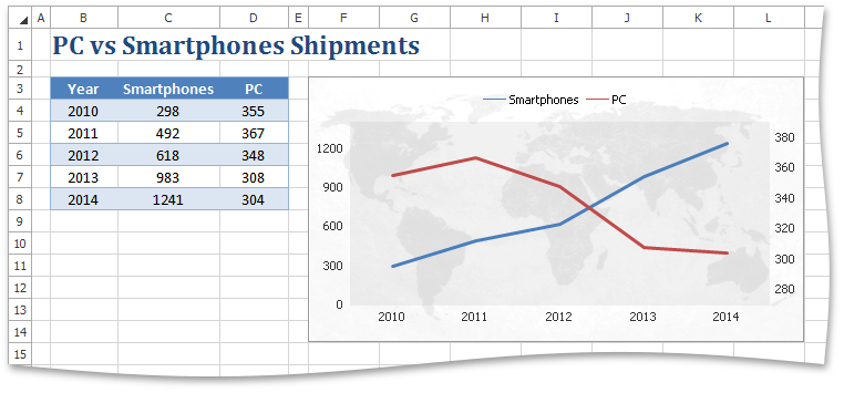
The example below demonstrates how to create a transparent chart with a semi-transparent plot area.
Note
A complete sample project is available at https://github.com/DevExpress-Examples/winforms-spreadsheet-chart-api-e5222
Worksheet worksheet = workbook.Worksheets["chartTask4"];
workbook.Worksheets.ActiveWorksheet = worksheet;

// Create a chart and specify its location.
Chart chart = worksheet.Charts.Add(ChartType.Line, worksheet["B3:D8"]);
chart.TopLeftCell = worksheet.Cells["F3"];
chart.BottomRightCell = worksheet.Cells["L14"];

// Customize the chart area and the plot area appearance.
chart.Fill.SetNoFill();
chart.Outline.SetSolidFill(Color.FromArgb(0x99, 0x99, 0x99));
chart.PlotArea.Fill.SetSolidFill(Color.FromArgb(0x22, 0x99, 0x99, 0x99));

// Specify the position of the legend.
chart.Legend.Position = LegendPosition.Top;

// Use a secondary axis.
chart.Series[1].AxisGroup = AxisGroup.Secondary;

// Customize the axis scale and appearance.
Axis axis = chart.PrimaryAxes[0];
axis.Outline.SetNoFill();
axis.MajorTickMarks = AxisTickMarks.None;

axis = chart.PrimaryAxes[1];
axis.Outline.SetNoFill();
axis.MajorTickMarks = AxisTickMarks.None;
axis.MajorGridlines.Visible = false;
axis.Scaling.AutoMax = false;
axis.Scaling.AutoMin = false;
axis.Scaling.Max = 1400;
axis.Scaling.Min = 0;

axis = chart.SecondaryAxes[1];
axis.Outline.SetNoFill();
axis.MajorTickMarks = AxisTickMarks.None;
axis.Scaling.AutoMax = false;
axis.Scaling.AutoMin = false;
axis.Scaling.Max = 390;
axis.Scaling.Min = 270;
Specify the Chart View Options
There are specific settings for different chart types that affect chart appearance. Use the properties of the ChartView and View3DOptions objects to specify chart options for 2-D and 3-D charts. For example, you can adjust the distance between column clusters in the column chart by using the ChartView.GapWidth property, or apply a different color to each data marker in the series by setting the ChartView.VaryColors property to true.
The example below demonstrates how to create the clustered column chart and specify the space between each column using the ChartView.GapWidth property.
Note
A complete sample project is available at https://github.com/DevExpress-Examples/winforms-spreadsheet-chart-api-e5222
Worksheet worksheet = workbook.Worksheets["chartTask5"];
workbook.Worksheets.ActiveWorksheet = worksheet;

// Create a chart and specify its location.
Chart chart = worksheet.Charts.Add(ChartType.ColumnClustered, worksheet["B2:C8"]);
chart.TopLeftCell = worksheet.Cells["F2"];
chart.BottomRightCell = worksheet.Cells["L15"];

// Set the gap width between data series.
chart.Views[0].GapWidth = 33;
// Hide the legend.
chart.Legend.Visible = false;