Customizing Galleries at Design Time
- 3 minutes to read
At design time, the gallery controls allow you to customize galleries (add and remove gallery item groups and items) using their Designers, while some controls also allow you to customize galleries right on the form, using context menus.
On-Form Gallery Customization
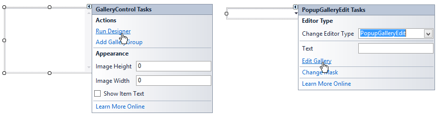
This feature is supported for controls whose gallery surfaces are visible at design time. The gallery surface of the PopupGalleryEdit control is not visible unless the popup is open, and so design-time on-form gallery customization is not supported for the PopupGalleryEdit control. See the following section to learn about this control’s gallery customization.
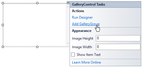
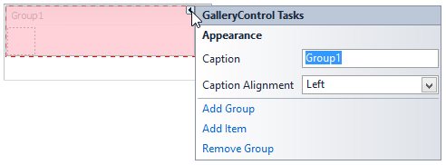
First, add a gallery item group (GalleryItemGroup) to the gallery. Select the Add GalleryGroup command in the gallery’s context menu or using a smart tag.
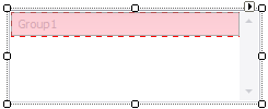
This creates an empty gallery item group.
In some controls, the gallery item group captions are hidden by default; they can be enabled using the gallery’s BaseGallery.ShowGroupCaption property.
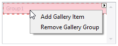
Add a gallery item to the group by selecting the Add Gallery Item command from the group’s context menu or smart tag menu.
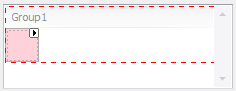
An empty gallery item will be added:
Customize the gallery item and gallery item group using their smart tag menus or the Properties grid. For an item, you can specify an image, caption, tooltip, etc.
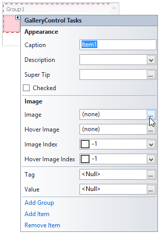
For a group, you can specify a caption and caption alignment.
- Add more groups and items, if required.
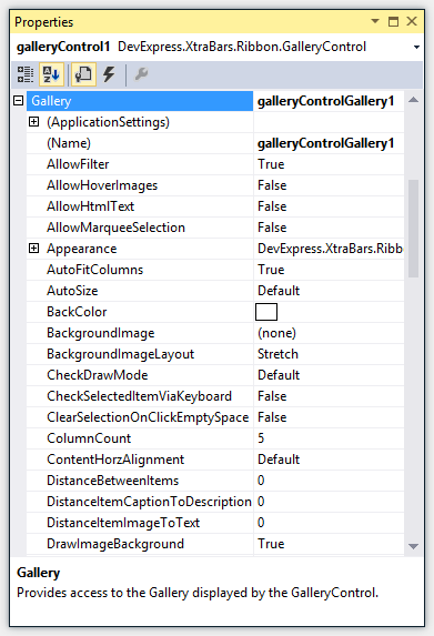
Customize the options that control the layout, view and behavior options of gallery items. These options are provided by the gallery itself and can be customized in the Properties grid.
See the Gallery Controls topic for a list of main gallery features and options that control the corresponding behavior.
Gallery Customization Using Designer
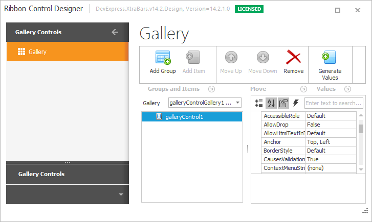
All gallery controls allow you to customize their galleries using Designers.
Invoke a control’s gallery Designer by selecting the Run Designer (or Edit Gallery) command from the control’s smart tag menu or context menu.
This opens the gallery Designer, which provides gallery customization buttons.
First, add a gallery item group (GalleryItemGroup) by clicking the Add Group button. This creates an empty group.
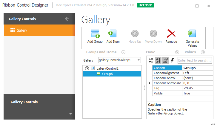
Use the Properties grid on the right to modify the group’s settings.
Ensure that the group is selected, and then click the Add Item button.
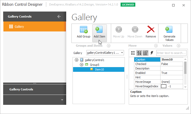
Use the Properties grid on the right to modify the created gallery item settings.
- Add as many groups and items as required by your application.
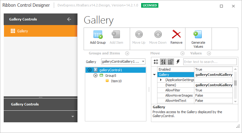
Customize the options provided by the gallery object that control the gallery item layout, view and behavior. To access these options, select the root element in the hierarchical gallery element list and expand the Gallery property in the Properties grid on the right.
See the Gallery Controls topic for a list of main gallery features and options that control the corresponding behavior.