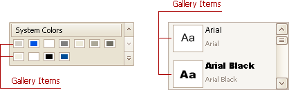
Gallery Items
- 6 minutes to read
A gallery item displays a single image in a gallery. It can also display a caption and descriptive text.
Gallery items are GalleryItem class objects. This class provides properties that control various display aspects of gallery items. The gallery itself (a BaseGallery descendant) also provides options that control the layout and behavior of gallery items. To learn about these options and the creation of gallery items, see the Gallery Controls and Customizing Galleries at Design Time topics.
Regular and Hover Images
You can provide regular and hover images for gallery items.
Regular Images
Regular images are displayed by gallery items when they are in a normal state. You can specify a regular image using the GalleryItem.Image or GalleryItem.ImageIndex property.
The Image property of the Image type provides a direct way to specify images. Another way to assign images to gallery items is to add all images that will be used by all gallery items to a single ImageCollection, bind this collection to the BaseGallery.Images property, and then specify the index of the required image in the collection using the gallery item’s ImageIndex property.
The Image property has a higher priority, so if an image is assigned to an item by both the Image and ImageIndex properties, the image specified by the Image property will be used.
By default, image areas are the same display size in all gallery items, even if sizes of the underlying images are different. This display size can be specified using the BaseGallery.ImageSize property. If the BaseGallery.UseMaxImageSize property is enabled, all gallery item images will have the same display size, matching the size of the largest image in the gallery. To display images in their original size, set the BaseGallery.FixedImageSize property to false. In this case, if underlying images are of different size, the gallery items will be different sizes as well.
The way images are aligned or stretched within the image area is controlled by the BaseGallery.ItemImageLayout.
Note
All images assigned to gallery items are loaded into memory simultaneously. So, if the volume of loaded images is too large, you may experience out-of-memory issues. If you have large images, resize them to a smaller size before assigning them to gallery items.
If you need to paint gallery images dynamically, handle the BaseGallery.CustomDrawItemImage event.
Hover Images
Gallery items support the hover images feature, which is disabled by default. To enable it, set the gallery’s BaseGallery.AllowHoverImages property to true. In this instance, when the mouse cursor moves over a gallery item’s regular image, the hover image automatically pops up. Generally, a hover image represents an enlarged version of its corresponding regular image.
You can use the GalleryItem.HoverImage or GalleryItem.HoverImageIndex property to assign a hover image to a gallery item. This image will pop up over the regular image when the hover images functionality is invoked. Like regular images, the image specified by the HoverImage property has a higher priority than the image specified by the HoverImageIndex.
However, it is possible to implement the hover images feature using only regular images. You can assign a regular image to an item using the GalleryItem.Image or GalleryItem.ImageIndex property. Then, specify the display bounds for regular and hover images via the BaseGallery.ImageSize and BaseGallery.HoverImageSize properties, respectively. Generally, the HoverImageSize is set to a value larger than the ImageSize, so when the mouse cursor passes a specific gallery item, the regular image will be enlarged to the size specified by the HoverImageSize, and this enlarged version will pop up.
Captions and Descriptions
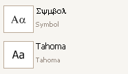
You can display captions and descriptions for gallery items. These are specified by the GalleryItem.Caption and GalleryItem.Description properties, respectively. They are not visible by default. To display the item text, set the BaseGallery.ShowItemText property to true.
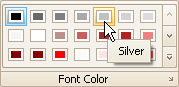
The appearance settings of the gallery item text are specified by the RibbonGalleryAppearances.ItemCaptionAppearance and RibbonGalleryAppearances.ItemDescriptionAppearance properties. These settings can be set for an individual gallery, using the BaseGallery.Appearance property, or for all galleries at one time via the BarAndDockingController.AppearancesRibbon property of the DefaultBarAndDockingController object. Note that these appearance settings are applied to all gallery items in a gallery. If you want to uniquely customize the appearance of individual gallery items, you can handle the BaseGallery.CustomDrawItemText event. In the following image, gallery item text is painted using this event:
To horizontally align an item’s caption and/or description within the text region, use the TextOptions.HAlignment property provided by the RibbonGalleryAppearances.ItemCaptionAppearance and RibbonGalleryAppearances.ItemDescriptionAppearance objects.
The item’s text region can be displayed along any edge of its image. Use the BaseGallery.ItemImageLocation property to specify the location of the image relative to the item’s text region.
Item Checking
The item checking feature, which allows an end-user to select one or multiple gallery items, can be enabled with the BaseGallery.ItemCheckMode property. Several selection modes are supported, enumerated by the ItemCheckMode type. For instance, you can allow a single item or multiple items to be selected within each group or throughout the gallery.
When the checking feature is activated, items are automatically checked/selected on clicking them. In multiple selection modes, several items can be checked simultaneously, by clicking them while holding the CTRL or SHIFT key.
Whenever an item’s check state (GalleryItem.Checked) is changed, the BaseGallery.ItemCheckedChanged event fires. To get all checked items, use the BaseGallery.GetCheckedItems method.
If you need to implement manual item checking, set the BaseGallery.ItemCheckMode property to None, and handle the BaseGallery.ItemClick event. In this event, you can manipulate an item’s check state using the GalleryItem.Checked property.
To allow items to be checked (selected) by dragging the mouse, use BaseGallery.AllowMarqueeSelection.
Hints
Gallery items support regular and extended tooltips, which allow you to provide more details on particular items for end-users. To specify a regular hint for an item, use the GalleryItem.Hint property. An extended tooltip, which supports multiple text and image regions, can be specified using the GalleryItem.SuperTip property. Hovering over an item will display a tooltip window with the specified hint.
It is possible to customize hints before they are displayed onscreen, and custom paint them using events provided by a ToolTipController object. See the Tooltip Management section for more information.
Gallery Item Actions
To respond to clicks on a gallery item, you can handle the BaseGallery.ItemClick and BaseGallery.ItemDoubleClick events.
If item checking is enabled, handle the BaseGallery.ItemCheckedChanged event to perform actions when gallery items are checked and unchecked.
These event parameters allow you to identify the clicked gallery item and the gallery.