Image Gallery and Context-Dependent Images
- 4 minutes to read
You can use the DevExpress icons in the DevExpress Image Gallery in your applications.
Launch the Image Gallery
When you specify an icon for a DevExpress UI element at design time, the “Image Picker” dialog with two tabs appears: the first tab displays the Visual Studio image chooser; the second displays the DevExpress Image Library.
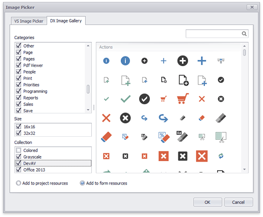
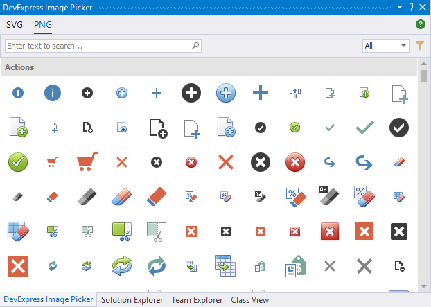
Image Gallery UI
The following image illustrates the DevExpress Image Gallery interface:
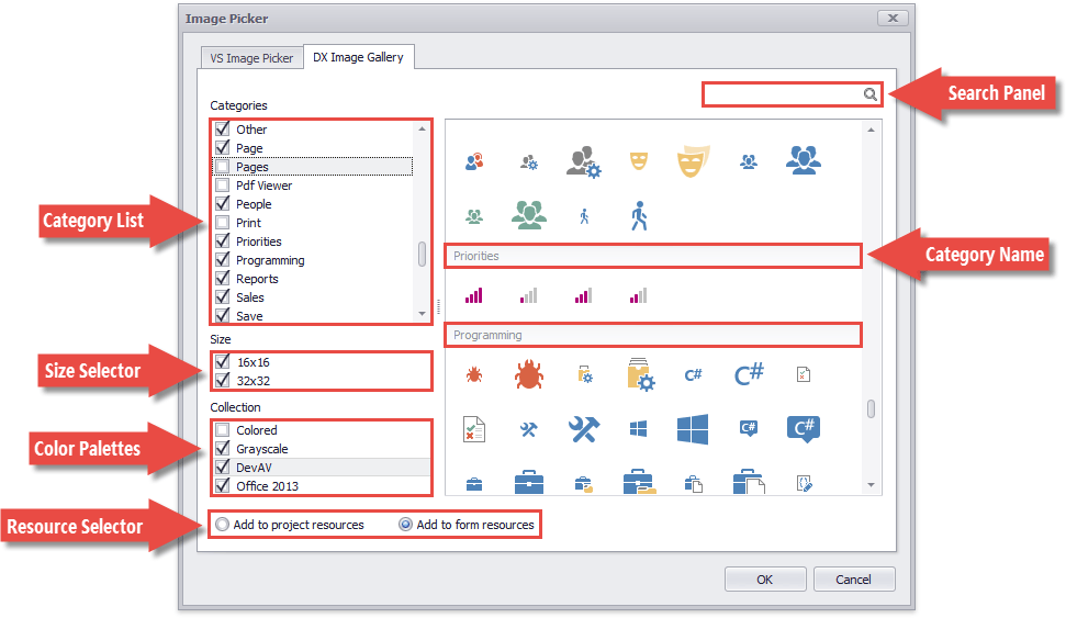
Category List
Icons in the Image Gallery are grouped by categories: arrows, mail, navigation, zoom, etc. You can un-check categories to exclude them from the gallery.
Size Selector
Image Gallery icons are available in two sizes - 16x16 and 32x32 pixels.
Color Palettes
Check boxes in this group allow you to choose images by a color scheme.
- Colored - Contains volumetric multi-color images (default).
- Grayscale - flat dark-gray icons that match monochrome UIs.
- DevAV - flat Hybrid UI icons.
- Office 2013 - Office 2013-inspired icons.
Resource Selector
You can add the selected icons to the form or project resources. If you add a DevExpress icon to project resources, you can assign this icon to non-DevExpress controls in the standard Visual Studio “Select Resource” dialog.
Search Panel
Allows you to find icons by their names (e.g., “Save”).
SVG Image Gallery
The SVG Image Gallery is invoked when specify vector images (for instance, the BarItemImageOptions.SvgImage property).

This gallery does not allow you to filter vector icons by size and color because they are scaled according to the SvgImageSize or other control settings, and automatically change their colors depending on the applied skin/palette. See the How To: Draw and Use SVG Images article for more information.
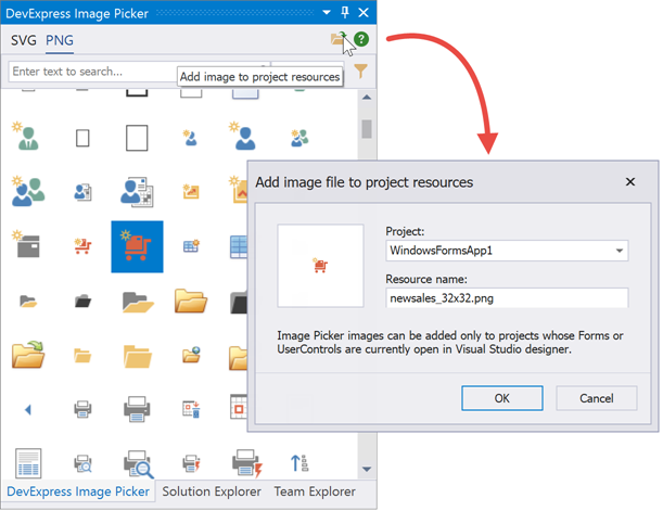
Image Picker
To set up icons for multiple UI elements at once, click a form’s smart-tag and select the “Image Picker” option. The Image Picker is a non-modal panel that you can dock anywhere inside Visual Studio. You can and drag-and-drop icons from this panel onto UI elements. The Image Picker can “read” the selected element’s caption and suggest icons that match this name.
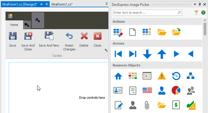
Starting with version 19.1, the Image Picker allows you to assign both vector and raster images. Earlier Image Picker versions support SVG images only.
You can copy selected Image Picker images to project resources. To do that, use the button in the panel’s top right corner.
The code below illustrates how to retrieve resource images in code.
Image URI (Context-Dependent Raster Images)
The Image URI feature allows you to use traditional raster images that adjust their sizes and color schemes automatically depending on the applied skin and the control’s size. The following screenshots demonstrate how toolbar buttons’ context-dependent images appear in different skins:
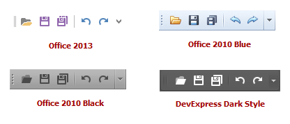
DevExpress controls and components that support context-dependent images provide DxImageUri type ImageUri properties. The DxImageUri.Uri property allows you to access DX Image Gallery images by their names. For instance, in the images above, the toolbar buttons’ ImageUri properties use the “Open”, “Save”, “SaveAll”, “Undo” and “Redo” names. Once you specify an image’s name, the control automatically displays an image that corresponds to the applied skin/image size.
At design time, to specify a context-dependent image for a control/component, select the control/component and click the ellipsis button next to the ImageUri property. Click the ellipsis button to invoke the Image Picker. Select an image and click OK.
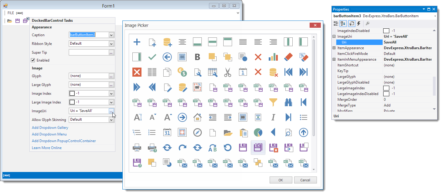
In code, you can specify the ImageUri property as shown below. Image names can be found in the Image Picker dialog. Hover over an image to display its common name as a tooltip.
The size of the displayed image (as well as its color scheme) is determined automatically. For instance, a button in the Ribbon Control can display a large or small icon. The Ribbon Control can automatically display smaller button images when the control’s width is reduced. The Ribbon automatically specifies the icon size when you assign an image to a Ribbon button using the ImageUri property.
Note
You should deploy the DevExpress.Images.v19.2 library when assigning images using URI names.
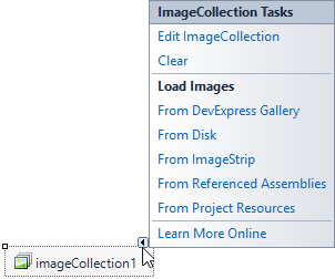
Image Collections
Image Gallery provides no public API to access its images from code. As a workaround, you can populate any DevExpress image collection (ImageCollection, SvgImageCollection) with Gallery icons, and use this collection to assign images in code.
You can also populate these collections with images stored in referenced assemblies. To do this, call the Add method overload that takes an assembly name as a parameter, or click a corresponding smart tag menu item at design time.