Snap List and Document Template
- 4 minutes to read
This document provides information on using Snap lists to create templates for dynamic Snap document content.
The document consists of the following sections.
General Information
A Snap list is a special kind of Snap field intended to combine pieces of a document’s markup into a single structure that functions as a template for a dynamically generated section of a Snap document.
Unlike other Snap document fields, the Snap list is hierarchical. It is divided into separate parts that serve different data shaping purposes (e.g., row template, list header and list footer). These parts can contain nested Snap lists forming a tree-like markup structure that provides the capability to create complex master-detail report.
When the final presentation of a Snap document is generated (for example, when the document is previewed, printed or exported), the Snap list’s row template is expanded into data rows, and all document fields contained in the row template are filled with actual data.
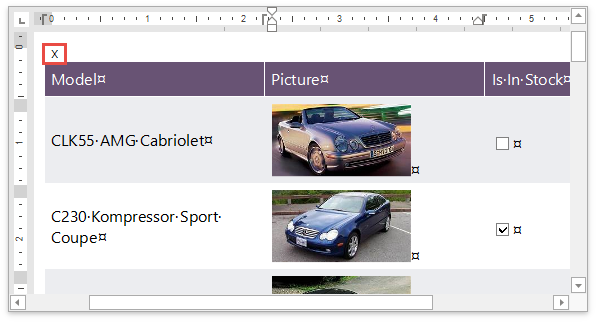
An empty paragraph before the SnList is a part of the field result. When the SnList is updated, the paragraph content can be lost. This paragraph is marked by a cross to prevent it from editing. Click Show/Hide Paragraph Mark on the Home tab or press Shift+Ctrl+8 to show the cross symbol.
The Report Explorer displays a visual tree of all Snap lists that exist in a document, and all groupings applied to them. To navigate to a document element, click the corresponding node in the Report Explorer.

The commands used to customize Snap lists are located in the List panel of the main toolbar.
Create a Document Template
To insert a Snap list into a document, do the following.
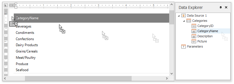
- Select the required data fields in the Data Explorer. You can select multiple fields by holding CTRL or SHIFT.
Drag-and-drop the selected data fields onto the empty document area on the design surface.
To improve performance, Snap shows only the first 20 data rows by default. To change this setting, use the Editor Row Limit option, which is located on the List tab of the main toolbar.
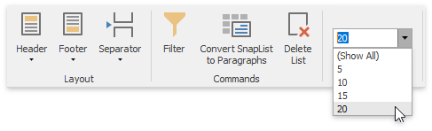
This setting does not affect the final document.
You can extend a Snap list by dropping data members from the Date Explorer onto the Snap list’s hot zones. Hot zones are located along the boundaries of the Snap list’s Rows and Columns. They represent the position in which content will be inserted, and are highlighted in blue when active.
To add a column to an existing Snap list, drag-and-drop a data field from the Data Explorer onto a hot zone located along the vertical boundary of a list column.
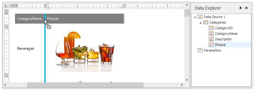
To insert a field in an existing column, drag-and-drop a data field from the Data Explorer to a column cell.
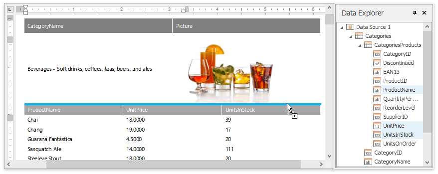
To add a detail section to a snap list, drag-and-drop a data field from the Data Explorer onto a hot zone located along the horizontal boundary of a list row. A nested list containing detail data will be added to the list.
Snap List Structure
This section of the document describes the structural parts of a Snap list.
In the document markup, a Snap list is represented by the SNLIST document field, which may contain the following switches.
Element | Switch | Description |
|---|---|---|
List header | \listheader | Specifies the content that precedes list data rows. It typically contains column captions. |
Row template | \t | Contains the template (filled with actual data) for data rows when the final document is generated. |
List footer | \listfooter | Specifies the content displayed below data rows (e.g., summaries). |
Separator | \separator | Contains the separator that is inserted between list data rows. |
Group headers, footers and separators | \tgX | Group headers, footers and separators specify the content of the corresponding areas of Snap list groups . X is the sequential alphabetic index of a group element (e.g., \tga, \tgb, or \tgc). |
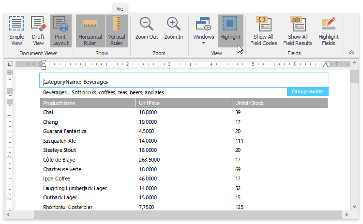
To simplify navigation through elements of a Snap list, you can use the Highlight option, which resides in the View tab of the main toolbar.
If this option is activated, the list element with input focus is highlighted by a frame that displays the element type.