Table Tools: Layout
- 3 minutes to read
This toolbar is context sensitive, and becomes active after placing the text cursor in a document table.
The commands available in the Layout toolbar of the Table Tools category are divided into the following sections.
Table
Command | Large Icon | Small Icon | Description |
|---|---|---|---|
Select |
|
| Allows you to select a cell, row, column or table. |
View Gridlines |
|
| Shows or hides table gridlines. This command is useful when working with tables that contain invisible borders. These lines are only displayed in the Design Surface; they do not appear in a published document. |
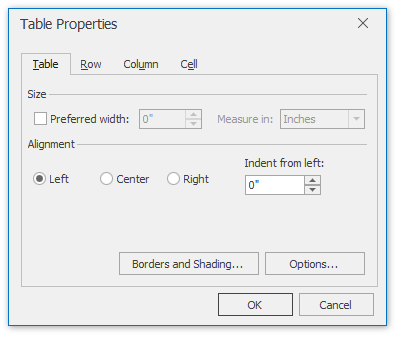
Properties |
|
| Invokes the Table Properties dialog for the selected table.
This dialog allows you to adjust the size and alignment properties of the current table cell, row, column or table. |
Rows & Columns
Command | Large Icon | Small Icon | Description |
|---|---|---|---|
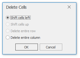
Delete |
|
| Deletes the specified cells or the currently selected row, column or table. To delete a single table cell, the Delete Cells dialog is invoked that allows you to select the “shift” mode for replacing the deleted cell.
To remove individual rows from a Snap List, use the Quick Filter command of the Data Tools: Field toolbar. |
Insert Above |
|
| Inserts a new row above the selected row. |
Insert Below |
|
| Inserts a new row below the selected row. |
Insert Left |
|
| Inserts a new column to the left of the selected column. |
Insert Right |
|
| Inserts a new column to the right of the selected column. |
Merge
Command | Large Icon | Small Icon | Description |
|---|---|---|---|
Merge Cells |
|
| Merges selected cells. The content of merged cells is converted to paragraphs of an output cell. |
Split Cells |
|
| Splits the selected cell into a specified number of rows and columns. The content of the source cell is placed in the top-left output cell. |
Split Table |
|
| Splits the table into two tables. The selected row becomes the first row of the new table. |
Cell Size
Command | Large Icon | Small Icon | Description |
|---|---|---|---|
AutoFit |
|
| Sets the auto fit mode of the selected table. The following auto fit modes are available:
|
Alignment
Command | Large Icon | Small Icon | Description |
|---|---|---|---|
Alignment | none | none | Sets the text alignment for selected cells. |
Cell Margins |
|
| Invokes the Table Options dialog, allowing you to set the default cell margins for the selected table cells. |
