Bar and Ribbon Glyph Skinning
- 3 minutes to read
The Glyph Skinning feature can assist you in creating monochrome interfaces for your applications.
Important
The Glyph Skinning feature is designed to be used with raster icons only. Vector icons are automatically colorized using skin palette colors.
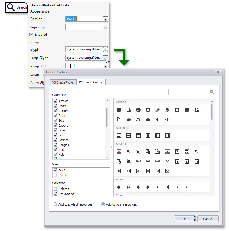
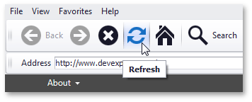
To build a monochrome UI, use gray-scaled images, for instance, from the DevExpress Image Gallery. The following image illustrates how to select a gray-scaled glyph for a BarItem via its smart tag.
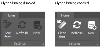
Gray-scaled images are painted in shades of gray by default. The Glyph Skinning feature allows you to colorize these glyphs, using the color that matches the current skin or a custom color. Thus, this feature comes in handy when you use dark skins or when you wish to use custom colors. The following image compares two Ribbon Controls painted in the DevExpress Dark Style, with the Glyph Skinning feature enabled and disabled:
To enable the Glyph Skinning feature, set the BarManager.AllowGlyphSkinning property to true. Note that you can apply glyph skinning for individual items instead of applying them to the entire BarManager. In this case, use the BarItem.AllowGlyphSkinning property. This property overrides the global Glyph Skinning setting specified via the BarManager.AllowGlyphSkinning property.
For the Ribbon Control and its BackstageView Control, use the RibbonControl.AllowGlyphSkinning and BackstageViewControl.AllowGlyphSkinning properties, respectively.
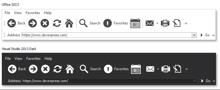
Different application Skins specify different default foreground colors for the text of UI elements (BarItemLinks). When the Glyph Skinning feature is enabled, the UI elements’ glyphs are painted in the Skin’s foreground color. The images below illustrate the same UI painted in the Office 2013 and Visual Studio 2013 Dark skins, respectively, with the Glyph Skinning feature enabled. In the Office 2013 skin, elements have black foreground colors, so icons are also painted in black. The Visual Studio 2013 Dark skin applies a white foreground color against a dark background for UI elements and their glyphs.
It is possible to apply a custom foreground color to an element’s text and glyphs instead of the default skin foreground color. The Bar Item foreground colors can be customized as follows:
- the BarAndDockingController.AppearancesBar property - stores appearance settings common to all Bar Items within an application;
- the BarItem.ItemAppearance property - stores appearance settings for individual Bar Items.
For example, the following code sets the foreground color for all hovered items within the barManager1 to DodgerBlue.
The figure below illustrates the result using the Office 2013 skin.
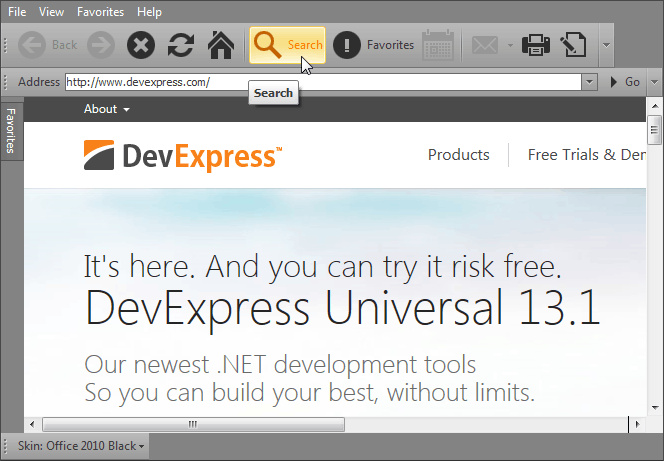
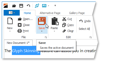
The image below illustrates a Ribbon Control with the Glyph Skinning feature applied.
RibbonControl and BarManager controls are not the only controls that support the Glyph Skinning feature. See the Glyph Skinning topic for a complete list of controls.