Chart
- 3 minutes to read
This document provides general information on using charts in Snap applications, and describes the main options for configuring charts using tools provided by the Snap user interface.
A Chart is a sophisticated report element used to embed graphs into a report. It represents a series of points graphically using 2D and 3D chart types. A Chart can be populated with points both manually (by specifying arguments and values for each point) and dynamically (by connecting it to a data source).
This document consists of the following sections.
Add a Chart to a Snap Report
To add a chart to a report, click the Chart command in the General Tools: Insert tab of the main toolbar. A chart will be inserted in the carriage position with all properties set to default values. The newly created chart will display sample data so that you can view the appearance of the chart without connecting it to a data source.
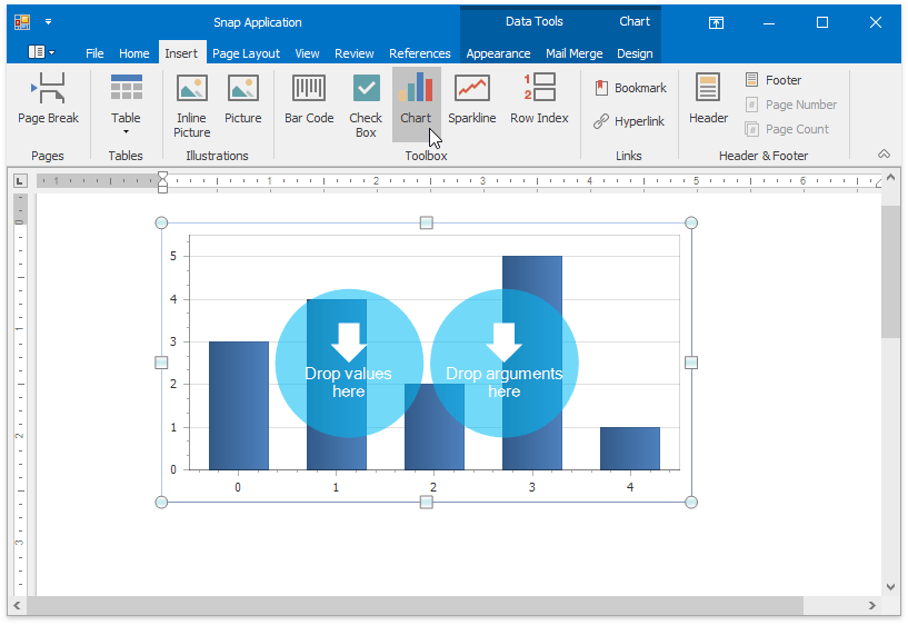
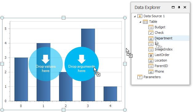
To quickly bind a chart to data, drag-and-drop data items from the Data Explorer to the corresponding blue circles representing values and arguments.
Note
If you drop a detail table onto a chart, this chart displays data for the current master record. Dropping a master table onto the chart makes this chart display all records.
To learn how to use the Chart Wizard to manually provide individual chart series with either static or dynamic data, see Data Page.
Configure a Chart
The main commands used for managing charts reside in the Chart Tools: Design tab of the main toolbar. These commands allow you to change the type and color scheme of the selected chart, or invoke the Chart Wizard for more configuration options.
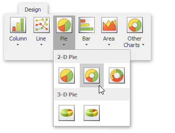
Snap supports a wide variety of 2D and 3D chart types that you can use to visualize your data. To change the type of a chart, do the following.
- Select the chart;
- Click a command for one of the available chart type categories in the Chart Tools: Design tab.
In the invoked drop-down list, select the chart type that you wish to apply to the chart.
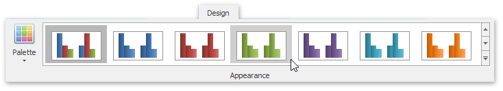
The color schemes for charts are stored in styles, which are grouped into palettes. To change a chart’s color scheme, do the following.
- Select the chart.
Click the Palette command in the Chart Tools: Design tab. In the invoked drop-down list, select the palette that you wish to apply to the chart. After selecting a pallette, the list of styles displays the styles available for this pallet.
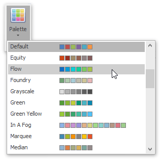
Click a style to apply it to the chart.
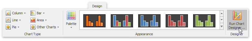
Use the Chart Wizard
The Chart Wizard is a powerful configuration tool, providing fast access to a full set of options available for charts, including options to manage chart series and their data connections, and to adjust view settings for different parts of a chart (e.g., axes, point labels, and legend).
To invoke the Chart Designer, click the Run Chart Designer… command in the Chart Tools: Design tab.
For detailed information on using the Chart Wizard, refer to the Chart Wizard topic.