Crosshair Cursor
- 15 minutes to read
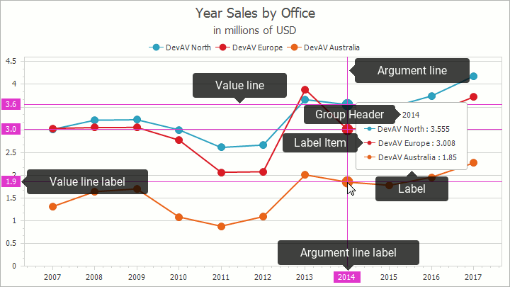
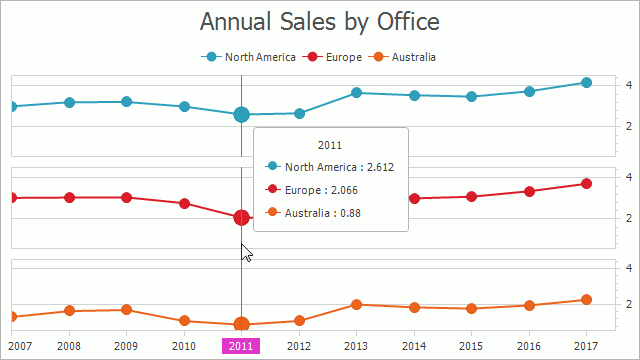
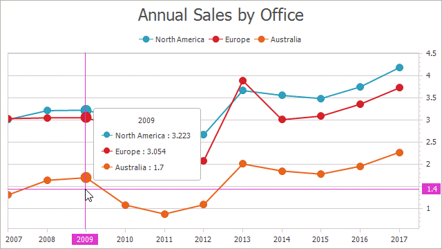
The Crosshair Cursor allows end-users to track series or indicator data point coordinates on the Chart Control with the Cartesian (XY-) or (Swift Plot) diagram specified. It consists of argument and value lines, their labels and data point labels:
Important
The Crosshair Cursor is enabled by default when the Chart’s diagram type is Cartesian (XY-) or SwiftPlot.
A Tooltip also allows end-users to track values. The Tooltip and Crosshair Cursor guide describes differences between the Tooltip and Crosshair Cursor in detail.
The following sections explain how to:
- Enable the Crosshair Cursor
- Manage Crosshair Cursor Elements’ Visibility
- Specify the Crosshair Cursor’s Content
- Customize Crosshair Cursor Elements’ Appearance
- Show the Crosshair Cursor on All Panes
- Disable Series Point Markers’ Highlighting
- Change the Point Snapping Mode (How the Cursor Selects Points to Display)
- Include Values That Are Out Of the Visual Range
- Change the Lines Snapping Mode
- Display Values in a Legend Instead of a Label
- Display Individual Labels for Each Series
- Change the Label Position
- Use the Crosshair Cursor’s Runtime API
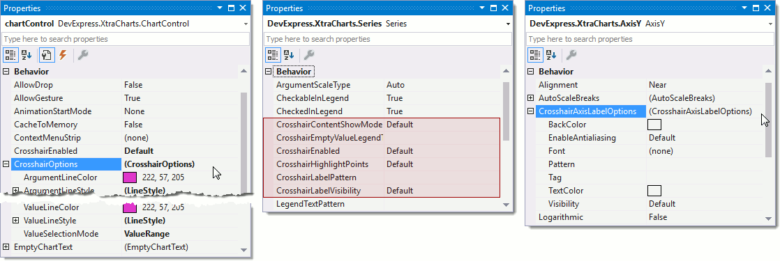
Note that all customizations are done in code in this guide however options that configure the Crosshair Cursor are available at design time:
Enable the Crosshair Cursor
The following code demonstrates how to enable or disable the Crosshair Cursor for a Chart Control and an individual series:
// The property below sets whether the Chart displays the Crosshair Cursor:
chartControl.CrosshairEnabled = DefaultBoolean.True;
// The following property manages whether the Crosshair Cursor displays specific series values:
chartControl.Series["DevAV North"].CrosshairEnabled = DefaultBoolean.False;
| Property | Description |
|---|---|
| ChartControl.CrosshairEnabled | Gets or sets a value that specifies whether or not a crosshair cursor is enabled for a chart. |
| SeriesBase.CrosshairEnabled | Gets or sets a value that specifies whether or not a crosshair cursor is enabled for this series. |
Important
If the Chart’s CrosshairEnabled property is set to DefaultBoolean.False, a series’ CrosshairEnabled property is not taken into account.
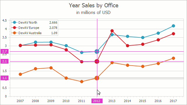
Manage Crosshair Cursor Elements’ Visibility
The Crosshair Cursor can show or hide its elements. For example, the Crosshair Cursor’s axis labels are hidden and lines are shown in the image below:
This code example demonstrates how to use this functionality:
chartControl.CrosshairOptions.ShowArgumentLine = true;
chartControl.CrosshairOptions.ShowArgumentLabels = false;
chartControl.CrosshairOptions.ShowValueLine = true;
chartControl.CrosshairOptions.ShowValueLabels = true;
chartControl.CrosshairOptions.ShowCrosshairLabels = true;
chartControl.CrosshairOptions.ShowGroupHeaders = false;
// An axis can hide the Crosshair Cursor's Axis Label that is displayed on this axis:
((XYDiagram)chartControl.Diagram).AxisY.CrosshairAxisLabelOptions.Visibility = DefaultBoolean.False;
| Property | Description |
|---|---|
| ChartControl.CrosshairOptions | Returns options that allow you to specify the Crosshair Cursor’s position, appearance and behavior. |
| CrosshairOptions.ShowArgumentLabels | Specifies whether to show an argument line of a series point indicated by a crosshair cursor on a diagram. |
| CrosshairOptions.ShowArgumentLine | Specifies whether to show an argument line of a series point indicated by a crosshair cursor on a diagram. |
| CrosshairOptions.ShowValueLabels | Gets or sets a value that specifies whether to show a value label of a series point indicated by a crosshair cursor on a diagram. |
| CrosshairOptions.ShowValueLine | Specifies whether to show a value line of a series point indicated by a crosshair cursor on a diagram. |
| CrosshairOptions.ShowCrosshairLabels | Specifies whether to show a crosshair label of a series point indicated by a crosshair cursor on a diagram. |
| CrosshairOptions.ShowGroupHeaders | Specifies whether to show a header for each series group in crosshair cursor labels. |
| Axis2D.CrosshairAxisLabelOptions | Gets the crosshair axis label settings allowing you to specify its appearance on a diagram. |
| CrosshairAxisLabelOptions.Visibility | Specifies whether to show crosshair axis labels for a diagram. |
Specify the Crosshair Cursor’s Content
The Crosshair Cursor uses text patterns to prepare texts that it displays for series, in axis labels, etc.:

The following code demonstrates how to format values that the Crosshair Cursor displays:
// The Crosshair Options contains a pattern specifying Crosshair Label Group Headers' texts:
chartControl.CrosshairOptions.GroupHeaderPattern = "{A:F0}";
// The Series' property formats the Crosshair element's text:
chartControl.SeriesTemplate.CrosshairLabelPattern = "{S}: {V:F2}";
// The axis provides a property formatting the Crosshair Axis Label's text:
((XYDiagram)chartControl.Diagram).AxisY.CrosshairAxisLabelOptions.Pattern = "{V:F1}";
| Property | Description |
|---|---|
| ChartControl.CrosshairOptions | Returns options that allow you to specify the Crosshair Cursor’s position, appearance and behavior. |
| CrosshairOptions.GroupHeaderPattern | Gets or sets a pattern that specifies the group header text to be displayed within the crosshair label. |
| SeriesBase.CrosshairLabelPattern | Gets or sets a string which represents the pattern specifying the text to be displayed within a crosshair label for the current Series type. |
| Axis2D.CrosshairAxisLabelOptions | Gets the crosshair axis label settings allowing you to specify its appearance on a diagram. |
| CrosshairAxisLabelOptions.Pattern | Gets or sets a string which represents the pattern specifying the text to be displayed within the crosshair axis label that appears for a series point. |
Note
The Crosshair Cursor’s Axis Label uses axis’ label text patterns by default.
A full list of available placeholders is detailed below.
| Pattern | Description |
|---|---|
| {S} | Displays the name of the series. |
| {A} | Displays a series point argument. |
| {V} | Displays series point values. |
| Pie (Donut) series specific placeholders | |
| {VP} | Displays series point values as percentages. |
| {TV} | Displays a total group value. |
| Stacked series specific placeholders | |
| {VP} | Displays series point values as percentages. |
| {G} | Displays the name of a stacked group. |
| {TV} | Displays a total group value. |
| Bubble series specific placeholders | |
| {W} | Displays the weight. |
| Range series specific placeholders | |
| {V1} | Displays the first value. |
| {V2} | Displays the second value. |
| {VD} | Displays the duration between the first and second data point values formatted using a common time format (e.g. HH:MM:SS for date time values and #.## for numeric values). |
| {VDTD} | Displays the duration between the first and second date-time data point values in days. |
| {VDTH} | Displays the duration between the first and second date-time data point values in hours. |
| {VDTM} | Displays the duration between the first and second date-time data point values in minutes. |
| {VDTS} | Displays the duration between the first and second date-time data point values in seconds. |
| {VDTMS} | Displays the duration between the first and second date-time data point values in milliseconds. |
| Financial series specific placeholders | |
| {OV} | Displays the open value. |
| {HV} | Displays the high value. |
| {LV} | Displays the low value. |
| {CV} | Displays the close value. |
Note
Make sure before using the {S} placeholder that the Series.Name property is specified.
You can also use standard and custom format specifiers, together with the placeholders and data field values (e.g., {V:F1}).
When the chart control or a series is bound to data, the text pattern may contain data field values in addition to default placeholders. For example, the data source contains the Discount field and the text pattern may looks like: {S}: {V:F2} (Discount: {Discount:P0}).
A crosshair group header is not displayed on the crosshair label when the CrosshairOptions.CrosshairLabelMode property is set either to CrosshairLabelMode.ShowForEachSeries or CrosshairLabelMode.ShowForNearestSeries modes and when the crosshair is only allowed for a single series. Specify CrosshairOptions.GroupHeaderPattern to make the Crosshair Cursor always show group headers.
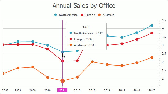
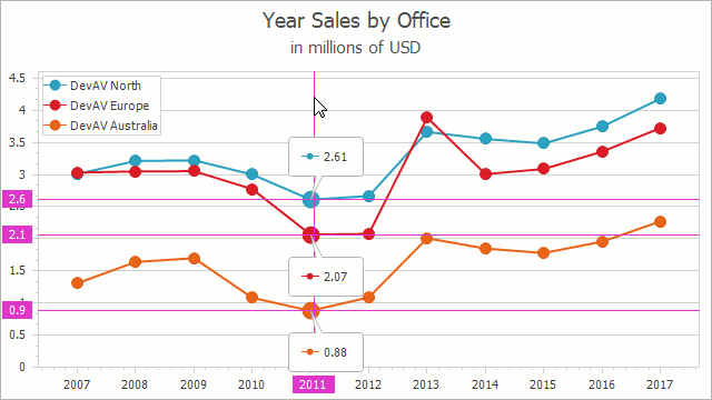
Customize Crosshair Cursor Elements’ Appearance
All Crosshair Cursor elements’ appearance is customizable. For example, Crosshair Cursor Lines can use a non-default color and a custom line style, the Crosshair Cursor Label - a custom font, text color and background color:
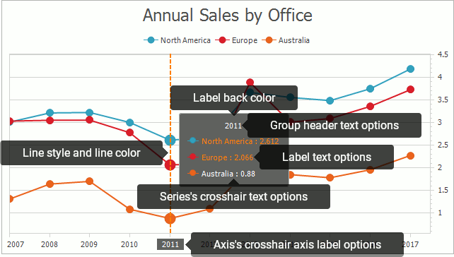
The code below demonstrates how to configure the Crosshair Cursor appearance to match the sample image above:
Color orangeColor = Color.FromArgb(247, 129, 25);
// Note that Argument Line Labels use this color by default.
chartControl.CrosshairOptions.ArgumentLineColor = orangeColor;
chartControl.CrosshairOptions.ShowValueLine = true;
chartControl.CrosshairOptions.ShowValueLabels = true;
// Note that Value Line Labels use this color by default.
chartControl.CrosshairOptions.ValueLineColor = orangeColor;
chartControl.CrosshairOptions.ValueLineStyle.DashStyle = DashStyle.Dash;
// The axis can customize the Crosshair label that is displayed on it.
((XYDiagram)chartControl.Diagram).AxisY.CrosshairAxisLabelOptions.BackColor = Color.Red;

chartControl.CrosshairOptions.CrosshairLabelBackColor = Color.FromArgb(63, 63, 63);
chartControl.CrosshairOptions.GroupHeaderTextOptions.TextColor = orangeColor;
chartControl.CrosshairOptions.CrosshairLabelTextOptions.TextColor = Color.White;
// The series can customize how its Crosshair element looks:
chartControl.Series["DevAV North"].CrosshairTextOptions.TextColor = orangeColor;
| Property | Description |
|---|---|
| ChartControl.CrosshairOptions | Returns options that allow you to specify the Crosshair Cursor’s position, appearance and behavior. |
| CrosshairOptions.ArgumentLineColor | Gets or sets the color of crosshair argument lines. |
| CrosshairOptions.ValueLineColor | Gets or sets the color of crosshair value lines. |
| CrosshairOptions.ArgumentLineStyle | Gets the argument line style settings of the crosshair cursor. |
| CrosshairOptions.ValueLineStyle | Gets the value line style settings of the crosshair cursor. |
| Axis2D.CrosshairAxisLabelOptions | Gets the crosshair axis label settings allowing you to specify its appearance on a diagram. |
| CrosshairAxisLabelOptions.Visibility | Specifies whether to show crosshair axis labels for a diagram. |
| CrosshairAxisLabelOptions.BackColor | Gets or sets the background color of crosshair axis labels. |
| CrosshairOptions.CrosshairLabelBackColor | Gets or sets the background color of the Crosshair series label. |
| CrosshairOptions.GroupHeaderTextOptions | Returns text options of the Crosshair series label group header. |
| CrosshairOptions.CrosshairLabelTextOptions | Returns text options of the Crosshair series label item. |
| SeriesBase.CrosshairTextOptions | Returns the text options of the Crosshair label item of the series. |
Important
Crosshair Options specify the appearance of all argument/value lines and labels simultaneously. Use the Axis2D.CrosshairAxisLabelOptions property to manage an individual label color and the visibility and the ChartControl.CustomDrawCrosshair event to customize a specific line. Refer to the Crosshair Cursor Runtime API section to learn more about the Custom Draw event.
Show the Crosshair Cursor on All Panes
The Chart displays the Crosshair Cursor only on the focused pane by default and it can show the Crosshair Cursor on all panes:
The following code demonstrates how to manage the Crosshair Cursor’s visibility on panes:
| Property | Description |
|---|---|
| ChartControl.CrosshairOptions | Returns options that allow you to specify the Crosshair Cursor’s position, appearance and behavior. |
| CrosshairOptions.ShowOnlyInFocusedPane | Gets or sets a value that specifies whether to show a crosshair cursor in a focused pane only. |
Disable Series Point Markers’ Highlighting
The Crosshair Cursor highlights series points that are currently hovered by default. The chart’s Crosshair Options manages highlighting for all series and an individual series can configure the capability to highlight its points:
The following code produces the image above:
chartControl.CrosshairOptions.HighlightPoints = false;
// Use the following series property to manage an individual series' point highlighting:
chartControl.Series["DevAV North"].CrosshairHighlightPoints = DefaultBoolean.True;
| Property | Description |
|---|---|
| ChartControl.CrosshairOptions | Returns options that allow you to specify the Crosshair Cursor’s position, appearance and behavior. |
| CrosshairOptions.HighlightPoints | Gets or sets a value that specifies whether the series points are highlighted when the crosshair cursor hovers over them. |
| SeriesBase.CrosshairHighlightPoints | Gets or sets a value that specifies whether the series points are highlighted when the crosshair cursor hovers over them. |
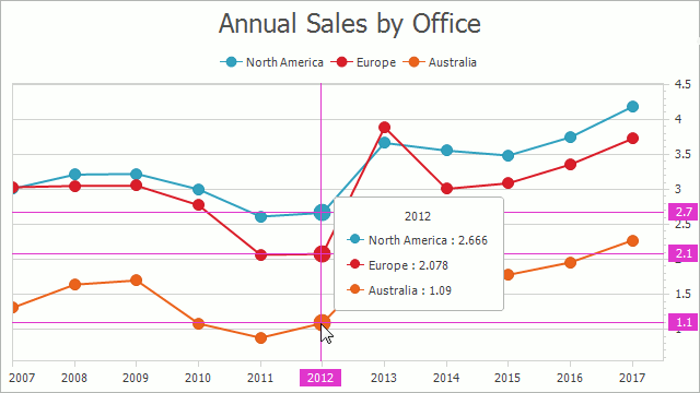
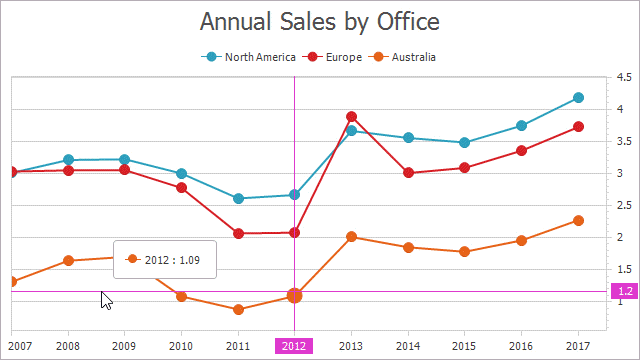
Change the Point Snapping Mode (How the Cursor Selects Points to Display)
The Crosshair Cursor allows you to specify what points it displays: points with the nearest argument to the mouse cursor or the nearest value. It shows points with the nearest argument by default. The following image demonstrates the Crosshair Cursor highlighting points with similar values:
The following code demonstrates how to change the mode:
| Property | Description |
|---|---|
| ChartControl.CrosshairOptions | Returns options that allow you to specify the Crosshair Cursor’s position, appearance and behavior. |
| CrosshairOptions.SnapMode | Specifies the current snap mode of a crosshair cursor. |
| CrosshairSnapMode | Lists the values used to specify how a crosshair cursor should detect a series point to which to snap. |
Include Values That Are Out Of the Visual Range
The Crosshair Cursor shows only values that are in the visual range by default. The chart’s Crosshair Options can enable showing data points that are out of the range in the Crosshair Cursor label:
The following code demonstrates how to enable this feature:
| Propety | Description |
|---|---|
| ChartControl.CrosshairOptions | Returns options that allow you to specify the Crosshair Cursor’s position, appearance and behavior. |
| CrosshairOptions.ShowOutOfRangePoints | Gets or sets the value specifying whether the Crosshair cursor should show points that are out of visual range. |
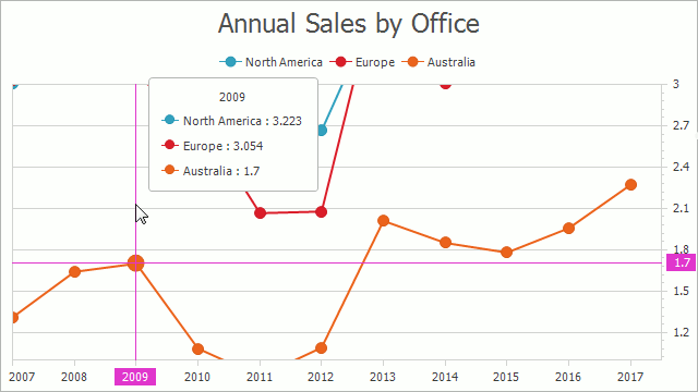
Lines: Change the Lines Snapping Mode
The Chart Control draws the Crosshair Cursor’s argument or value lines (depending on the current point selection mode) through data points while the second line follows the mouse cursor by default. Both of the Cursor’s lines can follow the mouse position as shown in the image below:
The following code sample demonstrates how to make the Crosshair Cursor’s lines follow the mouse pointer:
| Symbol | Description |
|---|---|
| ChartControl.CrosshairOptions | Returns options that allow you to specify the Crosshair Cursor’s position, appearance and behavior. |
| CrosshairOptions.LinesMode | Gets or sets the value specifying how the Crosshair Cursor’s lines snap to points when hovering on them. |
| CrosshairLinesMode | Lists values specifying how the Crosshair Cursor’s lines behave. |
Label: Display Values in a Legend Instead of a Label
The Crosshair Cursor displays selected points’ elements in a Label (by default) or in a Legend. The Crosshair Options provides the capability to specify where the Crosshair Cursor displays point values of all series and an individual series can configure where the Cursor should display the series’ Crosshair element:
The code below demonstrates how to make the series display its Crosshair elements in the required Chart Element:
chartControl.CrosshairOptions.ContentShowMode = CrosshairContentShowMode.Legend;
// Each series can configure where the Crosshair Cursor displays its element:
chartControl.Series["DevAV North"].CrosshairContentShowMode = CrosshairContentShowMode.Label;
| Symbol | Description |
|---|---|
| ChartControl.CrosshairOptions | Returns options that allow you to specify the Crosshair Cursor’s position, appearance and behavior. |
| CrosshairOptions.ContentShowMode | Gets or sets the element that displays the Crosshair’s content. |
| CrosshairContentShowMode | Lists all the chart elements that can display the Crosshair’s content. |
Label: Display Individual Labels for Each Series
The Crosshair Cursor can display individual labels for each series instead of a common label for all series:
The following code demonstrates how to show individual labels:
| Symbol | Description |
|---|---|
| ChartControl.CrosshairOptions | Returns options that allow you to specify the Crosshair Cursor’s position, appearance and behavior. |
| CrosshairOptions.CrosshairLabelMode | Specifies the way in which the crosshair label is shown for a series on a diagram. |
| CrosshairLabelMode | Lists the values used to specify how many crosshair labels should be displayed when a chart contains several series. |
Label: Change the Position
When the Crosshair Cursor displays the common label for all series, the Crosshair Options can specify the Label’s position:
The following code demonstrates how to specify the Crosshair Cursor’s Common Label position:
chartControl.CrosshairOptions.CommonLabelPosition = new CrosshairFreePosition {
    DockTarget = ((XYDiagram)chartControl.Diagram).DefaultPane,
    DockCorner = DockCorner.RightTop,
    OffsetX = 16,
    OffsetY = 16
};
| Symbol | Description |
|---|---|
| CrosshairOptions.CommonLabelPosition | Gets or sets the position of a crosshair label when a common crosshair label is shown for all series on a diagram. |
| CrosshairFreePosition | Specifies a free position of a crosshair label within a chart (defined by the dock target, dock corner and offset from this corner). |
| CrosshairMousePosition | Specifies a crosshair label position near the mouse pointer. |
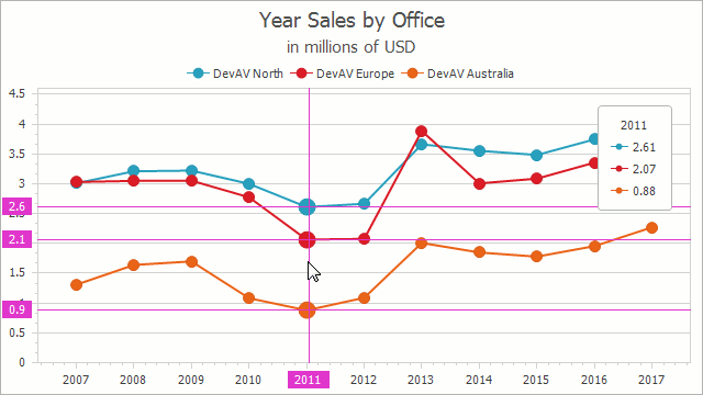
Use the Crosshair Cursor’s Runtime API
The Chart Control’s Crosshair Cursor API provides methods that allow you to show and hide the Crosshair Cursor and the event in whose handler the Crosshair Cursor’s elements may be customized individually:
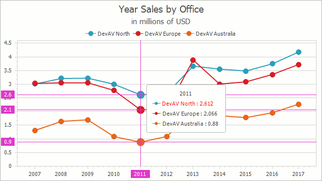
The code below produces this image:
btnShowCrosshair.Click += OnShowCrosshairBtnClick;
chartControl.CustomDrawCrosshair += OnCustomDrawCrosshair;
// ...
private void OnShowCrosshairBtnClick(object sender, EventArgs e) {
    ((XYDiagram)chartControl.Diagram).ShowCrosshair(2011, 1);
}
private void OnCustomDrawCrosshair(object sender, CustomDrawCrosshairEventArgs e) {
    if (e.CrosshairElementGroups.Count <= 0) return;
    CrosshairElementGroup group = e.CrosshairElementGroups[0];
    if (group.CrosshairElements.Count <= 0) return;
    CrosshairLabelElement labelElement = group.CrosshairElements[0].LabelElement;
    if (labelElement == null) return
    labelElement.TextColor = Color.Red;
}
| Symbol | Description |
|---|---|
| XYDiagram2D.ShowCrosshair | Shows the Crosshair Cursor at the specified coordinate of the Chart Control. |
| XYDiagram2D.ShowCrosshair | Shows the Crosshair Cursor at the specified coordinate of the Chart Control. |
| ChartControl.CustomDrawCrosshair | Occurs before crosshair items are drawn when the chart’s contents are being drawn. |