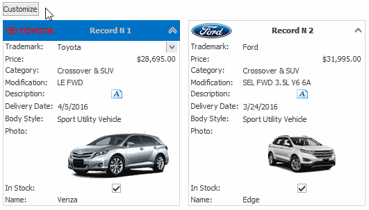
Customization Button
The customization button allows end-users to control column (card fields) visibility within a Card View, and applies sorting and filtering to columns. It is displayed in the top left corner of the View.
When a button is clicked, a dropdown list containing the Card View’s visible and hidden columns is displayed. A check box to the left of the column’s name can be used to toggle the column’s visibility state. Clicking the Sort button applies sorting to the corresponding column. Refer to the End-User Capabilities: Sorting topic for information on the available shortcuts that affect the sorting feature.
Clicking the Filter button displays the Column’s Filter DropDown that provide filtering facilities.
The following table lists the main properties that affect element appearance.
Availability | |
Look And Feel | The BaseView.PaintStyleName and GridControl.LookAndFeel properties. |
Contents |