How to: Create a Report with a Chart
- 2 minutes to read
This tutorial describes the steps used to add a chart to your Snap report. Snap supports all chart types provided by the XtraCharts Suite, as well as multiple visual appearance settings and chart palettes.
Snap also provides the Chart Wizard, which allows you to quickly create and customize complex charts. However, when advanced charting functionality is not required, Snap provides an even easier way to create and customize your charts.
To add a chart to a Snap document, do the following.
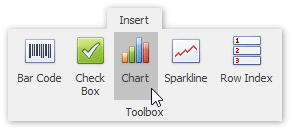
Click the Chart command in the Insert tab of the main toolbar.
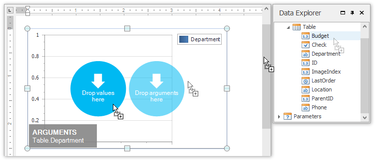
In the created chart, the blue circles correspond to the values and arguments of the chart. Drop the “GSP” field from the Data Explorer onto the “values” region in the chart…
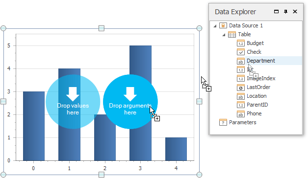
…and drop the “Region” field onto the “arguments” region.
Note
If you drop a detail table onto a chart, this chart displays data for the current master record. Dropping a master table onto the chart makes this chart display all records.
You can change the default chart type to one that best meets your requirements by selecting the chart and switching to the Design tab of the main toolbar. For more information about available chart types, see the 2D and 3D chart topics.
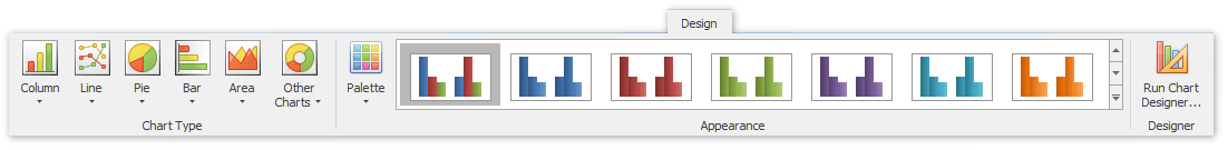
In the same tab, you can also select the chart’s palette and visual appearance.
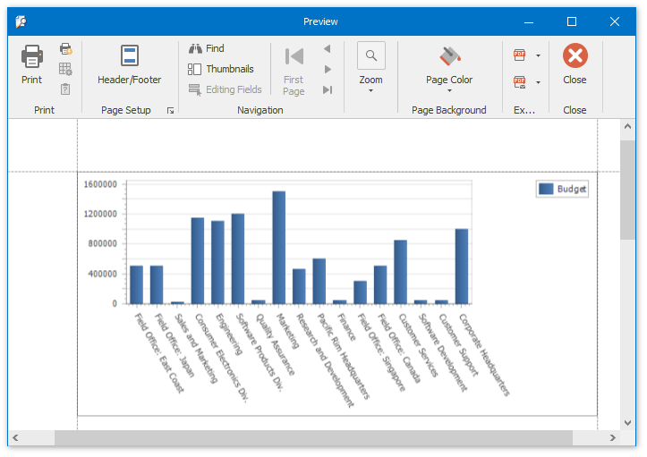
The Snap report with a chart is now ready. To view the result, switch to the File menu in the Ribbon toolbar and click the Print Preview button.