Node Checking - Checkboxes and Radio Buttons
- 5 minutes to read
To select nodes, use the node checking feature, which enables built-in check boxes or radio buttons for tree levels. In bound mode, you can sync node check states with a database field. This document explains this subject in detail.

Tip
To select nodes by highlighting them, use the Node Selection feature.
The following sections are covered in this topic.
- Enable Checkboxes/Radio Buttons
- Indeterminate Check State
- Get Nodes with Checked/Unchecked/Indeterminate States
- Obtain and Set Node Check States. Recursive Checking
- Sync Check States with Data Source
- Printing/Export
- Custom Paint Check Boxes
- Perform Custom Actions On Node Checking
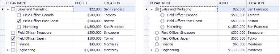
Enable Checkboxes/Radio Buttons
Show check boxes/radio buttons for all nodes
Set the TreeListOptionsView.CheckBoxStyle property to Check or Radio.
treeList1.OptionsView.CheckBoxStyle = DefaultNodeCheckBoxStyle.Check;
//or
treeList1.OptionsView.CheckBoxStyle = DefaultNodeCheckBoxStyle.Radio;
Tip
Radio buttons are mutually exclusive options. When you check a certain radio button, the TreeList automatically unchecks a previously checked radio button at the same hierarchy level.
The TreeListOptionsView.CheckBoxStyle property specifies default check box display mode for all TreeList nodes. You can override this setting for root nodes and any node’s children, as shown below.
Show check boxes/radio buttons only for root nodes
Set the TreeListOptionsView.RootCheckBoxStyle property to Check or Radio. Leave the TreeListOptionsView.CheckBoxStyle property set to Default.
treeList1.OptionsView.RootCheckBoxStyle = NodeCheckBoxStyle.Check;
treeList1.OptionsView.CheckBoxStyle = DefaultNodeCheckBoxStyle.Default;
//or
treeList1.OptionsView.RootCheckBoxStyle = NodeCheckBoxStyle.Radio;
treeList1.OptionsView.CheckBoxStyle = DefaultNodeCheckBoxStyle.Default;
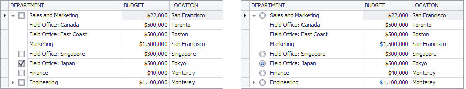
Show check boxes/radio buttons for all nodes, except root nodes
Set TreeListOptionsView.CheckBoxStyle to Check/Radio, and set TreeListOptionsView.RootCheckBoxStyle to None.
treeList1.OptionsView.CheckBoxStyle = DefaultNodeCheckBoxStyle.Check;
treeList1.OptionsView.RootCheckBoxStyle = NodeCheckBoxStyle.None;
//or
treeList1.OptionsView.CheckBoxStyle = DefaultNodeCheckBoxStyle.Radio;
treeList1.OptionsView.RootCheckBoxStyle = NodeCheckBoxStyle.None;
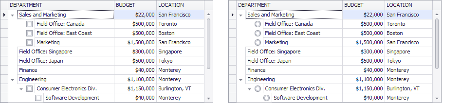
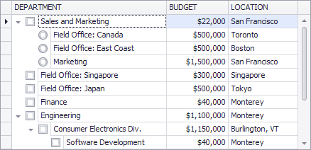
Show/hide check boxes/radio buttons for a certain node’s children
Use a node’s TreeListNode.ChildrenCheckBoxStyle property. This property overrides the TreeListOptionsView.CheckBoxStyle setting for the specified node’s children.
treeList1.OptionsView.CheckBoxStyle = DefaultNodeCheckBoxStyle.Check;
treeList1.OptionsView.RootCheckBoxStyle = NodeCheckBoxStyle.None;
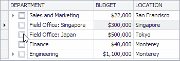
TreeListNode node1 = treeList1.FindNodeByFieldValue("DEPARTMENT", "Sales and Marketing");
node1.ChildrenCheckBoxStyle = DevExpress.XtraTreeList.NodeCheckBoxStyle.Radio;
Note
It is not possible to simultaneously display radio buttons and check boxes at the same hierarchy level.
Related API
- TreeListOptionsView.CheckBoxStyle - Gets or sets whether all TreeList nodes should display check boxes, radio buttons, or neither.
- TreeListOptionsView.RootCheckBoxStyle - Gets or sets whether root TreeList nodes should draw check boxes, radio buttons, or neither.
- TreeListNode.ChildrenCheckBoxStyle - Gets or sets whether all child nodes owned by this node should display check boxes, radio buttons, or neither.
Indeterminate Check State
Regular check boxes allow an end-user to toggle between the Checked and Unchecked states. If you enable the TreeListOptionsBehavior.AllowIndeterminateCheckState property, then the TreeList nodes will support three check states (Unchecked, Indeterminate and Checked). Clicking a check box sequentially toggles between these states.
Related API
- TreeListOptionsBehavior.AllowIndeterminateCheckState - Gets or sets whether an end-user can switch a node to the indeterminate check state with a mouse click.
Get Nodes with Checked/Unchecked/Indeterminate States
To retrieve all checked nodes, use the TreeList.GetAllCheckedNodes method.
The following code shows how to retrieve checked nodes using the TreeList.GetAllCheckedNodes method, and modify their values.
List<TreeListNode> list = treeList1.GetAllCheckedNodes();
foreach (TreeListNode node in list) {
    decimal budget = Convert.ToDecimal(node["BUDGET"])*1.1m;
    node["BUDGET"] = budget;
}
You can recursively retrieve nodes that match a certain condition (for instance, unchecked nodes or nodes with the indeterminate state) using a node iterator.
The following example shows how to use a node iterator to retrieve unchecked TreeList nodes.
using DevExpress.XtraTreeList.Nodes.Operations;

GetUncheckedNodesOperation op = new GetUncheckedNodesOperation();
treeList1.NodesIterator.DoOperation(op);
//Get the number of unchecked nodes:
int count = op.TargetNodes.Count;

//The operation class that collects unchecked nodes
class GetUncheckedNodesOperation : TreeListOperation {
    public List<TreeListNode> TargetNodes = new List<TreeListNode>();
    public GetUncheckedNodesOperation() : base() { }
    public override void Execute(TreeListNode node) {
        if (node.CheckState == CheckState.Unchecked)
            TargetNodes.Add(node);
    }
}
Obtain and Set Node Check States. Recursive Checking.
Use the following members to specify node check states in code.
- TreeListNode.Checked - Allows you to get/set a node’s check state when two check states are enabled (Checked and Unchecked)
- TreeListNode.CheckState - Allows you to get/set a node’s check state when three check states are enabled (Checked, Indeterminate and Unchecked)
- TreeList.SetNodeCheckState - Allows you to recursively and non-recursively set a node’s check state.
- TreeList.CheckAll, TreeListNode.CheckAll, TreeList.UncheckAll, TreeListNode.UncheckAll - methods that allow you to check and uncheck all nodes that belong to this TreeListControl or a specific parent node.
Recursive Checking
To check/uncheck child nodes when an end-user toggles a parent node’s check state, use the TreeListOptionsBehavior.AllowRecursiveNodeChecking property.
Example
TreeListNode node1 = treeList1.FindNodeByFieldValue("DEPARTMENT", "Sales and Marketing");
if (node1 != null)
    treeList1.SetNodeCheckState(node1, CheckState.Checked, false);
Sync Check States with Data Source
Use the TreeList.CheckBoxFieldName property to sync node check states with a specific data source field.
If TreeList nodes only support the checked and unchecked states, the bound data source field should be of the Boolean type. If TreeList nodes use three check states, the data source field should be of the Nullable Boolean type.
Perform Custom Actions on Node Checking
Handle the TreeList.BeforeCheckNode and TreeList.AfterCheckNode events.
Custom Paint Check Boxes
You can custom paint check boxes by handling the TreeList.CustomDrawNodeCheckBox event.
Printing/Export
To print/export check boxes, enable the TreeListOptionsPrint.PrintCheckBoxes option.