Customize Breadcrumbs
- 2 minutes to read
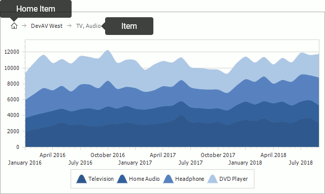
The Breadcrumbs element allows users to return to previous data detail levels. This element includes the following children, which can be customized.
Note
Breadcrumbs are displayed when at least one ~DrillTemplate property is specified.
The ChartControl.Breadcrumbs property manages the following element appearance settings.
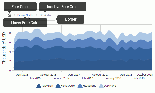
The following code utilizes the Breadcrumb properties demonstrated in the image above.
var breadcrumbs = chartControl.Breadcrumbs;
breadcrumbs.Border.Color = Color.LightGray;
breadcrumbs.Border.Visibility = DefaultBoolean.True;
breadcrumbs.Font = new Font("Tahoma", 12.0F, FontStyle.Bold);
breadcrumbs.HomeText = "Home";
breadcrumbs.HoverForeColor = Color.OrangeRed;
The table below lists the properties used in the code above.
| Property | Description |
|---|---|
| Breadcrumbs.Border | Gets the chart control’s border settings. |
| Breadcrumbs.Margins | Specifies the indent between the Breadcrumbs element’s edge and other chart elements (e.g. diagram, title), in pixels. |
| Breadcrumbs.Padding | Specifies the inner space between the Breadcrumb element’s content and its edge, in pixels. |
| Breadcrumbs.HomeText | Gets or sets the text that the Breadcrumb Home Item displays instead of an icon. |
| Breadcrumbs.Font | Gets or sets the font that Breadcrumb Items and Breadcrumb Home Item use to display their text. |
| Breadcrumbs.ForeColor | Gets or sets the foreground color that Breadcrumb Items and Breadcrumb Home Item use in the default state to display their text. |
| Breadcrumbs.HoverForeColor | Gets or sets the foreground color that Breadcrumb Items and Breadcrumb Home Item use in the hover state to display their text. |
| Breadcrumbs.InactiveForeColor | Gets or sets the foreground color that Breadcrumb Items and Breadcrumb Home Item use in the inactive state to display their text. |