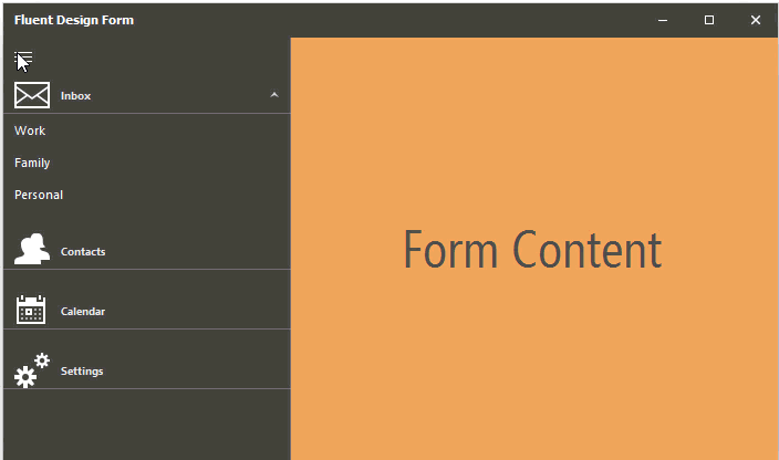
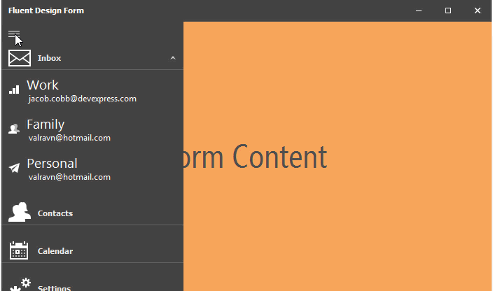
Hamburger Menu View Style
The Accordion control supports the Hamburger Menu view style, which, compared to the default view (Accordion Control), provides a Hamburger button (which expands/collapses the menu), and three display modes (Inline, Overlay and Minimal).
Inline — The Hamburger Menu is displayed as a side bar when collapsed, and in-line with form content when expanded.
Overlay — The Hamburger Menu is displayed as a side bar when collapsed, and in an overlay above the content area when expanded.
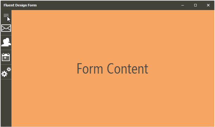
Minimal — The Hamburger Menu is rendered as a small Hamburger button when collapsed (if DockStyle is set to Left, Right or None), or as a top-aligned bar containing the Hamburger button (if DockStyle is set to Top). When expanded, the menu is shown as an overlay above the content area.
To enable this view style, set the AccordionControl.ViewType property to HamburgerMenu. The AccordionControl.OptionsHamburgerMenu.DisplayMode option (see AccordionOptionsHamburgerMenu.DisplayMode) specifies the menu’s display mode in the expanded and collapsed states. To specify the state: expanded or collapsed — use the AccordionControl.OptionsMinimizing.State property (see OptionsMinimizing.State).
accordionControl1.ViewType = DevExpress.XtraBars.Navigation.AccordionControlViewType.HamburgerMenu;
accordionControl1.OptionsHamburgerMenu.DisplayMode = DevExpress.XtraBars.Navigation.AccordionControlDisplayMode.Overlay;
To access additional Hamburger Menu options, use the AccordionControl.OptionsHamburgerMenu property.