Pager Navigation Behavior
The RadioGroup and WindowsUIButtonPanel can be used as a pager for a set of controls. The pager automatically splits the target control’s contents into pages, and provides navigation buttons to scroll to corresponding pages.
Supported controls
Behavior Settings
When adding a Pager Navigation Behavior, specify the following settings:
- Target - specifies the control whose contents should be scrolled using a pager.
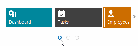
- Pager - the pager control (RadioGroup or WindowsUIButtonPanel), which provides navigation buttons.
Tip
If using a RadioGroup as a pager, you can set the following additional properties:
- RepositoryItemRadioGroup.ItemsLayout to Flow - to arrange items in a row.
- RepositoryItem.BorderStyle to NoBorder - to hide the border.
- RepositoryItemRadioGroup.ItemHorzAlignment to Center - to display radio buttons at the control’s center.
- BaseEdit.BackColor to Color.Transparent.