Office View
- 3 minutes to read
| The PropertyGrid control supports the Office 2016-inspired view. Its features include:
|
To activate this View, set the PropertyGridControl.ActiveViewType property to Office.
Organize Properties into Tabs at Design Time
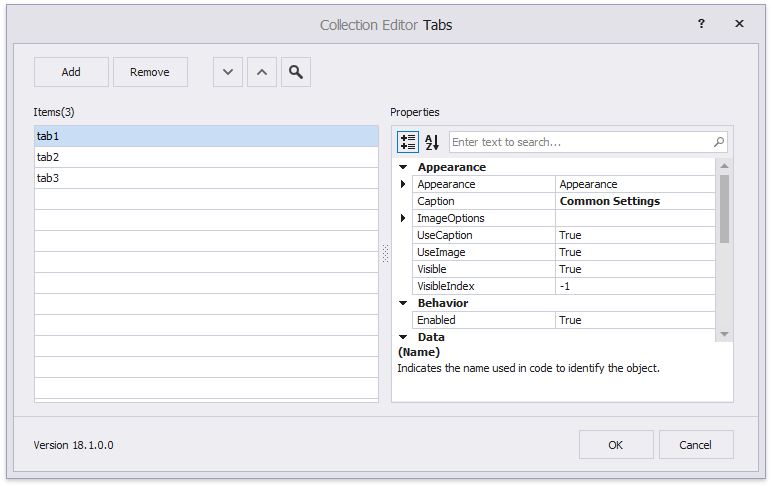
In Visual Studio’s Property Grid, click the ellipsis button next to the PropertyGridControl.Tabs property. This invokes the Collection Editor dialog that allows you to create tabs and customize their captions and icons.
After creating tabs, close the dialog and invoke the control’s smart tag. Click “Run Designer” and switch to the designer’s “Tabs” page. This page shows all available properties and draws checkboxes next to each one. Select each tab individually and check the properties you want inside them.
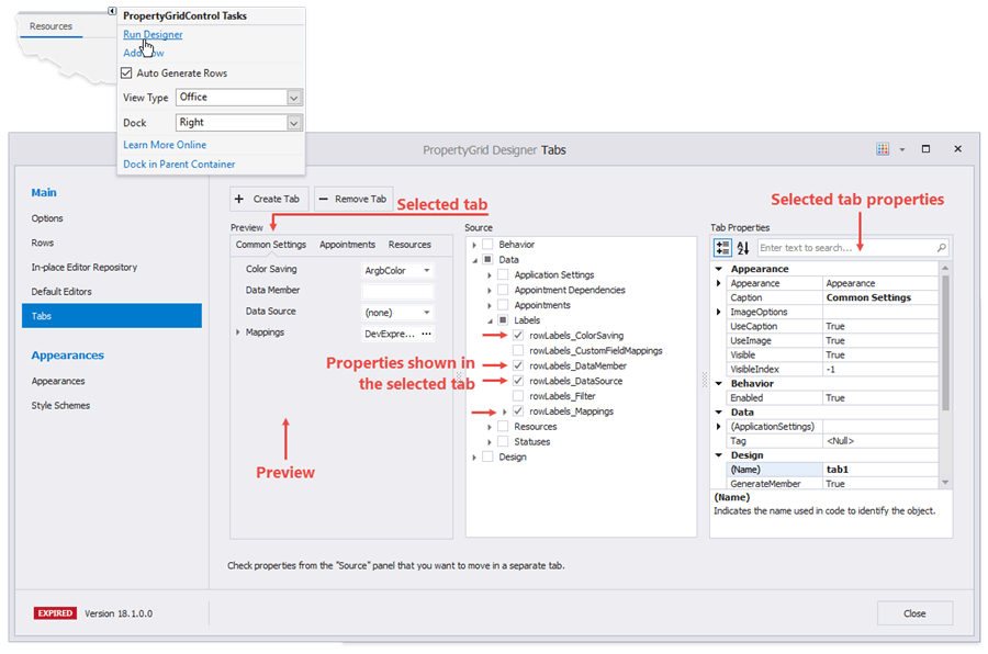
Note that the Property Grid does not display properties that have not been assigned to an existing tab.
Organize Properties into Tabs in Code
Do the following to add tabs to the Property Grid:
- Handle the PropertyGridControl.TabPanelCustomize event and create new Tab objects.
- Modify tabs’ FieldNames collection to add rows and row categories to these tabs.
- Use the PropertyGridControl.SelectedTab property to choose the initially selected tab.
The code sample below organizes the “Appearance” category, the “Accessibility” category, and the “Tabs” property into two tabs. Tab headers display vector icons.
private void propertyGridControl1_TabPanelCustomize(object sender, DevExpress.XtraVerticalGrid.Events.TabPanelCustomizeEventArgs e) {
    //tab #1
    Tab tab1 = new Tab();
    //add a separate property
    tab1.FieldNames.Add("Tabs");
    //add a category
    tab1.FieldNames.Add("categoryAccessibility");
    tab1.Caption = "Main Tab";
    tab1.ImageOptions.Image = SvgBitmap.FromFile(@"D:\Work\Images\_SVG\Pages.svg").Render(null, 1);

    //tab #1
    Tab tab2 = new Tab();
    tab2.FieldNames.Add("categoryAppearance");
    tab2.Caption = "Appearance";
    tab2.ImageOptions.Image = SvgBitmap.FromFile(@"D:\Work\Images\_SVG\Medium.svg").Render(null, 1);

    e.Buttons.Add(tab1);
    e.Buttons.Add(tab2);

    propertyGridControl1.SelectedTab = propertyGridControl1.Tabs[0];
}
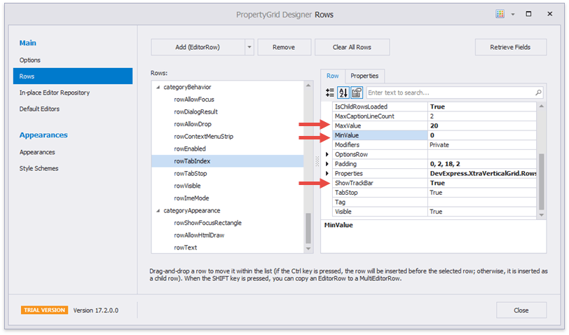
Display Trackbars For Numeric Properties
To display trackbars for numeric properties, handle the PropertyGridControl.CustomRowCreated event and specify minimum and maximum editor values. The following code adds a trackbar to the Font.Size property:
private void PropertyGridControl1_CustomRowCreated(object sender, DevExpress.XtraVerticalGrid.Events.CustomRowCreatedEventArgs e) {
    if (e.Row.Properties.FieldName == "Font.Size") {
        PGridNumericEditorRow row = e.Row as PGridNumericEditorRow;
        row.MinValue = 8;
        row.MaxValue = 72;
        row.ShowTrackBar = true;
        row.IgnoreMinMaxForSpinEdit = true;
    }
}
If the selected object’s properties are retrieved at design-time, you can set all these options in the Property Grid Designer.