Templated ListBox Controls
- 6 minutes to read
ListBox controls (ListBoxControl, CheckedListBoxControl, and ImageListBoxControl) can generate items from templates. Templates allow you to display multiple text and image elements in each item.
The following item template types are supported:
If you specify both types of templates for a control, the HTML-CSS template has priority over the regular template.
HTML-CSS Templates
Do the following to create an HTML-CSS template:
- Click the ellipsis button for the BaseListBoxControl.HtmlTemplates property in the Properties grid to open the Html Template Editor.
- Specify HTML code and CSS styles, and save the changes.
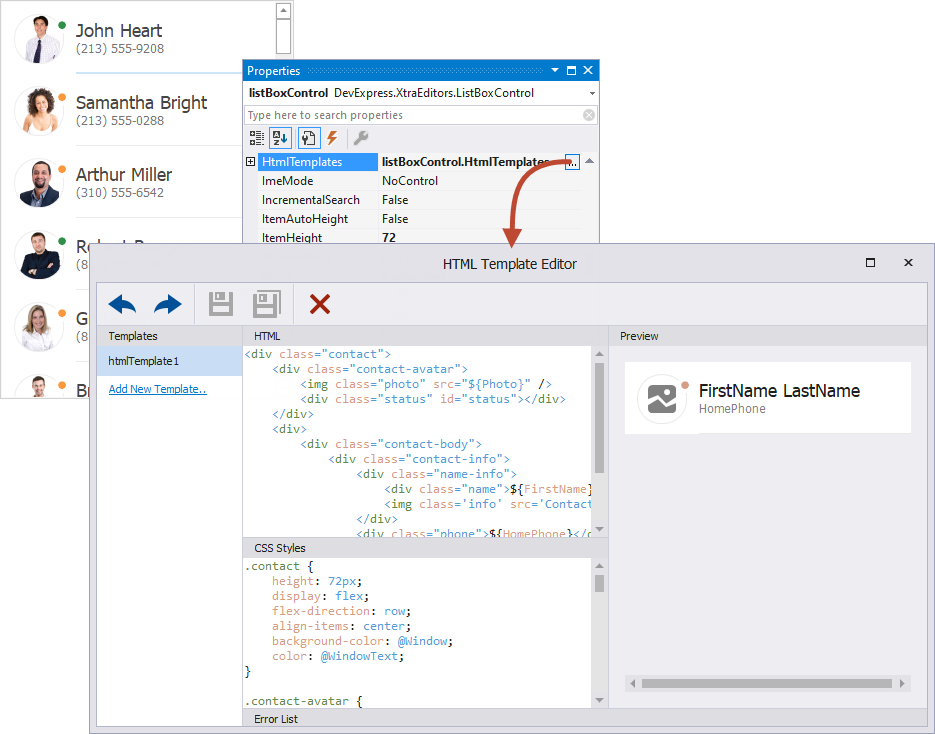
See the following demo to find the complete code that renders this UI:
Note
The HTML/CSS-aware controls and components support a limited set of HTML tags and CSS styles, listed in the following topics:
The main features of HTML-CSS templates include:
- Data binding
- The
${FieldName}syntax in HTML markup inserts values of fields from the control’s data source. See the following topic for details: Data Binding. - Images
- The
<img>HTML tag allows you to add images. - Buttons
- The HTML-CSS markup allows you to add elements to emulate buttons.
- Mouse actions
ListBox controls contain events to respond to mouse actions on HTML elements: BaseListBoxControl.HtmlElementMouseClick, BaseListBoxControl.HtmlElementMouseDown, BaseListBoxControl.HtmlElementMouseOut, BaseListBoxControl.HtmlElementMouseOver, and BaseListBoxControl.HtmlElementMouseUp.
You can also subscribe to mouse events for elements in HTML markup, and when using Fluent API.
- Dynamic item customization
- Handle the BaseListBoxControl.CustomizeItem event to change the visibility and appearance settings of individual template elements dynamically in listbox items.
- Multiple item templates
- You can use the BaseListBoxControl.CustomItemTemplate event to supply templates to items dynamically. See the following section for more information: Multiple Item Templates.
See the following topic for information about other controls that use HTML-CSS templates, and about supported HTML and CSS tags: HTML-CSS-based Desktop UI.
Regular Templates
A regular template consists of cells that can display text and image data from a bound data source, and static data.

Regular templates support the following features:
- A designer to create templates at design time.
- Multiple alignment options for template elements, including alignment relative to other elements, and absolute or relative element size specification.
- Use of element properties to customize their appearance settings.
- Dynamic item customization with the BaseListBoxControl.CustomizeItem event.
- Multiple item templates. You can use the BaseListBoxControl.CustomItemTemplate event to supply templates to items dynamically. See the following section for more information: Multiple Item Templates.
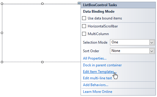
Invoke Item Template Designer
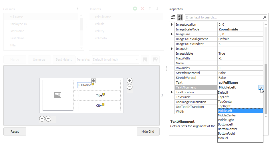
Click the Listbox control’s smart tag and select the Edit Item Templates command.
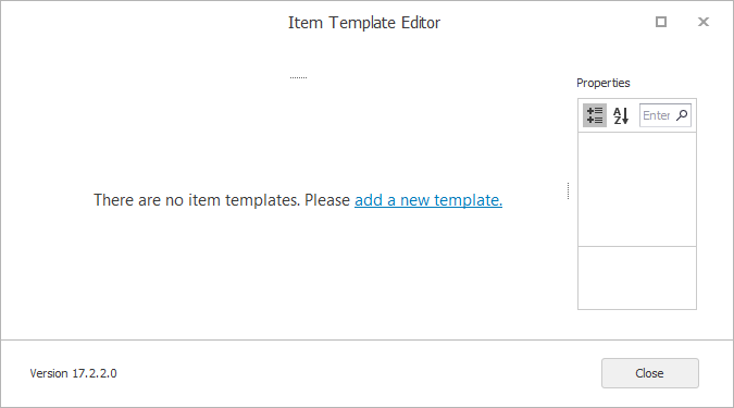
This opens the Item Template Designer. The designer prompts you to create a new template if there are no existing ones.
Once you enter a name for the new template, the Item Template Designer shows the template design surface.
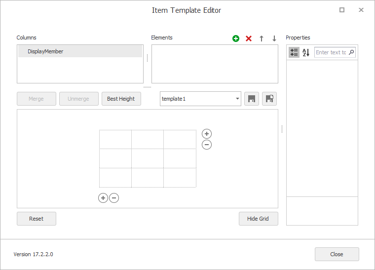
If the control was bound to a data source at design time, the Columns list allows you to access the available data source fields.
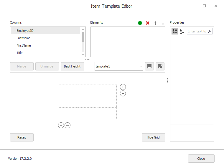
- Columns list — Displays fields from the data source bound to the ListBox control. If the ListBox control is not currently bound, the Columns list only displays the DisplayMember item (which identifies a listbox item’s default text content).
- Elements list — Displays existing template elements. You can use the buttons at the top of the list to add and delete elements. You can also drag fields from the Columns list onto the design surface to add elements.
- Properties grid — Allows you to modify the selected element’s settings.
Set Up Item Template
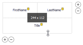
In a regular tile template, the design surface is divided into logical columns and rows, and the contents are placed in corresponding cells. The cells can be merged if required.
The supported template customization actions include:
Drag-and-drop fields from the Columns list onto table cells.
When you drop a field onto a cell, the designer automatically creates a bound template element.
- Drag-and-drop created elements between cells.
- Place multiple elements in the same cell, with different alignment options for these elements to prevent overlap (see the Anchor… properties).
- Select cells with the mouse pointer and click the Merge button to merge cells.
- Unmerge previously merged cells with the Unmerge button.
- Resize cells with the mouse pointer.
- Drag an item template’s edges with a mouse pointer to resize it.
Add/remove columns and rows with the
 buttons and context menu.
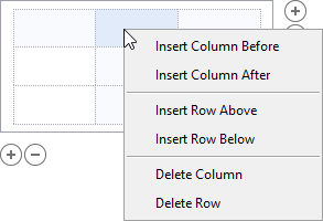
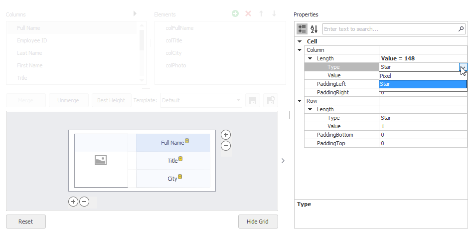
Click a cell to select it, and customize the cell’s size, size type (absolute or relative), and padding in the Property Grid.
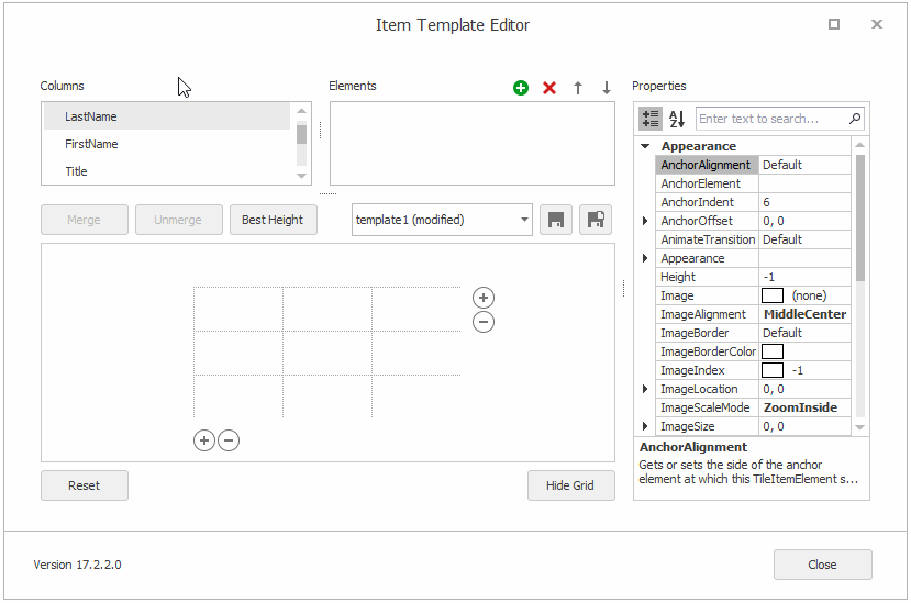
Click a dropped element to access it and customize its settings in the Property Grid.
- Manipulate the element collection from the Elements list. For instance, you can add unbound elements. When an element is created, it is automatically added to the template.
- Support for multiple templates.
Multiple Item Templates
The first template in a template collection (BaseListBoxControl.HtmlTemplates or BaseListBoxControl.Templates) becomes the default template. This template is initially used to render all items.
Note
If you specify both types of templates for a control, the HTML-CSS template has priority over the regular template.
The Template Designer allows you to create multiple templates in a template collection, and apply them to different items or in different situations. For instance, you can create two item templates — “compact” (displays less information) and “detailed” (displays more details), and switch between them depending on the control’s width.
To assign templates to items dynamically, handle the BaseListBoxControl.CustomItemTemplate event.
Example
The following code assigns a custom HTML template (htmlTemplate2) to items that have no images.
private void listBoxControl1_CustomItemTemplate(object sender, DevExpress.XtraEditors.CustomItemTemplateEventArgs e) {
    var item = e.Item as TodoItem;
    if (!item.HasImage)
        e.HtmlTemplate = htmlTemplate2;
}
Item Height
Use the BaseListBoxControl.ItemHeight property to specify the item height. You can handle the BaseListBoxControl.MeasureItem event to specify height for individual items.
When you edit a regular template, you can resize the template vertically. This operation changes the BaseListBoxControl.ItemHeight setting.
Item Auto-Height
A ListBox control calculates item height based on content if you enable the BaseListBoxControl.ItemAutoHeight property.
Auto-Height in Regular Templates
If you use regular item templates, besides the BaseListBoxControl.ItemAutoHeight option, you also need to enable the TableRowDefinition.AutoHeight setting for a specific row (or rows) in the ListBoxControl’s item template.
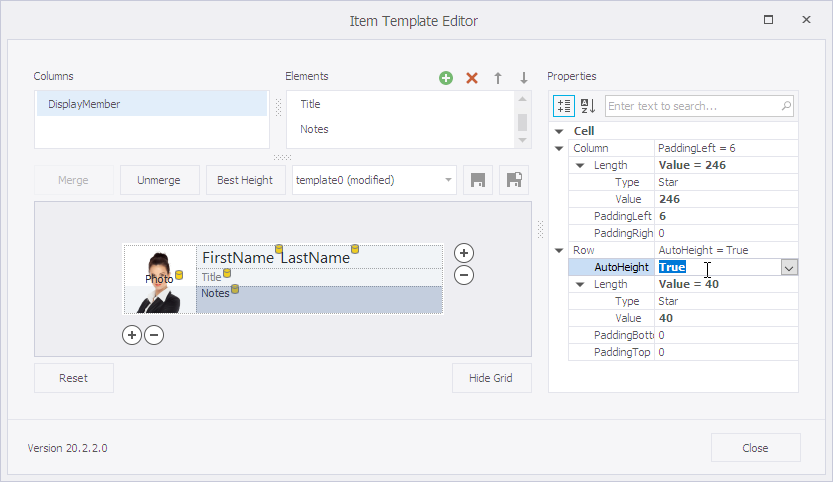
You can use the MaxLineCount property to specify a height limit for items.
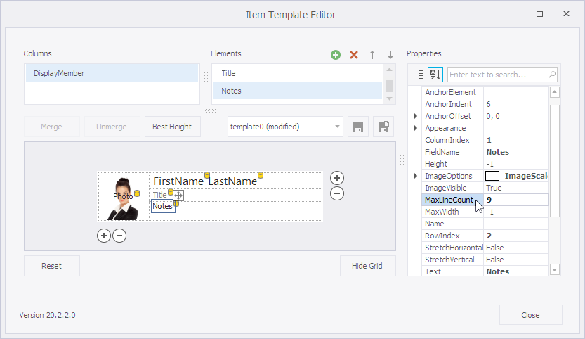
Example
The following example enables automatic item height calculation for a sample template-based ListBoxControl. The example allows the row that contains a Notes element to automatically adjust its height. In addition, the code sets the MaxLineCount property to limit the maximum height of the Notes element.