WindowsUI View
- 4 minutes to read
WindowsUIView for the DocumentManager component provides expansive opportunities for creating applications that fully match Microsoft Windows Modern UI guidelines.
A typical Windows UI application is a hierarchical application consisting of multiple screens. At runtime, an end-user navigates from one screen to another according to the application hierarchy. Backward navigation is automatically supported, as child screens are aware of their parents.

The WindowsUIView uses the same concept as all the other DocumentManager‘s Views - the content is hosted within Documents that can host any form, user control or third-party control. Windows UI View’s documents are represented by objects of the Document class.
Below is the list of features and concepts, provided by the WindowsUIView.
Getting Started Tutorials | |
Content Containers | |
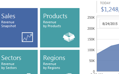
| A Content Container is an aggregate visual object that displays its children (documents or tiles) in a specific manner. There are a number of Content Containers provided by the WindowsUIView.
|
Navigation Bars | |
| Displayed at runtime by right-clicking the free container space. Navigation Bars are two horizontal strips at the top and bottom application edges. These bars display different types of buttons and serve as the replacement for traditional toolbars. Navigation bar buttons are WindowsUI Buttons, added to the corresponding action collections. You are free to add your own custom actions or hide default ones. It is also possible to completely disable navigation bars or display them in a custom scenario, different from a default right-click. |
Buttons | |
| The WindowsUIView supports multiple types of Actions - objects that implement custom functionality within standard View elements (documents, containers, navigation bars and flyouts). Basically, an action represents an advanced button that possesses a certain functionality, and if needed, a verification method that checks whether or not this button should be currently enabled (displayed). There are several types of Actions, grouped by their purpose, parent container type and place to be displayed. This topic describes all available custom actions and demonstrates detailed examples of adding these actions to the desired UI elements. |
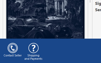
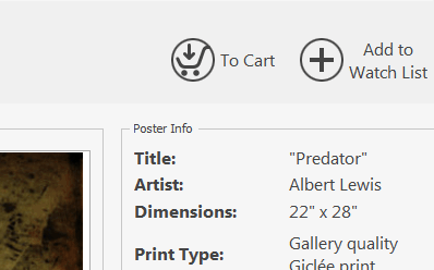
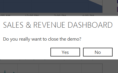
Flyouts | |
| Flyouts emulate message boxes and pop-up windows seen in Microsoft Store applications. There are three common scenarios for using Flyouts:
Flyout appearance and behavior differs depending on the selected scenario. |
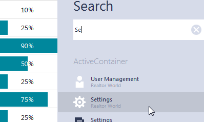
Search Panel | |
| Windows UI View supports the search panel out-of-the-box. The panel allows your end-users to search for the required content throughout content containers and tiles and instantly navigate to it. By default, the panel is invoked using the Ctrl+F keyboard shortcut. To close the panel, you can click anywhere outside it or press the Esc key. The panel is docked to the right edge of the Windows UI View by default, but you can dock it to the opposite left edge by modifying its AnchorType property. |
WindowsUI View Designer | |
| The Windows UI View Designer is the most convenient way to work with this View at design time. Using this designer, you can do the following:
|
Application Hierarchy and Module Navigation | |
| This article explains how to bind separate application modules together. |