Working with Panel Containers
- 8 minutes to read
You can combine DockPanels into split, tab, and auto-hide containers.
- Common Container Features
- Float Forms
- Split Container
- Tab Container
- Auto-Hide Container
- Customize Dynamically Created Containers
Common Container Features
All panel containers can emerge dynamically at runtime, as a result of docking operations performed by end-users or docking methods called from code. If the number of container child panels becomes less than it is allowed, this container is automatically disposed of.
Float Forms
Floating panels reside within dynamically generated FloatForm objects. To access these objects for individual floating panels, utilize the DockPanel.FloatForm property. For dock panels that belong to floating split and tab containers, this property will return nothing. In this case, use the DockPanel.FloatForm property of the container itself. To access the container, use the DockPanel.RootPanel property for a child panel.
Split Container
A DockPanel that contains one or more child panels, grouped side-by-side and divided by splitters.
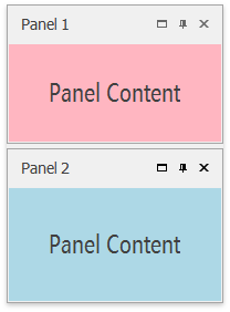
Main Properties
Unlike regular panels, split containers’ DockPanel.Count property value differs from zero and specifies the number of dock panels grouped within this container. The DockPanel.Dock property of all child panels inside a split container changes to DockingStyle.Fill.
Add a Split Container
To add a split container at design time or at runtime, dock one panel perpendicularly to another. For example, if panel “A” is docked vertically (the DockPanel.Dock property equals Left or Right), panel “B” must be docked to either the top or bottom side of panel “A”. Otherwise, these will be two adjacent panels not united by a split container.
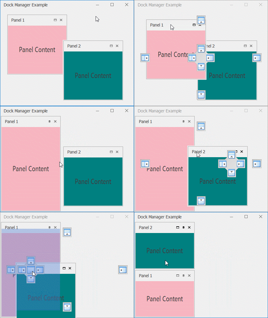
The same orientation rule applies when creating split containers in code. Use the DockPanel.DockTo method to combine panels.
panel1.Dock = DockingStyle.Left;
// dock panel2 to panel 1. A split container will be created automatically
panel2.DockTo(panel1, DockingStyle.Bottom);
Recognizing Split Containers. Panel Features
Dock panels that serve as split containers do not normally display their headers, borders, or any other visual elements. At first sight, this can be deceiving and make it hard to distinguish neighboring panels combined into a container from those that are not.
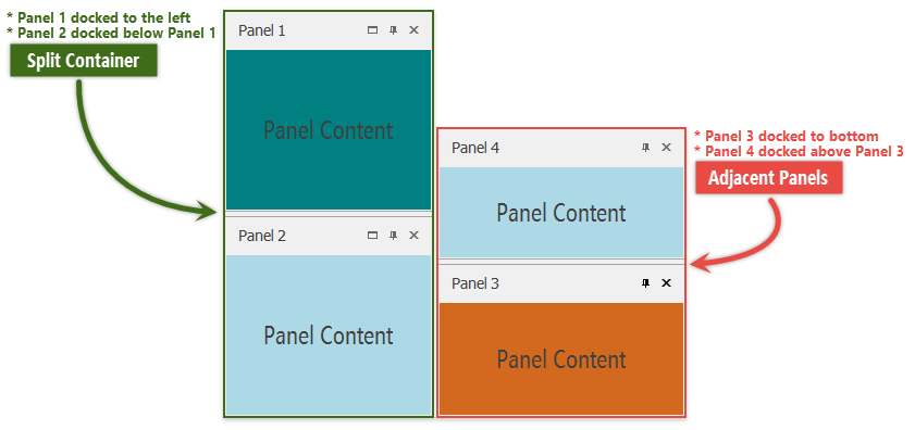
Split container child panels can be identified by the following unique features, not available for sole panels.
Panels owned by split containers display the “Maximize” button.
Show animation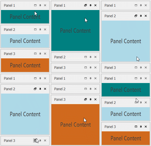
Split container child panels cannot be resized individually. Instead, the entire container is resized at once.
Show animation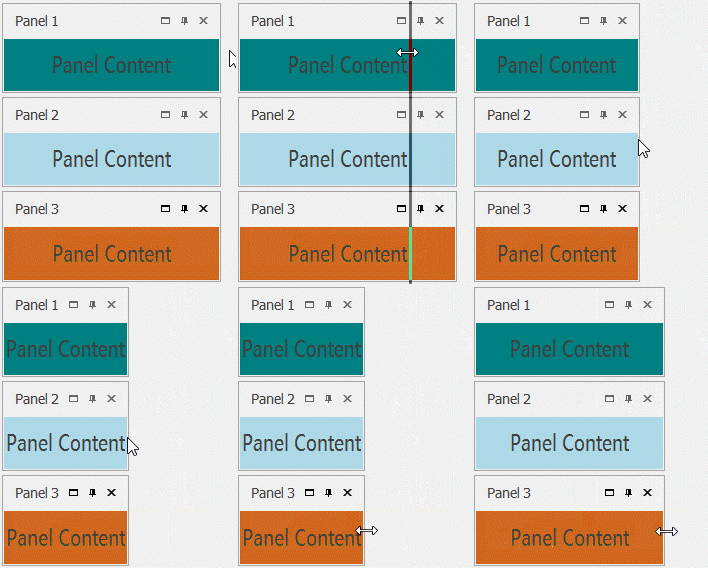
Keep this in mind and do not attempt to resize in code individual panels that belong to a split container. Instead, utilize the DockPanel.ParentPanel property to retrieve a parent container and modify its size.
Floating Split Containers
Floating dock panels can also be grouped into split containers. In this scenario, you can dock a panel to either side of a floating panel. Also, unlike docked split containers, floating ones display their headers with captions.
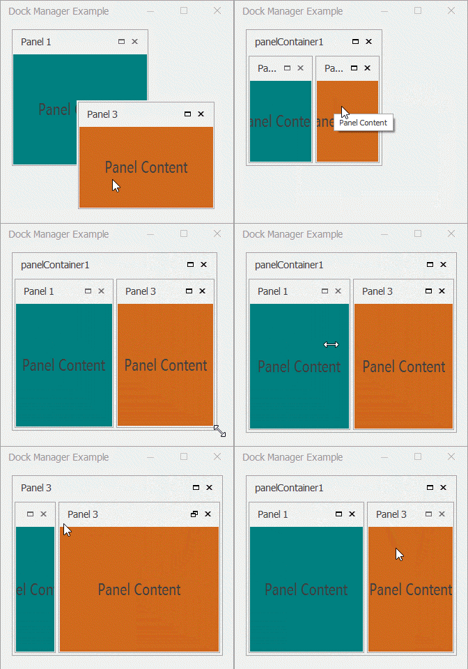
You can change the orientation of dock panels inside a split container by utilizing this container’s DockPanel.FloatVertical property.
Tab Container
A floating or docked DockPanel that presents its child panels as tabs. Clicking a tab header activates a related panel.
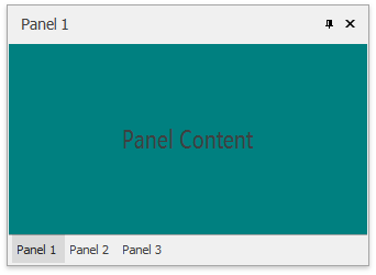
Main Properties
Child panels of a tab container have their DockPanel.Dock properties set to DockingStyle.Fill and their DockPanel.IsTab property returns true. To retrieve a currently selected tab, use the container’s DockPanel.ActiveChild property.
Add a Tab Container
To create a tab container at either design time or runtime, drag a panel to a central docking hint of another panel. A tab container for both panels will be created automatically.
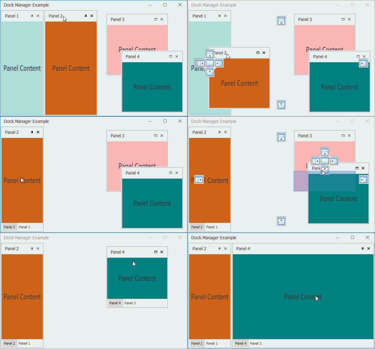
In code, call the DockPanel.DockAsTab method to create tabs. Alternatively, you can enable the DockPanel.Tabbed property of a split container to morph it into a tab container.
// create a tab container with panel1 and panel2 tabs
panel2.DockAsTab(panel1, 1);

//or

// create a split container with two panels
panel2.DockTo(panel1);
// transform a split container into a tab container
panel1.ParentPanel.Tabbed = true;
Container Header
A tab container has a visible header with text and default and/or custom header buttons. The header caption is represented by a string value stored within the DockPanel.Text property of a currently selected child panel.

Tab Headers
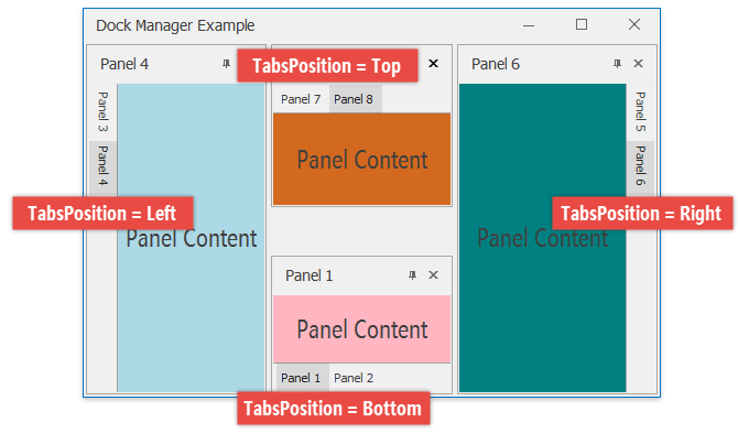
A tab header of a child panel can display a caption and an image (the DockPanel.TabText and DockPanel.Image properties). Use the DockPanel.TabsPosition property to align tab headers to either side of a tab container.
Auto-Hide Container
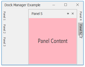
An object of the AutoHideContainer that contains one or more panels which are hidden when not focused. Hidden panels leave only their headers visible on screen. Clicking a header temporarily brings a panel on-screen.
Important
The auto-hide feature is not available if a DockManager component is hosted within an unmanaged window.
Main Properties
To access all currently existing auto-hide containers owned by this Dock Manager, use the DockManager.AutoHideContainers property.
Add and Remove Auto-Hide Containers
Non-floating dock panels display pin buttons by default. When end-users click this button, a panel gets inside an auto-hide container aligned to the same form edge the panel was docked to. If no auto-hide container is currently present, it will be created automatically.
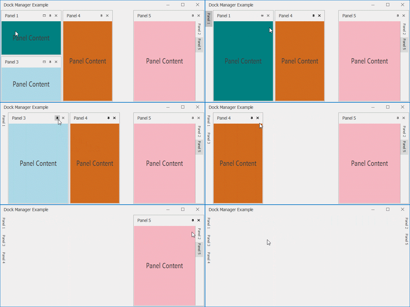
In code, set the panel DockPanel.Visibility property to DockVisibility.AutoHide in order to place this panel in the nearest auto-hide container.
The maximum number of auto-hide containers that can be simultaneously present within a form is four (one along each side of the form).
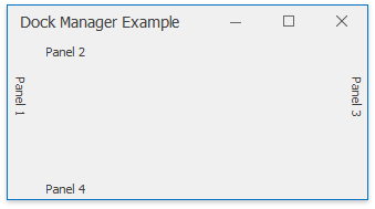
To remove a panel from an auto-hide container, click the pin button again or drag the panel tab header away.
Additional Settings
| Property | Description |
|---|---|
| DockingOptions.HidePanelsImmediately | Specifies whether panels are hidden immediately or with a certain delay with slight animation effects. |
| DockManager.AutoHideSpeed | In case the panels are hidden slowly with slide animation effects applied, this property allows you to speed up this process or slow it down. The default speed value is 1. |
| DockManager.AutoHiddenPanelShowMode | Gets or sets whether auto-hidden panels are shown on a mouse click or mouse hover. |
| DockManager.AutoHiddenPanelCaptionShowMode | If you set this property to ShowForActivePanel, only active tabs of auto-hide containers will display both an image and text. Inactive tabs in turn will display only icons. This setting has no effect for tabs without icons. |
Auto-Hiding Panel Containers
Since both split and tab containers are DockPanel objects, you can auto-hide them as well. Tab containers display headers with the same pin button as regular panels. Clicking this button adds the entire container to an auto-hide container. Similarly, clicking the pin button once again restores the container with all its tabs.
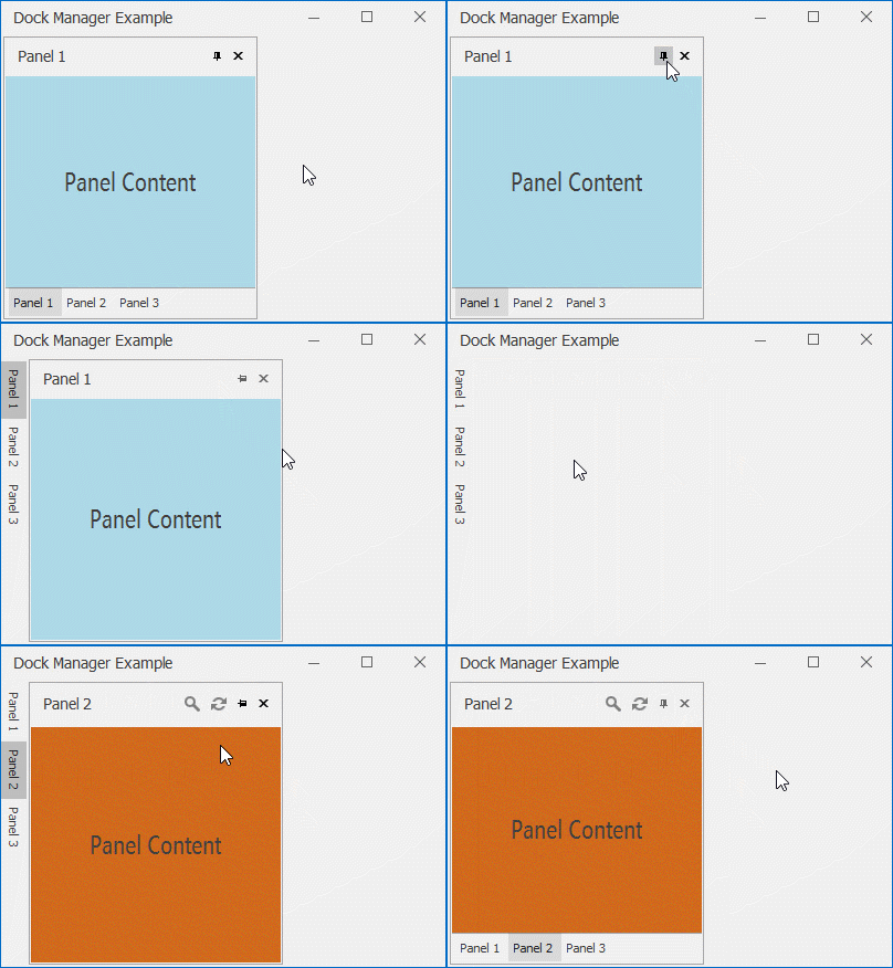
In their turn, non-floating split containers have no headers and end-users cannot auto-hide them. For this reason, setting a split container’s DockPanel.Visibility property to DockVisibility.AutoHide produces unexpected behavior and is not recommended.
Customize Dynamically Created Containers
All panel containers can emerge and dispose dynamically at runtime, as a result of docking operations performed by end-users or docking methods called from code. The creation of split and tab containers fires the DockManager.RegisterDockPanel event. Handle it to perform required container modifications. For example, the code below detects the forming of a floating split container and changes its default “panelContainer” caption.
private void DockManager1_RegisterDockPanel(object sender, DockPanelEventArgs e) {
   if (e.Panel.Count !=0 && e.Panel.FloatForm != null) {
        e.Panel.Text = "Floating Split Container";
    }
}
The following code sample illustrates how to change the header caption of a dynamically created tab container.
private void DockManager1_RegisterDockPanel(object sender, DockPanelEventArgs e) {
   // track new tab containers
   if(e.Panel.Count !=0 && e.Panel.Tabbed == true) {
        foreach (DockPanel child in e.Panel.Controls) {
            // remember the original tab panel title
            child.Tag = child.TabText = child.Text;
            // modify tab panel text strings
            child.TabText = child.Tag.ToString();
            child.Text = child.Tag.ToString() + " in Tab Container";
            child.DockChanged += Child_DockChanged;
        }
    }
}

// restore the original tab panel title when this panel leaves its tab container
private void Child_DockChanged(object sender, EventArgs e) {
    DockPanel panel = sender as DockPanel;
    if (panel.IsTab == false) {
        panel.Text = panel.Tag.ToString();
    }
}
Auto-hide containers are not DockPanel objects and their creation should be tracked by using the DockManager.CreateAutoHideContainer event.