Stub Glyph Behavior
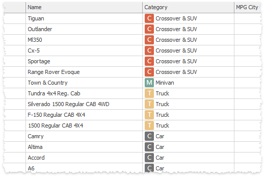
The Stub Glyph Behavior provides fake icons for objects that do not have any custom icons yet. These fake icons are colored shapes with one or two of the initial letters of the item caption. For example, at the figure below, the stub glyph behavior is assigned to the “Category” grid column.
Supported controls
- GridColumn
- ImageComboBoxEdit
- LayoutControlGroup
- LayoutControlItem
- XtraTabPage
- TreeListColumn
- ImageListBoxControl
Behavior options
- GlyphSize - specifies the size of stub glyph icons. The default size is 16x16 pixels.
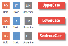
GlyphOptions - provides access to glyph icon appearance settings (case mode, colors, letter count, alignment, etc.). To learn more about each setting and see illustrated examples, refer to the Bars and Ribbon Stub Glyphs article (in Ribbon controls and toolbars stub glyphs run naturally, without a necessity to attach an external behavior first).