Behaviors
- 3 minutes to read
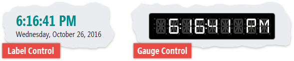
A Behavior is an appearance and\or functionality preset for controls. For instance, you can use the Clock Behavior to turn a LabelControl or a digital gauge into a clock.
You can submit Support Center tickets to request new Behaviors.
Attach a Behavior to a Control
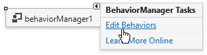
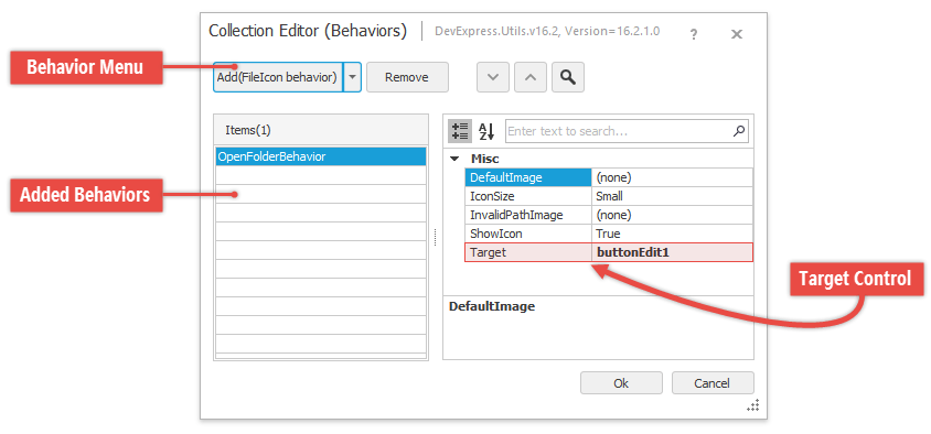
Open Visual Studio’s Toolbox and drag-and-drop the Behavior Manager component onto the form. Click the component’s smart tag and select “Edit Behaviors” to invoke the Collection Editor dialog.
This dialog allows you to create new Behaviors, and use their Target properties to assign them to controls.
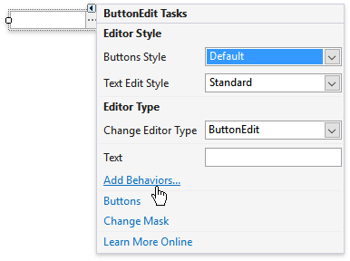
You can use the “Add Behaviors…” link in a control’s smart tag menu to add the Behavior Manager component and open its Collection Editor dialog.
To attach Behaviors in code, call the Behavior Manager’s Attach method and use lambda expressions to set the Behavior’s options.
using DevExpress.Utils.Behaviors.Common;

behaviorManager1.Attach<OpenFolderBehavior>(buttonEdit1, behavior => {
    behavior.Properties.IconSize = FileIconSize.Small;
    behavior.Properties.InvalidPathImage = DevExpress.Images.ImageResourceCache.Default.GetImage("images/actions/close_16x16.png");
    behavior.Properties.ShowIcon = true;
});
Available Behaviors
The table below lists all the DevExpress Behaviors and the controls that support them.
Behavior Name | Description | Target Controls |
|---|---|---|
This Behavior adds a file/folder icon to a control if this control displays a path to an existing file or folder. | ||
Operates similarly to the FileIconBehavior, and additionally provides auto-complete hints. | ||
These Behaviors add ellipsis buttons to the ButtonEdit editor. Users can click these buttons to invoke file/folder browser dialogs. The editor displays an icon and a caption of the selected file/folder. | ||
If you close and re-open a form with this Behavior attached, the form restores its last known position and size. |
controls that implement the ISupportXtraSerializer interface | |
Allows standard and DevExpress forms to snap to other windows and screen edges. |
standard forms and their descendants | |
Provides automatically generated icons for the target control or its child elements. | ||
Turns a control into a clock that displays the system’s date and time. | ||
Indicates whether system keys (Caps Lock, Num Lock, Scroll Lock) are pressed. | ||
This Behavior allows a Picture Edit to automatically cycle through a collection of images. | ||
Allows users to drag-and-drop items between controls. | ||
Allows users to invoke the Magnifier tool and pick colors on their screen. | All ColorEdit descendants | |
Allows you use a RadioGroup or WindowsUIButtonPanel to browse the target control’s child items (tiles, slide images, etc.). | ||
Allows you to implement a breadcrumb navigation through a TreeList‘s hierarchy using a BreadCrumbEdit control. |