Stub Glyphs
- 3 minutes to read
Bar items and their links display images and string captions. Images are assigned by using the following properties.
- BarItem.Glyph - a regular-size icon.
- BarItem.LargeGlyph - a large icon displayed when the item’s BarItem.RibbonStyle property equals RibbonItemStyles.Large.
- BarItem.ImageUri - specifies the uniform resource identifier (URI) that retrieves an icon from the DevExpress Image Gallery. The size and the color palette of the retrieved image is chosen automatically.
- BarItem.ImageIndex, BarItem.LargeImageIndex - these properties allow you to pick a regular and large images from image collections assigned to the BarManager.Images/BarManager.LargeImages or RibbonControl.Images/RibbonControl.LargeImages properties.
- BarItemLink.UserGlyph - assigns a unique icon to a bar item link. This allows you to replace a default icon retrieved from the parent bar item.
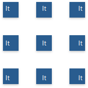
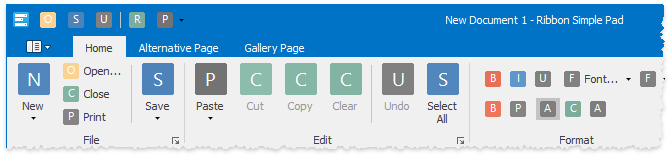
When none of these properties are specified, links to bar items will, by default, display stub glyphs instead. A stub glyph is a colored square with rounded corners and one or two of the initial letters of the item caption. These fake icons are primarily used to quickly identify icons that have no icons as yet so you won’t miss them. The figure below illustrates a sample.
Enable Stub Glyphs
You can enable stub glyphs for all item links within a Ribbon (toolbars), or for individual links only. To enable stub glyphs for all items at once, access the BarManager.OptionsStubGlyphs or RibbonControl.OptionsStubGlyphs properties section and set the StubGlyphOptions.AllowStubGlyphs property to DefaultBoolean.True or DefaultBoolean.Default.
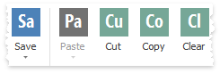
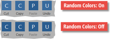
Individual items provide the BarItem.AllowStubGlyph properties that, when not set to DefaultBoolean.Default, override the global setting. For example, the following figure illustrates the “Cut” bar item link that displays a stub glyph while other links don’t.
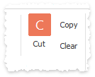
ribbonControl1.OptionsStubGlyphs.AllowStubGlyphs = DefaultBoolean.False;
iCut.AllowStubGlyph = DefaultBoolean.True;
Customize Stub Glyphs
The BarManager.OptionsStubGlyphs and RibbonControl.OptionsStubGlyphs sections provide multiple properties to customize the appearance of item stub glyphs.
Property | Description |
|---|---|
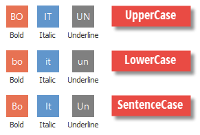
Allows you to choose the case mode for captions within stub glyphs. Accepts the following values of the GlyphTextCaseMode enumerator.
| |
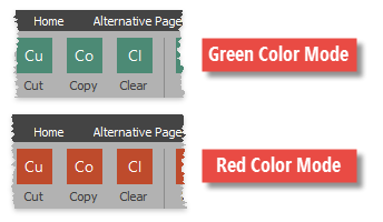
By default, each stub glyph is painted using a random color from six available colors. You can utilize this property to explicitly choose one specific color for all stub glyphs.
| |
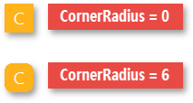
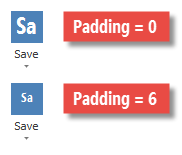
Specifies the corner radius for rectangular stub glyphs (see the “Type” property). Set this property to 0 for straight square icons.
| |
Specifies the font settings for stub glyphs’ caption strings. The following figure illustrates glyph captions painted using the bold “Segoe Condensed” font.
| |
Two properties that allow you to arrange stub glyph captions into one of nine predefined positions.
| |
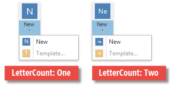
Stub glyph captions always start with the first character of their related bar item captions. Set this property to GlyphTextSymbolCount.Two to draw the second character as well. Displaying two characters requires more space and thus, is primarily recommended for large bar item links.
| |
Gets or sets the distance between glyph borders and inner text content.
| |
Gets or sets whether different variations of the same hue are enabled.
| |
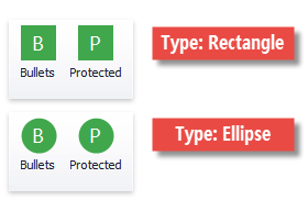
Switches between rectangular and circular stub glyphs. For rectangular glyphs, you can additionally specify the StubGlyphOptions.CornerRadius property.
|