How To: Create a Windows Modern UI Application Manually
- 8 minutes to read
This document explains how to build a Windows Modern UI application manually. To create an application with the DevExpress Template Gallery, see the How To: Create a Windows Modern UI Application Using the Template Gallery document.
In Visual Studio, click “File | New | Project” (or press CTRL+SHIFT+N) to create a new project. Select “DevExpress Template Gallery” and click OK.
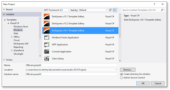
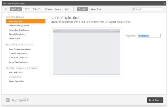
Choose the “Blank Application” template and click “Create Project”.
Invoke the smart tag and click “Convert To Skinnable Form” to change a regular form into an XtraForm.
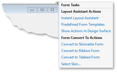
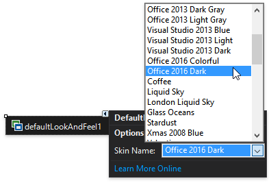
In the same smart tag pane, click “Select Skin…” to add a DefaultLookAndFeel component and choose the required DevExpress skin. For a Windows Modern UI, choose a flat skin with a light appearance and thin or no borders (e.g., Office 2013, Office 2016, Metropolis, etc.).
- Set the form’s FormBorderStyle property to None and the WindowState property to Maximized.
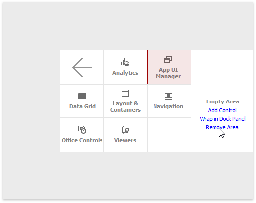
Click the “Instant Layout Assistant” link on the form to launch the on-form wizard. Hover over all side regions and click “Remove Area”. In the remaining empty area, click “Add Control” and select “App UI Manager | Windows UI”. Next, click the apply button to add the DocumentManager component with the WindowsUIView applied.
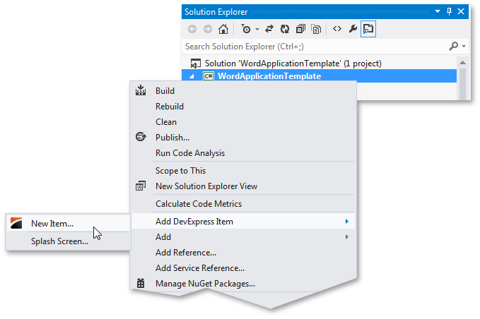
Right-click the project in the Solution Explorer window and select “Add DevExpress Item | User Control…”.
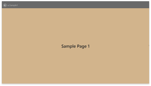
Add a few more user controls and populate them. These user controls will be presented as separate application screens.
Return to the main application form, invoke the DocumentManager component’s smart tag, and click “Run Designer”. Switch to the Designer‘s “Elements | Documents” tab and click “Populate”.
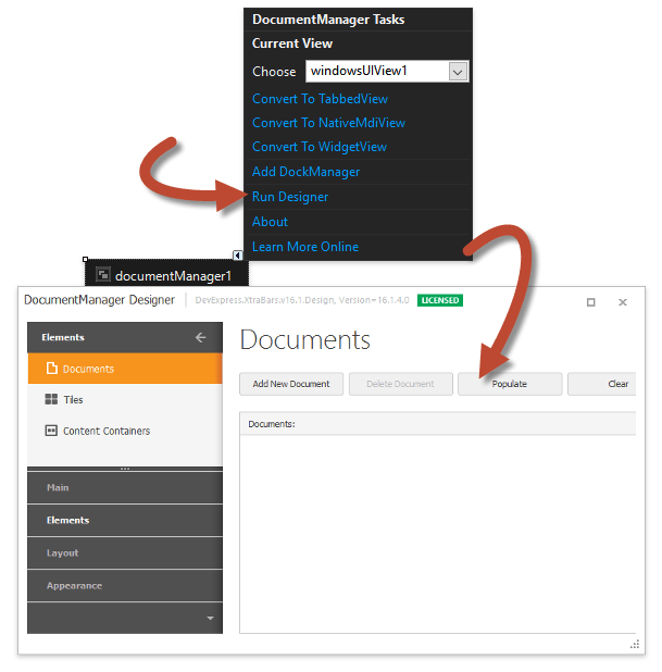
Once you click “Populate”, the Document Manager will generate the following:
- Document objects that refer to your user controls by BaseDocument.ControlName and BaseDocument.ControlTypeName properties;
- medium-sized tiles (Tile objects) for generated documents;
- a Tile Container to store and display tiles;
the BaseView.QueryControl event handler, which initializes documents.
void windowsUIView1_QueryControl(object sender, DevExpress.XtraBars.Docking2010.Views.QueryControlEventArgs e) {
    if (e.Document == ucSample1Document)
        e.Control = new WinModernUI.ucSample1();
    if (e.Document == ucSample2Document)
        e.Control = new WinModernUI.ucSample2();
    // . . .
    if (e.Control == null)
        e.Control = new System.Windows.Forms.Control();
}
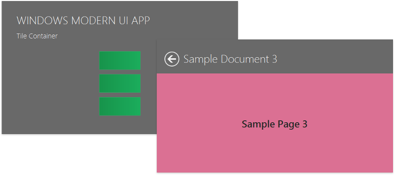
Run and review your application. On application start-up, an auto-generated Tile Control populated with tiles is displayed. Press Esc or right-click the empty form space to invoke Navigation Bars with an embedded “Exit” button.
Tiles utilize the Tile.Document property to link to the corresponding document. When a tile is clicked, a dynamically generated Page container displays the document with an embedded ”Back” button. Same button is displayed within navigation bars.
Close the application to modify it. First, use the WindowsUIView.Caption, BaseContentContainer.Caption and BaseContentContainer.Subtitle propertiesto add application title strings. Also, use the BaseDocument.Caption property to modify auto-generated document captions.
Note
Initially, you will not see the WindowsUIView.Caption string since the tile container caption will overlap it. This title will be visible, however, in content container headers, which you will create later in this tutorial.
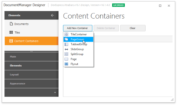
Go to the designer‘s “Elements” page and select the “Content Containers” tab. Click “Add New Container” and select Page Group from the drop-down menu.
Switch to the designer’s “Layout | Navigation Tree” tab and drag your documents into the page group’s “Items” collection.
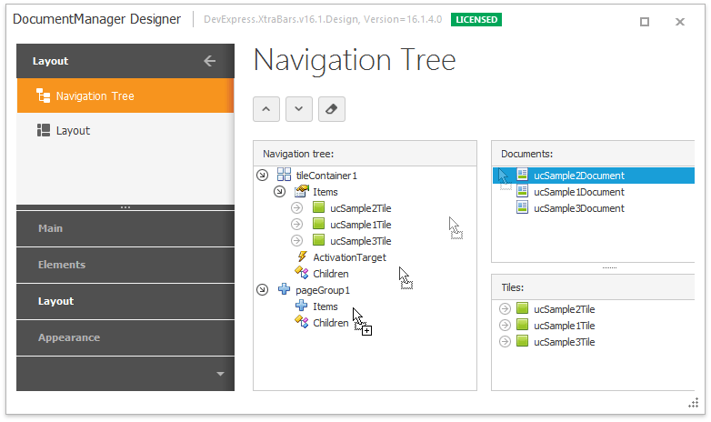
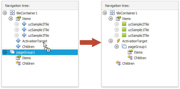
In the same “Layout | Navigation Tree” designer tab, drag the page group to the tile container’s “ActivationTarget” node, which assigns the page group to the tile container’s TileContainer.ActivationTarget property. Note that the page group is activated when a tile within the container is clicked.
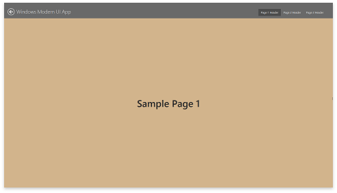
Run the app to see what has changed. Clicking tiles now leads you to the page group. Besides, the page group automatically activates a document related to a clicked tile, so there is no need to explicitly set the activation target for each individual tile. The page group header displays the View caption (the WindowsUIView.Caption property) and shows the embedded “Back” button - now end-users can navigate back to the start-up page without invoking the Navigation Bars. Run the app to see the changes. When you click a tile, you navigate to the page group, which automatically activates the tile’s corresponding document – so there is no need to explicitly set the activation target for each tile. The page group header displays the View caption (the WindowsUIView.Caption property) and an embedded ”Back” button - for end-users to navigate back to the start-up page without a Navigation Bars.
To replace the header string, specify the BaseContentContainer.Caption property for the page group container. You can also set document BaseDocument.Header properties to modify text within page headers.
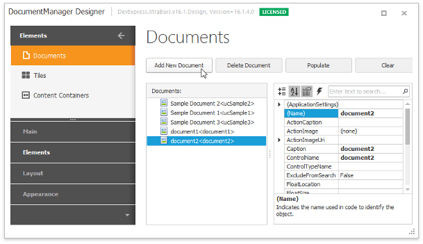
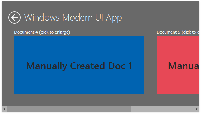
All application documents are auto-generated. Next, in the designer’s ”Elements | Documents” tab, click ”Add New Document” to add a document manually. A tile corresponding to the document is added automatically.
Since the additional documents have no content, an attempt to display one of these documents will throw an exception. The BaseView.QueryControl event uses the Deferred Load feature to dynamically populate empty documents, which can improve application performance significantly. The QueryControl event was already handled at step 9, so you only need to add a few more code lines.
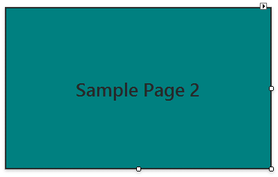
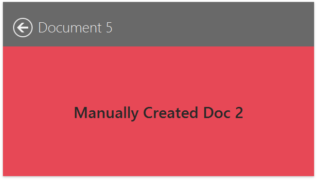
void windowsUIView1_QueryControl(object sender, DevExpress.XtraBars.Docking2010.Views.QueryControlEventArgs e) { //. . . if (e.Document == document1) e.Control = CreateSampleContent("Manually Created Doc 1", Color.FromArgb(0, 99, 177)); if (e.Document == document2) e.Control = CreateSampleContent("Manually Created Doc 2", Color.FromArgb(231, 72, 86)); } public LabelControl CreateSampleContent(string text, Color backcolor) { Font sampleFont = new Font(new FontFamily("Segoe UI Semibold"), 42f); LabelControl lc = new LabelControl() { AutoSizeMode = LabelAutoSizeMode.None, Dock = DockStyle.Fill, BackColor = backcolor, ForeColor = Color.FromArgb(40, 40, 40), Text = text, Font = sampleFont, }; lc.Appearance.TextOptions.HAlignment = DevExpress.Utils.HorzAlignment.Center; lc.Appearance.TextOptions.VAlignment = DevExpress.Utils.VertAlignment.Center; return lc; }- Another another content container is required to store the new documents. Add a Slide Group container and populate it with items, as explained in steps 12 and 13. (In the “Content Containers” tab, select “SlideGroup” instead of “PageGroup”.)
In the designer’s “Layout | Navigation Tree” tab, drag the slide group into the “Activation Target” node for each new tile. The navigation hierarchy should appear as follows.
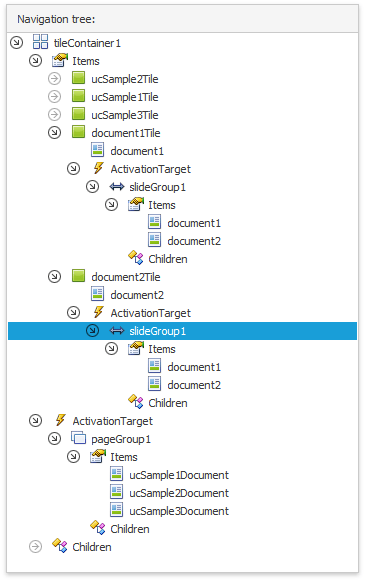
Run the application to test the current navigation hierarchy. Note that the Tile.ActivationTarget property is not specified for tiles with auto-generated documents, so the parent tile container (the page group) is activated instead. The additional tiles will apply their own activation targets as well, which navigate to the slide group.
Click a document header (the BaseDocument.Header property) to view the document in a separate, dynamically generated Page container.
Customize your start-up tile container and its tiles as required. Tile container is based on a separate Tile Control and it inherits its base customization concepts.
- Specify BaseTile.Group properties to categorize your tiles. Set the ITileContainerDefaultProperties.ShowGroupText property to DefaultBoolean.True, to display captions for tile groups.
- Modify the ITileContainerDefaultProperties.ItemSize property value to increase or decrease the tile size.
- Change the ItemSize property for individual tiles to change the size and shape (see Tile Groups and Items).
- Populate static tiles with TileItemElement objects to fill these tiles with content (see Tile Item Structure).
- Add TileItemFrame objects to tiles that should be animated (“live” tiles), then set the content for each frame (see Tile Animation).
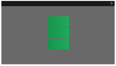
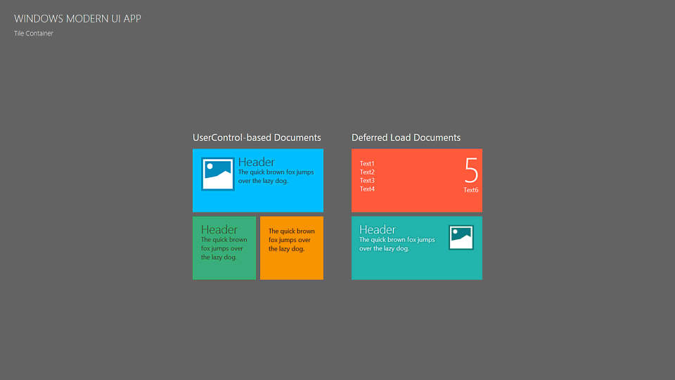
The animation below illustrates a customized tile container with sample tiles, populated with templates.
Complete the application with the following minor modifications.
- Add more buttons to navigation bars and content containers. Refer to WindowsUI Buttons and WindowsUI Buttons for details.
- Add Flyouts - Windows Modern-style messages and dialogs.
- Customize the built-in search panel invoked by the CTRL+F shortcut.
- Congratulations, your Windows Modern UI application is complete. See Application UI Manager to learn more about this component and its Views, or the WindowsUI View section for more information on this specific View.