Add Bar Items To Toolbars
- 6 minutes to read
In this tutorial, you will add items to your main menu and status bars.
Add Buttons and Sub-Menus
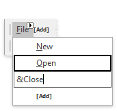
Click the [Add] link within the main menu bar. You will see a drop-down menu with all the bar items available for adding.
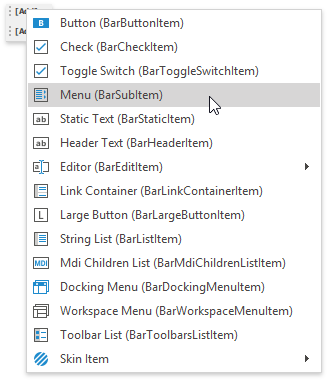
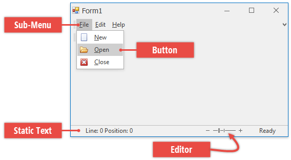
Main menu bars traditionally contain sub-menus only, so select the “Menu (BarSubItem)” option, enter the sub-menu caption and press Enter. Start your bar item captions with the ampersand character (&) to instantly generate keyboard shortcuts for these items. For instance, the following figure illustrates a sub-menu with the “&File” caption - notice the automatically underlined “F” character.
When an end-user presses ALT to enable keyboard navigation, pressing the F key will open this sub-menu. Note that the ampersand character can be placed before any desired symbol, not only before the first one.
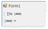
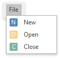
Click your “File” sub-item at design-time. This will invoke the sub-menu with the same [Add] link, which when clicked, allows you to add items to this menu.
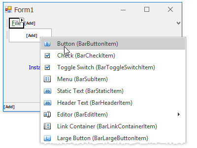
Add three regular buttons (BarButtonItem objects) to the menu and set their captions as “New”, “Open” and “Close”. Remember to place the ampersand characters before desired caption letters to create keyboard shortcuts.
By default, all bar items eligible for showing icons will display fake icons with initial letters of these items’ captions. These fake icons are called stub glyphs. Bar items show these icons unless you manually provide custom icons for them.
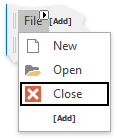
Add button icons by clicking required items and specifying the BarItem.Glyph property. You can utilize free DevExpress icons available from the Image Gallery.
Tip
There are two more ways to specify bar item icons.
- BarItem.ImageIndex - an integer property that picks one image from the collection and assigns this image to the target bar item. The source image collection is stored in the BarManager.Images property.
- BarItem.ImageUri - allows you to provide a context-dependent icon for the current item using a uniform resource identifier.
Note that the “File” sub-menu button will not display an icon even when you assign one. This is the default behavior for main menu items.
Repeat the steps above to create the desired main menu.
Add Labels and Editors
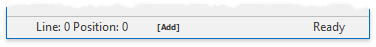
To populate the Status Bar, click the same [Add] button and select the “Static Text (BarStaticItem)” option. Set its caption to “Line: 0 Position: 0”.
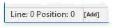
Take a look at the vertical dash drawn near the static bar item’s right edge. To remove this separator, set the BarItem.Border property to BorderStyles.NoBorder.
Static items are auto-sized by default. To change this behavior, switch the item BarStaticItem.AutoSize property to None and set your custom item size using the BarItem.Size property.
Additionally, you can change the bar static item’s caption alignment by utilizing the BarStaticItem.TextAlignment property.
Add one more status label with the “Ready” caption and dock it to the bar’s right edge using the BarItem.Alignment property.
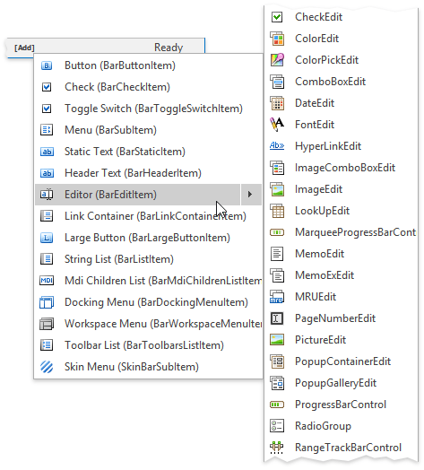
Any bar can display editors from the DevExpress Editors bundle. To do so, the required repository item must be embedded to the BarEditItem object, which in turn can be hosted within a bar or a menu. To add the desired editor at design-time, click [Add] and hover the “Editor (BarEditItem)” menu item for a while. You will see a list of all available DevExpress editors. Find and click the “ZoomTrackBarControl” to add a bar edit item that contains the RepositoryItemZoomTrackBar object.
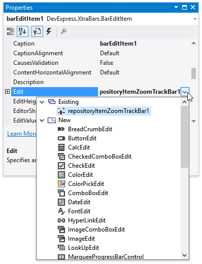
In case you did not click the right place and created an editor of the wrong type, locate the BarEditItem.Edit property in the Visual Studio Properties window and invoke its drop-down menu. Expand the “New” node and choose the correct editor type. The “Existing” node displays all existing repository items and allows you to re-use them throughout multiple bar edit items.
Enlarge your trackbar by increasing the BarEditItem.EditWidth value.
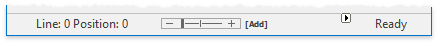
Expand the BarEditItem.Edit node in the VS Properties window and set the repository item’s RepositoryItem.BorderStyle property to BorderStyles.NoBorder. This will remove borders drawn around the trackbar.
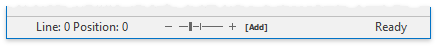
Move the trackbar to the bar’s right edge by setting the BarItem.Alignment property to the corresponding value. By doing so, you will arrange the trackbar after the “Ready” static bar item.

To swap these two bar items, drag the trackbar and drop it before the static item.

Note
An in-place editor (BaseEdit descendant) within a Bar, Menu or Ribbon Control is created from a RepositoryItem descendant and activated only when a corresponding edit box is focused. If the edit box is not focused, the editor doesn’t exist at this point in time. When the edit box loses focus, the corresponding editor is automatically destroyed. So, it’s not possible to access an editor displayed within a Bar/Menu/Ribbon Control unless this editor has focus.
To access and customize a specific in-place editor, first activate the editor via the BarEditItemLink.ShowEditor method. To access the editor, use the BarManager.ActiveEditor property (for the RibbonControl, use the RibbonControl.Manager.ActiveEditor property).
Specific dropdown editors allow their items to be populated from a data source (e.g., a LookUpEdit or CheckedComboBoxEdit). If this editor is embedded into a Bar or Ribbon Control and the corresponding edit box is not focused, changes made to the data source are not reflected by the edit box. To update the edit box, you can use the BarItem.Refresh method.
Bar Manager Designer
You can also use the Bar Manager Designer to add buttons and editors, and move them to desired toolbars.
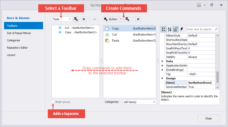
The Bar Manager Designer is accessible via the component’s smart tag.
Code Sample
public void AddBarItems() {
    #region Main Menu Bar
    bm.BeginUpdate();
    BarSubItem bsiFile = new BarSubItem(bm, "&File");
    BarButtonItem bbiNew = new BarButtonItem(bm, "New");
    bbiNew.ImageUri.Uri = "New";
    BarButtonItem bbiOpen = new BarButtonItem(bm, "Open");
    bbiOpen.ImageUri.Uri = "Open";
    BarButtonItem bbiClose = new BarButtonItem(bm, "Close");
    bbiClose.ImageUri.Uri = "Close";
    bsiFile.AddItems(new BarItem[] { bbiNew, bbiOpen, bbiClose });
    bm.MainMenu.AddItem(bsiFile);
    bm.EndUpdate();
    #endregion
    #region Status Bar
    BarStaticItem bsiLinePos = new BarStaticItem() {
        Caption = "Line: 0 Position: 0",
        Alignment = BarItemLinkAlignment.Left,
        Width = 150,
        AutoSize = BarStaticItemSize.None,
        TextAlignment = System.Drawing.StringAlignment.Center
    };
    BarStaticItem bsiReady = new BarStaticItem() {
        Caption = "Ready",
        Alignment = BarItemLinkAlignment.Right,
        Width = 80,
        AutoSize = BarStaticItemSize.None,
        TextAlignment = System.Drawing.StringAlignment.Far,
        Border = DevExpress.XtraEditors.Controls.BorderStyles.NoBorder
    };
    BarEditItem beiZoom = new BarEditItem(bm, new RepositoryItemZoomTrackBar()) {
        EditWidth = 150,
        Alignment = BarItemLinkAlignment.Right
    };
    beiZoom.Edit.BorderStyle = DevExpress.XtraEditors.Controls.BorderStyles.NoBorder;
    bm.StatusBar.AddItems(new BarItem[] { bsiLinePos, beiZoom, bsiReady });
    #endregion
}