UI Types
- 3 minutes to read
The Scaffolding Wizard can create three UI types for your application:
This article merely describes each UI type. For a detailed tutorial on UI generation, refer to the How To: Generate an Application Based on the Existing Data Access Level document. To learn about runtime capabilities provided by scaffolded applications of different UI variations, refer to the Embedded Functionality article.
Tabbed MDI
One of the most widely used UI types, the Tabbed MDI variation features the Application UI Manager component, which manages tabs. Each collection and detail View is placed within a separate tab and docked to this component. Main application commands are available from the Ribbon control. Finally, the Accordion Control allows users to navigate through existing collection Views.
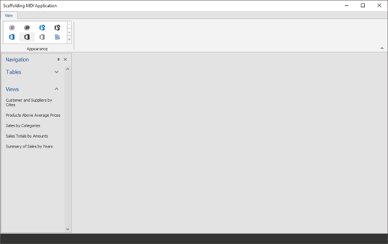
1. Start-up View
The central blank region contains the Application UI Manager component that can host tabs
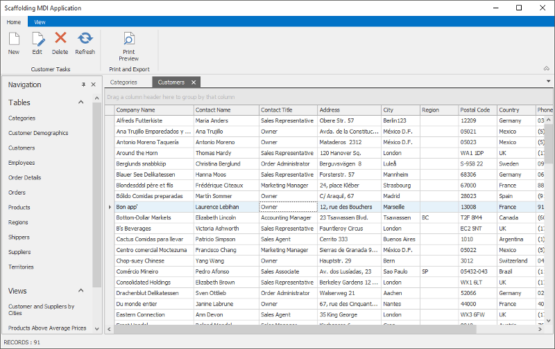
2. Collection View
On this figure, tabs that show data records are docked to the central area of the start-up View
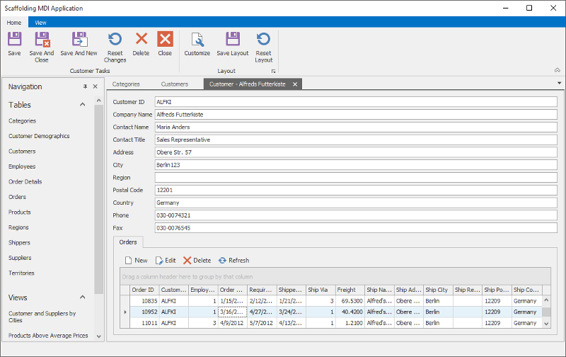
3. Detail View
Individual records are also modified within separate tabs
Hybrid UI
The Hybrid UI is designed to fit both large desktop screens and smaller screens of touch-input devices, such as tablets and phones. This UI pattern is described in the Touch-Enabled Tile UI article.
A Main View generated by the Wizard features the Navigation Frame control. The Frame displays pages that wrap the collection and detail Views, one page at a time. To switch between pages, end-users click tiles provided by the Tile Bar control, docked to form’s top. To add, remove or modify data records, users utilize the buttons of the WindowsUI Button Panel controls at Views’ bottom.
A Main View for Hybrid UI applications contains code that sets the static WindowsFormsSettings.TouchUIMode property to the TouchUIMode.True value. This setting enlarges size and margins of UI elements, making it easier to operate the application on touch-input devices.
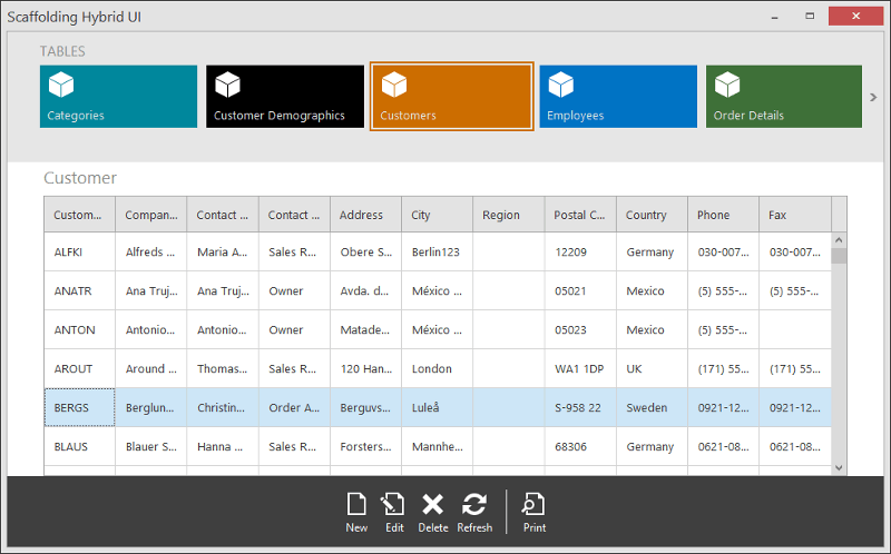
1. Main and Collection Views
A data grid with records and buttons at the form’s bottom belongs to individual collection Views
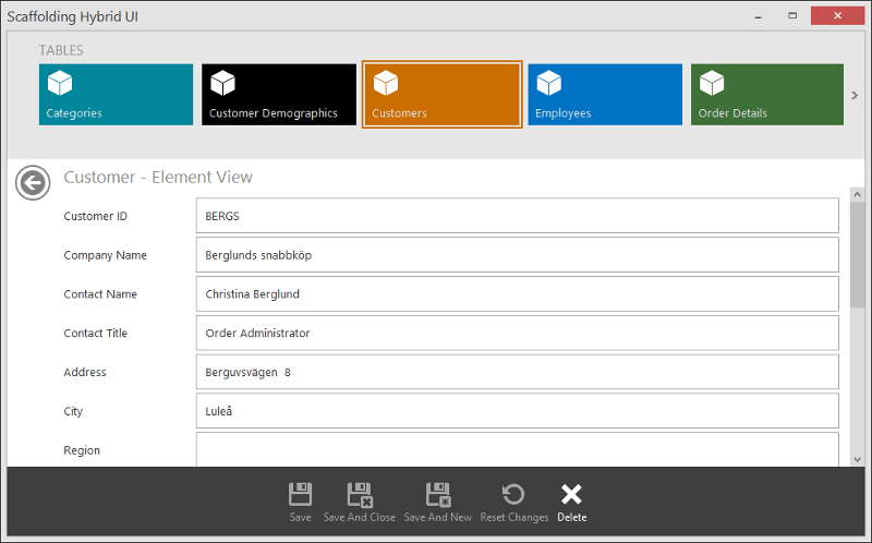
2. Detail View
The embedded Back button allows end-users to navigate back to the collection View
Outlook Inspired UI
Outlook Inspired UI is a particular variation of a common design pattern, shared among Microsoft Office applications. This UI features a flat, clean design with a commanding region based on the Ribbon control, navigation area (Office Navigation Bar in possible conjunction with Navigation Bar) and a central region with a control that displays main content (in case of Scaffolding-generated UI, such control is Data Grid).
Same as with the Hybrid UI, Scaffolding Outlook Inspired application does not allow end-users to view main and collection screens separately. The main View contains the Navigation Frame component that always keeps one of its pages active. Pages in turn are objects that wrap collection Views. End-users can double-click individual data records to browse them in a separate edit form (detail View).
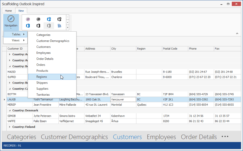
1. Main and Collection Views
Collection Views display data records in a tabular format using the Data Grid component
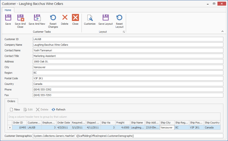
2. Detail View
Hosted within a separate form; end-users can have multiple edit forms opened simultaneously