How to: Use RangeControl in a Scheduling Application
- 4 minutes to read
This document describes how to add a RangeControl instance to a scheduling application, associate it with a SchedulerControl object, and expose the necessary API in order to customize RangeControl behavior and appearance.
Add RangeControl to a Project and Bind it to SchedulerControl
Create an application with SchedulerControl bound to resource and appointment data. Switch off data grouping by setting the SchedulerControl.GroupType property to SchedulerGroupType.None.
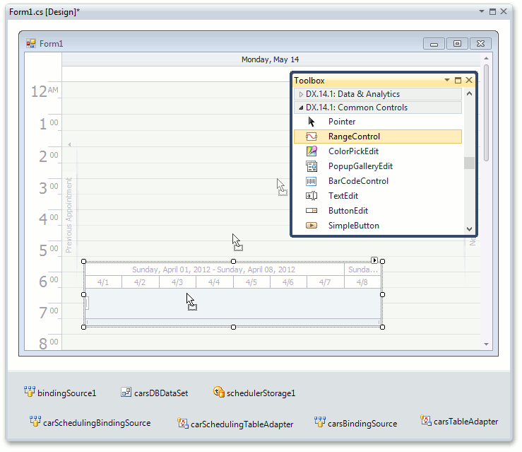
Drop the RangeControl item onto the form from the DX.18.2: Common Controls toolbox tab.
RangeControl is automatically bound to the scheduler that already exists on the form - the RangeControl.Client property is set to the corresponding SchedulerControl object. A collection of default scales is immediately displayed within RangeControl at design time (the Week and Day scales).
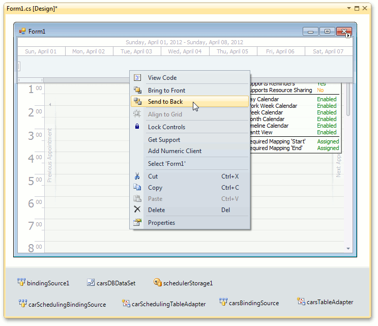
To arrange RangeControl and SchedulerControl controls on the form, set the RangeControl.Dock property to Top and select Send to Back from the RangeControl’s context menu at design time.
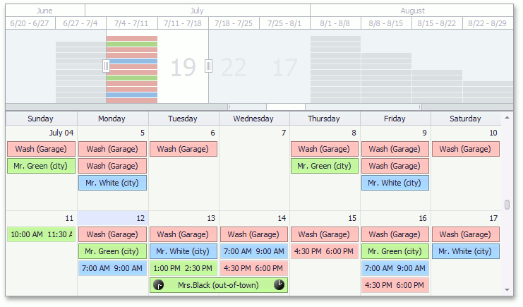
Run the project and try the interaction between RangeControl and SchedulerControl. You can scroll and navigate through several months in the scheduler using an intuitive UI provided by RangeControl.
When bound to SchedulerControl, RangeControl shows multi-level scales that are the most appropriate for operating in the current scheduler view (in this example, the Month and Week scales are used to work in the Week view), and these scales are immediately adjusted when the scheduler view is changed.
A scheduler view is automatically switched to the most appropriate display type for showing the time range selected in RangeControl. In turn, the RangeControl’s selected, visible and total ranges are automatically recalculated taking into account the scheduler visible interval and current view.
In addition, RangeControl displays appointment data in its viewport. Each RangeControl interval shows appointment thumbnails colored as appointment labels or the number of appointments contained in the corresponding time interval of the scheduler. Note that the information on appointments displayed in RangeControl is changed on the fly, when you create, edit or delete appointments in the scheduler.
These characteristics of the interaction between SchedulerControl and RangeControl are specified via default values of special options that become available after RangeControl and SchedulerContorl are integrated. Use these options to customize RangeControl and SchedulerControl behavior when these controls are integrated.
Specify Behavior Settings of RangeControl
Once RangeControl and SchedulerControl are integrated, a number of options allowing you to specify the behavior and appearance of these controls become available. These options are accessed via SchedulerControl.OptionsRangeControl or (if the RangeControl.Client property is set to a SchedulerControl object) via RangeControl.ClientOptions.
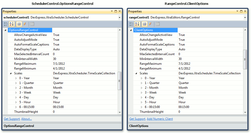
Use the following properties of the SchedulerOptionsRangeControl object for flexible customization of interaction between RangeControl and SchedulerControl.
AllowChangeActiveView
Specifies whether or not the scheduler should automatically switch its active view to the most appropriate display type to show the time interval selected in RangeControl. The default is true.
AutoAdjustMode
Specifies whether RangeControl should be automatically adjusted in the following way:
- After the scheduler’s active view has been changed (SchedulerControl.ActiveView), RangeControl visible scales (ScaleBasedRangeControlClientOptions.Scales) are changed to the scales that are the best for using within RangeControl for navigating within the newly set scheduler view.
- After the scheduler’s start date (SchedulerControl.Start) is switched to the date that is beyond the RangeControl’s available time range, this range is recalculated so that this date becomes the middle of the newly set time range available in RangeControl.
The default is true.
AutoFormatScaleCaptions
Specifies whether the format of RangeControl’s scale captions should be automatically changed when the RangeControl viewport is resized or zoomed. Thus, time scale captions can be left readable regardless of the time scale element width. The default is true.
DataDisplayType
Specifies how appointment data contained within a particular time interval of the scheduler should be displayed in a corresponding RangeControl’s interval - as appointment thumbnails colored according to appointment labels or a number of appointments.
MaxSelectedIntervalCount
Specifies the maximum number of intervals that can be selected within RangeControl at the same time.
MinIntervalWidth
Specifies the minimum width of intervals that can be reached when an end-user resizes or zooms a RangeControl viewport.
RangeMinimum and RangeMaximum
Specify the boundaries of the time range to be available in RangeControl. To set the constant time range, specify these property values while the AutoAdjustMode property is set to false. If the AutoAdjustMode property value is true, the RagneControl range is automatically recalculated each time after the scheduler’s start date is moved beyond the time range previously set in RangeControl.
Scales
Specifies a collection of scales to be visible within RangeControl. If the AutoAdjustMode property value is true, a set of displayed scales is automatically adjusted after the scheduler view has changed.
ThumbnailHeight
Specifies a height of appointment thumbnails.