Adorner Guides
- 4 minutes to read
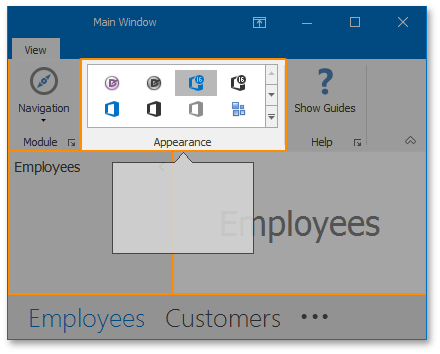
Guides are adorner elements designed to highlight and emphasize specific spots or regions within a parent form and give an optional description for these areas. At the animation below, five different guides are automatically displayed one by one. This interactive tour highlights main application regions and names DevExpress controls they are based on.
Guides are objects of the Guide class. Identically to other child Adorner UI Manager items, each guide has a target - a UI element assigned to this guide’s AdornerElement.TargetElement property. To create and modify guides, click the Choose Elements link on the component’s smart-tag and use the invoked Collection Editor dialog. See the root Adorner UI Manager article for more details.
Demo: Guides (requires DevExpress Demo Center of version 16.2 or newer installed)
Common Concepts
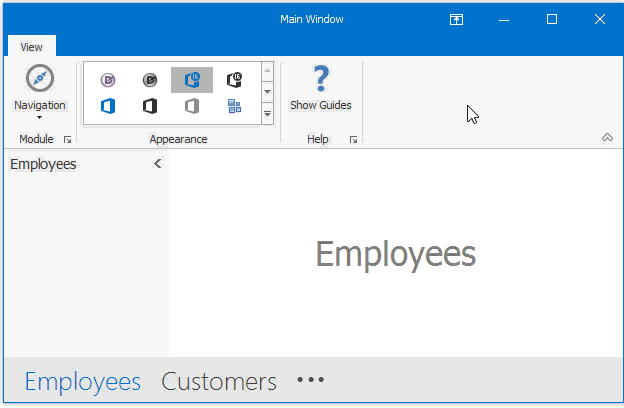
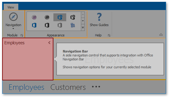
Initially, all adorner guides are hidden at runtime. To turn these guides on, set the AdornerUIManager.ShowGuides property to true. After you do so, a semi-transparent gray layer will darken your entire form (user control). A selected guide cuts a “hole” in this underlying layer by painting its target element’s region with a transparent color. This creates a highlight effect for the target region. Guides that are not currently selected display their borders only. The figure below illustrates an example.
End-users can click guides to select them. To hide all guides and the gray layer beneath them, an end-user must press Escape. Note that when guides are shown, end-users cannot use any of the form’s UI elements, since all mouse events are intercepted by an adorner layer.
To cycle through existing guides, use the manager’s AdornerUIManager.SelectNext and AdornerUIManager.SelectPrev methods. These methods display guides according to their TabIndex property values. The AdornerUIManager.SelectElement method allows you to be more specific and navigate directly to the desired guide.
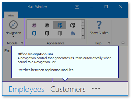
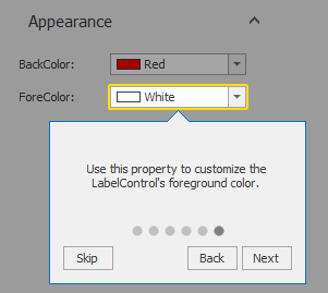
Populating Flyouts
If a guide’s GuideDefaultProperties.AllowFlyoutPanel property does not equal DefaultBoolean.False, each guide displays a flyout panel upon activation. Initially, this panel is empty as shown below.
To populate flyout panels for any existing guide, handle the manager’s AdornerUIManager.QueryGuideFlyoutControl event. This event provides the e.SelectedElement property to identify a panel for which the guide pops up. The e.Control property accepts any control, which will be displayed within the desired guide’s flyout panel. The code sample below illustrates how to populate a guide flyout with an HTML-formatted text string.
void adornerUIManager1_QueryGuideFlyoutControl(object sender, QueryGuideFlyoutControlEventArgs e) {
    if(e.SelectedElement.TargetElement == navBarControl) e.Control = new LabelControl() {
        AllowHtmlString = true,
        Width = 350,
        AutoSizeMode = LabelAutoSizeMode.Vertical,
        Padding = new Padding(20),
        Text = "<b>Navigation Bar</b><br>" +
                "A side navigation control that supports integration with Office Navigation Bar<br><br>" +
                "Shows navigation options for your currently selected module"
    };
}
Flyout panels can carry much more complex content rather than simple labels. On the following image, the flyout displays three buttons and a WindowsUI Button Panel.
Flyout panels size automatically to fit their content. To set a flyout display position, use the GuideDefaultProperties.FlyoutLocation property.
Appearance Settings
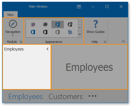
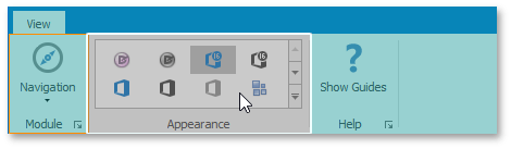
You can customize the appearance of any guide element, as well as appearances for an external layer. To re-paint guides (their borders and inner region), access properties in Guide.Appearances (for individual guides) and AdornerUIManager.GuideAppearances (for all guides) groups. Individual guide appearance settings override relative global settings. A customized guide is shown at the figure below.
Important
When setting custom background colors for guides, use four-number ARGB values to assign semi-transparent colors.
An external layer can be painted using an AppearanceObject assigned to the GuideAppearances.Layer property. Same as with custom guide colors, use ARGB values instead of solid colors when setting a custom layer background.
Finally, to customize guide flyout panels, use the AdornerUIManager.GuideProperties group. Here you can utilize the GuideDefaultProperties.FlyoutBackColor and GuideDefaultProperties.FlyoutBorderColor properties to apply custom appearance settings. The GuideDefaultProperties.FlyoutOpacity property allows you to create semi-transparent flyout panels. The following figure illustrates a non-transparent guide flyout with navy borders and azure background.