WinExplorer View
- 7 minutes to read
The WinExplorer View (the WinExplorerView) is a Data Grid View optimized for showing image-containing records. The View provides eight styles to represent data similarly to the way Windows Explorer does. |
View Styles
The WinExplorer View features seven unique display modes or styles for its records. These styles specify what data each record shows and how it is presented on-screen. To select the currently active view style, utilize the WinExplorerViewOptionsView.Style property.
WinExplorerView - Tiles Style
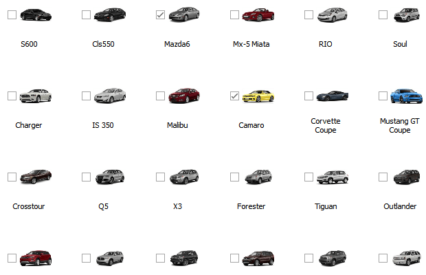
WinExplorerView - Small Style
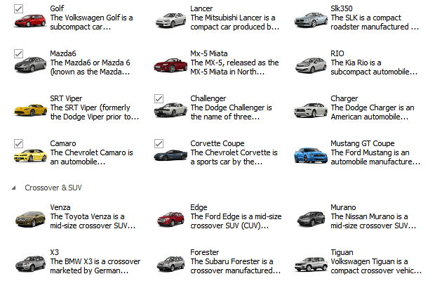
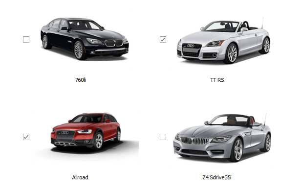
WinExplorerView - Medium Style
WinExplorerView - Large Style
WinExplorerView - ExtraLarge Style
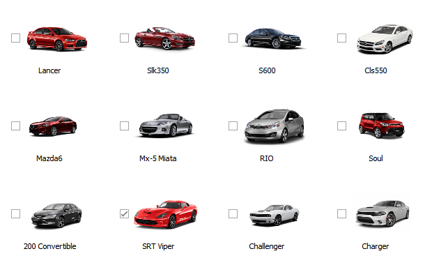
WinExplorerView - Content Style
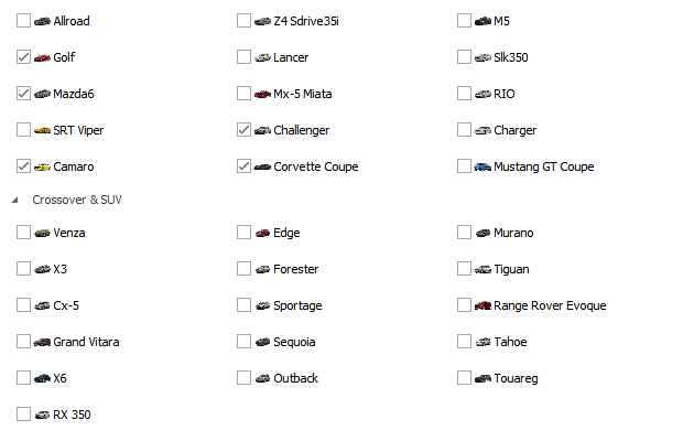
WinExplorerView - List Style
- Tiles style: records display medium images with text captions, descriptions, and optional check boxes painted at the image’s top-left corner. Check boxes are visible only when checked or hovered.
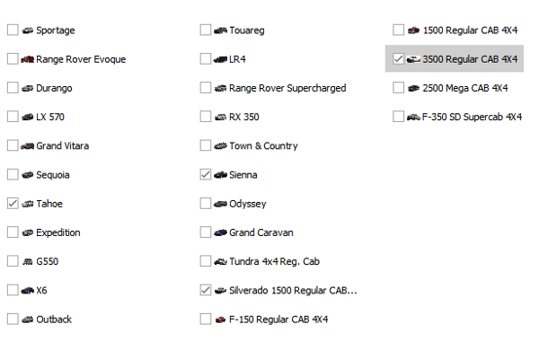
- Small style: records display small images with text captions to the right and optional check boxes to the left. Records are arranged horizontally. Groups are placed one under another.
- Medium style: records display medium images with text captions below and optional check boxes to the left.
- Large style: records display large images with text captions below and optional check boxes to the left.
- ExtraLarge style: records display extra-large images with text captions below and optional check boxes to the left.
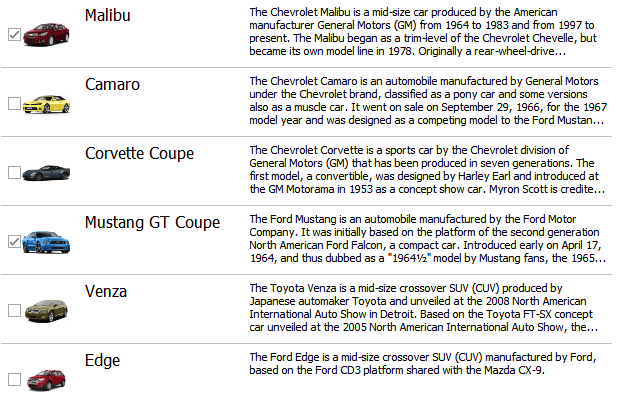
- Content style: records display medium images, bold text captions, and descriptions in a row. Records are arranged one under another and separated by horizontal lines. You can optionally display a check box to the left of the image.
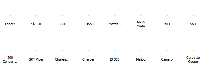
- List style: records display small images with text captions to the right and optional check boxes to the left. Records are arranged vertically, while groups are placed horizontally side-by-side. Groups display no collapse buttons.
Note that all styles have fixed designs that cannot be changed. If you want to customize data records’ layout, try Tile View instead.
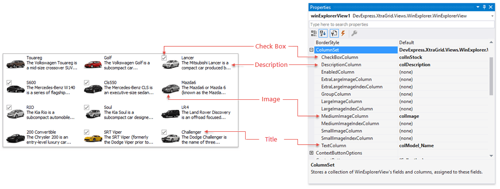
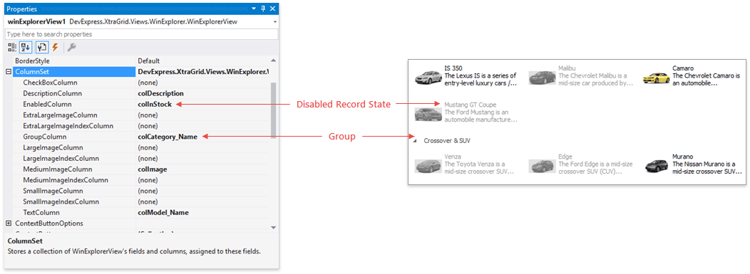
Column Set
A newly created WinExplorer View displays nothing at runtime even if the Data Grid is bound to a source. To have the View show data, select the data fields you want to show. To do so, expand the WinExplorerView.ColumnSet property in the VS Property Grid and assign automatically generated grid columns to the required properties.
Unlike regular Views that use columns or card fields to display any number of data source fields, the WinExplorer View’s records are limited to a maximum of four data portions: an image, a short title, a detailed description and a check box.
- Titles are strings from a grid column assigned to the WinExplorerViewColumns.TextColumn property.
- Descriptions are strings from a grid column assigned to the WinExplorerViewColumns.DescriptionColumn property.
- Images are retrieved from columns assigned to “…ImageColumn” properties. There are four image-related properties present, see the Images section of this article to learn the details.
- Check boxes display boolean values from a grid column assigned to the WinExplorerViewColumns.CheckBoxColumn property.
Two additional properties in the ColumnSet group allow you to organize records in groups and/or render specific records disabled.
- To group data, assign a grid column to a WinExplorerViewColumns.GroupColumn property.
- To disable individual records, assign a grid column to a WinExplorerViewColumns.EnabledColumn property. Disabled records are drawn with stricken-out captions.
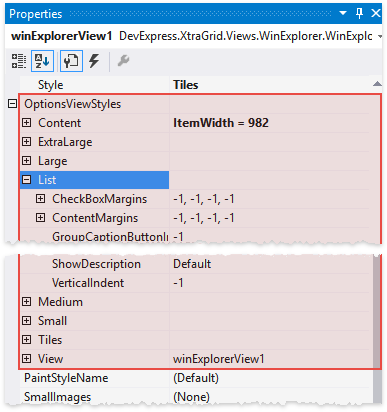
View and View Style Settings
The WinExplorerView.OptionsView property provides access to common View settings.
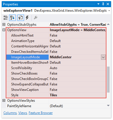
You can also specify unique settings for each individual View style. To do so, expand the WinExplorerView.OptionsViewStyles property and access properties exposed by the required sub-group.
Images
The table below describes all types of images the WinExplorer View supports.
Image type | Default size (in pixels) | View styles that utilize these images | Related ColumnSet Property |
|---|---|---|---|
Small | 16x16 | Small, List | |
Medium | 48x48 | Medium, Content, Tiles | |
Large | 96x96 | Large | |
Extra Large | 256x256 | Extra Large |
Note that you do not need to assign image columns to all four properties - if there are no images of a size that the currently applied style requires, the View automatically scales images taken from other columns.
In View style settings, utilize the WinExplorerViewStyleOptions.ImageSize property to change the default image size for this View style.
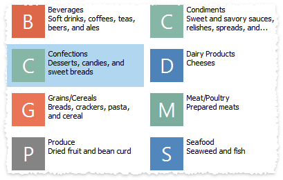
Stub Glyphs
Instead of regular images, the WinExplorer View can display auto-generated images called stub glyphs. These are colored squares or circles with one or two initial letters of record title strings.
Related API
StubGlyphOptions.AllowStubGlyphs - specifies whether or not stub glyphs are enabled.
WinExplorerView.OptionsStubGlyphs - provides access to advanced stub glyph options, such as font settings, color scheme, glyph shapes, etc. Refer to the “Customize Stub Glyphs” section of the Stub Glyphs article for details.
Asynchronous Image Load
Activating the Asynchronous Image Load mode allows you to do the following:
- force the view to load images dynamically, on-demand, rather than all images at once;
- retrieve images from the data source and manually transform them;
- assign your own images from an external source;
- display images with animation effects and show animated indicators for those images that are not yet ready.
Context Buttons
The WinExplorer records can display context buttons along their top and bottom sides. You can choose whether these buttons are constantly visible, or only when a user hovers over an item.
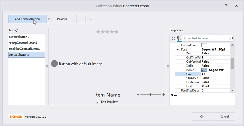
To add context buttons, click the ellipsis button next to the WinExplorerView.ContextButtons property. The combo-box editor of the Collection Editor dialog allows you to add items of three types:
- ContextButton - a regular push button that performs actions when clicked. With no glyph assigned, such buttons serve as labels;
- CheckContextButton - check buttons that toggle their checked/unchecked states when clicked;
- RatingContextButton - items that allow end-users to rate this item based on a default five-star grade.
Related API
ContextItem.AlignmentOptions - allow you to choose whether a button should be displayed above the item, below it, or in the middle.
WinExplorerViewStyleOptions.ContextButtonsUseFullItemArea - context buttons are drawn within bounds of item image. If your items have no images, or you want to draw buttons inside bounds of an entire item, set this property to true. You can also increase WinExplorerViewStyleOptions.ContentMargins to increase the distance between item images and top (bottom) context buttons.
TopPanelColor, BottomPanelColor - these properties, accessed through the WinExplorerView.ContextButtonOptions group specify colors for top and bottom panels that host context buttons. Use 4-number ARGB values to assign semi-transparent colors.
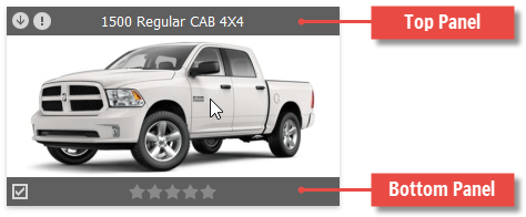
ContextItem.Visibility - specifies whether this button is always visible or only when the parent record is hovered (default behavior). If a button is constantly visible, its underlying button panel is shown as well. With this feature, you can clear the WinExplorerViewColumns.TextColumn property to replace default record titles with context buttons. The following image demonstrates a WinExplorer View record with a caption inside the record itself. A code sample for this task can be found later in this section.

WinExplorerView.ContextButtonClick - occurs when end-users click context buttons.
WinExplorerView.ContextButtonCustomize - handle this event to modify context buttons for individual records.
The code below illustrates how to turn a regular context button into a label that shows a model name and a trademark for car records.
using DevExpress.XtraGrid.Views.WinExplorer;
// ...
private void winExplorerView1_ContextButtonCustomize(object sender, Views.WinExplorer.WinExplorerViewContextButtonCustomizeEventArgs e) {
    WinExplorerView view = sender as WinExplorerView;
    if(view == null) return;
    if(e.Item.Name == "itemText") {
        ((ContextButton)e.Item).Caption = GetContextButtonCaption(e.RowHandle, view.Columns["model.Name"], view.Columns["trademark.Name"]);
    }
}

string GetContextButtonCaption(int rowHandle, GridColumn model, GridColumn trademark) {
    string caption = string.Empty;
    if(model != null)
        caption = (string)this.winExplorerView1.GetRowCellValue(rowHandle, model);
    if(caption != null && trademark != null && caption.Length < 20)
        caption = string.Format("{0} {1}", this.winExplorerView1.GetRowCellValue(rowHandle, trademark), caption);
    return caption;
}