Tutorial: WinExplorer View - Context Buttons
- 4 minutes to read
This walkthrough is a transcript of the WinExplorer View - Context Buttons video available on the DevExpress YouTube Channel.
In this tutorial, you will learn how to add context buttons to View items thus transforming the View into an interactive image gallery.
Since the WinExplorer View can be treated as an image gallery with a data source, you may want to allow end-user interaction with these images. This can be done using the Context Buttons feature.
Enabling the ExtraLarge Style
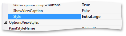
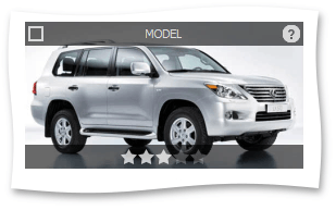
First, set the View WinExplorerViewOptionsView.Style to WinExplorerViewStyle.ExtraLarge. This will provide enough space for context buttons within the image area.
Then, remove the WinExplorerViewColumns.TextColumn from the WinExplorerView.ColumnSet. Launch the app to see that only images are displayed now.

Adding Context Buttons
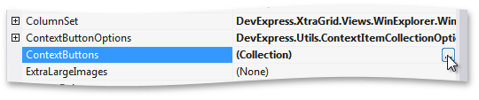
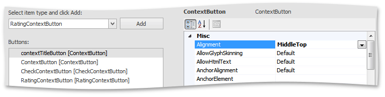
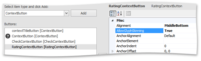
Next, locate the WinExplorerView.ContextButtons property and invoke the editor dialog.
Here you can add context buttons shared by all view items. There are three button types – simple push buttons, check buttons and rating controls. Select a simple Context Button type button type and add it to the collection. In a similar fashion, add another simple button, a check button and a rating control.
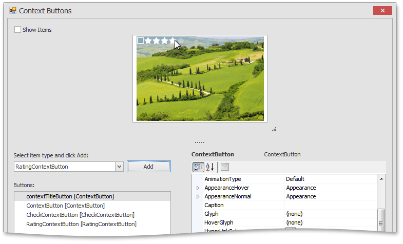
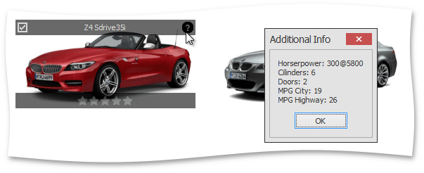
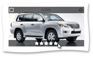
The first push button will work as a label displaying the car model name. For the time being, set its ContextButtonBase.Caption to MODEL and align it to MiddleTop.
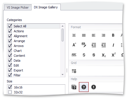
For the second button, select the question mark image from the DevExpress icon gallery (see ContextItem.Glyph). This button will display additional car information.
Change the ContextItem.Alignment property to move this button to the upper right corner.
The rating item will allow end-users to rate cars, move it to the MiddleBottom position.
Displaying Context Button Panels
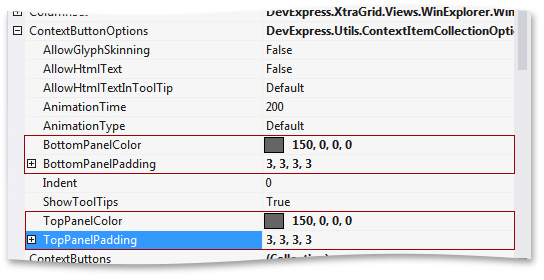
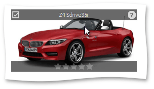
By default, buttons are displayed over the underlying image when you hover the corresponding areas. You can also enable top and bottom panels that will appear as containers for the buttons. Expand the WinExplorerView.ContextButtonOptions property. Set the top and bottom panel’s background color to 150, 0, 0, 0 , which is a semi-transparent black color. Then, add padding for both panels.
Run the application to see the result. The panels have appeared but now there’s not enough contrast between the panel and button colors.
Return to the Context Buttons editor and set the foreground color to Gainsboro for all items. Make sure to turn glyph skinning feature on so that button icons will be painted with the same color.
Then, launch the app again to see that all colors have been applied.
Customizing Individual Context Buttons
To properly initialize check boxes and title labels, handle the WinExplorerView.ContextButtonCustomize event. It allows you to customize a button before it is displayed in an item. To set the value in the title button, set its ContextButtonBase.Caption property to the Model Name column value in the current record. Similarly, set the check button’s CheckContextButton.Checked property depending on the In Stock column value.
using DevExpress.XtraGrid.Views.WinExplorer;
// ...
private void winExplorerView1_ContextButtonCustomize(object sender, DevExpress.XtraGrid.Views.WinExplorer.WinExplorerViewContextButtonCustomizeEventArgs e) {
    WinExplorerView view = sender as WinExplorerView;
    if (view == null) return;
    if (e.Item.Name == "contextTitleButton")
        ((ContextButton)e.Item).Caption = (string)view.GetRowCellValue(e.RowHandle, colModel_Name);
    if (e.Item.Name == "CheckContextButton")
        ((CheckContextButton)e.Item).Checked = (string)view.GetRowCellValue(e.RowHandle, colInStock);
}
Run the application to see the changes – car models displayed in the top panel and check boxes indicating which cars are in stock.
Responding to Clicking Context Buttons
Finally, handle the WinExplorerView.ContextButtonClick event, which fires for any clicked button regardless of its type. First, determine which button has been clicked. If it is the question mark button, display a message box with additional information about the car, which is comprised of field values from the same data record.
using DevExpress.XtraGrid.Views.WinExplorer;
// ...
private void winExplorerView1_ContextButtonClick(object sender, ContextItemClickEventArgs e) {
    WinExplorerView view = sender as WinExplorerView;
    if (view == null) return;
    string caption = e.Item.Name;
    switch (caption) {
        case "ContextButton":
            string horsepower = view.GetRowCellValue((Int32)e.DataItem, colHorsePower).ToString;
            string cilinders = view.GetRowCellValue((Int32)e.DataItem, colCilinders).ToString;
            string doors = view.GetRowCellValue((Int32)e.DataItem, colDoors).ToString;
            string mpgCity = view.GetRowCellValue((Int32)e.DataItem, colMPGCity).ToString;
            string mpgHighway = view.GetRowCellValue((Int32)e.DataItem, colMPGHighway).ToString;
            XtraMessageBox.Show("Horsepower: " + horsepower + "\nCilinders: " + cilinders + "\nDoors: " + doors +
                "\nMPG City: " + mpgCity + "\nMPG Highway: " + mpgHighway, "Additional Info");
    }
}
Run the application and click the question mark button in one of the items to see the message box.