Tutorial: WinExplorer View - Basics
- 4 minutes to read
This walkthrough is a transcript of the WinExplorer View - Basics video available on the DevExpress YouTube Channel.
WinExplorer View Features
The WinExplorer View emulates the Microsoft Windows Explorer UI. The DevExpress Demo Center showcases the WinExplorer View in different scenarios. In one of the demos, the View is used to recreate the file manager experience. Much like in the Windows Explorer, there are seven display types ranging from a large image display to a simple list. Coupled with Context Buttons and Custom Grouping features, the WinExplorer View allows you to create a highly customizable image gallery.
Starting Point
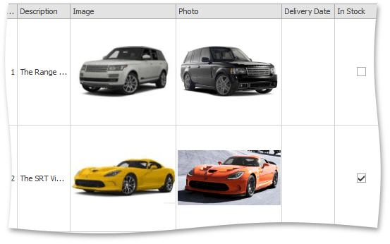
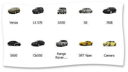
Start with a grid control that displays data using the default Grid View format. Run the application and examine available data that includes car information with images.
Switching to the WinExplorer View Format
Try to create a more elegant layout by switching the View to the WinExplorer type. To do so, use the grid’s Level Designer.
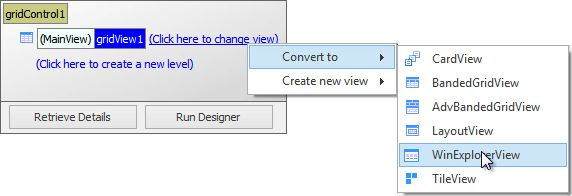
After you’ve switched the View type, the grid becomes empty and you need to build the layout manually.
WinExplorer View Main Columns
The WinExplorer View is designed to visualize four main data fields – images in four different sizes, text, description and checkbox. Additionally, you can specify a column that will apply data grouping, and a column that manages items’ enabled state. All these columns are specified within the WinExplorerView.ColumnSet section. Assign the Model Name column to the WinExplorerViewColumns.TextColumn property, and the Image column to the WinExplorerViewColumns.SmallImageColumn property.
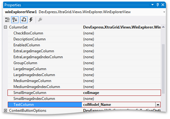
Run the application. Note that if not all image sizes have been associated with a column, the View will automatically resize images when you switch between display styles.
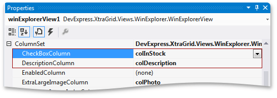
Now set the remaining primary WinExplorerView.ColumnSet properties – description and check box.
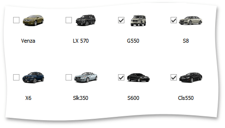
If you launch the app, you can see that nothing has changed. To show checkboxes, you need to expand WinExplorerView.OptionsView and set the WinExplorerViewOptionsView.ShowCheckBoxes property to true.
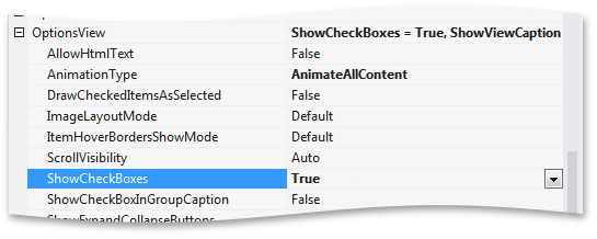
As you can now see, checkboxes appear next to each item. They are checked if the corresponding field values are set to true.
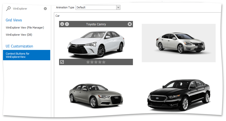
WinExplorer View Styles
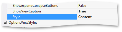
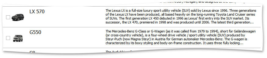
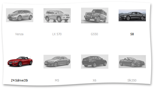
Item descriptions are only displayed in specific display styles, which is specified by the WinExplorerViewOptionsView.Style property under GridView.OptionsView. Change the value to WinExplorerViewStyle.Content.
Run the application to see the description displayed in this layout.
You can add a control to the Ribbon to allow end-users to select one of the seven available display styles. Write the handler that changes the WinExplorerViewOptionsView.Style property value depending on the selected dropdown item.
public Form1() {
    // ...
    foreach (BarCheckItemLink itemLink in barSubItem1.ItemLinks) {
        (itemLink.Item as BarCheckItem).CheckedChanged += Form1_CheckedChanged;
    }
}

void Form1_CheckedChanged(object sender, ItemClickEventArgs e) {
    SetGridStyle(e.Item.Caption);
}

void SetGridStyle(string buttonName) {
    switch (buttonName) {
        case "Small":
            winExplorerView1.OptionsView.Style = DevExpress.XtraGrid.Views.WinExplorer.WinExplorerViewStyle.Small;
            break;
        case "Medium":
            winExplorerView1.OptionsView.Style = DevExpress.XtraGrid.Views.WinExplorer.WinExplorerViewStyle.Medium;
            break;
        case "Large":
            winExplorerView1.OptionsView.Style = DevExpress.XtraGrid.Views.WinExplorer.WinExplorerViewStyle.Large;
            break;
        case "Extra Large":
            winExplorerView1.OptionsView.Style = DevExpress.XtraGrid.Views.WinExplorer.WinExplorerViewStyle.ExtraLarge;
            break;
        case "List":
            winExplorerView1.OptionsView.Style = DevExpress.XtraGrid.Views.WinExplorer.WinExplorerViewStyle.List;
            break;
        case "Tiles":
            winExplorerView1.OptionsView.Style = DevExpress.XtraGrid.Views.WinExplorer.WinExplorerViewStyle.Tiles;
            break;
        case "Content":
            winExplorerView1.OptionsView.Style = DevExpress.XtraGrid.Views.WinExplorer.WinExplorerViewStyle.Content;
            break;
        case "Default":
            winExplorerView1.OptionsView.Style = DevExpress.XtraGrid.Views.WinExplorer.WinExplorerViewStyle.Default;
            break;
    }
}
Launch the app and see how it works by trying different styles.
| WinExplorer View Style | Image |
|---|---|
| Small | 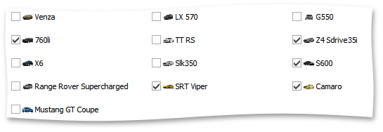 |
| Medium | |
| Large | 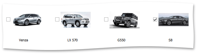 |
| ExtraLarge |  |
| List | 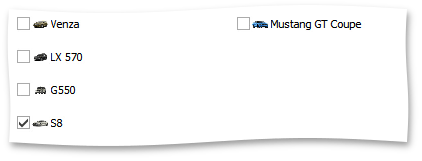 |
| Tiles | 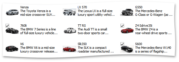 |
| Content | |
Disabling Specific Items
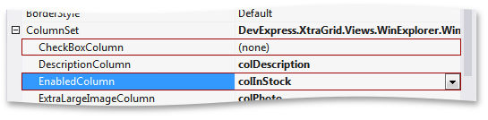
Return to design time and hide the check boxes by setting the WinExplorerViewOptionsView.ShowCheckBoxes property back to false and then assign the InStock column to the WinExplorerViewColumns.EnabledColumn property instead of WinExplorerViewColumns.CheckBoxColumn.
If you launch the app, you can see that now items for sold-out cars appear grayed-out and not clickable.
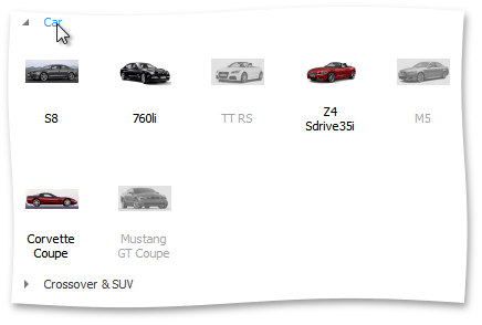
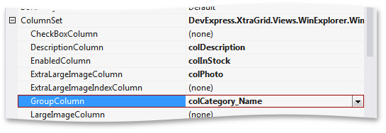
Grouping Data
Finally, you can group your data against values in a column assigned to the WinExplorerViewColumns.GroupColumn property. To group cars by category, first set the WinExplorerViewColumns.GroupColumn property to the Category Name column.
Run the application to see data grouping applied in the WinExplorerViewStyle.Content and WinExplorerViewStyle.Medium display styles.
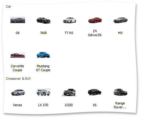
Note that the group titles are not interactive. Return to design time, expand WinExplorerView.OptionsView and set the WinExplorerViewOptionsView.ShowExpandCollapseButtons property to true. Now run the app to see the groups become collapsible. End-users can double-click captions to expand and collapse data groups.