Tile View
- 14 minutes to read
Tile View (the TileView class) displays data records as read-only tiles, which can arrange multiple elements (bound and unbound) in any custom manner. Users can utilize a separate Edit Form to edit tiles

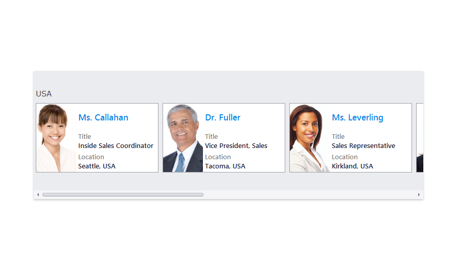
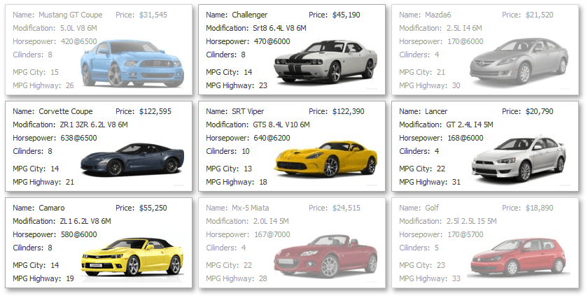
Tile View - LayoutMode: Default (Tiles are arranged down then across or across then down depending on the orientation)
Data Grouping: Disabled, Orientation: Horizontal, RowCount: 3
Tile View - LayoutMode: Default
Data Grouping: Enabled, Orientation: Horizontal, RowCount: 2
Tile View - LayoutMode: Default
Data Grouping: Enabled,Orientation: Horizontal, RowCount: 1
Tile View - LayoutMode: Default
Data Grouping: Enabled, Orientation: Vertical, ColumnCount: 2
Tile View - LayoutMode: Default
Data Grouping: Enabled, Orientation: Vertical, ColumnCount: 1
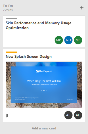
Tile View - LayoutMode: Kanban (Each group arranges tiles in a single column; Independent column scrolling)
Data Grouping: Enabled, Orientation: Horizontal
Tile View - LayoutMode: Kanban (Each group arranges tiles in a single row; Independent row scrolling)
Data Grouping: Enabled, Orientation: Vertical
Tile View - LayoutMode: List (Tiles are arranged in one/multiple columns while stretching to fit the View’s width)
Data Grouping: Enabled, Orientation: Vertical, ColumnCount: 1

Tile View - LayoutMode: List (Tiles are arranged in one/multiple columns while stretching to fit the View’s width)
Data Grouping: Enabled, Orientation: Vertical, ColumnCount: 2

Tile View - LayoutMode: List (Tiles are arranged in one/multiple rows while stretching to fit the View’s height)
Data Grouping: Enabled, Orientation: Horizontal, RowCount: 1

Tile View - LayoutMode: List (Tiles are arranged in one/multiple rows while stretching to fit the View’s height)
Data Grouping: Enabled, Orientation: Horizontal, RowCount: 2
The supported tile layout modes (TileViewItemOptions.LayoutMode) include:
- Default - Tiles are arranged in multiple columns and rows. Automatic tile wrapping is enabled.
- Kanban - This mode is tailored to group tiles by a column, and access each group content independent of other groups (using independent group scrolling). Tile wrapping is disabled.
- List - Tiles are arranged in column(s)/row(s) with the tile stretching feature enabled.
The following are main Tile View features:
- A tile template from which all tiles are generated by default.
- Tile template setup in the Data Grid’s Designer
- Dynamic tile template substitution at runtime, with the TileView.CustomItemTemplate event.
- Bound and unbound elements in the tile template. Unbound elements are used to display static text and images. You can use bound elements to display data from underlying data source fields.
- Multiple tile element alignment options, including alignment relative to other elements, and absolute or relative element size specification.
- Tile grouping by a column.
- Support for tile checking.
- Data editing feature (using a separate Edit Form).
- Tile selection.
- Tile drag-and-drop.
- Tile auto-height.
Demos
Online Videos
Tile View - Basics
This video shows you how to switch the usual grid data layout to the Tile View that displays data records as tiles. You will learn the basics of tile template configuration, such as how to add data bound and unbound elements and position them within the template.
Tile View - Layout & Appearance
Learn how to add items to tiles, custom arrange these items and set up item appearance.
Tile View - Service Columns & Dynamic Tile Customization
In this video, you will learn how to apply data grouping to the Tile View, how to control the enabled state or check the status of tiles depending on a field value, and how to use a specially designed event to customize tile items.
Create Tile View, Bind It to Data and Populate Column Collection
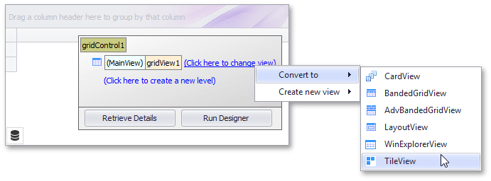
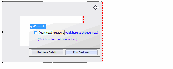
When you create a GridControl, it contains a Grid View that displays data in the column and row format. To convert this View to a TileView at design time, use the Data Grid’s Level Designer.
To supply data to the Tile View, bind the Data Grid to a data source with the GridControl.DataSource and GridControl.DataMember properties. At design time, you can use the grid control’s smart tag.
Once the data grid is bound to data, the Tile View (as with any other View) automatically creates columns (GridColumn objects) for all data source fields.
Note
The column collection (ColumnView.Columns) is not automatically populated if a View already contains any columns.
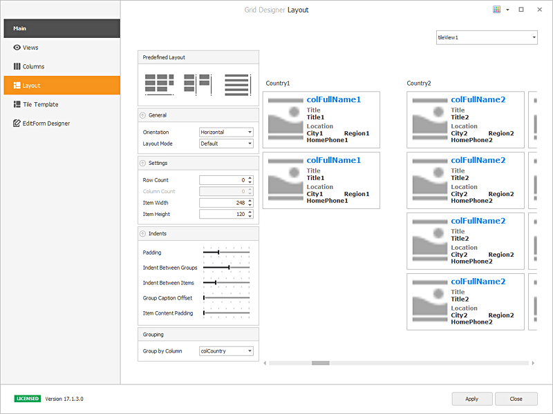
You can use the Data Grid’s main Designer to check the contents of the newly created column collection. Click the Run Designer button and then switch to the Columns Page.
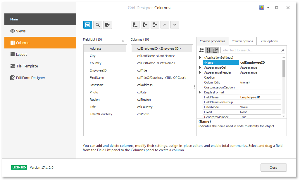
This Designer page allows you to manipulate the column collection. For instance, you can manually create columns and bind them to certain data source fields with the GridColumn.FieldName property. It is also possible to create unbound columns, for which data is provided using a custom expression or a dedicated event.
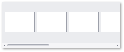
Note that if you run the application now, you may see empty tiles (each tile represents a data source record). The created columns are not visible, as they have not yet been added to a tile template.
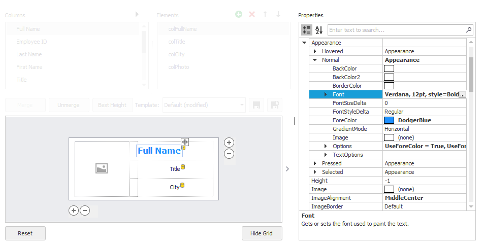
Create Tile Template
The Tile Template specifies the layout of elements within a tile. Below is a sample tile template that contains bound and unbound elements.
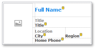
Bound tile elements are those that are linked to and obtain data from certain grid columns (TileViewItemElement.Column). Unbound tile elements are typically used to display static text and images.
Tip
Data for any tile element (bound and unbound) can be customized dynamically for each individual tile with the TileView.ItemCustomize event.
Below is a sample Tile View whose tiles are generated from the template above.

To create a tile template, switch to the Designer’s Tile Template page.
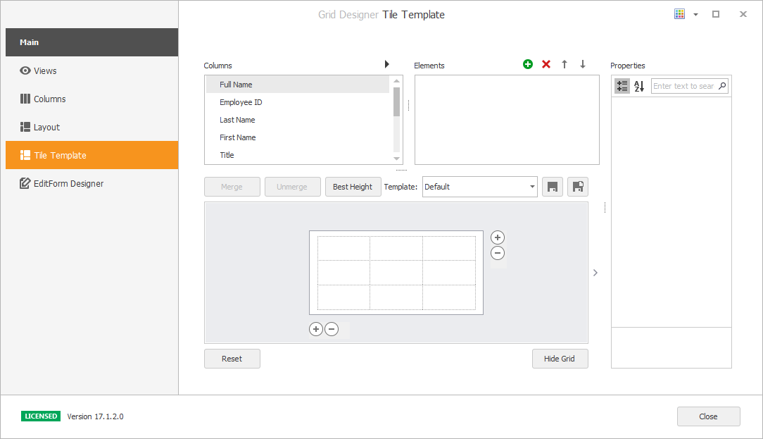
Tile template setup is based on the common Table Layout concept, in which the design surface is divided into logical columns and rows, and the contents are placed in corresponding cells (which can be merged if required).
The supported tile template customization actions include:
Drag-and-drop of grid columns from the Columns list onto the table cells.
When you drop a column onto a cell, a bound tile element (TileViewItemElement) is automatically created.
- Drag-and-drop of created elements between cells.
- Place multiple elements in the same cell, with different alignment options for these elements to prevent overlap.
- Select cells with the mouse pointer and click the Merge button to merge cells.
- Unmerge previously merged cells with the Unmerge button.
- Resize cells with the mouse pointer.
- Drag a tile template’s edges with a mouse pointer to resize it.
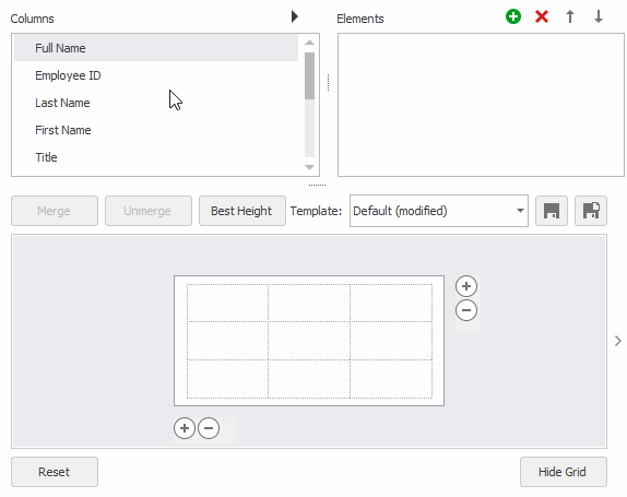
Add/remove columns and rows with the
 buttons and context menu.
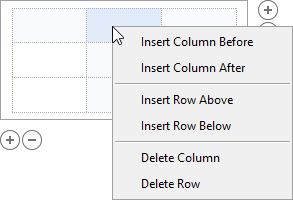
Click a cell to select it, and customize the cell’s size, size type (absolute or relative) and padding in the Property Grid.
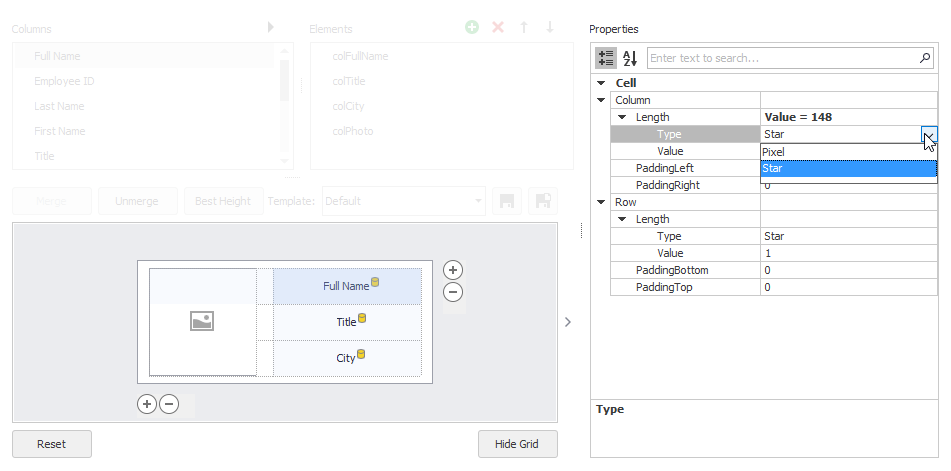
Click a dropped element to access it and customize its settings in the Property Grid.
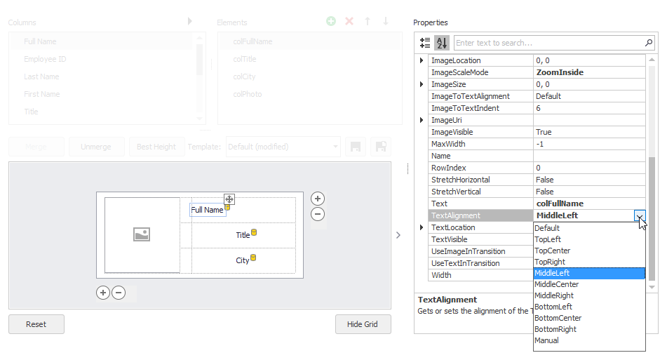
- Manipulate the element collection from the Elements list. For instance, you can add unbound elements. When an element is created, it is automatically added to the template.
- Use the Save As button to save the current template with a different name and create multiple templates. Multiple templates are useful if you use the TileView.CustomItemTemplate event to dynamically provide different templates for tiles.
Tile Element Contents and Alignment
A bound tile element obtains a display value from the linked column. The column’s data type is automatically determined, and thus the tile element automatically chooses the information to display: either text or image.
If you need to display an additional label or image next to a tile element, add a new unbound tile element.
For an unbound tile element, you can supply data with the TileItemElement.Text and TileItemElement.Image/TileItemElement.ImageUri properties. To specify the alignment of an element’s text data relative to the image, see TileItemElement.ImageToTextAlignment.
Tile elements are centered vertically and horizontally within cells by default. There are two options to align elements:
- Align an element within a cell with the TileItemElement.TextAlignment (for text data) and TileItemElement.ImageAlignment (for graphics) properties.
- Align an element relative to another element with the TileItemElement.AnchorElement and TileItemElement.AnchorAlignment properties.
Note
TileView does not support repository items and does not use them to render Tile Item element content.
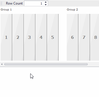
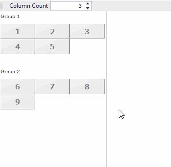
Tile Size and Layout
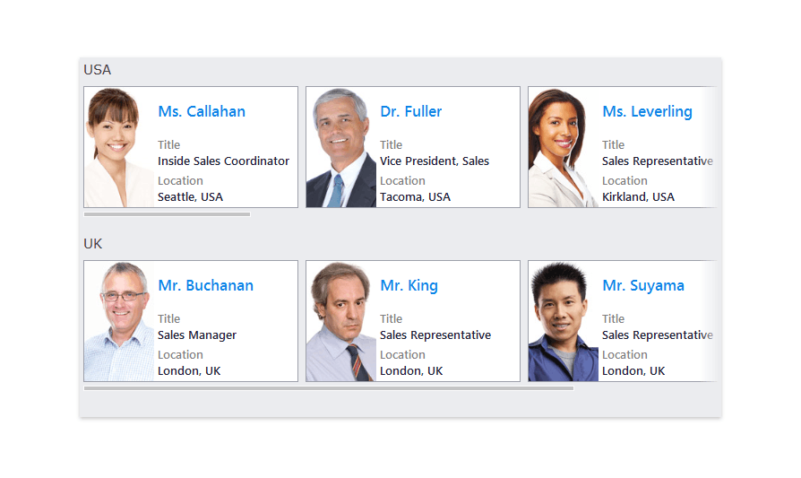
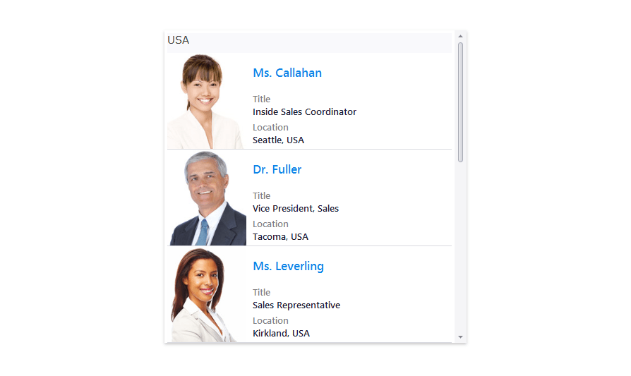
Tile arrangement depends on the currently selected layout mode and orientation. The layout mode also specifies element indents, whether tiles are stretched, and how an end-user scrolls through tiles.
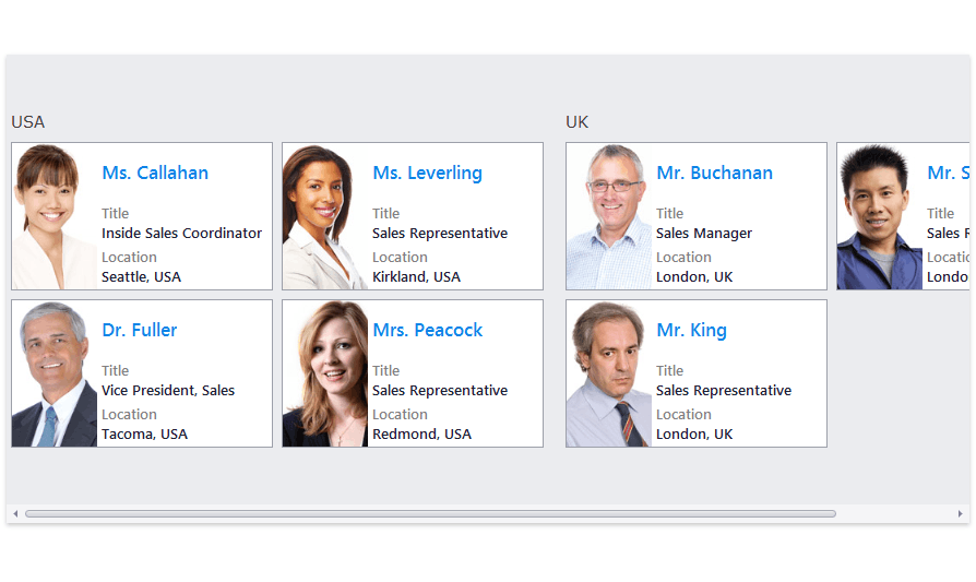
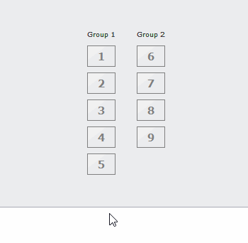
The following image shows the supported layout modes when data grouping is enabled and demonstrates tile scrolling and response to resize operations.
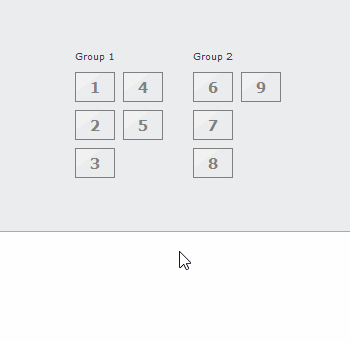
Tile View - LayoutMode: Default
Orientation: Horizontal, RowCount: 3
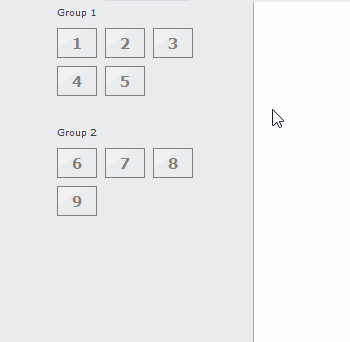
Tile View - LayoutMode: Default
Orientation: Vertical, ColumnCount: 3
Tile View - LayoutMode: Kanban
Orientation: Horizontal
Tile View - LayoutMode: Kanban
Orientation: Vertical
Tile View - LayoutMode: List
Orientation: Horizontal
Tile View - LayoutMode: List
Orientation: Vertical
At design time, you can customize the main layout settings from the Data Grid Designer’s Layout page. This designer page allows you to apply one of the predefined layouts and then tune the layout settings, if needed.
You can also access these and other layout settings from the TileView.OptionsTiles object:
TileViewItemOptions.LayoutMode - Gets or sets the layout mode for tiles within the TileView.
This property allows you to choose from among three layout modes.
- Default - Tiles are arranged in multiple columns and rows. Automatic tile wrapping is enabled.
- Kanban - This mode is tailored to group tiles by a column, and access each group content independent of other groups (using independent group scrolling). Tile wrapping is disabled. For more information, see Kanban Board.
- List - Tiles are arranged in column(s)/row(s) with the tile stretching feature enabled.
- TileViewItemOptions.Orientation - Gets or sets the way tiles are arranged, horizontally or vertically.
- TileViewItemOptions.RowCount - Specifies the row count in the horizontal orientation in List layout mode. In Default layout mode, this property specifies the maximum number of rows.
- TileViewItemOptions.ColumnCount - Specifies the column count in the vertical orientation in List layout mode. In Default layout mode, this property specifies the maximum number of columns.
- TileViewItemOptions.ItemSize - Gets or sets the size of tiles within this TileView.
- TileViewItemOptions.StretchItems - Gets or sets whether tiles are stretched to fit the View’s width/height (depending on the Orientation setting). The property is ignored in List layout mode.
- TileViewItemOptions.Padding - Gets or sets the current TileView padding.
- TileViewItemOptions.IndentBetweenGroups - Gets or sets the distance between neighboring tile groups.
- TileViewItemOptions.IndentBetweenItems - Gets or sets the distance between neighboring tiles within this TileView.
- TileViewItemOptions.GroupTextOffset - Gets or sets the horizontal offset of the group header, in pixels.
- TileViewItemOptions.GroupTextToItemsIndent - Gets or sets the indent between the group header and group items, in pixels.
- TileViewItemOptions.ItemPadding - Gets or sets the padding for all tiles within the TileView.
Tile Auto-Height
Demo: Office Compact View
When you create a tile template, you can enable auto-height mode for a specific template row. This allows tiles to have different heights depending on their contents.
See the following help topic for more information: TableRowDefinition.AutoHeight.
Note
The tile auto-height feature is not supported when Tile Views are bound to server-mode data sources.
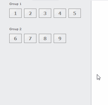
Data Grouping
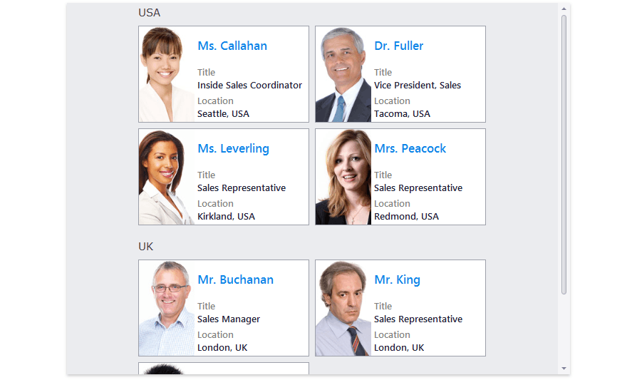
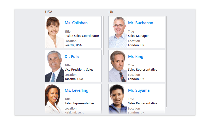
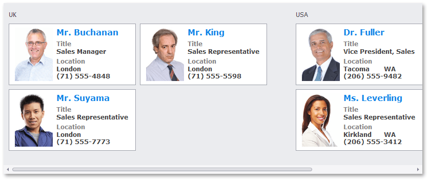
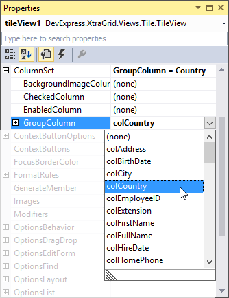
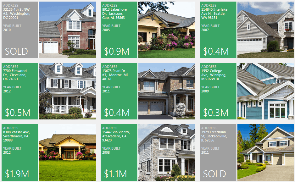
The Tile View can group its tiles by any one column (grouping by multiple columns is not supported). All tiles with identical group column values will be combined into the same tile group (a TileViewGroup object). The following image shows a sample Tile View, whose data is grouped by the Country column.
To enable data grouping, assign a group-by-column to the TileView.ColumnSet.GroupColumn property (TileViewColumns.GroupColumn).
Related API
- TileView.Appearance.GroupText
- TileViewItemOptions.GroupTextPadding
- TileViewItemOptions.IndentBetweenGroups
- TileViewItemOptions.ShowGroupText
Tile Check State
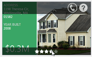
Any Boolean column can control the checked state of tiles. Checked tiles are displayed with a check mark at their top right corner, as the figure below illustrates.
To specify the column that will determine the tile check state, set the TileView.ColumnSet.CheckedColumn property (TileViewColumns.CheckedColumn).
If the check column is specified, users will be able to right-click tiles to toggle the tile check state. This action will fire the TileView.ItemRightClick and TileView.ItemCheckedChanged events.
Tile Enabled State
Similar to the checked column, you can specify a Boolean column that will control the enabled state of each tile. Assign this column to the TileView.ColumnSet.EnabledColumn property (TileViewColumns.EnabledColumn).
The figure below illustrates the visual difference between enabled and disabled tiles. End users are not able to interact with disabled tiles (for instance, they cannot right-click a tile to change the tile check state).
Tile Background Image
You can set images from a specific grid column as tile background images. To do this, assign the column to the TileView.ColumnSet.BackgroundImageColumn property (TileViewColumns.BackgroundImageColumn).
To custom align background images and modify their scale mode, use the TileViewItemOptions.ItemBackgroundImageAlignment or TileViewItemOptions.ItemBackgroundImageScaleMode properties respectively.
Customizing Individual Tiles
All tiles are generated from a template specified by the TileView.TileTemplate property. When you handle the TileView.CustomItemTemplate event, you can dynamically replace the default template with another one for individual or all tiles based on custom logic. You can use the Data Grid Designer’s Tile Template page to create predefined tile templates beforehand. These templates will be stored in the TileView.Templates collection.
Another event that helps you customize the contents of individual tiles is TileView.ItemCustomize. When you handle this event, you can dynamically modify the contents and appearance of tile elements in any tile.
When you handle this event, read the Item event parameter to identify the currently processed tile (TileItem). To access and modify the tile’s elements, use the TileItem.Elements collection.
The code below demonstrates the use of the TileView.ItemCustomize event to change the contents and background color of tile elements.
private void tileView1_ItemCustomize(object sender, DevExpress.XtraGrid.Views.Tile.TileViewItemCustomizeEventArgs e) {
    e.Item.Elements[6].Text = String.Format("${0}M", ((Decimal)(Int32)tileView1.GetRowCellValue(e.RowHandle, colPrice) / 1000000).ToString("0.0"));
    if ((bool)tileView1.GetRowCellValue(e.RowHandle, colSold) == true) {
        e.Item.Elements[1].Image = global::TileViewHomes.Properties.Resources.gray_element;
        e.Item.Elements[6].Text = "SOLD";
    }
}
The following figure illustrates the result.
Tile Selection
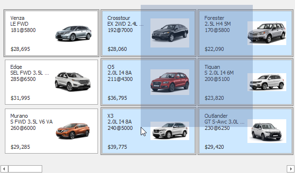
Use the TileView.OptionsSelection.MultiSelect poperty to enable multiple tile selection. You can additionally enable the TileView.OptionsSelection.AllowMarqueeSelection property to allow users to select tiles by dragging the mouse pointer over them with the left mouse button pressed.
Related API
- TileView.Appearance.ItemSelected - Specifies the appearance settings used to paint selected tiles.
- ColumnView.GetSelectedRows() - Returns the handles of currently selected tiles.
- ColumnView.SelectedRowsCount - Returns the number of selected tiles.
- ColumnView.SelectRow(Int32) - Allows you to select a specific tile.
- ColumnView.SelectAll() - Selects all tiles.
- ColumnView.SelectRange(Int32, Int32) - Selects a continuous range of tiles.
Context Buttons
Tile View can display context buttons for its tiles.
The TileView.ContextButtons property allows you to specify one set of context buttons, which will be applied to each tile. If required, you can handle a dedicated event to dynamically modify the availability of context buttons for certain tiles. See the following help topic to learn more: TileView.ContextButtons.
Appearance
Appearance settings for tiles and their elements can be adjusted at three levels:
- Appearance settings provided by the Tile View (TileView.Appearance) - These are the default appearance settings for all tiles and tile elements.
- Appearance settings provided by tiles (TileItem.Appearance) - These override the default appearance settings. You can customize the tile appearance settings by handling the TileView.ItemCustomize event.
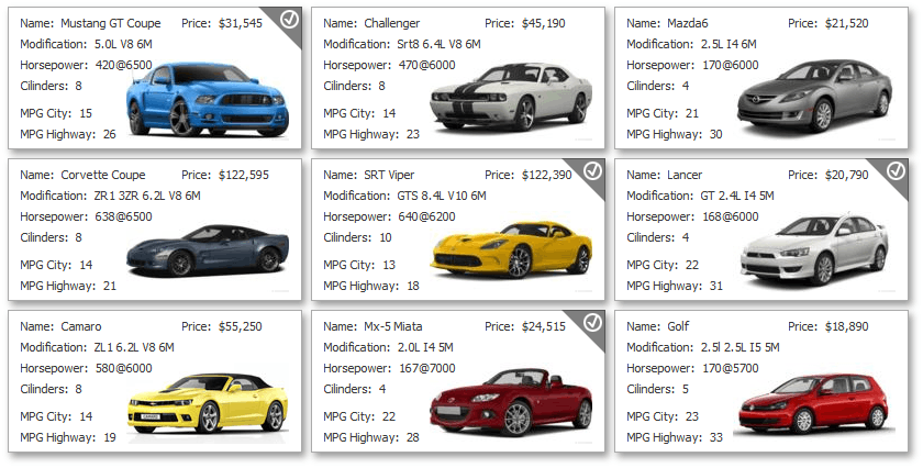
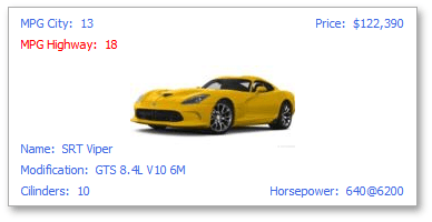
Appearance settings provided by tile elements (TileItemElement.Appearance) - These settings, which override the default settings and tile settings, can be customized by handling the TileView.ItemCustomize event, and at design time using the Data Grid Designer’s Tile Template page (see the image below).
The figure below demonstrates a tile with all tile elements (except one) painted with a blue color, which is set as default. The MPG Highway element overrides this setting to display a red foreground color.
The appearance of group captions can be customized with the TileView.Appearance.GroupText property. All tile groups use the same appearance settings.

Drag-and-drop
The TileViewOptionsDragDrop.AllowDrag property enables built-in drag-and-drop of tiles within the current Tile View. Handle dedicated events to perform actions during tile drag-and-drop operations.
Related API
- TileViewOptionsDragDrop.ShowDropIndicators
- TileView.BeforeItemDrag
- TileView.BeforeItemDrop
- TileView.ItemDrop
To enable drag-and-drop of tiles to/from another Tile View and Grid View, use Drag And Drop Behavior (part of the BehaviorManager component).