Tutorial: Tile View - Element Layout and Appearance
- 3 minutes to read
This walkthrough is a transcript of the Tile View - Element Layout and Appearance video available on the DevExpress YouTube Channel.
In this tutorial, you will learn more about populating the tile layout with data.
Starting Point
Begin with a Tile View that displays a data-bound image and a static text element (see Tutorial: Tile View - Basics).

Task
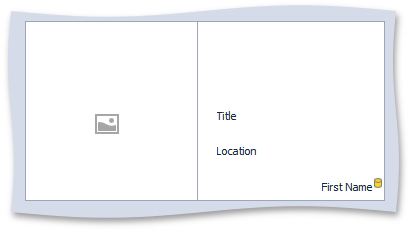
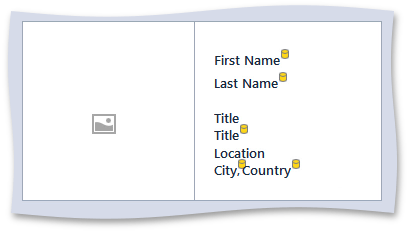
This is how the same View will look after you’re done with the customization.

Customizing Element Layout
Adding an Unbound Tile Element
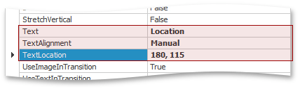
Open the Tile Template page in the grid control’s Designer dialog. Add an unbound element, change its TileItemElement.Text to Location and then specify its position so that it’s displayed under the previously added element.
Adding a Bound Tile Element
Then, select the First Name column and add a tile element bound to it.
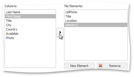
Note that the preview shows a yellow icon next to this element indicating that it is bound to data.
Once again specify a custom position for this element, now above all other text elements.

Adding Other Tile Elements
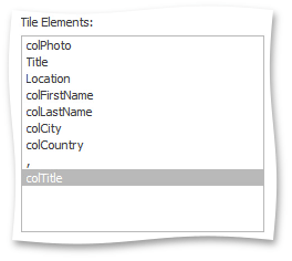
Add tile elements for other data fields and one static text element that has a comma as its display text.
Grouping Tile Elements
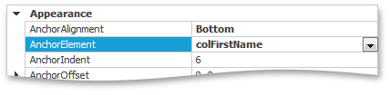
If elements need to go together, such as the first and last name, consider arranging them by anchoring one to the other. Select the Last Name element and set its TileItemElement.AnchorElement and TileItemElement.AnchorAlignment properties. You can also set the TileItemElement.AnchorIndent property to specify the distance between these elements.
Using this approach anchor tile elements into multiple groups and launch the app to see the result. Tiles now display all required information.

Customizing Element Appearance
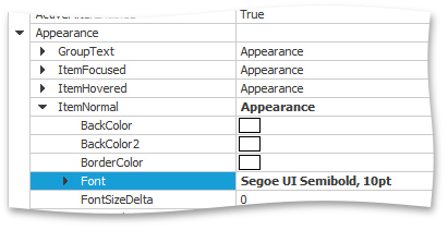
The next step is to customize element styles. Start with font settings applied to all tile items, which are available using the View’s TileView.Appearance property under ItemNormal. Change the font to Segoe UI Semibold, 10 pt.
Switch to the Tile Template page in the Designer to see the result.
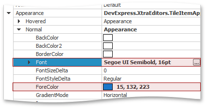
Individual elements have their own appearance settings that override the styles specified at the View level. Select a tile element and expand its TileItemElement.Appearance property. Modify the settings under TileItemAppearances.Normal.
Run the application to see the result.
Arranging Tiles in Multiple Rows
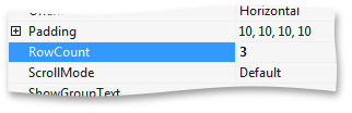
Finally, you can modify the TileViewItemOptions.RowCount property to arrange your tiles in multiple rows. Set this property to 3, meaning that the grid can display up to three rows depending on the container’s height.
Run the application and see that the current window size only allows the grid to fit two rows.