Tutorial: Column Filter Dropdowns
- 7 minutes to read
This walkthrough is a transcript of the Column Filter Dropdowns video available on the DevExpress YouTube Channel.
The tutorial will show you the Microsoft Excel and Microsoft Windows Explorer inspired data filtering features available in the DevExpress WinForms grid, including:
- Filter dropdown lists
- Custom Filter Dialogs
- Most Recently used filter values
- Filter dropdowns for date-time values
- Checked lists in filter dropdowns
You will learn what’s available by default, how to disable or customize these data filtering UI elements.
Regular Filter Dropdown Lists
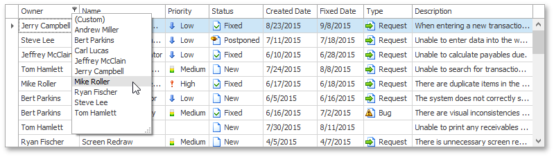
Excel-style filter dropdowns are available using the buttons that appear when you hover column headers. For all column types, except date-time, the filter dropdown displays a simple list where you can select one item at a time.
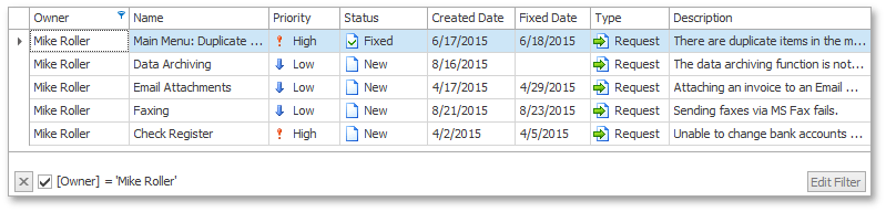
When you select an item, the grid automatically closes the dropdown and filters the grid’s data to display records that have the selected value in the corresponding column.
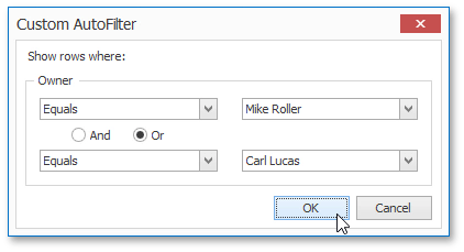
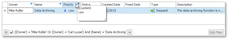
Dropdown lists also provide the (Custom) item, which invokes the Custom Filter Editor. Much like in Microsoft Excel, this dialog allows end-users to specify up to two filter conditions. Display records whose owner is Mike Roller or Carl Lucas.
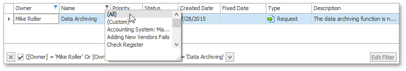
You can filter the grid’s data against multiple columns. If you click another column’s filter button, you’ll only see values from the records that meet the previously applied filter criteria. If you need to see values fetched from all records, click the filter button while holding the SHIFT key pressed. If a filter condition is applied to a column, this column’s filter dropdown shows all values.
To clear filtering by a specific column, click the (All) item in the corresponding dropdown list.
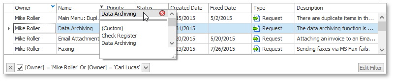
After that, you can click a column’s filter button again to find the most recently used items at the top of the list. They are separated from the rest of the items by a double line.
Now close the application and expand the View’s ColumnView.OptionsFilter property. To disable the recently used filter items display, turn off the ColumnViewOptionsFilter.AllowColumnMRUFilterList option. Change the dropdown height by setting the ColumnViewOptionsFilter.ColumnFilterPopupMaxRecordsCount property to 10.
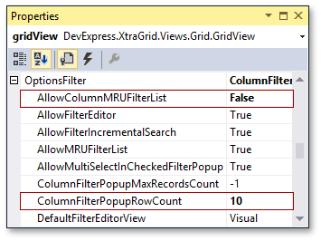
Run the application. Now column header dropdowns display 10 or less items and a vertical scrollbar, if required. Filter dropdowns no longer display the most recently used items.
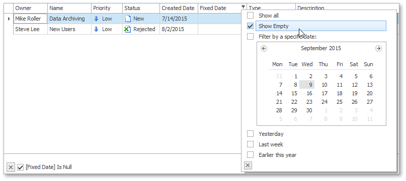
Calendar Filter Dropdowns
Click the filter button in a date-time column. You’ll see a dropdown that has an embedded calendar in it. After selecting the desired date or interval, the grid immediately filters its data.
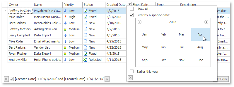
You can also use check boxes below the calendar to select common date intervals such as “Earlier this month”, “Earlier this year”, and so on. To clear the current filter, select the Show all check box. To hide the dropdown, click the close button.
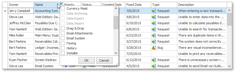
Checked Filter Dropdown Lists
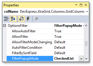
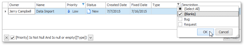
You can also use check list dropdowns, much like in newer versions of Microsoft Excel or Windows File Explorer. To enable this mode, select a column, expand its GridColumn.OptionsFilter property and set the OptionsColumnFilter.FilterPopupMode option to FilterPopupMode.CheckedList.
Run the application and click the column’s filter button. Now you can select multiple items simultaneously. Select three values and click OK.
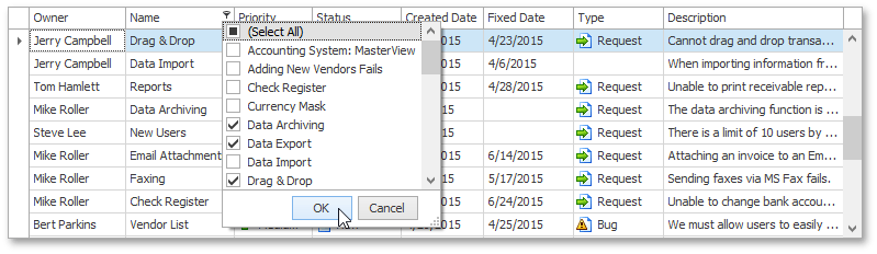
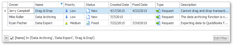
The grid now displays records that have any of those values selected in the dropdown.
To clear filtering against this column, invoke the dropdown, click Select All, and then OK.
Filtering Empty and Null Values
Filter dropdowns provide special items to handle empty or null values. If you select the (Blanks) item in the dropdown, the grid will display records whose values are empty.
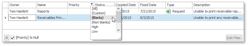
In the same manner, you can select (Non Blanks) to filter out those empty values. Similarly, checked dropdown lists provide the (Blanks) item.
Dropdowns for date-time columns don’t include such items by default.
Close the application. To hide the (Blanks) and (Non Blanks) items from dropdowns, set the OptionsColumnFilter.ShowBlanksFilterItems property to False. Select the Fixed Date column and set its OptionsColumnFilter.ShowEmptyDateFilter option to True. This adds a checkbox for null values into date-time filter dropdowns.
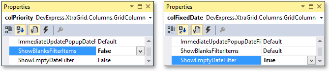
Run the application to see the result. Invoke the Priority column dropdown and see that it doesn’t contain (Blanks) and (Non Blanks) items. Then, click the filter button within the Fixed Date column header. Now this column dropdown displays the additional Show Empty check box.
Customizing Filter Dropdown Lists
The grid also allows you to manually customize filter dropdown lists.
Customizing Regular Dropdown Lists
You can add new or delete existing items. Switch to design time to see how this can be done.
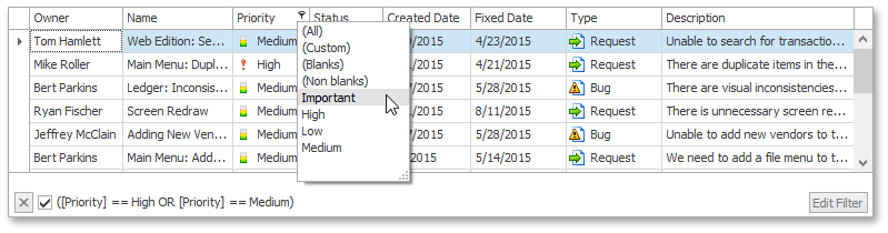
Regular dropdown lists can be customized with the View’s ColumnView.ShowFilterPopupListBox event, which fires before the filter dropdown is displayed. Write a handler for this event to add a new custom item to the Priority column’s dropdown. The event’s Column parameter specifies the column whose dropdown is about to be displayed. First, find the index of the first value item to insert a custom item before it. To do this, iterate through items displayed by the current dropdown using the RepositoryItemComboBox.Items property of the event’s FilterPopupListBoxEventArgs.ComboBox parameter. To skip a double line that separates MRU items from predefined items, check whether the current item is represented by the FilterItem object. Then, use the current item’s Value property. If it’s of the FilterItem or ColumnFilterInfo type, then the current item is not a value item. Once a value item is detected, the search process should be stopped.
After that, create a filter criterion to select records with High and Medium priorities. Specify the desired filter condition and text to display within the filter panel, and create a new ColumnFilterInfo object with these settings. Insert the new filter item with the “Important” caption into the located position within the filter dropdown.
private void gridView_ShowFilterPopupListBox(object sender, FilterPopupListBoxEventArgs e) {
    if (e.Column.FieldName != "Priority") return;
    // Get the index of the first value item.
    int index;
    for (index = 0; index < e.ComboBox.Items.Count; index++) {
        object item = e.ComboBox.Items[index];
        if (item is FilterItem) {
            object itemValue = ((FilterItem)item).Value;
            if (itemValue is FilterItem || itemValue is ColumnFilterInfo) continue;
            break;
        }
    }
    // Create a filter criterion to select records with the "High" and "Medium" priorities.
    string filterString = "([Priority] == 3 OR [Priority] == 2)";
    string filterDisplayText = "[Priority] == High OR [Priority] == Medium";
    ColumnFilterInfo filterInfo = new ColumnFilterInfo(filterString, filterDisplayText);
    e.ComboBox.Items.Insert(index, new FilterItem("Important", filterInfo));
}
Run the application to see the result. Click the Priority column’s filter button to find the Important item displayed within the dropdown. When you select this item, the grid displays records with the priority set to High or Medium.
Customizing Checked Dropdown Lists
Now close the application and customize the checked dropdown list in the Name column. Select the View and handle its ColumnView.ShowFilterPopupCheckedListBox event. The event’s Column parameter identifies the column whose dropdown is about to be displayed. The FilterPopupCheckedListBoxEventArgs.CheckedComboBox parameter provides the item collection of the dropdown list. The event handler disables items starting with ‘Data’ and removes items starting with ‘Help’.
private void gridView_ShowFilterPopupCheckedListBox(object sender, FilterPopupCheckedListBoxEventArgs e) {
    if (e.Column.FieldName != "Name") return;
    for (int i = 0; i < e.CheckedComboBox.Items.Count; i++) {
        CheckedListBoxItem item = e.CheckedComboBox.Items[i];
        string itemValue = (string)(item.Value as FilterItem).Value;
        // Disable checked items that start with "Data".
        if (itemValue.StartsWith("Data"))
            e.CheckedComboBox.Items[i].Enabled = false;
        // Remove checked items that start with "Help".
        if (itemValue.StartsWith("Help")) {
            e.CheckedComboBox.Items.Remove(item);
            i--;
        }
    }
}
Run the application again and click the filter button in the Name column. The checked dropdown list that appears doesn’t contain items starting with ‘Help’ and has three disabled items whose text starts with ‘Data’.