Card and Layout Views
- 4 minutes to read
|
| In Card View (CardView class), data source records are represented as cards arranged down and then across. The Layout View (LayoutView class) offers more layout modes and is significantly more advanced in terms of provided features and customization flexibility. Common Information Card View Layout View |
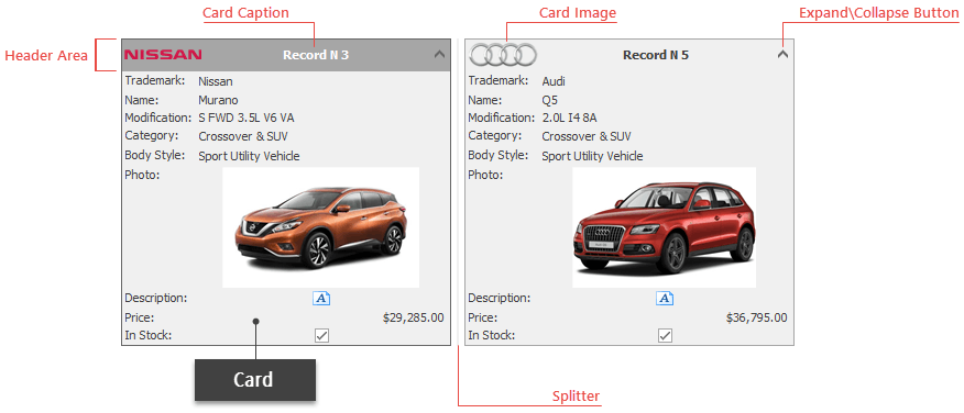
Cards
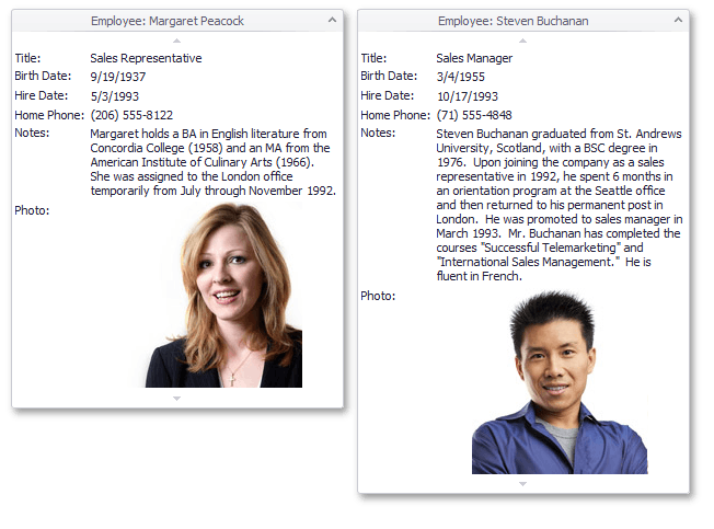
Cards in both Views display captions with embedded collapse\expand buttons for end-users to minimize and restore these cards. In cases where cards do not fit a current View height, end-users can scroll them. Neighboring cards are visually delimited by splitters that allow end-users to resize these cards (in Card View only).
Property Name (Card View) | Property Name (Layout View) | Description |
|---|---|---|
Allow you to hide card captions or change their default “Record N {0}” format. | ||
Handle this event to supply icons for card headers. | ||
When cards do not vertically fit in the View, end-users can scroll card content by embedded scroll buttons (Card View) or by entering the Panning mode (Layout View). | ||
In Card View, these settings specify card widths and the availability of card splitters. Card widths in the Layout View can be changed only in the customization window. | ||
Allow you to disable card expand\collapse buttons or render them invisible. |
Multiple Card Selection
If the ColumnViewOptionsSelection.MultiSelect option is enabled, end-users can click cards with the “Ctrl” or “Shift” keys pressed to select multiple records at once. In addition, the Layout View also supports marquee selection.
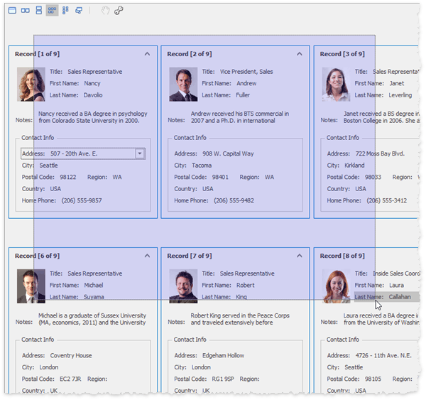
In code, call the ColumnView.SelectRange method to select multiple cards manually or the ColumnView.GetSelectedRows method to retrieve all currently selected cards.
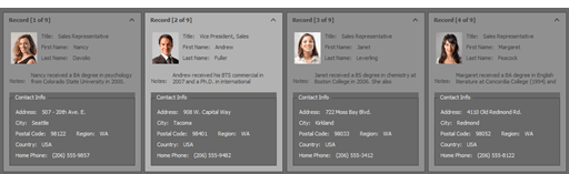
Card View: Field Captions and Value Cells
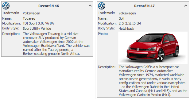
Cards display data in the “Caption: Value” format.
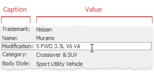
- A caption displays the GridColumn.Caption property value and can be hidden by disabling the CardOptionsView.ShowFieldCaptions property.
- A value is the data source value displayed by the in-place editor assigned to the related grid column.
- You can specify different appearance settings for captions and values through the CardViewAppearances.FieldCaption and CardViewAppearances.FieldValue properties respectively.
Card View: Layout
The layout of cards in Card View depends on row and column counts, card size settings and card indents.
Rows and columns
- CardView.MaximumCardRows - allows you to limit the number of card rows.
- CardView.MaximumCardColumns - limits the number of columns.
Card size
- CardView.CardWidth - specifies the card width (200 pixels by default). If the CardOptionsBehavior.AutoHorzWidth option is enabled, cards stretch horizontally to occupy the View’s client area, but no more than the “MaximumCardColumns” setting allows them to.
- Card height is determined automatically depending on the card content - cards stretch vertically until they reach the maximum available row height (the “MaximumCardRows” setting) or the current View’s client area height.
If the CardOptionsView.ShowEmptyFields option is disabled, cards do not display empty values, which may cause cards to have different heights.
Cards can also have different heights when the CardOptionsBehavior.FieldAutoHeight setting is enabled. In this case, PictureEdit and MemoEdit in-place editors gain only as much height as their content requires.
Card Indent
- Both vertical and horizontal distances between cards are controlled by the CardView.CardInterval property.
Card View: Scrolling
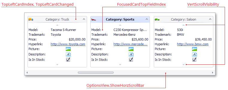
The Card View provides a horizontal scroll bar for the entire View (allows end-users to scroll through cards) and a vertical scroll bar for individual cards that do not fit vertically in the current View region. When scrolling horizontally, the minimal scroll step is one card.
Related API
CardOptionsView.ShowHorzScrollBar, CardView.VertScrollVisibility - specify whether or not scrolls are available.
CardView.TopLeftCardIndex - gets or sets the first visible card.
CardView.TopLeftCardChanged - occurs when end-users scroll through cards.
CardView.FocusedCardTopFieldIndex - allows you to scroll a focused card down to the required field.
Card View: Customization Panel
End-users can click the “Customize” button at the View’s top left corner to invoke the customization panel, apply filtering, sorting, and toggle column visibility.
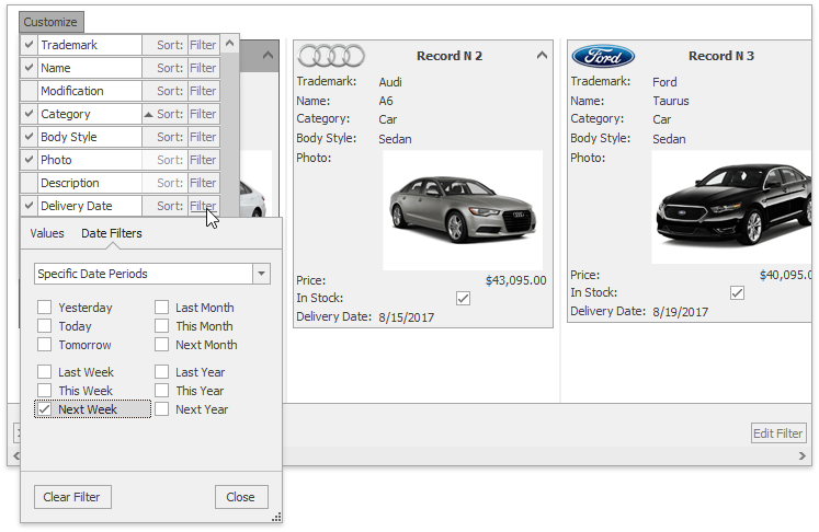
Set the CardOptionsView.ShowQuickCustomizeButton property to false to disable this button.