Tutorial: Grouping Basics
- 6 minutes to read
This walkthrough is a transcript of the Grouping Basics video available on the DevExpress YouTube Channel.
The tutorial starts with the data grouping UI available in the DevExpress WinForms grid by default. It then shows you how to apply the data grouping at design time and goes on to cover related options, such as:
- using predefined value ranges to group data;
- anchoring group rows to the top of the view when scrolling large data groups;
- changing group row paint style;
- automatically expanding group rows;
- disabling end-user data grouping.
Finally, the tutorial will guide you through the basic API you can use to group data in code.
Default Behavior
To group data by a specific column, end-users can drag a header from the column header panel onto the group panel. The GridControl automatically sorts data groups in ascending order. To reverse the sort order, click the column header.

To expand a group row and thus access its child data rows, double-click anywhere on the group row or click the row’s expand button.

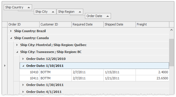
One more way to group data is by selecting the Group by This Column item from the column header context menu. With two or more columns in the group panel, rows will form a hierarchy according to grouping column values.

You can drag a column header to another position within the group panel.
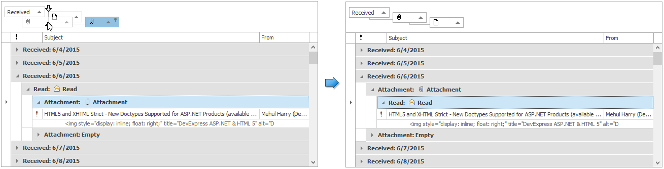
When dragging column headers, hold the Ctrl key to dock one header to another. This allows you to group grid data by multiple columns at once.
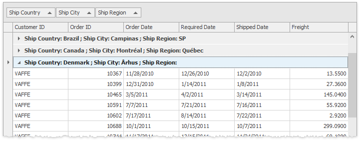
Merged column grouping blocks can be combined with regular column grouping.
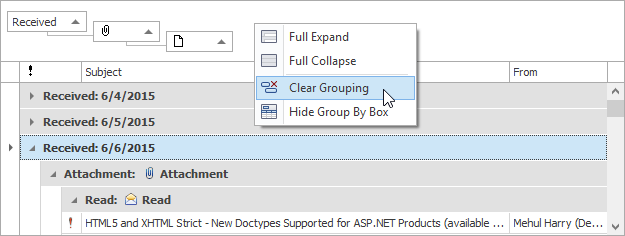
To ungroup data, drag a column header from the group panel to the column header panel, or right-click a column header and select Ungroup from the context menu. To remove all grouping, right-click the group panel and select Clear Grouping.
Grouping at Design-Time
At design time, you can use the same drag-and drop operations and context menus. In addition to that, you can use a column’s GridColumn.GroupIndex property. Set this property to a non-negative integer value, which specifies the grouping level. Set it to 0 for the Received column and to 1 for the Read column. As a result, the Received column will be at the root grouping level, the Read column will be at the second level.

Run the application and try expanding and collapsing rows to see the logic behind data row grouping.
Predefined Value Ranges
By default, data groups contain identical values, but the grid also allows you to group ranges of values together. This can be easily demonstrated with date/time columns. Open the Property grid displaying the Received column’s settings and set the GridColumn.GroupInterval property to ColumnGroupInterval.DateRange. As a result, the grid rows are combined into date ranges including “Today”, “Yesterday”, “Last Week”, and so on.

Related Options
Next, review the options that affect grid behavior as it concerns data grouping.
By default, grouping column values are only displayed within group rows and the columns are not shown within the View. If you need to display them, expand the grid view’s GridView.OptionsView property and enable the GridOptionsView.ShowGroupedColumns option. You’ll see that the grouping column now stays within the View.

The View’s GridOptionsView.GroupDrawMode property specifies the paint style for group rows. Let’s change this property value. The paint style typically affects the height of group rows and indents of data groups.

Now expand the View’s GridView.OptionsBehavior property and enable the GridOptionsBehavior.AllowFixedGroups option. When scrolling through grouped data, the top group row is anchored to the top of the grid and is always displayed. A special glyph indicates that you’ve already scrolled past a part of rows in this group.

Data groups are usually collapsed after grouping operations. To automatically expand all the group rows, set the GridOptionsBehavior.AutoExpandAllGroups property to true. See how all data rows become visible if you change grouping.

Restricting End-User Capabilities
The GridControl allows you to prevent end-users from changing the grouping conditions already applied to the grid. Set a column’s OptionsColumn.AllowGroup property to false to prevent end-users from grouping against this column. To do the same for all columns within a view, disable the View’s GridOptionsCustomization.AllowGroup property. In addition, you can hide the group panel using the View’s GridOptionsView.ShowGroupPanel property.

Grouping in Code
The next step is to see how to group grid data in code. Note that this works regardless of the View’s GridOptionsCustomization.AllowGroup and the column’s OptionsColumn.AllowGroup options.
Group data by the Received and Read columns in a button’s Click event handler. First, obtain the corresponding two grid column objects. Clear existing group settings by calling the View’s GridView.ClearGrouping method. Then, use the GridColumn.GroupIndex property to set required grouping levels. Note that the GridControl will re-sort its data after each statement – three times in our example. To prevent excessive updates, use the ColumnView.BeginSort and ColumnView.EndSort methods. In this case, the grid view will be updated only once.
private void btn_Group_ItemClick(object sender, ItemClickEventArgs e) {
    GridColumn colReceived = gridView.Columns["Date"];
    GridColumn colRead = gridView.Columns["Read"];
    gridView.BeginSort();
    try {
        gridView.ClearGrouping();
        colReceived.GroupIndex = 0;
        colRead.GroupIndex = 1;
    }
    finally {
        gridView.EndSort();
    }
}
Run the application and click the Group button. As a result, grid data is grouped by the Received and Read columns.
Another way to apply grouping to grid columns is using the View’s ColumnView.SortInfo collection. Call the GridColumnSortInfoCollection.ClearAndAddRange method to clear existing sorting/ grouping settings, and then sort and group data as needed. Pass an array of two GridColumnSortInfo elements as the first parameter of the method. These elements apply sorting to the Received and Read columns in ascending order. Pass 2 as the second parameter thus indicating that data grouping, not sorting, needs to be applied. The method updates the View only once, so you don’t need to use the ColumnView.BeginSort and ColumnView.EndSort methods.
private void btn_Group_ItemClick(object sender, ItemClickEventArgs e) {
    GridColumn colReceived = gridView.Columns["Date"];
    GridColumn colRead = gridView.Columns["Read"];
    gridView.SortInfo.ClearAndAddRange(new GridColumnSortInfo[] {
        new GridColumnSortInfo(colReceived, DevExpress.Data.ColumnSortOrder.Ascending),
        new GridColumnSortInfo(colRead, DevExpress.Data.ColumnSortOrder.Ascending),
        }, 2);
}
Now run the application again and click the Group button to see the result.
To expand all group rows in the Expand All Groups button’s Click event handler, use the View’s GridView.ExpandAllGroups method. Similarly, write the Click event handler for the Collapse All Groups button with the GridView.CollapseAllGroups method call.
private void btn_Expand_ItemClick(object sender, ItemClickEventArgs e) {
    gridView.ExpandAllGroups();
}

private void btn_Collapse_ItemClick(object sender, ItemClickEventArgs e) {
    gridView.CollapseAllGroups();
}
Run the application and group data by clicking the Group button. When you click the Expand All Groups button, all data rows become visible. To collapse group rows, click the Collapse All Groups button.