WindowsUI Button Panel
- 5 minutes to read
The WindowsUI Button Panel is a stand-alone container for buttons painted in the Windows 10-inspired flat style. In code, these panels are represented by the WindowsUIButtonPanel class instances.
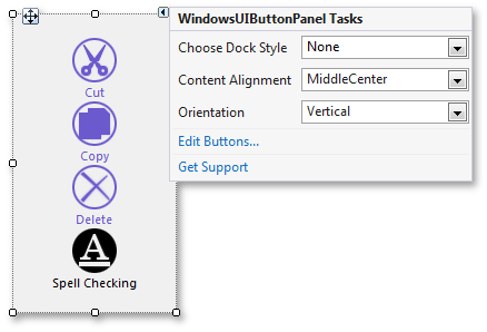
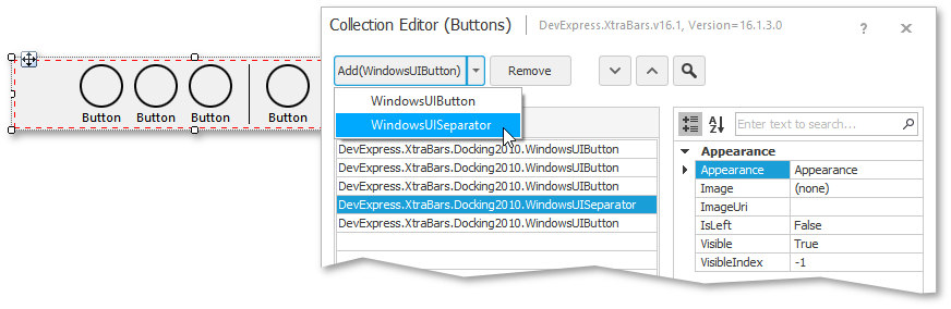
The “Edit Buttons” link in the control’s smart tag invokes the Collection Editor dialog. Using this dialog, you can add buttons and separators (non-clickable elements that visually delimit neighboring buttons). To select which element to add, use the Collection Editor’s combo box editor as shown below. The property grid on the dialog’s right allows you to modify appearance and behavior settings for any element added. For instance, you can utilize the Style property for a button to specify whether it should act as a regular push button or as a check button.
To populate a panel in code, use the WindowsUIButtonPanel.Buttons collection. This collection accepts child elements of the WindowsUIButton and WindowsUISeparator classes. A code sample below illustrates the example.
windowsUIButtonPanel1.AllowGlyphSkinning = true;
WindowsUIButton checkBtn1 = new WindowsUIButton() {
    Caption = "Left",
    Style = ButtonStyle.CheckButton,
    ImageUri = "AlignLeft;Size16x16;GrayScaled",
    GroupIndex = 1
};
WindowsUIButton checkBtn2 = new WindowsUIButton() {
    Caption = "Center",
    Style = ButtonStyle.CheckButton,
    ImageUri = "AlignCenter;Size16x16;GrayScaled",
    GroupIndex = 1
};
WindowsUIButton checkBtn3 = new WindowsUIButton() {
    Caption = "Right",
    Style = ButtonStyle.CheckButton,
    ImageUri = "AlignRight;Size16x16;GrayScaled",
    GroupIndex = 1
};
WindowsUIButton pushBtn1 = new WindowsUIButton() {
    Caption = "Home",
    Style = ButtonStyle.PushButton,
    ImageUri = "Home;Size16x16;GrayScaled"
};
windowsUIButtonPanel1.Buttons.AddRange(new WindowsUIButton[] { checkBtn1, checkBtn2, checkBtn3, pushBtn1 });
windowsUIButtonPanel1.Buttons.Insert(3, new WindowsUISeparator());
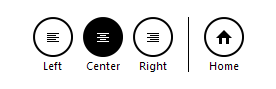
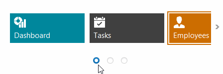
The figure below illustrates the result.
To customize button appearance settings, see the WindowsUIButtonPanel.AppearanceButton property.
Example
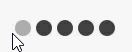
This code sample illustrates how to use the WindowsUIButtonPanel control to create a compact Windows-inspired content navigator (see the animation below). You can use this navigator to switch modules within any content container, e.g., a Navigation Frame.
To implement this navigator you need to do the following.
- Create the required number of WindowsUIButton objects and add them to the panel’s WindowsUIButtonPanel.Buttons collection.
- Set the Style property for each button to CheckButton and the GroupIndex property to the same integer value. This will unite all your buttons into a radio group: end-users will be able to check only one button at a time.
- Set the UseCaption property to false for all buttons.
- Specify required button images.
- Hide circular button borders by setting the WindowsUIButtonPanel.UseButtonBackgroundImages property to false. Now when your buttons have neither borders nor captions, they will shrink to the size of their images.
- Specify the WindowsUIButtonPanel.ButtonInterval property to move buttons close or further to (from) each other.
- Handle the WindowsUIButtonPanel.ButtonChecked event. The e.Button property allows you to identify which exact button has been checked.
using System.Drawing;
using DevExpress.XtraBars.Docking2010;

namespace WinUIPanelExample {
    public partial class Form1 : DevExpress.XtraEditors.XtraForm {
        public Form1() {
            InitializeComponent();
            windowsUIButtonPanel1.AllowGlyphSkinning = true;
            windowsUIButtonPanel1.AppearanceButton.Pressed.BackColor = Color.DarkGray;
            windowsUIButtonPanel1.UseButtonBackgroundImages = false;
            windowsUIButtonPanel1.ButtonInterval = 5;
            WindowsUIButton navButton1 = new WindowsUIButton() {
                Tag = "Ad1",
                Checked = true
            };
            WindowsUIButton navButton2 = new WindowsUIButton() {
                Tag = "Ad2"
            };
            WindowsUIButton navButton3 = new WindowsUIButton() {
                Tag = "Ad3"
            };
            WindowsUIButton navButton4 = new WindowsUIButton() {
                Tag = "Ad4"
            };
            WindowsUIButton navButton5 = new WindowsUIButton() {
                Tag = "Ad5"
            };
            windowsUIButtonPanel1.Buttons.AddRange(new WindowsUIButton[] { navButton1, navButton2, navButton3, navButton4, navButton5 });
            foreach(WindowsUIButton navButton in windowsUIButtonPanel1.Buttons) {
                navButton.Style = ButtonStyle.CheckButton;
                navButton.ImageUri = "Add;Size16x16;Colored";
                navButton.GroupIndex = 1;
                navButton.UseCaption = false;
            }
            windowsUIButtonPanel1.ButtonChecked += windowsUIButtonPanel1_ButtonChecked;
        }

        void windowsUIButtonPanel1_ButtonChecked(object sender, ButtonEventArgs e) {
            string tag = ((WindowsUIButton)e.Button).Tag.ToString();
            switch(tag) {
                case "Ad1":
                    /* Navigate to page A */
                    break;
                case "Ad2":
                    /* Navigate to page B */
                    break;
                case "Ad3":
                    /* Navigate to page C*/
                    break;
                case "Ad4":
                    /* Navigate to page D */
                    break;
                case "Ad5":
                    /* Navigate to page E */
                    break;
            }
        }
    }
}
Pager Navigation
The RadioGroup and WindowsUIButtonPanel can be used as a pager for the following controls:
The pager automatically splits the target control’s content into pages, and provides navigation buttons to scroll to corresponding pages. The pager navigation functionality is implemented as a Behavior and can be added to your controls using the BehaviorManager component.