Office Navigation Bar
- 5 minutes to read
The OfficeNavigationBar is a customizable navigation bar with flat borderless buttons. This control can operate separately or in conjunction with the Navigation Bar. The following figure illustrates a sample Office Navigation Bar painted with Office 2013 Light Gray DevExpress skin.

This document illustrates how to populate and customize the Office Navigation Bar, and how to assign it to a NavBarControl.
View Modes
Use the OfficeNavigationBar.ViewMode property to specify how the Office Navigation Bar is displayed.
- Default — the same as Office
Office — the Office 2013-inspired view that supports borderless buttons

Tab — the Office 2019-inspired view that supports animated underlines highlighting the active item

The OfficeNavigationBar.OptionsTabView property provides access to the tab view options.
The customization button (see OfficeNavigationBar.CustomizationButtonVisibility) is hidden in this mode.
Skinned — the active item is highlighted using a background color that depends on the current skin

Items
After you drop the Office Navigation Bar onto a form, it will appear with two automatically created items. These items are objects of the NavigationBarItem class. To add, remove, or customize items, invoke the control’s smart tag and click the “Edit Items…” link. This will display the Collection Editor dialog shown in the figure below.

In code, you can access Office Navigation Bar items in the OfficeNavigationBar.Items collection.
NavigationBarItem newItem = new NavigationBarItem() {
    Text = "My Item",
    CustomizationText = "Item Created In Code"
};
officeNavigationBar1.Items.Add(newItem);
The control will display all existing items (given that it has enough space to do so). To limit the number of initially shown items, use the OfficeNavigationBar.MaxItemCount property. Remaining items will be accessible by clicking the control’s ellipsis button (see the Runtime Customization section below).
Individual items do not provide click events. To perform specific actions on item click, handle the OfficeNavigationBar.ItemClick event.
Peek Panel
The Office Navigation Bar supports peek panels that pop up when end-users hover control items for a certain period.
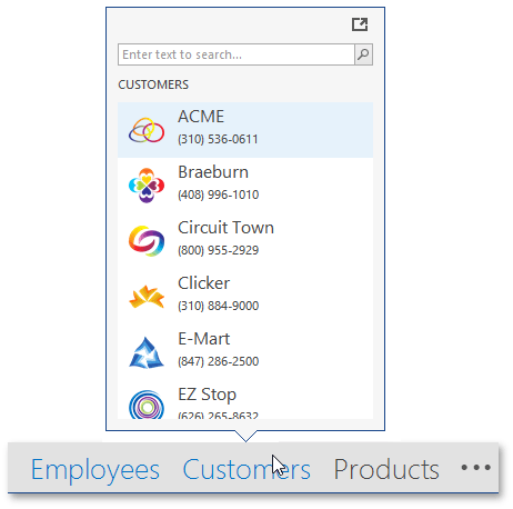
To enable peek panels, set the OfficeNavigationBar.ShowPeekFormOnItemHover property to true. The NavigationBarItem.ShowPeekFormOnItemHover property allows you to override this global control setting and prohibit the display of peek panels for individual items.
A peek panel is displayed after a delay, which can be modified by using the OfficeNavigationBar.PeekFormShowDelay property. The default time frame before the panel appears is 1.5 seconds. You can also manually display and/or hide a peek panel by calling the OfficeNavigationBar.ShowPeekForm/OfficeNavigationBar.HidePeekForm method in code.
To supply a peek panel with content for each Office Navigation Bar item, handle the OfficeNavigationBar.QueryPeekFormContent event. Event parameters allow you to identify the source item and assign required content specific for this very item. The code below illustrates an example.
private void OfficeNavigationBar1_QueryPeekFormContent(object sender, QueryPeekFormContentEventArgs e) {
     if (e.Item == navigationBarItem1) e.Control = new XtraUserControl1();
 }
A peek panel will be sized automatically according to its content. To set a fixed panel size, use the OfficeNavigationBar.PeekFormSize property.
Additional peek panel settings can be accessed through the OfficeNavigationBar.OptionsPeekFormButtonPanel properties group. For example, in this group you can set the FlyoutPanelButtonOptions.ShowButtonPanel property to true to enable the built-in button panel - a region that displays buttons and is docked to either the top or bottom edge of a peek panel. Buttons displayed in this panel are stored in the FlyoutPanelButtonOptions.Buttons collection. At design time, locate this property in Visual Studio’s property grid and click its ellipsis button. This will invoke the already familiar collection editor dialog that allows you to add, remove, and customize peek panel buttons.
Peek panel buttons provide multiple properties, the most significant of which are listed below.
- IButtonProperties.Caption and IButtonProperties.Image - specify button content.
- IButtonProperties.Style - gets or sets whether this button is a regular push button, or a check button that supports pressed and regular (elevated) visual states.
- IButtonProperties.GroupIndex - check buttons with the same value for this property unite into a radio group. When an end-user presses a radio group button, the previously checked button that belongs to the same radio group automatically returns to an elevated state.
Interaction with a Navigation Bar
Although an Office Navigation Bar can be used as a separate control, it was originally created to be used in conjunction with a Navigation Bar. These controls can be used together when:
- the Office Navigation Bar serves as a bottom navigation panel for the Navigation Bar;
- the Office Navigation Bar replaces specific Navigation Bar Groups (or all of them) when in a collapsed state.
To learn more about each scenario, refer to the Interaction with Navigation Bar article.
Runtime Customization
The Office Navigation Bar displays an ellipsis button after its last visible item. This is a customization button that provides access to currently hidden Office Navigation Bar items, and allows end-users to customize the bar itself. To place this button before Office Navigation Bar items or completely hide it, use the OfficeNavigationBar.CustomizationButtonVisibility property.
At runtime, end-users see a pop-up menu as they click the customization button (see the figure below).

On the image above, “Sales” and “Opportunities” menu items are links to currently hidden Office Navigation Bar items. The “Navigation Options” menu item is a default item that invokes the customization dialog, as illustrated below.

In this dialog, end-users can do the following.
- Re-arrange Office Navigation Bar items by clicking the “Move Up” and “Move Down” buttons.
- Change the maximum number of visible items. This setting is identical to modifying the OfficeNavigationBar.MaxItemCount property in code.
- Switch the Office Navigation Bar from regular to compact mode and back (similarly to the OfficeNavigationBar.Compact property).
All Office Navigation Bar customization capabilities persist when the control is used in conjunction with the Navigation Bar control.