Tile Nav Pane
- 4 minutes to read
Overview
The Tile Navigation Pane is a touch-enabled control that provides navigation functionality similar to Microsoft Dynamics®.
The TileNavPane control features include:
- a nav bar that is always visible in the application window
- three- or two-level navigation hierarchy via drop-down bars
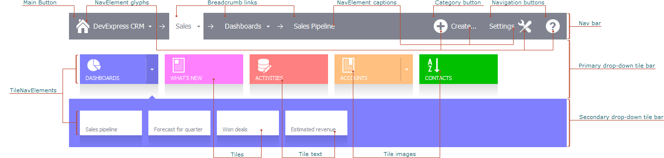
- the main button that provides access to root navigation elements
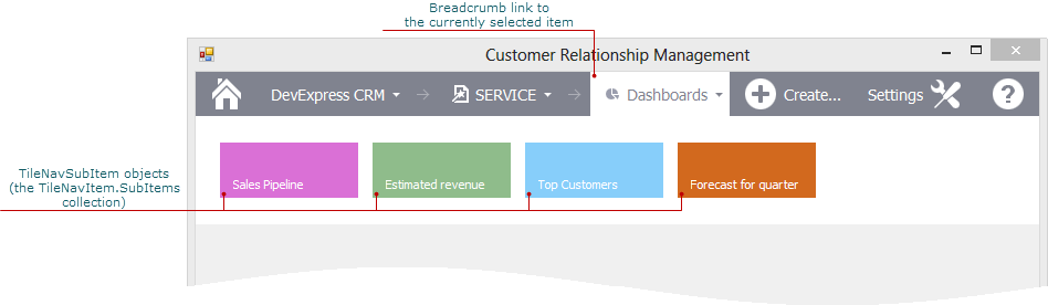
- breadcrumbs that help users to keep track of the current location in the navigation hierarchy
- custom buttons in the nav bar
Note
Run the Tile Navigation demo to try out the Tile Navigation Pane.
Bars
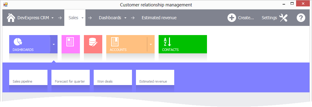
The Tile Navigation Pane consists of the nav bar and two drop-down bars:
- The nav bar is always visible on the form. It contains the main button, breadcrumbs, navigation and category buttons.
- The primary drop-down tile bar appears below the nav bar and contains root level navigation elements. Users can click the main button or breadcrumb link to invoke this bar. In the latter case, the bar contains sub-elements of the corresponding navigation element.
- The secondary drop-down tile bar appears below the primary drop-down tile bar and contains sub-elements of the element selected in the primary drop-down tile bar.
Drop-down Bar Options
Use the following properties to access options that specify drop-down bar appearance, light dismiss, tile height and width, etc.
- TileNavPane.OptionsPrimaryDropDown — options applied to the primary drop-down bar.
- TileNavPane.OptionsSecondaryDropDown — options applied to the secondary drop-down bar.
- TileNavElement.OptionsDropDown — options applied to a specific tile’s drop-down bar.
Navigation Elements
To navigate through the application, users use navigation elements — buttons in the nav bar and tiles in the drop-down bars. Handle the TileNavPane.ElementClick event to respond to a click on a navigation element. To respond to a click on a tile, handle the TileNavPane.TileClick event.
Navigation buttons
The NavButton class represents navigation buttons — custom buttons that can be displayed directly in the nav bar. To add custom navigation buttons to the nav bar, use the TileNavPane.Buttons collection.
Categories
The TileNavCategory class represents categories — root-level navigation elements. These elements are displayed in the primary drop-down bar.
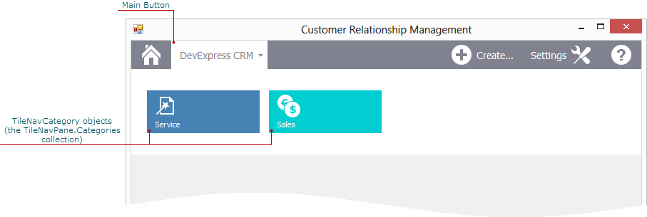
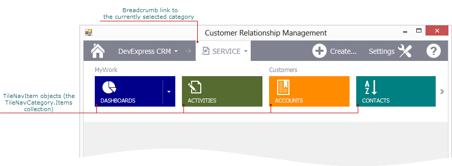
To add categories to the navigation hierarchy, use the TileNavPane.Categories collection. Users can click a category’s tile to select it. When a category is selected, it is displayed as a breadcrumb link next to the main button. The TileNavPane.SelectedElement property specifies the selected navigation element.
A category can also be displayed as a button in the nav bar. To add a category to the nav bar, use the TileNavPane.Buttons collection.
Category Items
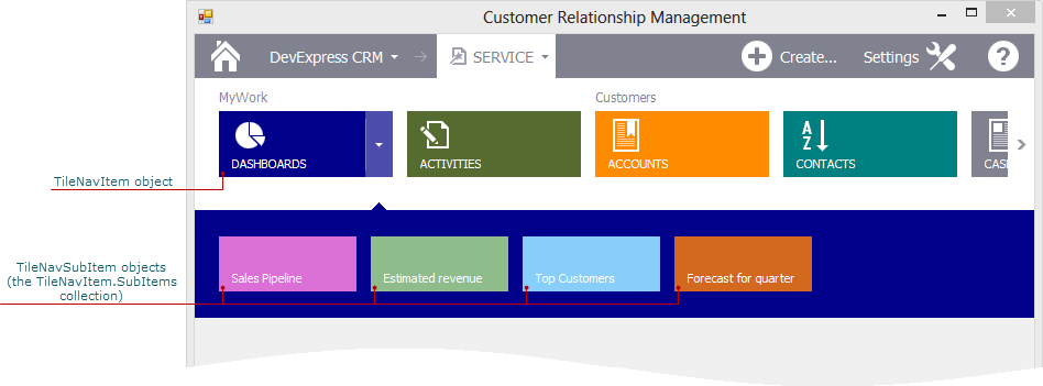
The TileNavItem class represents category items — middle-level navigation elements that are contained in a category. To add items to a category, use the TileNavCategory.Items collection. Category items are displayed in the primary drop-down bar.
Sub-items
The TileNavSubItem class represents sub-items — bottom-level navigation elements that can be contained in a category item. Use the TileNavItem.SubItems collection to add sub-items to a category item.
If a category item contains sub-items, its tile has a drop-down button. A click on this button invokes the secondary drop-down bar that displays the sub-items.
Users can also click a category tile to select it. The selected item is displayed as a breadcrumb link in the nav bar. A click on this link invokes the primary drop-down bar that contains sub-items.
Tile Groups
Tiles at the same navigation level can be combined into groups. To specify the group to which a tile belongs, use the TileNavElement.GroupName property. The group name is displayed above the first tile in the group.
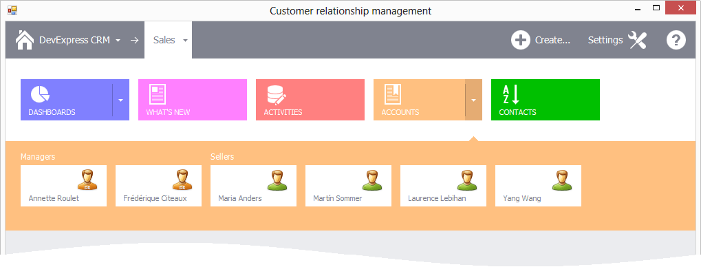
Use the TileNavPaneDropDownOptions.AppearanceGroupText property to specify the group caption’s appearance.
Main Button
The main button provides access to root navigation elements. The main button is automatically added to the nav bar if you create the TileNavPane in the designer. If you create the control in code, the main button should be created manually. See How to: Create and Customize the TileNavPane Control in Code for an example.
Three- or Two-level navigation hierarchy
The TileNavPane.MainButtonBehavior property specifies whether the main button provides access to a three- or two-level hierarchy of navigation elements.
ShowCategories — enables a three-level hierarchy that consists of categories, items, and sub-items. To specify categories at the root level, use the TileNavPane.Categories collection.
ShowDefaultCategoryItems — enables a reduced two-level hierarchy that has only one default category at the root level. The TileNavPane.DefaultCategory property provides access the category. To populate the default category with navigation elements, use its Items collection.