Chart Ribbon and Toolbars
- 5 minutes to read
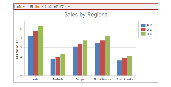
The Ribbon and Toolbars allow users to perform basic charting tasks, for example, change a series’s view type, print/export a chart or use the Chart Designer to customize the chart.
](/WindowsForms/images/chart-control/ribbon/ribbon.png?v=19.2)
](/WindowsForms/images/chart-control/ribbon/toolbar.png?v=19.2)
Note
The Chart Control can use only one command UI type at a time.
Demos:
Financial Charting - Shows the Chart Control with a Ribbon
Financial Indicators - Shows the Chart Control with Toolbars
How to Generate the Ribbon and Toolbars
The newly added Ribbon contains the Chart Tools page category with the Design and Other contextual pages, and the Toolbars contain the Design and Other groups of bars.
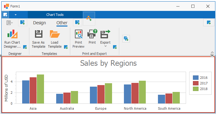
The Ribbon with the Design and Other pages
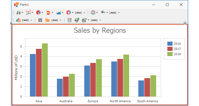
The Toolbar with the Design and Other bars.
Note
See the Financial Options section for information on how to add the Financial Options page/toolbar.
Add the Ribbon
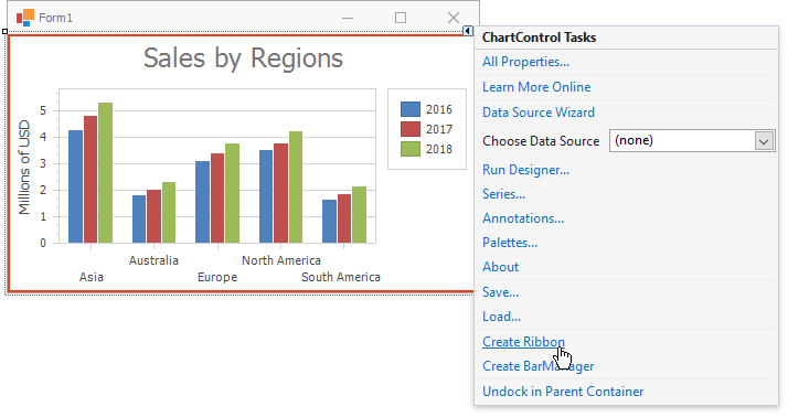
Click the Chart Control’s smart-tag and select Create Ribbon:
Refer to the Ribbon Control for more information about the Ribbon.
Add the Toolbars
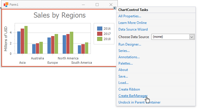
Click the Chart Control’s smart-tag and select the Create BarManager link:
Refer to the Bars for more information about the Bar Manager.
Add, Remove or Restore UI Elements
After the Chart Control’s Ribbon/Toolbars are added, the smart tag’s menu includes the following commands:
- Create All Bars - Adds or restores the Design, Other, Financial Options pages/toolbars.
- Create Common Bars - Adds or restores the Design and Other pages/toolbars.
- Create Financial Bars - Adds or restores the Financial Options page/toolbars.
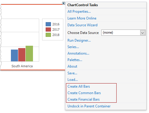
To remove a UI element from the Ribbon or Toolbar, select the element and click the Delete key.
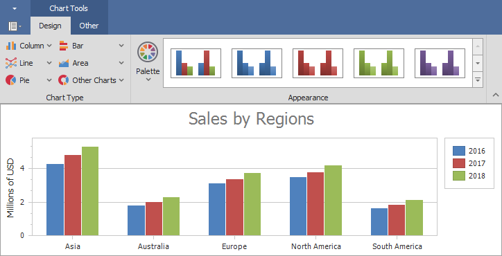
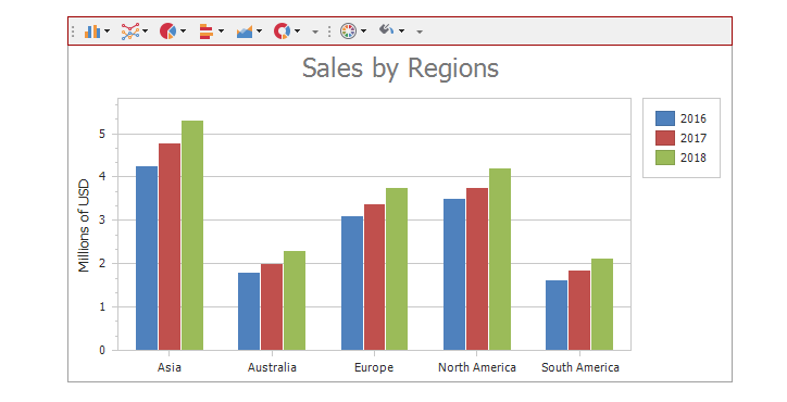
Design
The Design page/toolbar allows you to customize the chart’s appearance and series’ view type.
Ribbon
Toolbar
The Design page/toolbar includes the following groups:
- Chart Type group elements allow you to change the view type of all chart series. If the chart does not contain series, a new series will be added.
- Appearance group elements allow you to configure the chart’s palette and appearance.
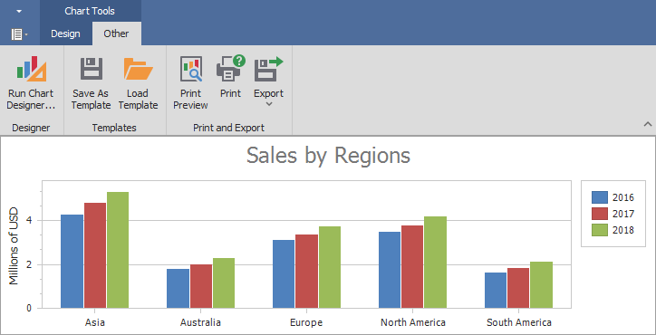
Other
The Other page/toolbar elements allow you to perform the following actions:
- Invoke the Chart Designer.
- Load or save a chart layout.
- Print or export a chart.
Ribbon
Toolbar
Financial Options
Select the Create Financial Bars link in the chart control smart tag’s menu to add the Financial Options page/toolbar.
The Financial Options page/toolbar provides the following commands:
- Change a view for the series selected in the Series list.
- Draw Fibonacci indicators for the series selected in the Series list.
- Add technical indicators for the series selected in the Series list.
- Remove indicators. Enable the Remove Indicator option and click an indicator to remove it. If a single indicator is in a separate pane, you can click the pane to remove the indicator.
- Change the date-time x-axis measurement units. See the How to Add New Measurement Units or Periods section to learn how to extend the list of predefined axis measurement units.
- Set the date-time x-axis visible range to a predefined interval. See the How to Add New Measurement Units or Periods section to learn how to extend the list of predefined time periods.
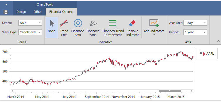
Ribbon
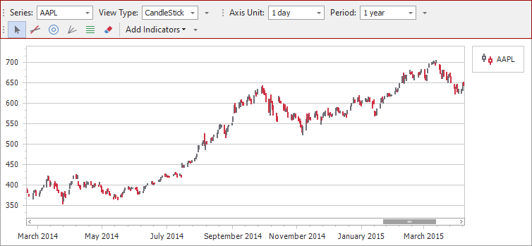
Toolbar
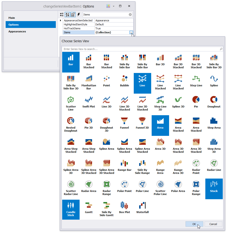
How to Add Series Views to the View Type List
You can customize the list of views in the Ribbon and the Toolbar.
Click the View Type element’s smart tag. Select the All Properties… item.
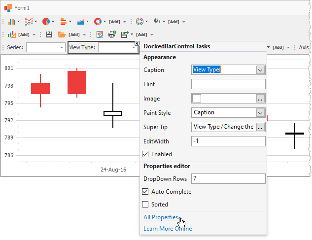
Click the Options.Items property’s ellipsis button. To select multiple views in the Choose Series View dialog, press Ctrl or Shift and click the series’ view icons.
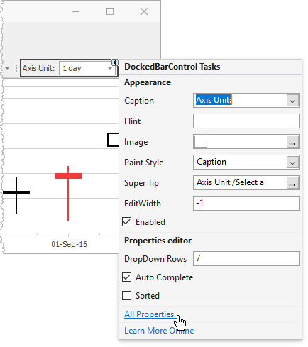
How to Add New Measurement Units or Periods
You can customize the list of measurement units in the Ribbon and Toolbar.
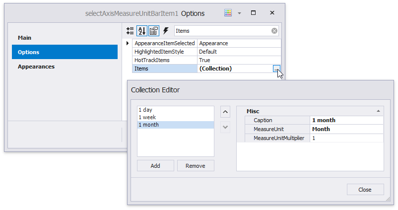
Click the Axis Unit (Period) element’s smart tag. Select the All Properties… item.
Click the Options.Items property’s ellipsis button. Use the Add button to add a new item. Specify the MeasureUnit and MeasureUnitMultiplier properties.
Note
You can only configure axis units and periods for date-time x-axes.
Provide Custom Actions when Drawing Indicators
The following example shows how to handle the CheckedChanged events of the Indicators group’s items (DrawTrendLineIndicatorBarItem, DrawFibonacciArcsIndicatorBarItem, DrawFibonacciFansIndicatorBarItem, DrawFibonacciRetracementIndicatorBarItem and RemoveIndicatorBarItem) to disable the Crosshair Cursor and scrolling capabilities while you draw or remove an indicator:
drawTrendLineIndicatorBarItem1.CheckedChanged += OnCheckedChanged;
drawFibonacciArcsIndicatorBarItem1.CheckedChanged += OnCheckedChanged;
drawFibonacciFansIndicatorBarItem1.CheckedChanged += OnCheckedChanged;
drawFibonacciRetracementIndicatorBarItem1.CheckedChanged += OnCheckedChanged;
removeIndicatorBarItem1.CheckedChanged += OnCheckedChanged;
// ...
private void OnCheckedChanged(object sender, DevExpress.XtraBars.ItemClickEventArgs e) {
    bool isNotChecked = !drawTrendLineIndicatorBarItem1.Checked && !drawFibonacciArcsIndicatorBarItem1.Checked && !drawFibonacciFansIndicatorBarItem1.Checked &&
                            !drawFibonacciRetracementIndicatorBarItem1.Checked && !removeIndicatorBarItem1.Checked;
    // Disable the Crosshair Cursor.
    chartControl1.CrosshairEnabled = isNotChecked ? DefaultBoolean.True : DefaultBoolean.False;
    // Disable the capability to scroll the chart.
    XYDiagram diagram = (XYDiagram)chartControl1.Diagram;
    diagram.EnableAxisXScrolling = isNotChecked;
}