Application Appearance and Skin Colors
- 6 minutes to read
This topic provides information on methods that allow you to change application and/or individual UI element appearance.
Global settings
- Look-and-Feel
- Skins and Skin Palettes (separate article)
- Default application font (separate article)
Individual control appearance settings
- Appearance Objects
- Highlight Individual Controls
- Appearance Editor - Reuse appearance settings
- Appearance priority
- Print Appearances
Look-and-Feel
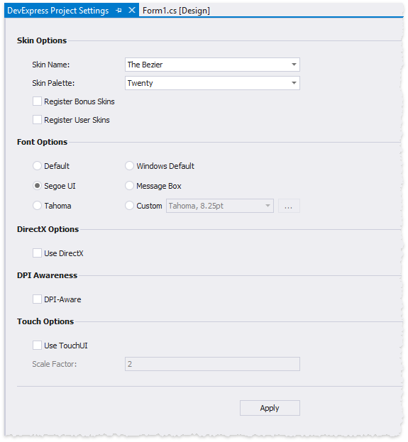
The Look-and-Feel settings are global style settings such as the default application font and skin. You can use the following approaches to specify these settings.
Use the Project Settings dialog (the recommended approach). To invoke this dialog, right-click a project in Visual Studio’s Solution Explorer and select “DevExpress Project Settings”.
Call UserLookAndFeel class methods in code.
//apply raster skin
 DevExpress.LookAndFeel.UserLookAndFeel.Default.SetSkinStyle(SkinStyle.Office2016Colorful);
//apply vector skin and choose a palette
DevExpress.LookAndFeel.UserLookAndFeel.Default.SetSkinStyle(SkinStyle.Bezier, SkinSvgPalette.Bezier.CherryInk);
//disable skinning, apply the "Flat" style
//note that several DevExpress controls (for example, the Ribbon) cannot be displayed without a skin
DevExpress.LookAndFeel.UserLookAndFeel.Default.SetStyle(LookAndFeelStyle.Flat, false, true);
Individual controls inherit global Look-and-Feel settings from their parents (forms, user controls, panels, etc.). You can override these inherited settings if you access these controls’ LookAndFeel properties in code (hidden in the VS Property Grid). However, only override global Look-and-Feel settings to change a control’s background (DevExpress controls v18.1 or older).
Appearance Objects
Individual controls provide Appearance properties that store AppearanceObject or AppearanceObjectEx class objects. These objects specify background, foreground, and font settings that affect their parent controls only.
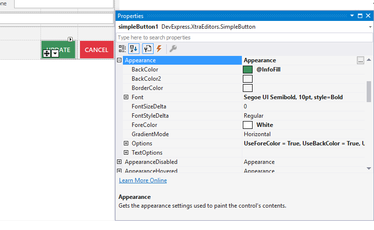
For each supported visual state (normal, disabled, hovered, etc.), a control may provide individual Appearance settings.
Tip
The StyleController component allows you to specify Appearance settings for multiple editors at once.
Highlight Individual Controls
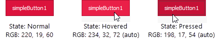
You can change an individual controls’ background and foreground colors to highlight these controls. For raster skins, custom background colors will blend in with element skin bitmaps. For vector skins, custom colors will be displayed “as is”.
Versions 18.2 and newer | Versions 18.1 and older |
|---|---|
Tip
As the code samples in the table above demonstrate, beginning with version 18.2, UI elements no longer require that you disable their skins in order to see custom Appearance colors. This change may lead to unexpected results due to junk Appearance settings becoming functional once you upgrade to v18.2. To trace and eliminate such API, use the WindowsFormsSettings.ForcePaintApiDiagnostics method. You can also change the global WindowsFormsSettings.BackgroundSkinningMode setting to restore the behavior seen in versions 18.1 and earlier.
Note that you can set a custom color for the Normal element state only; other element states (Pressed, Hovered, Disabled) will automatically receive slightly different hues of this same color. Additionally, starting with version 18.2, when you change an element background color, this element automatically adjusts its foreground to increase contrast and improve readability. Use the WindowsFormsSettings.AutoCorrectForeColor setting to disable this behavior.
Note
Not all DevExpress control backgrounds are modified through the Appearance.BackColor settings. For example, to highlight a GroupControl you need to change its Appearance.BorderColor property instead. Refer to control-specific documentation to check whether this control can be highlighted with a custom background color and to find out which Appearance setting you need to modify in order to do so.
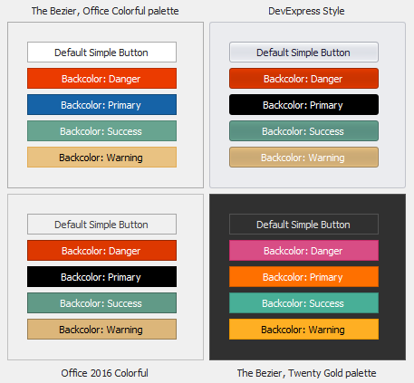
Starting with version 18.2, you can also use Skin Colors as UI element background and/or foreground colors. At design time, switch to the “DX Skins” tab to choose a Skin Color.
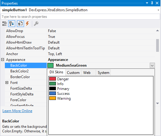
The same Skin Color may vary in different skins and vector skins palettes (see the figure below).
To assign Skin Colors in code, retrieve them from the DevExpress.LookAndFeel.DXSkinColors.FillColors (for background only) or DevExpress.LookAndFeel.DXSkinColors.ForeColors (for foreground only) classes.
simpleButton1.Appearance.BackColor = DXSkinColors.FillColors.Danger;
//or
simpleButton1.Appearance.ForeColor = DXSkinColors.ForeColors.Warning;
Appearance Editor - Reuse appearance settings
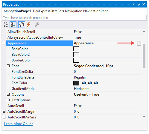
The Appearance Editor allows you to customize, save, and apply appearance settings to objects at design time. Click the ellipsis button next to a control’s Appearance property to invoke the Appearance Editor.
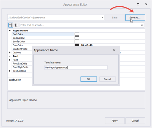
Customize the appearance settings and click the “Save As…” button to save these settings as a template.
You can access saved templates from the drop-down selector when you invoke the Appearance Editor for a control/visual element. To apply these settings to the current AppearanceObject, select a template and click “Apply”.
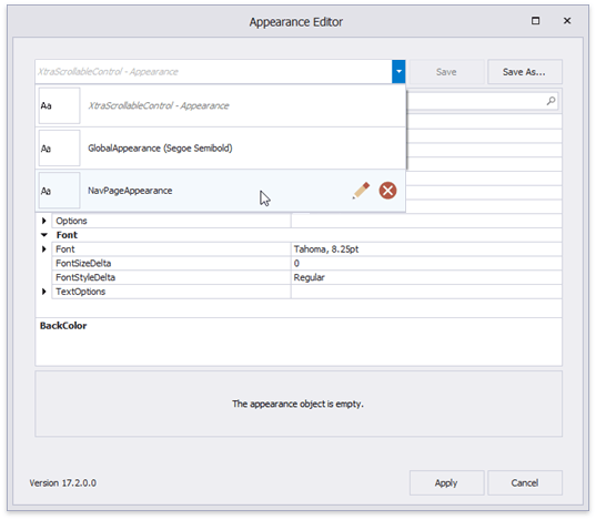
Appearance styles are saved as .xml files to the “C:\Users\Public\Documents\DevExpress\AppearanceTemplates” folder. You can reuse saved appearance settings in other Visual Studio projects.
Appearance Priority
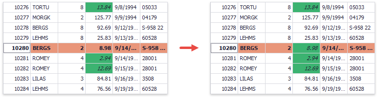
Data Grid, Tree List and Vertical Grid appearance properties return the AppearanceObjectEx class objects. This class provides the AppearanceOptionsEx.HighPriority property that allows you to change the Appearance priority. For instance, the following sample demonstrates how to prioritize cell appearance settings.
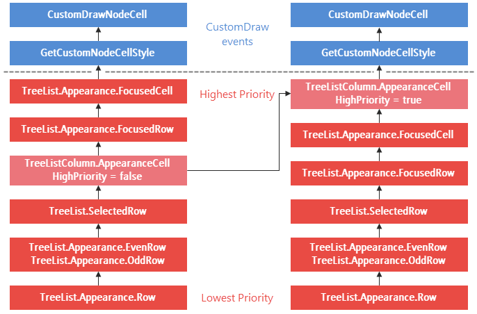
You can use this feature, for instance, to show Conditional Formatting rule appearances for selected Data Grid rows.
using DevExpress.XtraEditors;
using DevExpress.XtraGrid;
using DevExpress.XtraGrid.Views.Grid;
using System.Drawing;

GridFormatRule freightRule;

public Form1() {
    InitializeComponent();
    // . . .

    //selected row appearance
    gridView1.Appearance.FocusedRow.BackColor = Color.DarkSalmon;
    gridView1.Appearance.FocusedRow.FontStyleDelta = FontStyle.Bold;
    //rule condition and condition settings
    FormatConditionRuleValue freightRuleCondition = new FormatConditionRuleValue();
    freightRuleCondition.Condition = FormatCondition.Less;
    freightRuleCondition.Value1 = 20;
    freightRuleCondition.Appearance.BackColor = Color.MediumSeaGreen;
    freightRuleCondition.Appearance.Options.UseBackColor = true;
    freightRuleCondition.Appearance.Options.UseFont = true;
    freightRuleCondition.Appearance.FontStyleDelta = FontStyle.Italic;
    freightRuleCondition.Appearance.Options.UseBackColor = true;
    freightRuleCondition.Appearance.Options.HighPriority = true; //override default appearances for focused and selected rows
    //format rule
    freightRule = new GridFormatRule() { Column = colFreight, Rule = freightRuleCondition };
    gridView1.FormatRules.Add(freightRule);
}
Since custom draw and custom style events (GridView.RowStyle, GridView.RowCellStyle, GridView.CustomDrawCell, etc.) have the highest priority, you can use them more effectively instead of changing the appearance priority.
GridFormatRule freightRule;

private void GridView1_RowCellStyle(object sender, DevExpress.XtraGrid.Views.Grid.RowCellStyleEventArgs e) {
    GridView view = sender as GridView;
    if (view.IsRowSelected(e.RowHandle) && e.Column.FieldName == "Freight" &&
        freightRule.IsFit(e.CellValue, view.GetDataSourceRowIndex(e.RowHandle))) {
            e.Appearance.Assign((freightRule.Rule as FormatConditionRuleAppearanceBase).Appearance);
    }
}
Print and Export Appearances
DevExpress controls expose AppearancePrint properties that store appearance settings applied when the control is printed and/or exported. The AppearancePrint settings provide properties that specify whether printed/exported controls should use these unique appearances.
- GridOptionsPrint.UsePrintStyles
- TreeListOptionsPrint.UsePrintStyles
- PivotGridOptionsPrint.UsePrintAppearance
If these properties are set to false, printed and/or exported controls are the same as those that appear on-screen. See Printing and Exporting for more information.