Office Inspired UI
- 3 minutes to read
The DevExpress WinForms Controls allow you to build UIs with a look and feel inspired by Microsoft Office applications such as Word, Excel, PowerPoint, and Visio – as seen in the following image.
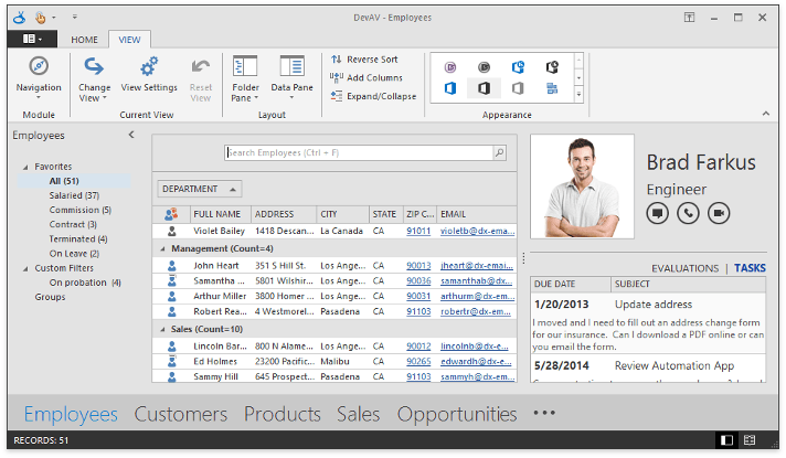
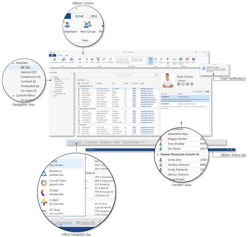
The figure below shows the elements of a typical Office-inspired app.
Use the following DevExpress controls to emulate an Office-inspired UI within your applications.
Ribbon Control + Ribbon Status Bar
The Ribbon Control, introduced in Microsoft Office 2007, replaced traditional toolbars and is now used throughout all Office applications. The RibbonStatusBar displayed at the bottom of an application form is used to display various types of information (document status, page number, etc.).
Navigation Controls
One of multiple Navigation Controls that allows your end-users to switch content in the application content area or perform other tasks. Navigation Controls allow end-users to change the content displayed in the main application area.
- Navigation Bar - a traditional side bar control that features expandable groups and clickable items. It has three built-in styles that change its behavior and appearance;
- AccordionControl - a modern replacement for the navigation bar, which allows you to create a multi-level hierarchy of groups and items;
- NavigationPane - a side bar similar to the one used in Adobe Reader. Includes vertically aligned tabs displayed in an expandable area that can be resized, maximized, or collapsed.
Content Area Controls
Office-inspired controls that display main application content.
- Data Grid - an editing and shaping component for end-users to display data. Provides a flexible UI with a various views, including Banded Grid View, Advanced Banded Grid View, Card View, Layout View, WinExplorer View and Tile View;
- Rich Text Editor - a word processor component for Microsoft Word-inspired applications;
- Scheduler - a Microsoft Outlook-style scheduling component;
- Spreadsheet - a spreadsheet component to create, view, and edit documents with a look and feel similar to Microsoft Excel.
Notifications
Notifications allow you to communicate crucial events that occur within an app to end-users. They are displayed as small windows that pop up at the top or bottom of the screen, and disappear after a specified length of time.
- Alert Windows - Notifications with a traditional appearance similar to Microsoft Outlook email alerts;
- Toast Notifications - Windows 10-inspired notifications with a modern, flat appearance.
-
Emulates the Microsoft navigation control introduced in Outlook 2013, which displays navigation links (items) to invoke specific features. This control integrates with the Navigation Bar.
Additional Controls and Components
- RibbonForm - a replacement for the default form, designed to be used with the Ribbon Control. The RibbonForm shares the title bar used by the Ribbon.
- Layout and Data Layout Controls - allows you to arrange multiple components within an application form.
- Other utility and multi-use controls that allow you to implement such features as splash screens, custom wait forms, spell check, and multifunctional buttons used within Windows taskbar, adorner elements drawn above UI items, etc.
Alternatively, you can use the DevExpress Template Gallery to implement DevExpress Office-inspired UI controls.
- Word Processing Application - creates an MS Word-style application;
- Scheduling Application - creates a scheduling application with an integrated calendar, navigation bar and Ribbon.