Table Layout
- 11 minutes to read
A layout group supports regular, flow and table layout modes, which differ in the way child layout items are arranged and sized. In this topic, you will learn about a table layout.
The Table Layout mode allows you divide a group’s area into rows and columns and then place controls into created cells by specifying row and column indexes and span values. This mechanism is like the one you use when creating an HTML table.
Online Video
The following sections help you get started with the Table layout.
- Enable Table Layout Mode
- Add Controls to Cells and Customize Control and Layout Item Settings
- Example: Creating a Table Layout in Code
1. Enable Table Layout Mode
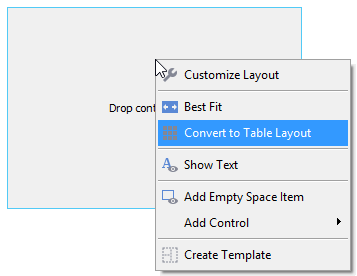
By default, when a layout group is created, its LayoutGroup.LayoutMode property is set to Regular. To select the table layout mode, change this property to Table.
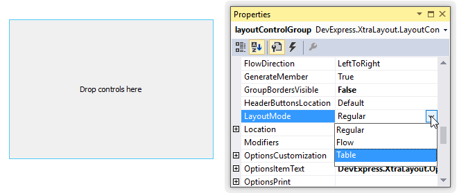
You can enable table layout mode for a group at design time using a context menu.
2. Create and Customize Rows and Columns
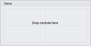
When table layout mode is enabled, two rows and two columns are automatically created. They divide the group client area into four equal cells.
To create a new row in the table, add a RowDefinition object to the OptionsTableLayoutGroup.RowDefinitions collection, which stores available rows. To add a new column to the table, add a ColumnDefinition object to the OptionsTableLayoutGroup.ColumnDefinitions collection, which stores available columns. The OptionsTableLayoutGroup.RowDefinitions and OptionsTableLayoutGroup.ColumnDefinitions collections are accessible from the LayoutGroup.OptionsTableLayoutGroup property.
At design time, you can customize the row and column collections using dedicated editors, which can be invoked by clicking the ellipsis button for the OptionsTableLayoutGroup.RowDefinitions and OptionsTableLayoutGroup.ColumnDefinitions properties, respectively.
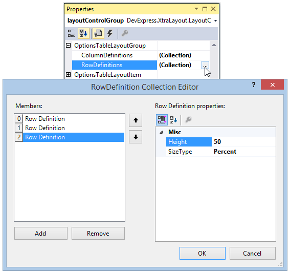
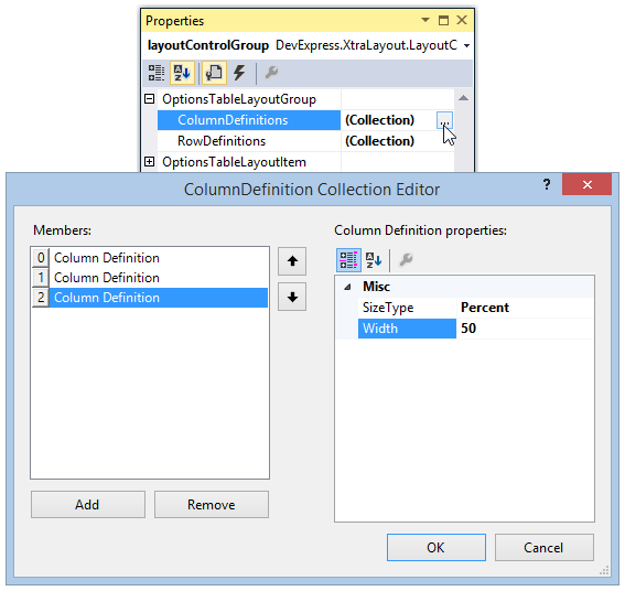
Make a note that the SizeType property of columns and rows is set to Percent and their size is set to 50. This means that each of them currently occupies 50% of the total group width/height. See the Cell Size Options section below to learn more about supported size types and their specifics.
To add new rows and columns with default settings in code, use the OptionsTableLayoutGroup.AddRow and OptionsTableLayoutGroup.AddColumn methods. To append an existing RowDefinition or ColumnDefinition object to corresponding collections, use the following methods.
- OptionsTableLayoutGroup.Add
- RowDefinitions.Add and RowDefinitions.AddRange
- ColumnDefinitions.Add and ColumnDefinitions.AddRange
The following code enables table layout mode. In addition to existing two rows and two columns, one more row and one more column are created.
// Enable table mode for the target group.
layoutControlGroup.LayoutMode = LayoutMode.Table;
// Two rows and two columns are automatically created.

// Add one more row whose height is set to 50%.
RowDefinition rowDefinition = new RowDefinition(layoutControlGroup, 50, SizeType.Percent);
layoutControlGroup.OptionsTableLayoutGroup.RowDefinitions.Add(rowDefinition);

// Add one new column whose width is set to 50%.
ColumnDefinition columnDefinition = new ColumnDefinition(layoutControlGroup, 50, SizeType.Percent);
layoutControlGroup.OptionsTableLayoutGroup.ColumnDefinitions.Add(columnDefinition);
The image below shows the resulting table layout with three rows and three columns.
Cell Size Options
Rows and columns in table layout mode support three size types (which can be selected with the RowDefinition.SizeType and ColumnDefinition.SizeType properties): Absolute, Percent and AutoSize. In Absolute and Percent modes, you can set the row and column size using the RowDefinition.Height and ColumnDefinition.Width properties, which accept either the number of pixels or percentages (according to the current size type).
Absolute - Size is specified in absolute units (pixels). When a layout is resized, rows and columns of the Absolute type are never resized.
In the following animation, the Absolute size type is enabled for the first row and first column.
Percent - The size value specifies a portion of the layout group in percentages. When a layout is resized, rows and columns of the Percent type are proportionally resized.
The following video demonstrates a table layout with two rows whose heights are 50% and 50%, and with two columns whose widths are 40% and 60%
AutoSize - Cell size is automatically calculated to fit cell contents. Size constraints imposed on layout items (or embedded controls) affect size of rows and columns of the AutoSize type.
The following animation shows a table layout in which the first row and first column are of the AutoSize type. A picture editor placed in the first cell has a limitation on its width. Thus, the cell width is not increased when the layout width is increased.
Note
When a layout item residing in a row/column of the Absolute or Percent type, size constraints cannot limit the overall item size.
A table layout may contain rows and columns of different size types simultaneously. In this case, available space is distributed between rows and columns in the following order.
- First, space is allocated for rows/columns of the Absolute type.
- Second, space is allocated for rows/columns of the AutoSize type.
- Finally, the remaining space is distributed among rows/columns of the Percent type.
Rows and Columns API
Individual columns and rows can be accessed by their indexes in the OptionsTableLayoutGroup.RowDefinitions and OptionsTableLayoutGroup.ColumnDefinitions collections. You can also obtain a row or column located at the specified position using the OptionsTableLayoutGroup.GetColumn and OptionsTableLayoutGroup.GetRow methods. The OptionsTableLayoutGroup.RowCount and OptionsTableLayoutGroup.ColumnCount properties specify the number of elements in the row and column collections. To delete a specific row or column, call the corresponding overload of the OptionsTableLayoutGroup.Remove method.
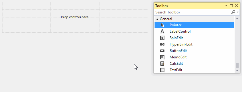
3. Add Controls to Cells and Customize Control and Layout Item Settings
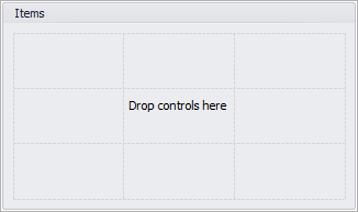
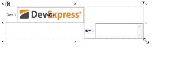
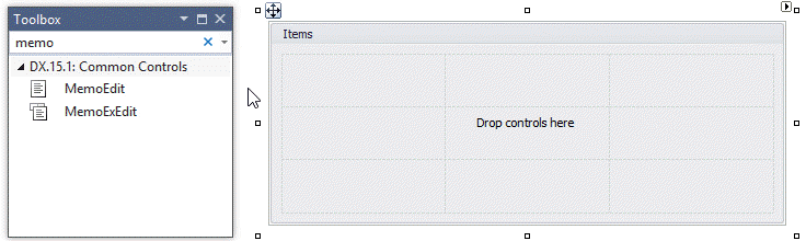
To add controls to the table layout, drag these controls from the Toolbox and drop onto target table cells. For each control dropped, a layout item that embeds this control is created. You can move existing items to other empty cells using drag-and-drop operations.
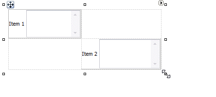
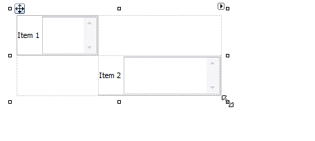
If you are about to add a new control to a cell that is already occupied by a layout item, the new layout item will be added to the topmost and leftmost cell. If this cell is also occupied, the old and new items will overlap.
To add controls to the table layout in code, use methods of the target layout group: LayoutGroup.Add, LayoutControlGroup.AddRange and LayoutGroup.AddItem.
LayoutControlItem item1 = layoutControlGroup.AddItem("Item 1", new MemoEdit() { Name = "Memo1" });
LayoutControlItem item2 = layoutControlGroup.AddItem("Item 2", new MemoEdit() { Name = "Memo2" });
In table layout mode, item addition methods all place new layout items in the topmost and leftmost cell. Thus, the code above adds two layout items in a single cell.
To explicitly position layout items within the table layout in code, set their OptionsTableLayoutItem.RowIndex and OptionsTableLayoutItem.ColumnIndex properties. To specify the desired number of columns and rows occupied by the item, use the OptionsTableLayoutItem.ColumnSpan and OptionsTableLayoutItem.RowSpan properties.
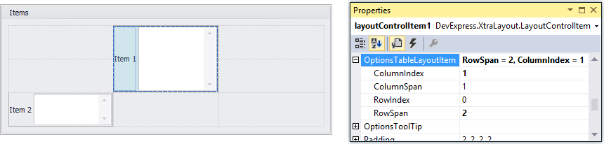
The following image illustrates the OptionsTableLayoutItem.RowIndex, OptionsTableLayoutItem.ColumnIndex, OptionsTableLayoutItem.ColumnSpan and OptionsTableLayoutItem.RowSpan settings.
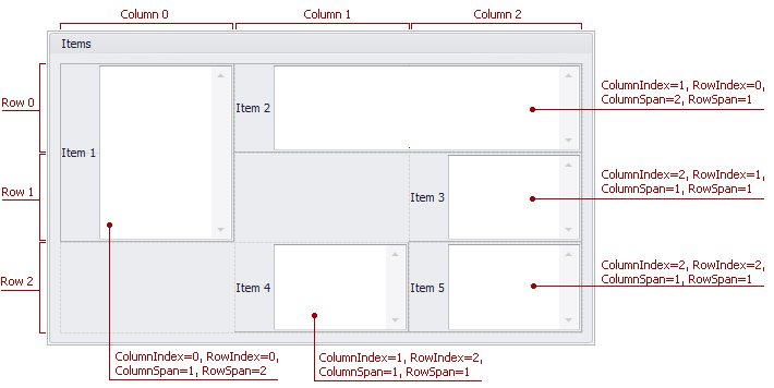
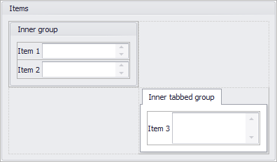
Table cells can also contain nested regular and tabbed layout groups (see the image below).
Example: Creating a Table Layout in Code
The following code demonstrates how to create a table layout (LayoutMode.Table) consisting of three columns and four rows. Controls are placed in certain cells. Specific controls occupy more than one cell.
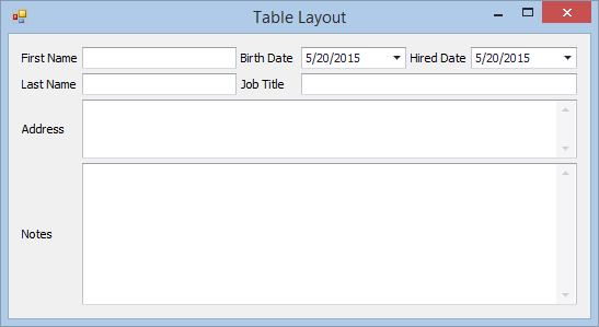
Table layout mode is enabled with the LayoutGroup.LayoutMode property. When this mode is enabled, two rows and two columns are implicitly added to the table layout. Each of them initially occupies 50% of the total width/height (their SizeType property is set to Percent and their size is set to 50).
In this example, one more column (ColumnDefinition) of the Percent type is added to the layout. Its width is set to 50%.
Then, two more rows (RowDefinition) are added to the layout. Their heights are set to 30% and 70%, respectively.
The cell size type is then modified for automatically created rows and columns. Since the first two rows contain text editors, there is no need to resize these cells vertically when the layout is resized. Thus, the RowDefinition.SizeType property of these rows is set to AutoSize.
For the first column, which displays the First Name and Last Name items, the size is set to 200 pixels (the size type is set to Absolute to regard the size value as the number of pixels).
The next portion of the code adds controls to the table layout. Created layout items are explicitly positioned within table cells with the OptionsTableLayoutItem.RowIndex and OptionsTableLayoutItem.ColumnIndex values. Three items are stretched horizontally with the OptionsTableLayoutItem.ColumnSpan property to occupy two and three columns.
// Enable table mode for the root group.
layoutControl.Root.LayoutMode = LayoutMode.Table;

// Two columns were automatically created. Add one more column whose width is set to 50%
ColumnDefinition columnDefinition3 = new ColumnDefinition();
columnDefinition3.SizeType = SizeType.Percent;
columnDefinition3.Width = 50;
layoutControl.Root.OptionsTableLayoutGroup.ColumnDefinitions.Add(columnDefinition3);

// Two rows already exist. Add two new rows whose heights are 30% and 70%.
RowDefinition[] rowDefinitions = new RowDefinition[] {
    new RowDefinition(layoutControl.Root, 30, SizeType.Percent),
    new RowDefinition(layoutControl.Root, 70, SizeType.Percent)
};
layoutControl.Root.OptionsTableLayoutGroup.RowDefinitions.AddRange(rowDefinitions);

// Enable auto-size mode for the first and second rows.
// Set the first column's width to an absolute value.
layoutControl.BeginUpdate();
layoutControl.Root.OptionsTableLayoutGroup.RowDefinitions[0].SizeType = SizeType.AutoSize;
layoutControl.Root.OptionsTableLayoutGroup.RowDefinitions[1].SizeType = SizeType.AutoSize;
layoutControl.Root.OptionsTableLayoutGroup.ColumnDefinitions[0].SizeType = SizeType.Absolute;
layoutControl.Root.OptionsTableLayoutGroup.ColumnDefinitions[0].Width = 200;
layoutControl.EndUpdate();

// Add controls to the table layout.
LayoutControlItem item1 = layoutControl.AddItem("First Name", new TextEdit() { Name = "TextEdit1" });
LayoutControlItem item2 = layoutControl.AddItem("Last Name", new TextEdit() { Name = "TextEdit2" });
LayoutControlItem item3 = layoutControl.AddItem("Birth Date", new DateEdit() { Name = "DateEdit1" });
LayoutControlItem item4 = layoutControl.AddItem("Hired Date", new DateEdit() { Name = "DateEdit2" });
LayoutControlItem item5 = layoutControl.AddItem("Job Title", new TextEdit() { Name = "TextEdit3" });
LayoutControlItem item6 = layoutControl.AddItem("Address", new MemoEdit() { Name = "MemoEdit1" });
LayoutControlItem item7 = layoutControl.AddItem("Notes", new MemoEdit() { Name = "MemoEdit2" });

// Position created layout items within table cells.
item1.OptionsTableLayoutItem.RowIndex = 0;
item1.OptionsTableLayoutItem.ColumnIndex = 0;

item2.OptionsTableLayoutItem.RowIndex = 1;
item2.OptionsTableLayoutItem.ColumnIndex = 0;

item3.OptionsTableLayoutItem.RowIndex = 0;
item3.OptionsTableLayoutItem.ColumnIndex = 1;

item4.OptionsTableLayoutItem.RowIndex = 0;
item4.OptionsTableLayoutItem.ColumnIndex = 2;

item5.OptionsTableLayoutItem.RowIndex = 1;
item5.OptionsTableLayoutItem.ColumnIndex = 1;
item5.OptionsTableLayoutItem.ColumnSpan = 2;

item6.OptionsTableLayoutItem.RowIndex = 2;
item6.OptionsTableLayoutItem.ColumnIndex = 0;
item6.OptionsTableLayoutItem.ColumnSpan = 3;

item7.OptionsTableLayoutItem.RowIndex = 3;
item7.OptionsTableLayoutItem.ColumnIndex = 0;
item7.OptionsTableLayoutItem.RowSpan = 1;
item7.OptionsTableLayoutItem.ColumnSpan = 3;