Get Started With Data Grid and Views
- 25 minutes to read
The WinForms Data Grid (GridControl class) is a data-aware control that can display data in various formats (Views). This topic describes how to work with the Grid control, its Views and columns (data fields).
Tutorial Video
This video walks you through basic Data Grid customization. It begins with an empty Data Grid control with an applied GridView format, which displays records as rows and columns. Then, it shows the main Grid control features: data binding, column creation, sorting, grouping, and filtering data, summaries, access to grid options, in-place editors, etc. Finally, the GridView is converted to the LayoutView format, which displays underlying data as cards instead of rows and columns.
Grid Control’s Views
The WinForms Grid control ships with a flexible View-based architecture. Views — visual components that can be embedded in the Data Grid. Assign an appropriate View to the Grid control to display data in a specific manner.
The Grid control supports the following data views:
- Standard Table View
- Banded Column Views
- Card View
- Windows Tile View
- Windows Explorer View
- Layout / Carousel View
- Items View
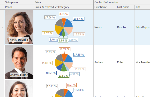
Grid View
The GridView displays data in a tabular form. It is represented by the GridView class.
GridView - Standard Table View
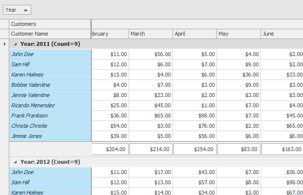
GridView - Data Grouping
GridView - Conditional Formatting
GridView - Cell Merging
GridView - Row Auto Height
Features include:
- Custom and automatic row height
- Sort and group data
- Filter data
- Calculate summaries
- Master-detail mode
- Select rows and cells
- Split presentation mode
- Fixed columns
- Edit cells in-place with various data editors
- Merge cells
- Customize layout at runtime
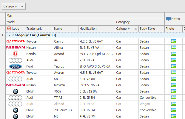
Banded Grid View
The Banded GridView displays data in a tabular form and organizes columns into bands. It is represented by the BandedGridView class.
One Band Level - Row Auto Height
Nested Bands
Fixed Bands and Data Grouping
Features include:
- Custom and automatic row height
- Sort and group data
- Filter data
- Calculate summaries
- Master-detail mode
- Select rows and cells
- Split presentation mode
- Fixed columns
- Edit cells in-place with various data editors
- Merge cells
- Customize layout at runtime
Learn more about Banded GridView
Advanced Banded Grid View
The Advanced Banded GridView displays data in a tabular form, organizes columns into bands, and supports complex data cell arrangement. It is represented by the AdvBandedGridView class.
Multi-Row Cell Layout
Data Grouping
Customization Form
The main features of the Advanced Banded Grid View match those of the Grid View (except for Cell Merging). Features include:
- Custom and automatic row height
- Sort and group data
- Filter data
- Calculate summaries
- Master-detail mode
- Select rows and cells
- Split presentation mode
- Fixed columns
- Edit cells in-place with various data editors
- Customize layout at runtime
Learn more about Advanced Banded GridView
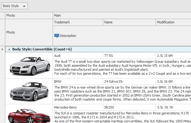
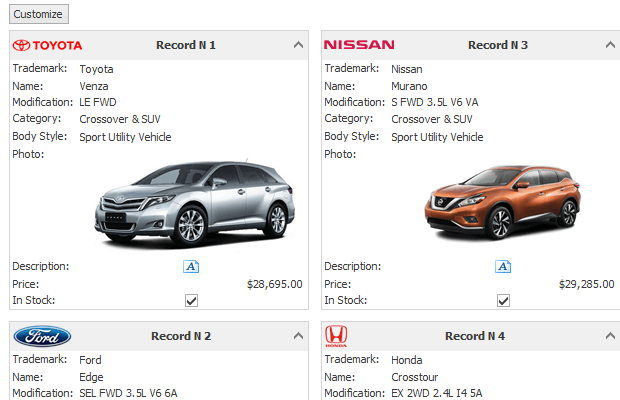
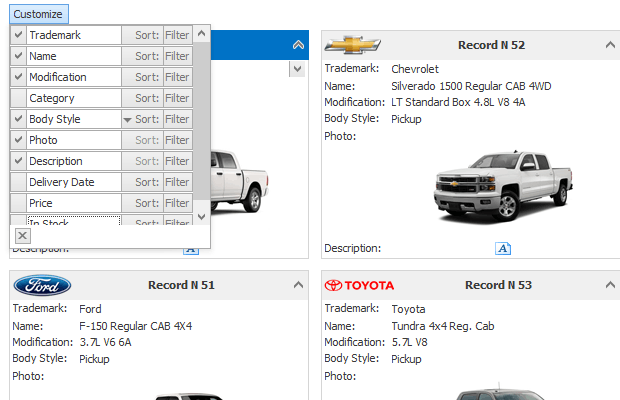
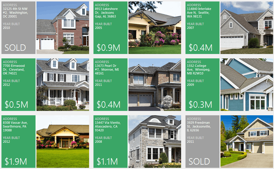
Layout View
The Layout View displays records as cards in one or more columns, in one or more rows, in an ellipse (carousel mode), or as a single card at a time. The view supports complex card field layouts, built-in groups, tabbed groups, and labels. It is represented by the LayoutView class.
LayoutView
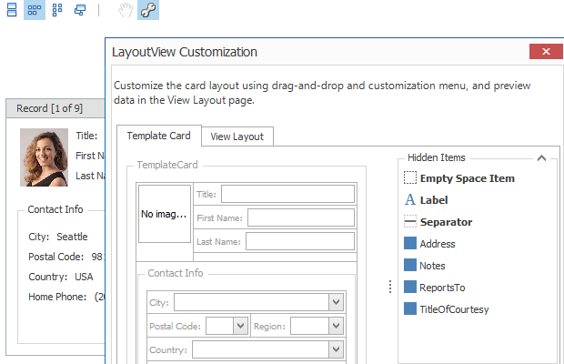
LayoutView - Runtime Customization
LayoutView - Carousel Mode

LayoutView
Features include:
- Simple and complex arrangement of fields within cards
- Several card arrangement rules (in one or multiple columns, in one or multiple rows, in an ellipse (carousel mode), or a single card at a time)
- Stretching cards to View width/height
- Sorting and filtering cards
- Multiple card selection
- Split presentation mode
- In-place cell editing using various data editors
- Runtime card field layout customization
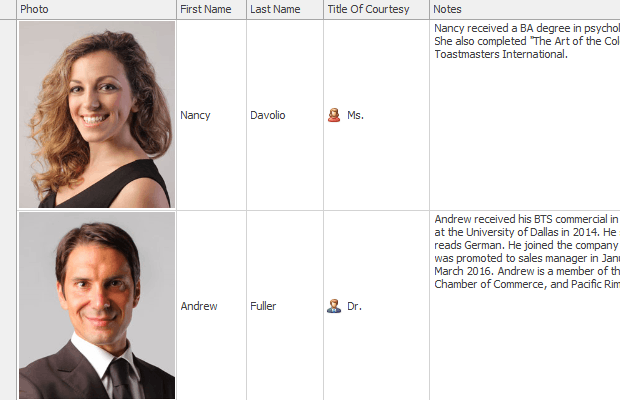
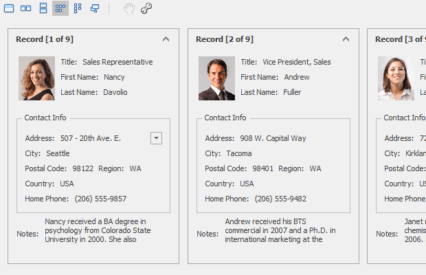
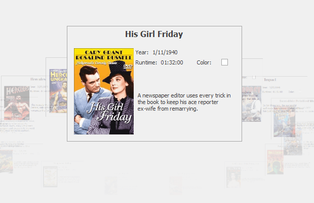
Card View
The Card View displays data records as cards, arranged down and then across. Card fields are always arranged in a single column. The Card View is represented by the CardView class.
CardView
CardView - Runtime Customization
Features include:
- Basic card field arrangement (in a single column)
- Arrangement of cards down and then across
- Card sort and filter
- Multiple card selection
- Split presentation mode
- In-place cell editing using various data editors
- Runtime card field layout customization (toggle card field visibility)
WinExplorer View
The WinExplorer View displays records using one of seven styles supported by Microsoft Windows Explorer — Small, Medium, Large, Extra Large, List, Tiles, and Content. The view supports HTML-CSS templates that allow you to create fully custom UIs. The view is represented by the WinExplorerView class.
WinExplorerView - Tiles Style
WinExplorerView - Small Style
WinExplorerView - Medium Style

WinExplorerView - Large Style

WinExplorerView - ExtraLarge Style

WinExplorerView - Content Style
WinExplorerView - List Style
Features include:
- Seven data presentation formats — Small, Medium, Large, Extra Large, List, Tiles, and Content
- Context buttons
- Card sort and filter (in code)
- Data grouping (by one column)
- Disable items based on data from a data source
- Select items with built-in item check boxes
- Load images asynchronously
- Select multiple cards
- Split presentation mode
Learn more about WinExplorerView
Tile View & Kanban Board
The Tile View displays records as tiles using one of the following layout modes: default (standard table layout), list (tiles have no space between them), or Kanban. The Tile View includes the Tile Template feature that allows you to arrange fields relative to other fields, specify absolute or relative field display bounds, etc. In-place editors are supported when you use HTML-based templates.
The Tile View is represented by the TileView class.
Features include:
- Arrange tile elements (columns) relative to tile corners and other tile elements
- Context buttons
- Sort and filter tiles (in code)
- Group data (by one column)
- Disable tiles based on data from a data source
- Tile check marks
- Edit data in a modal edit form
- Kanban tile presentation mode
- Load images asynchronously
- Split presentation mode
Items View
The Items View renders items (records) using an HTML-CSS template that you can specify with a property, or dynamically with an event. It is represented by the ItemsView class.
Select a View
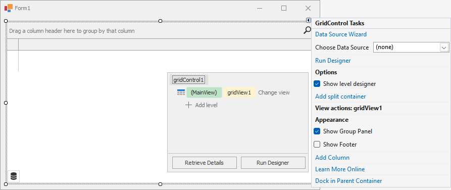
When you drop a GridControl onto the form at design time (or when you create this control in code), it is created with an embedded GridView - a View that presents underlying data as a two-dimensional table.
At design time:
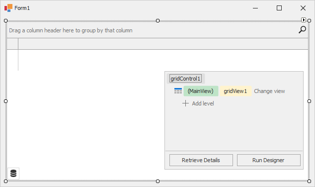
At runtime (after you bind the grid to data and add columns to the GridView):
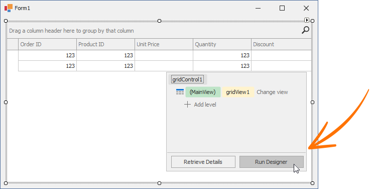
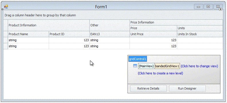
At design time, the data grid displays the Level Designer at the bottom right corner. The Level Designer allows you to access and manipulate (create, delete, and convert) data Views, and run the Grid Designer.
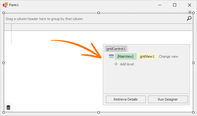
The  box in the Level Designer identifies the current View. Click Change view to change the data View.
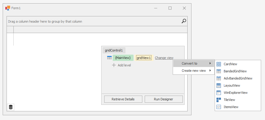
Select one of the following options:
- Convert to — Allows you to convert the View to another type. The conversion transfers columns (if they exist) and appropriate settings from this View to a new View. The “old” View is removed (destroyed).
- Create new view — Allows you to create a new View (the “old” View is not removed). You can access new and old Views in the Level Designer, the grid control’s Designer, and the GridControl.ViewCollection property in code.
For instance, if you convert the GridView to CardView, the Level Designer will display  .
.
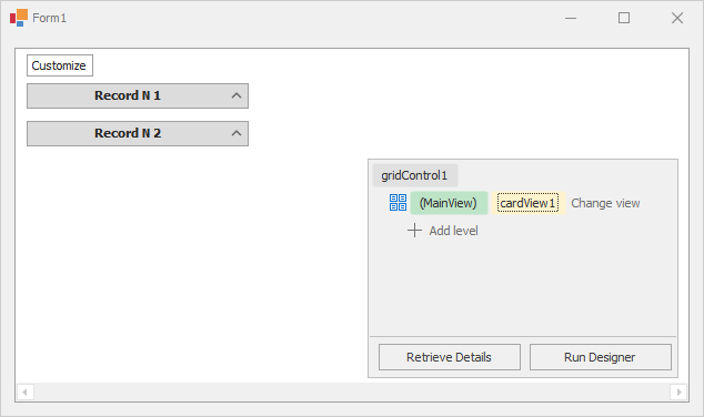
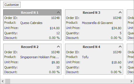
At runtime, you will see the following card UI:
Note
The Grid Control can also display data from hierarchical data sources (with two or more tables (data lists) linked by master-detail relationships). These relationships are also called one-to-many relationships: each record in a master table corresponds to one or more records in a child (detail) table. With the Level Designer, you can specify the data Views that display master and detail tables.
Read the following topic for detailed information: Master-Detail Relationships.
Supply Data for Views and Populate Column Collection
A View’s data is supplied by the grid control’s bound data source that is specified by the GridControl.DataSource and GridControl.DataMember properties.
At design time, you can use the Grid’s smart tag menu to bind the grid control to data.
You can do one of the following:
- Open the drop-down menu next to Choose Data Source to run the Visual Studio Data Source Configuration Wizard.
- Select Data Source Wizard to run the DevExpress Data Source Configuration Wizard that simplifies binding to various data source types (ADO.NET, SQL data, Entity Framework, etc.).
Important
The DevExpress Data Source Wizard calls the standard Visual Studio Data Source Configuration Wizard that is not available in .NET projects. You should create datasets, binding sources, and table adapters manually (or you can generate them in a .NET Framework project and add to the .NET project).
Refer to the following topic for more information on how to bind to various data source types: Data Binding.
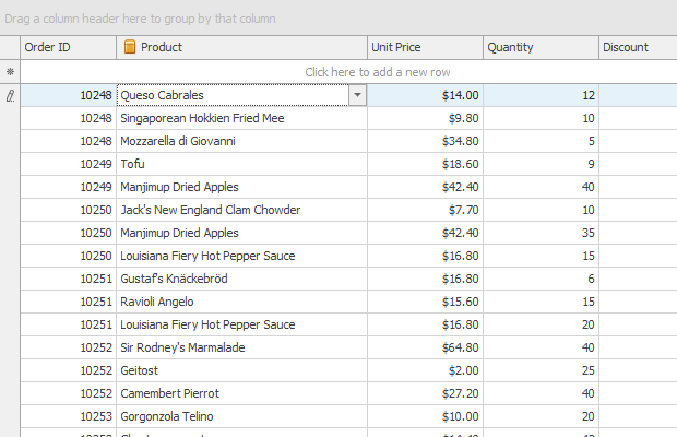
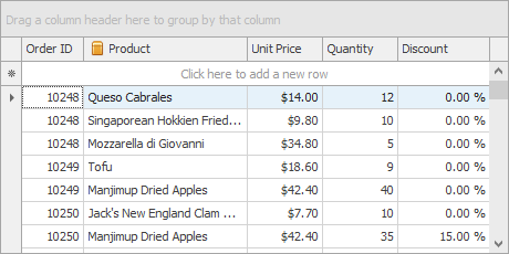
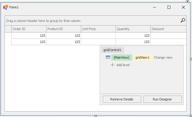
Once you bind the grid control to data, the View automatically creates columns for all fields in the bound data source (if the grid’s column collection was empty prior to binding). The following image shows the GridView populated with data from a sample data table that has five data fields.
You can use the View’s OptionsBehavior.AutoPopulateColumns setting to disable automatic column population.
Unlike other Views, the WinExplorerView and TileView do not automatically show added columns. For these Views, additional customization is required to set up a layout within items/cards. Read the following topics for more information:
Access and Customize Views and Columns at Design Time
Views and their columns have multiple options and events to customize the way underlying data is presented on-screen. You can access and customize their settings in a number of ways.
On-Form Selection and Properties Window
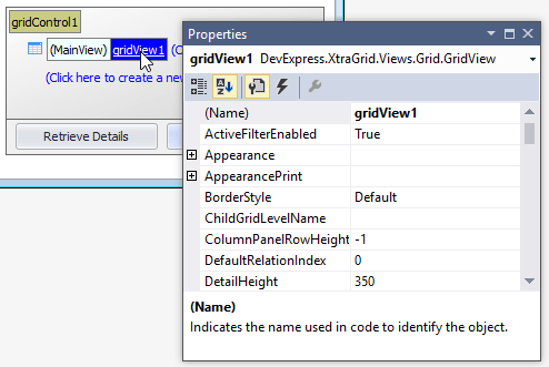
Since View and column objects are visual components, they are accessible from the Visual Studio Properties window.
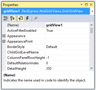
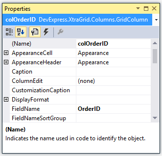
The data grid supports design-time on-form selection of Views and columns. To select a View and list its settings in the Properties window, click the View in the Level Designer.
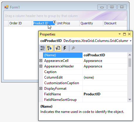
To select a column, click its header directly on the form:
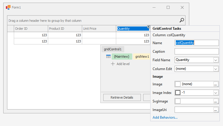
Column Smart Tags
Column smart tags display main column settings in GridViews, Banded GridViews, and Advanced Banded GridViews:
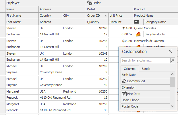
Grid Designer
The Grid Designer allows you to manage Views, columns, in-place editors, group summaries, appearance settings, and layout options. It contains the “Feature Browser” page to quickly locate settings related to a specific functionality. To invoke the Grid Designer, click the Run Designer button in the Level Designer:
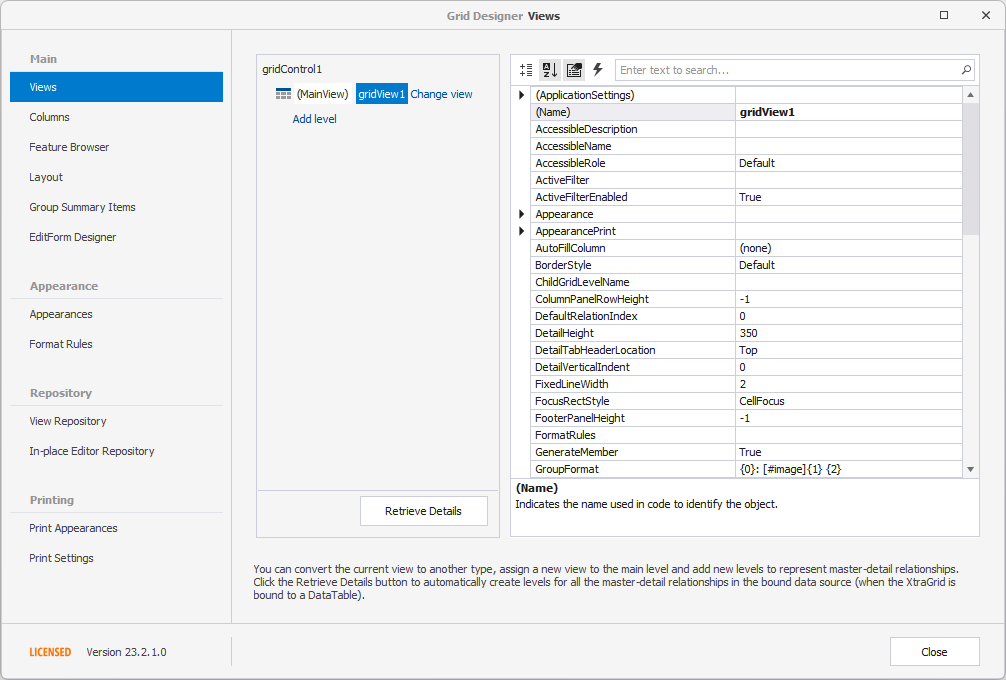
The Grid Designer has a navigation bar on the left that allows you to select various pages. For instance, the Views page is equivalent to the Level Designer. This page allows you to access the current top level View and nested Views (if any).
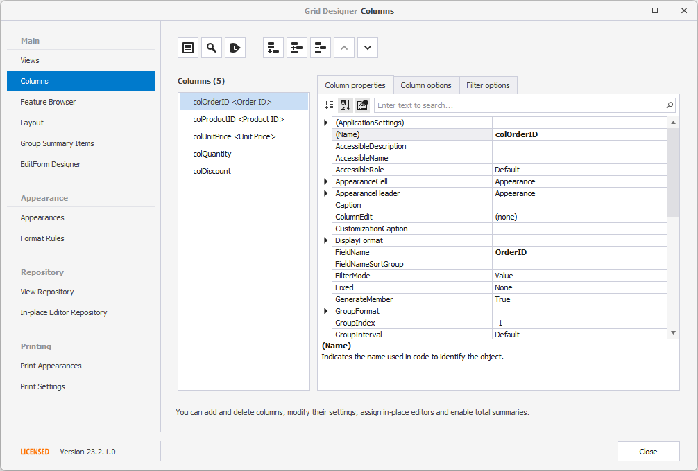
The Columns page shows available data source fields and columns (visible and hidden) that are bound to these fields. You can customize individual columns, clear the column collection, add new columns manually, or populate the View with columns from the bound data source with a single button click.
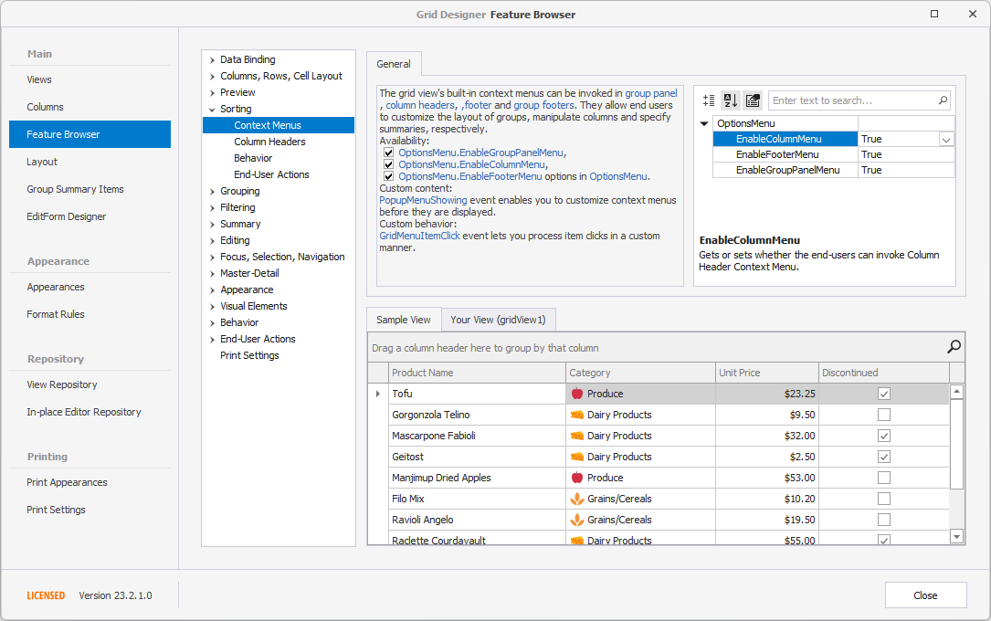
The Feature Browser page categorizes options and events based on specific features:
Read the following topic for more information: Grid Designer.
Access and Customize Views and Columns in Code
View and column objects are components. When created at design time, you can access them in code by their names:
Use the GridControl.MainView property to access the grid control’s top level View (you should cast this property value to the corresponding View type):
GridView view = gridControl1.MainView as GridView;
if (view != null)
    view.OptionsView.RowAutoHeight = true;
The following example shows how to change the main View:
You can obtain grid columns from the View’s ColumnView.Columns collection by the index or field name:
In master-detail mode, the data grid displays multiple Views. Use the following properties and methods to get displayed detail Views:
Read the following topics to learn more: Master-Detail Relationships - Pattern and Clone Views and Access Master and Clone Views.
Example: How to Change the View
The following example replaces the existing top level View with a BandedGridView, and adds a band and column to the View:
using DevExpress.XtraGrid.Views.BandedGrid;

// Dispose of the old view
gridControl1.MainView.Dispose();
// Create a Banded Grid View
BandedGridView bandedView = new BandedGridView(gridControl1);
gridControl1.MainView = bandedView;
// Add one band and one column to the view
GridBand band = bandedView.Bands.AddBand("General");
BandedGridColumn column = (BandedGridColumn)bandedView.Columns.AddField("CustomerID");
column.OwnerBand = band;
column.Visible = true;
Layout of Columns and Bands (in Grid Views and Banded Grid Views)
The GridView, BandedGridView, and AdvBandedGridView support on-form design-time layout customization via drag-and-drop. You can re-order, resize and hide columns and bands:
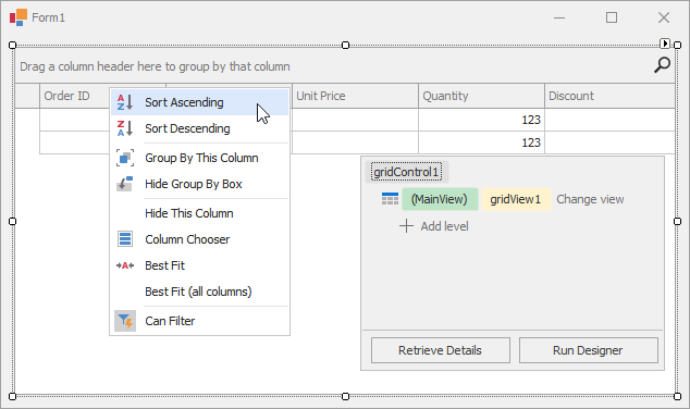
The context menu, invoked on a column header click, allows you to sort and group data against a column, calculate the best column width and show the Column Chooser (Column/Band Chooser in Banded Views) - a floating panel that provides access to hidden columns (and bands in Banded Views). Hidden columns (and bands) can be restored from the Column/Band Chooser back to the View using drag-and-drop:
You can also customize column and band settings in the Visual Studio Properties window (GridColumn.VisibleIndex, GridBand.VisibleIndex, GridColumn.Width, GridColumn.SortOrder, GridColumn.SortIndex, etc.).
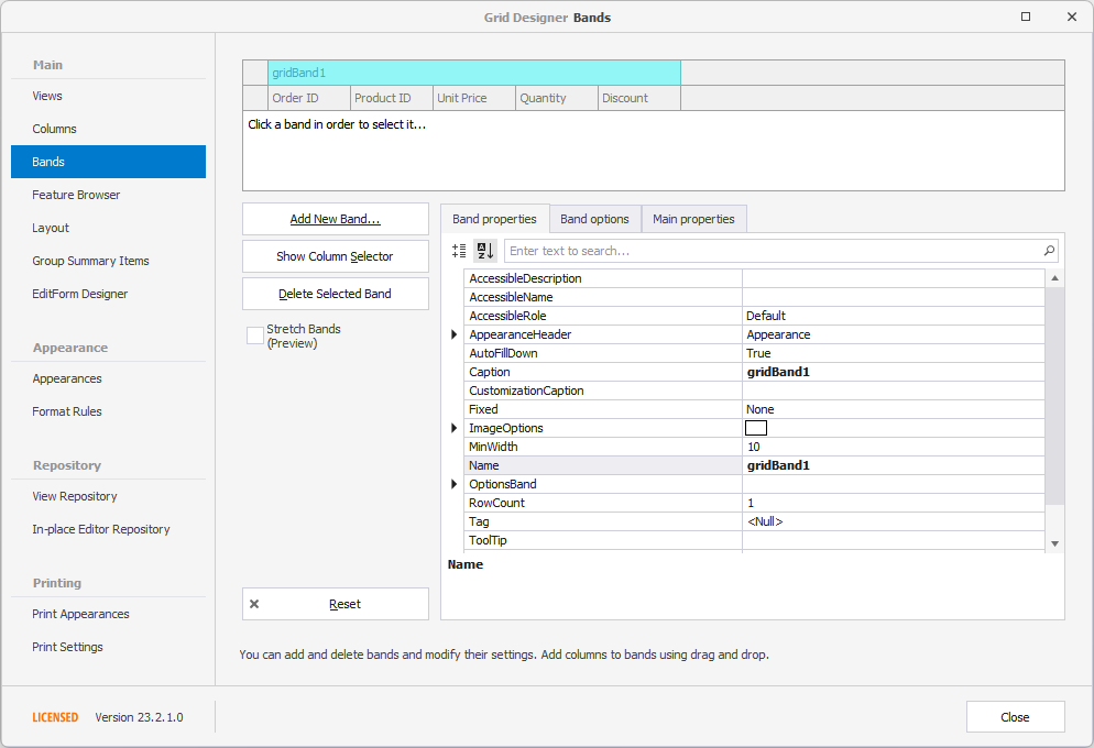
For Banded Views (BandedGridView and AdvBandedGridView), use the Bands page of the Grid Designer to add new bands and rearrange bands and columns. You can also re-arrange bands and columns on the form:
Examples
Create GridView
The following example creates a GridControl at runtime and shows how to perform basic customization tasks:
- Bind the grid to a data source
- Access the View that displays the underlying data
- Access columns
- Assign an in-place editor (a combo box editor) to a column
- Sort and group data
- Calculate total and group summaries
- Create a filter
- Hide columns and calculate column “best” widths
- Expand group rows
- Focus a specific cell
- Specify DataAnnotation attributes (column display names and data formats) at the data source level
Note
Add the corresponding assemblies to your Windows Forms project.
Read the following topic for information: Redistribution and Deployment.
using System;
using DevExpress.ClipboardSource.SpreadsheetML;
using DevExpress.Data;
using DevExpress.XtraEditors;
using DevExpress.XtraEditors.Repository;
using DevExpress.XtraGrid;
using DevExpress.XtraGrid.Columns;
using DevExpress.XtraGrid.Views.Grid;
using System.ComponentModel;
using System.ComponentModel.DataAnnotations;
using System.Runtime.CompilerServices;
using System.Windows.Forms;
namespace DXApplication {
public partial class Form1 : XtraForm {
public Form1() {
InitializeComponent();
this.Load += Form1_Load;
}
private void Form1_Load(object sender, EventArgs e) {
GridControl gridControl1 = new GridControl() {
Name = "gridControl1",
Parent = this,
Dock = DockStyle.Fill
};
gridControl1.DataSource = DataHelper.GetData(30);
// The grid automatically creates columns for the public fields found in the data source.
// Calling the gridView1.PopulateColumns method is not required unless gridView1.OptionsBehavior.AutoPopulateColumns is disabled.
// The grid automatically creates a GridView that displays the underlying data as a two-dimensional table.
GridView gridView1 = gridControl1.MainView as GridView;
// Obtain created columns.
GridColumn colCompany = gridView1.Columns["CompanyName"];
GridColumn colID = gridView1.Columns["ID"];
GridColumn colDate = gridView1.Columns["RequiredDate"];
GridColumn colPayment = gridView1.Columns["Value"];
GridColumn colProcessed = gridView1.Columns["Processed"];
// The Company column uses a ComboBox in-place editor that shows a list of available companies.
RepositoryItemComboBox riComboBox = new RepositoryItemComboBox();
riComboBox.Items.AddRange(DataHelper.companies);
gridControl1.RepositoryItems.Add(riComboBox);
colCompany.ColumnEdit = riComboBox;
// Hide a column.
colID.Visible = false;
// Group and sort data.
colCompany.GroupIndex = 0;
colDate.SortIndex = 0;
colDate.SortOrder = DevExpress.Data.ColumnSortOrder.Descending;
// Show group columns in the table.
gridView1.OptionsView.ShowGroupedColumns = true;
// Expand group rows.
gridView1.ExpandAllGroups();
// Apply a filter.
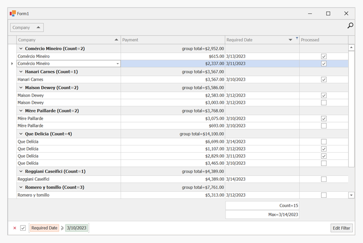
gridView1.ActiveFilterString = "[RequiredDate]>= #" + DateTime.Today.ToString() + "#";
// Calculate two total summaries.
colDate.Summary.Add(SummaryItemType.Count, colDate.FieldName, "Count={0}");
colDate.Summary.Add(SummaryItemType.Max, colDate.FieldName, "Max={0:d}");
gridView1.OptionsView.ShowFooter = true;
// Calculate group summaries.
GridGroupSummaryItem item = new GridGroupSummaryItem();
item.FieldName = colCompany.FieldName;
item.SummaryType = DevExpress.Data.SummaryItemType.Count;
gridView1.GroupSummary.Add(item);
GridGroupSummaryItem item1 = new GridGroupSummaryItem();
item1.FieldName = colPayment.FieldName;
item1.SummaryType = SummaryItemType.Sum;
item1.DisplayFormat = "group total={0:c2}";
item1.ShowInGroupColumnFooter = colPayment;
gridView1.GroupSummary.Add(item1);
// Forcibly move group footer summaries to positions in group rows under corresponding column headers.
gridView1.OptionsBehavior.AlignGroupSummaryInGroupRow = DevExpress.Utils.DefaultBoolean.True;
// Focus a specific cell.
gridView1.FocusedRowHandle = 1;
gridView1.FocusedColumn = colCompany;
// Optimize column widths.
colDate.BestFit();
colProcessed.BestFit();
}
}
public class Record : INotifyPropertyChanged {
public Record() {
}
int id;
public int ID {
get { return id; }
set {
if(id != value) {
id = value;
OnPropertyChanged();
}
}
}
string text;
[DisplayName("Company")]
public string CompanyName {
get { return text; }
set {
if(text != value) {
if(string.IsNullOrEmpty(value))
throw new Exception();
text = value;
OnPropertyChanged();
}
}
}
Nullable<decimal> val;
[DataType(System.ComponentModel.DataAnnotations.DataType.Currency)]
[DisplayName("Payment")]
public Nullable<decimal> Value {
get { return val; }
set {
if(val != value) {
val = value;
OnPropertyChanged();
}
}
}
DateTime dt;
[DisplayFormat(DataFormatString = "d")]
public DateTime RequiredDate {
get { return dt; }
set {
if(dt != value) {
dt = value;
OnPropertyChanged();
}
}
}
bool state;
public bool Processed {
get { return state; }
set {
if(state != value) {
state = value;
OnPropertyChanged();
}
}
}
public override string ToString() {
return string.Format("ID = {0}, Text = {1}", ID, CompanyName);
}
public event PropertyChangedEventHandler PropertyChanged;
protected void OnPropertyChanged([CallerMemberName] string propertyName = "") {
if(PropertyChanged != null)
PropertyChanged(this, new PropertyChangedEventArgs(propertyName));
}
}
public class DataHelper {
public static string[] companies = new string[] { "Hanari Carnes", "Que Delícia", "Romero y tomillo", "Mère Paillarde",
"Comércio Mineiro", "Reggiani Caseifici", "Maison Dewey" };
public static BindingList<Record> GetData(int count) {
BindingList<Record> records = new BindingList<Record>();
Random rnd = new Random();
for(int i = 0; i < count; i++) {
int n = rnd.Next(10);
records.Add(new Record() {
ID = i + 100,
CompanyName = companies[i % companies.Length],
RequiredDate = DateTime.Today.AddDays(n - 5),
Value = i % 2 == 0 ? (i + 1) * 123 : i * 231,
Processed = i % 2 == 0,
});
};
return records;
}
}
}
Create BandedGridView
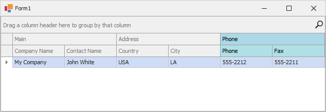
This example shows how to create a GridControl, while presenting its underlying data using a banded grid format (BandedGridView). The example creates three bands (Main, Address and Phone), adds columns to the bands and customizes the background color for the third band and its columns.
using System;
using System.Collections.Generic;
using System.Windows.Forms;
using DevExpress.XtraEditors;
using DevExpress.XtraGrid;
using DevExpress.XtraGrid.Views.BandedGrid;

namespace DXApplication {
    public partial class Form1 : XtraForm {
        public Form1() {
            InitializeComponent();
            this.Load += Form1_Load;
        }
        private void Form1_Load(object sender, EventArgs e) {
            GridControl gridControl1 = new GridControl() { Parent = this, Dock = DockStyle.Fill };

            BandedGridView bandedGridView1 = new BandedGridView(gridControl1);
            GridBand gridBandMain = new GridBand() { Caption = "Main", VisibleIndex = 0 };
            GridBand gridBandAddress = new GridBand() { Caption = "Address", VisibleIndex = 1 };
            GridBand gridBandPhone = new GridBand() { Caption = "Phone", VisibleIndex = 2 };
            BandedGridColumn colCity = new BandedGridColumn() { FieldName = "City", Visible = true };
            BandedGridColumn colCompanyName = new BandedGridColumn() { FieldName = "CompanyName", Visible = true };
            BandedGridColumn colContactName = new BandedGridColumn() { FieldName = "ContactName", Visible = true };
            BandedGridColumn colCountry = new BandedGridColumn() { FieldName = "Country", Visible = true };
            BandedGridColumn colPhone = new BandedGridColumn() { FieldName = "Phone", Visible = true };
            BandedGridColumn colFax = new BandedGridColumn() { FieldName = "Fax", Visible = true };

            gridControl1.DataSource = new List<DataRecord>() {
                new DataRecord(){ City = "LA", CompanyName = "My Company", ContactName = "John White",
                   Country = "USA",  Fax = "555-2211", Phone = "555-2212" }
            };
            gridControl1.ViewCollection.Add(bandedGridView1);
            gridControl1.MainView = bandedGridView1;

            bandedGridView1.Bands.AddRange(new GridBand[] { gridBandMain, gridBandAddress, gridBandPhone });
            bandedGridView1.Columns.AddRange(new BandedGridColumn[] { colCompanyName, colContactName, colCity, colCountry, colPhone, colFax });

            colPhone.AppearanceCell.BackColor = System.Drawing.Color.PowderBlue;
            colPhone.AppearanceCell.Options.UseBackColor = true;
            colPhone.AppearanceHeader.BackColor = System.Drawing.Color.PowderBlue;
            colPhone.AppearanceHeader.Options.UseBackColor = true;

            colFax.AppearanceCell.BackColor = System.Drawing.Color.PowderBlue;
            colFax.AppearanceCell.Options.UseBackColor = true;
            colFax.AppearanceHeader.BackColor = System.Drawing.Color.PowderBlue;
            colFax.AppearanceHeader.Options.UseBackColor = true;

            gridBandMain.Columns.Add(colCompanyName);
            gridBandMain.Columns.Add(colContactName);

            gridBandAddress.Columns.Add(colCountry);
            gridBandAddress.Columns.Add(colCity);

            gridBandPhone.AppearanceHeader.BackColor = System.Drawing.Color.LightBlue;
            gridBandPhone.AppearanceHeader.Options.UseBackColor = true;
            gridBandPhone.Columns.Add(colPhone);
            gridBandPhone.Columns.Add(colFax);

            bandedGridView1.OptionsCustomization.AllowChangeColumnParent = false;
        }
    }

    public class DataRecord {
        public string CompanyName{ get; set; }
        public string ContactName { get; set; }
        public string City { get; set; }
        public string Country { get; set; }
        public string Phone { get; set; }
        public string Fax { get; set; }
    }
}
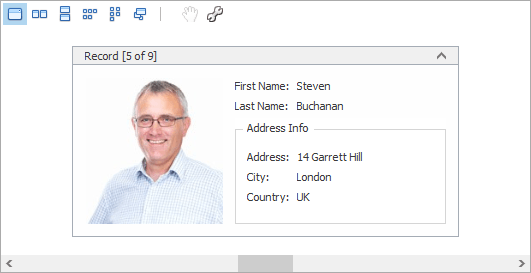
Create LayoutView
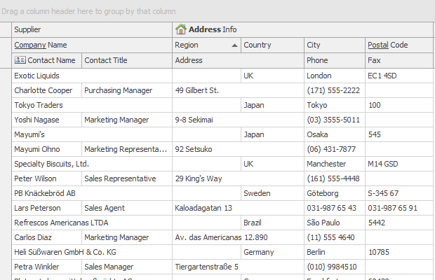
The following example shows how to create and customize a Layout View in code. In the example, a template card is created, consisting of six fields arranged as in the image below:
Before arranging layout fields in code, ensure that corresponding columns are visible (see LayoutViewColumn.Visible and GridColumnCollection.AddVisible).
using DevExpress.XtraGrid;
using DevExpress.XtraGrid.Views.Layout;
using DevExpress.XtraGrid.Columns;
using DevExpress.XtraLayout;
using DevExpress.XtraLayout.Customization;
using DevExpress.XtraLayout.Utils;
using DevExpress.XtraEditors.Repository;
using DevExpress.XtraEditors.Controls;

GridControl grid = new GridControl();
LayoutView lView = new LayoutView(grid);
grid.MainView = lView;
lView.OptionsBehavior.AutoPopulateColumns = false;

grid.DataSource = employeesBindingSource;
this.Controls.Add(grid);
grid.Dock = DockStyle.Fill;

// Create columns.
LayoutViewColumn colFirstName = lView.Columns.AddVisible("FirstName") as LayoutViewColumn;
LayoutViewColumn colLastName = lView.Columns.AddVisible("LastName") as LayoutViewColumn;
LayoutViewColumn colAddress = lView.Columns.AddVisible("Address") as LayoutViewColumn;
LayoutViewColumn colCity = lView.Columns.AddVisible("City") as LayoutViewColumn;
LayoutViewColumn colCountry = lView.Columns.AddVisible("Country") as LayoutViewColumn;
LayoutViewColumn colPhoto = lView.Columns.AddVisible("Photo") as LayoutViewColumn;

// Access corresponding card fields.
LayoutViewField fieldFirstName = colFirstName.LayoutViewField;
LayoutViewField fieldLastName = colLastName.LayoutViewField;
LayoutViewField fieldAddress = colAddress.LayoutViewField;
LayoutViewField fieldCity = colCity.LayoutViewField;
LayoutViewField fieldCountry = colCountry.LayoutViewField;
LayoutViewField fieldPhoto = colPhoto.LayoutViewField;

// Position the FirstName field to the right of the Photo field.
fieldFirstName.Move(new LayoutItemDragController(fieldFirstName, fieldPhoto,
    InsertLocation.After, LayoutType.Horizontal));

// Position the LastName field below the FirstName field.
fieldLastName.Move(new LayoutItemDragController(fieldLastName, fieldFirstName,
    InsertLocation.After, LayoutType.Vertical));

// Create an Address Info group.
LayoutControlGroup groupAddress = new LayoutControlGroup();
groupAddress.Text = "Address Info";
groupAddress.Name = "addressInfoGroup";

// Move the Address, City and Country fields to this group.
groupAddress.AddItem(fieldAddress);
fieldCity.Move(fieldAddress, InsertType.Bottom);
fieldCountry.Move(fieldCity, InsertType.Bottom);

lView.TemplateCard.AddGroup(groupAddress, fieldLastName, InsertType.Bottom);

// Assign editors to card fields.
RepositoryItemPictureEdit riPictureEdit = grid.RepositoryItems.Add("PictureEdit") as RepositoryItemPictureEdit;
riPictureEdit.SizeMode = PictureSizeMode.Squeeze;
colPhoto.ColumnEdit = riPictureEdit;

// Customize card field options.
colFirstName.Caption = "First Name";
colLastName.Caption = "Last Name";
// Set the card's minimum size.
lView.CardMinSize = new Size(250, 180);

fieldPhoto.TextVisible = false;
fieldPhoto.SizeConstraintsType = SizeConstraintsType.Custom;
fieldPhoto.MaxSize = fieldPhoto.MinSize = new Size(150, 150);