Tabbed View
- 9 minutes to read
The Tabbed View displays Documents as tabs. Each document is maximized to occupy the entire area of the DocumentManager. An end-user can navigate through tabs by clicking their headers. A Tabbed View is represented by the TabbedView class instance. The image below illustrates a common tabbed UI.

Note
If you do not need all the DocumentManager features and all you want is a simple tabbed UI, use the XtraTabbedMdiManager component instead.
Tabs
Each tab is the Document class instance, docked to the View’s region. These tabbed documents are stored within the BaseView.Documents collection. The Tabbed View also allows Dock Manager panels to be docked to this View. In this case, the View will create tabbed documents to wrap dock panels. See the Interaction with Dock Panels topic to learn more about exclusive features that both components gain when placed upon the same form.
To dock documents at runtime, end-users use docking hints that are shown when the document is being dragged (see the figure below).

To do the same in code, use the View controller that provides all required methods to manage documents (e.g., the ITabbedViewController.Dock or IBaseViewController.Float methods).
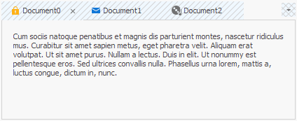
Tabs can be pinned by clicking the pin button next to their close button. Pinned documents are placed before regular tabs (see below). To enable this behavior, set the IDocumentProperties.AllowPin property to true.

Floating Documents
Tabs can be made floating by doing one of the following:
- right-clicking a tab’s header and choosing the ‘Float’ option;
- clicking a tab’s header and dragging it to the desired position.
Floating documents occupy the size according to their BaseDocument.FloatSize property values and are stored within the BaseView.FloatDocuments collection. Note that the BaseView.Documents collection does not provide access to floating documents.
To prevent end-users from undocking your tabs, set the IBaseDocumentProperties.AllowFloat property to false; and vice versa if the IBaseDocumentProperties.AllowDock property equals false, thus floating documents will be unable to dock back to the View. Same settings are available for individual documents rather than an entire View. To access them use the BaseDocument.Properties group.
Floating documents are often presented as separate MDI forms. If you set the BaseView.FloatingDocumentContainer property to FloatingDocumentContainer.DocumentsHost, floating documents will be hosted within their own floating Document Managers. This allows your end-users to dock multiple floating documents into one single floating form. The following figure illustrates an example.
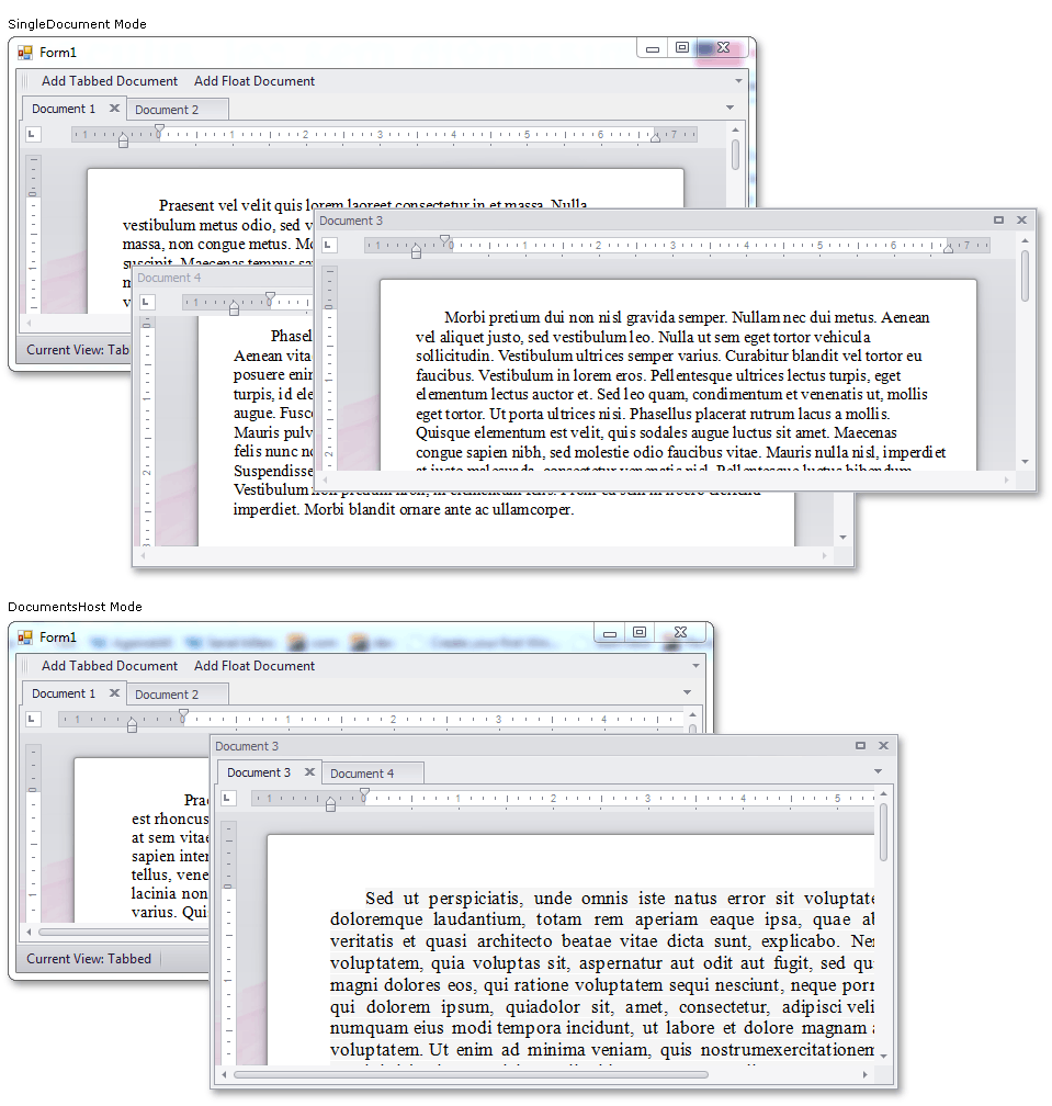
Since floating documents in the DocumentsHost mode are owned by separate local DocumentManager objects, each with its own Tabbed View within, all events related to floating documents are fired for these local Tabbed Views rather than for the main form’s View. If you need to handle these events, create your own custom document container and pass it to the View on the BaseView.CustomDocumentsHostWindow event. See this link for a detailed example.
Document Groups (Default Mode)
A document group is an instance of the DocumentGroup class that is capable of containing tabs and separated from neighboring document groups with splitters. End-users can drag these splitters at runtime to resize document groups as required. The following figure illustrates an example.

A Tabbed View always contains at least one document group that nests all tabbed documents. It is also possible to add new groups by doing one of the following:
dragging a required document to the form’s or document group’s edge, and dropping it on the required docking hint (see below);

- right-clicking a tab header and selecting the ‘New Horizontal Group’ or ‘New Vertical Group’ option;
- calling the controller’s ITabbedViewController.CreateNewDocumentGroup method from code;
manually modifying the TabbedView.DocumentGroups collection as the following code snippet shows.
By default, the second document group can be docked to any side of the View (and to any side of the first document group respectively). When two document groups are created, the View becomes either vertically or horizontally oriented, depending on whether these groups are located side-by-side or one below the other. This orientation is stored within the TabbedView.Orientation property. Starting with this moment, new document groups can be added only according to the View orientation. To address this limitation and enable document groups to dock to any desired side, switch the View to Free Layout Mode.
Free Layout Mode
In this mode, documents can be docked to any form edge regardless of the View orientation. This allows you to mix vertically and horizontally oriented groups as your needs dictate. The following figure illustrates an example.

To enable this behavior, set the TabbedView.EnableFreeLayoutMode property to true.
In Free Layout mode, document groups are placed to special containers - docking containers (the DevExpress.XtraBars.Docking2010.Views.Tabbed.DockingContainer class objects). Each container can host numerous child containers or one document group. The root container in this hierarchy is assigned to the View’s TabbedView.RootContainer property.
There is no need to add, remove or modify docking containers manually. If you wish to arrange your documents and groups in code, use the DocumentGroup.DockTo method to dock one group to another - this will automatically create all required docking containers with appropriate settings.
Docking Containers: Technical Info
Important
This section contains advanced info on docking container mechanics. Note that we do not recommend that you modify container properties manually. All required modifications are applied automatically when you change the layout at design time or dock groups by calling related controller methods from code.
Docking containers provide the Element and Nodes properties. The Element property stores the DocumentGroup, displayed within this container. The Nodes property provides access to child docking containers. These child containers are aligned into a column or row depending on the parent container’s Orientation property value.
Assume you have a layout, illustrated on the following figure: four documents are grouped into three document groups with mixed horizontal and vertical orientations.

For this layout, the View will create five (or at least four) docking containers, aligned as shown on the scheme below.

Docking Container 5 and Docking Container 4 - two top-level containers that host Document Group 3 (green) and Document Group 2 (blue) groups. These groups are assigned to their parent containers’ Element properties.
Docking Container 3 - a vertically oriented mid-level container that hosts previous two containers within its Nodes collection.
Docking container 2 - another mid-level container, holds the Document Group 1 (red).
Docking Container 1 - the underlying container which hosts all mid-level containers.
dockingContainer1.Nodes.AddRange(new DevExpress.XtraBars.Docking2010.Views.Tabbed.DockingContainer[] {dockingContainer2, dockingContainer3});Such a container is required when the View’s TabbedView.Orientation property value does not match the required layout of mid-level containers. In this example, the Docking Container 1 serves as a seam between the vertically oriented Tabbed View and two horizontally aligned containers (Docking Container 2 and Docking Container 3). If the View was oriented horizontally, Docking Container 1 would be unnecessary and its child containers could be hosted directly in the root container.
Root Container - a ground-level ‘shadow’ container. Accessed through the TabbedView.RootContainer property. This root container is added by a Tabbed View itself, no matter whether or not the Free Layout mode is enabled. Modifying this container’s property is strongly not recommended.
Docking containers expose no public properties to manage their sizes. Instead, each top-level container sizes automatically to fit its child group’s DocumentGroup.GroupLength property value. Mid-level containers are sized according to their child containers respectively.
Display MDI Documents
Use the DocumentManager.MdiParent property to specify the parent MDI form.
This example shows how to enable a tabbed UI for a DocumentManager where MDI child windows are presented as tab pages.

//Form1.cs
using System;
using System.Windows.Forms;
using DevExpress.XtraBars.Docking2010;
using DevExpress.XtraBars.Docking2010.Views.Tabbed;
using DevExpress.XtraEditors;

namespace DocumentManager_TabbedUI {
    public partial class Form1 : Form {
        public Form1() {
            InitializeComponent();
        }
        void Form1_Load(object sender, EventArgs e) {
            AddDocumentManager();
            for(int i = 0; i < 3; i++) {
                AddChildForm();
            }
        }
        void AddDocumentManager() {
            DocumentManager manager = new DocumentManager(components);
            manager.MdiParent = this;
            manager.View = new TabbedView();
        }
        int count;
        void AddChildForm() {
            Form childForm = new Form();
            childForm.Text = "Child Form " + (++count).ToString();

            SimpleButton btn = new SimpleButton();
            btn.Text = "Button " + count.ToString();
            btn.Parent = childForm;

            childForm.MdiParent = this;
            childForm.Show();
        }
    }
}
Custom Paint Tabs
Handle the CustomDrawTabHeader event to manually paint tab headers.
The code below shows how to draw a custom background in tab headers and header buttons.
using System.Drawing.Drawing2D;

HatchBrush myHatchBrush1 = new HatchBrush(HatchStyle.BackwardDiagonal, Color.LightGray, Color.AliceBlue);
private void TabbedView_CustomDrawTabHeader(object sender, XtraTab.TabHeaderCustomDrawEventArgs e) {
    e.Cache.FillRectangle(myHatchBrush1, e.Bounds);
    e.DefaultDrawText();
    e.DefaultDrawImage();
    e.DefaultDrawButtons();
    e.Handled = true;
}
HatchBrush myHatchBrush2 = new HatchBrush(HatchStyle.DiagonalCross, Color.LightGray, Color.AliceBlue);
private void TabbedView_CustomDrawHeaderButton(object sender, XtraTab.HeaderButtonCustomDrawEventArgs e) {
    e.Cache.FillRectangle(myHatchBrush2, e.Bounds);
    e.DefaultDraw();
    e.Handled = true;
}
The following example demonstrates how to obtain the bounds of a tab header and its UI elements, and the document itself:
using System.Drawing.Drawing2D;

private void TabbedView1_CustomDrawTabHeader(object sender, DevExpress.XtraTab.TabHeaderCustomDrawEventArgs e) {
    // Gets the document.
    var document = (e.TabHeaderInfo.Page as IDocumentInfo).Document;
    var tabHeaderBounds = e.Bounds;
    var textBounds = e.TabHeaderInfo.Text;
    var buttonBounds = e.TabHeaderInfo.ButtonsPanel.Bounds;
    /*
     * Draw the tab header and its UI elements.
     * ...
     */
}