BackstageView Control
- 4 minutes to read
BackstageViewControl emulates the main application menu in Ribbon-based Office 2010 (and newer) applications. Also, the BackstageView Control can be used separately from RibbonControl to implement a multi-level navigation control.
- Create a BackstageView Control-Based Ribbon Menu
- Backstage Regions and Items
- Styles
- Multi-Level Backstage Menus
Create a BackstageView Control-Based Ribbon Menu
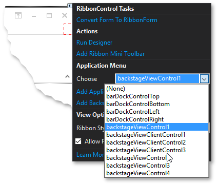
To create a BackstageView Control associated with a Ribbon, invoke the Ribbon smart tag and click “Add Backstage View”.
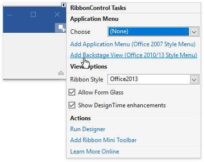
Alternatively, locate the “BackstageViewControl” item in your VS Toolbox (the “Navigation & Layout” tab) and drop it onto your form. Then, assign it to the Ribbon’s RibbonControl.ApplicationButtonDropDownControl property.
To hide/display the BackstageView at design time, use “the Hide in DesignTime” / “Show BackStageView” smart tag commands.
Backstage Regions and Items
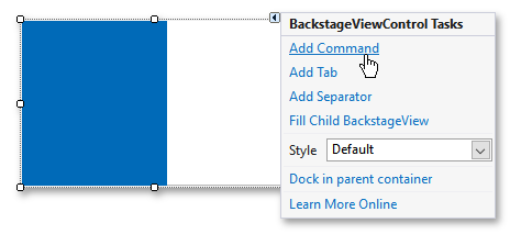
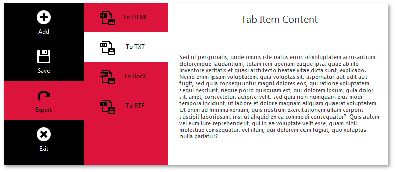
BackstageViewControl supports three child item types: buttons, tabs, and separators.
- BackstageViewButtonItem - a regular push button that performs a certain action when clicked.
- BackstageViewTabItem - a tab item that carries a specific content. This content is visible when the tab is selected.
- BackstageViewItemSeparator - a solid thin line that delimits neighboring items.
To populate a backstage with items at design time, utilize the backstage smart-tag.
In code, you can do the same by modifying the BackstageViewControl.Items collection.
BackstageViewButtonItem button1 = new BackstageViewButtonItem() {
    Caption = "Save",
    Glyph = DevExpress.Images.ImageResourceCache.Default.GetImage("office2013/save/save_32x32.png")
};
BackstageViewTabItem tab1 = new BackstageViewTabItem() {
    Caption = "Save As...",
    Glyph = DevExpress.Images.ImageResourceCache.Default.GetImage("office2013/save/saveas_32x32.png")
};
backstageViewControl1.Items.Add(button1);
backstageViewControl1.Items.Add(tab1);
backstageViewControl1.Items.Insert(1, new BackstageViewItemSeparator());
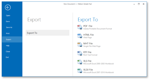
Buttons, tabs and separators reside in the left (main) region of your backstage. The right (content) region remains empty until an end-user selects a tab item. When this happens, the selected tab expands its content to the content region.
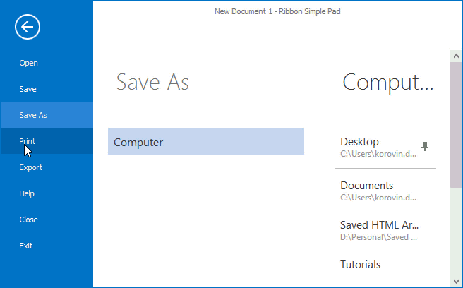
To get or set which Ribbon tab is currently selected, utilize the BackstageViewControl.SelectedTab property.
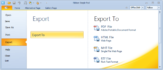
To populate a tab item, you can use one of the following patterns.
Create UserControls for each tab item and manually populate them with buttons, editors, labels, etc. Then you can drag-and-drop a UserControl into a BackstageViewClientControl container, which is automatically created for every tab item. The sample below illustrates how to do the same in code.
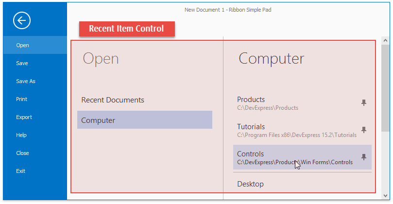
Utilize the Recent Item Control - a stand-alone control that provides a set of child elements (tabs, buttons, pin buttons, labels, etc.). A Recent Item Control divides the content region of your BackstageView Control in two panes, which allows you to create a complex 3-tier backstage layout.
- Place separate BackstageView Controls inside tab items of other BackstageView Controls. This approach is used to create multi-level navigation menus.
Backstage Styles
The BackstageView Control supports two styles - Office 2010 and Office 2013. By default, a BackstageView changes its style automatically when the parent Ribbon control’s style changes. You can also explicitly apply a desired style by utilizing the BackstageViewControl.Style property.
Office 2010 | Office 2013 | |
|---|---|---|
Image |
|
|
Related Ribbon styles (the RibbonControl.RibbonStyle property values) | ||
Size and position | Leaves the Quick Access Toolbar and page headers visible. | Covers the entire parent form. |
Back button | No | Yes |
Additional Features |
|
|
Multi-level Backstage Menus
It is possible to assign a separate BackstageViewControl to each tab item of another BackstageView Control. Selecting a tab inside the top-level backstage menu will bring another set of buttons and tabs, owned by tier two backstage. This backstage, in turn, can show other child backstage controls for its tab items, etc. Such a cascade of backstage menus can be used separately from the ribbon, for instance, as a side navigation control.
A parent BackstageView Control can share its appearance settings with child BackstageView Controls.
Refer to the How to: Create a multi-level BackstageView Control article to learn how to combine multiple backstage view controls.