Tile Groups and Items
- 5 minutes to read
This article will introduce to you tiles and tile groups - basic Tile Control elements. In this topic:
Tiles
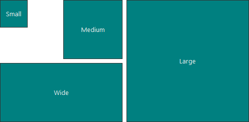
A Tile is the TileItem class object that is the Windows Modern-styled push or check button. Tile Control supports four tile sizes, specified by the TileItem.ItemSize property.
- Small - a square Tile with side dimension of half the TileControl.ItemSize property value.
- Medium - a square Tile with side dimension equal to the TileControl.ItemSize property value. This is the default Tile size.
- Wide - a rectangular Tile with its lesser side equal to the TileControl.ItemSize property value and its larger side twice as big as the lesser side.
- Large - an extra large square Tile with side dimensions twice as large as the TileControl.ItemSize property value.
The figure below demonstrates tiles of all supported sizes.
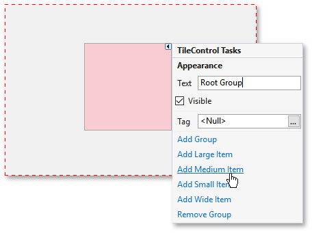
At design time, you can use a tile group’s smart-tag to add a tile of the desired size (see below).
Each tile can display one or many images and text blocks. Refer to the Tile Item Structure topic to learn more. You can also animate your tiles by using the Tile Frame Animation feature.
Tiles can be dragged at both design and runtime. To disable dragging tiles at runtime, set the TileControl.AllowDrag property to false. You can also set the TileControl.AllowDragTilesBetweenGroups property to false to prohibit dragging tiles to tile groups other than their current parent groups. In this case, dragging tiles within their source groups’ bounds will still be enabled.
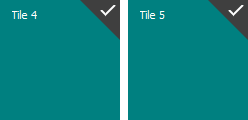
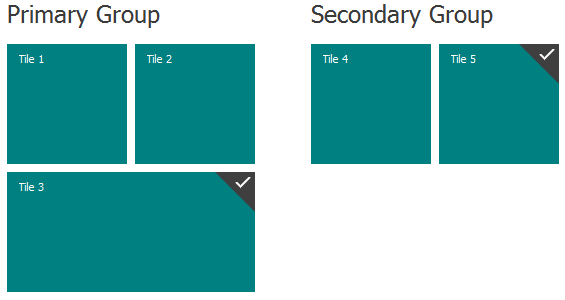
By default, tiles act as simple push buttons - clicking a tile raises the TileItem.ItemClick event that allows you to perform required actions. However, if you set the TileControl.ItemCheckMode to a value different from None, end-users will be able to right-click a tile to check it. Checked tiles are tiles with their TileItem.Checked properties equal to true. At runtime, such tiles display a check mark at their upper right corner depending on the currently applied application skin (see the following image). Checking and unchecking tiles fires the TileItem.CheckedChanged event.
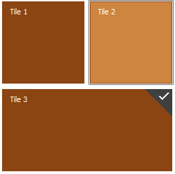
Tiles can also be selected. To enable this behavior, set the TileControl.AllowSelectedItem property to true. When enabled, this option allows you to select tiles by clicking them. Selected tiles are painted using appearance settings, stored within the Selected section of the TileControl.AppearanceItem property (see ‘Tile 2’ tile at the figure below). A selected tile is stored in the TileControl.SelectedItem property.
To change the distance between neighboring tiles, use the TileControl.IndentBetweenItems property.
Tile Groups
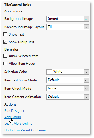
Tile groups are instances of the TileGroup class that host tiles. Each Tile Control must have at least one group. If you need more tile groups, click the corresponding link within the Tile Control’s smart-tag.
In code you can access the TileControl.Groups collection and modify it as required. To organize tiles into the specific tile group, add these tiles to the group’s TileGroup.Items collection.
Tile groups can display captions, assigned to their TileGroup.Text properties (see the figure below). By default, these captions are not displayed. If you wish to show these text blocks, set the TileControl.ShowGroupText property to true or check the related check-box within the control’s smart-tag. The TileControl.AppearanceGroupText property provides access to the appearance settings, applied to tile group captions.
To change the distance between neighboring groups, use the TileControl.IndentBetweenGroups property.
Orientation and Tile Layout
Depending on the control’s TileControl.Orientation property, both groups and items within them are arranged differently.
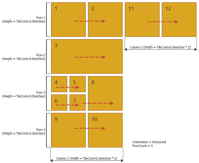
Horizontal orientation
- Appropriate for tiles of mixed sizes.
- Groups are arranged side-by-side in a single row.
- The TileControl.ColumnCount property is ignored.
- Within each group, tiles are arranged in maximum of X rows. The X is specified by the TileControl.RowCount property.
- The first tile of each group is located in the group’s top left corner. All further tiles stick next to this first item until their common width reaches the width of the logical tile column, which equals the doubled TileControl.ItemSize property value. After that, the next tile row starts and the process repeats. When the maximum row amount is reached (or there is no TileControl space left), the next logical tile column begins. The following figure illustrates this scheme. On this image, tiles 1 and 11 start new logical columns.
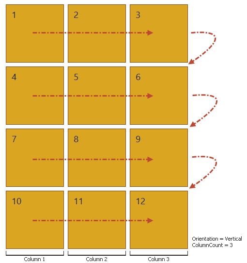
Vertical orientation
- Primarily used when all tiles are of the same size. Otherwise, you may observe gaps between tiles due to the item arrangement algorithm.
- Groups are arranged one below the other in a single column.
- The TileControl.RowCount property is ignored.
- The TileControl.ColumnCount property specifies the maximum amount of tile columns allowed for each tile group.
- The first tile of each group is located in the group’s top left corner. Further tiles stick next to this first item until the maximum amount of tile columns is reached (one tile goes for one column, no matter what size each tile has). When this maximum amount of tiles is reached (or there is no TileControl space left), the new row starts and the process repeats. This pattern is illustrated on the following figure.
Starting from version 16.1, the Tile Control supports Adaptive Layout Mode. See this link to learn more.